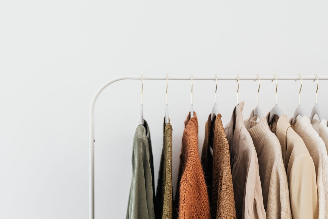
Most artists overthink wardrobe for a portrait because they are used to thinking about it for other kinds of photos. A headshot rewards polish. A fashion shoot rewards the clothes themselves. An artist portrait rewards neither. It rewards looking like the person who actually makes the work, photographed in the place where they make it.
That distinction changes almost every wardrobe decision that follows, from what to pull off the rack to how many pieces to bring to set. This guide walks through the practical calls: sourcing from the real closet instead of buying new, choosing color and texture on purpose, and knowing when a quick styling consult is worth the call and when it genuinely is not.
What wardrobe is actually doing in an artist portrait
An artist portrait has a narrower job than most people assume. It is not there to make the artist look like a different, more polished version of themselves. It is there to document who they actually are while they are working, in a way that a gallery, a press contact, or a collector can trust.
That means the clothes need to disappear a little. Not literally, but functionally. If a viewer's first reaction to the portrait is "nice outfit," the wardrobe has taken attention away from the work and the person. The goal is closer to the opposite: the viewer should walk away with an impression of the artist and, if the work is visible in frame, the work itself. The clothes did their job precisely by not becoming the subject.
This is a genuinely different brief from a corporate headshot, where a crisp blazer often does real communication work, or a fashion shoot, where the clothes are explicitly the subject. Artist portraits sit in between: professional enough to be usable everywhere the artist needs it, but honest enough that it still looks like them on an ordinary studio day.
Pull from the real closet, not a photoshoot outfit
The single most useful piece of advice we give artists before a portrait session is also the simplest: wear what you actually wear while you work, just make sure it is clean and well fitted. Not a special outfit assembled for the occasion. Not something purchased the week before because it felt more "photo ready."
There is a reason this holds up on camera. An artist who is used to their own clothes moves differently in them. They sit differently, they reach for a brush or a tool differently, they hold themselves differently, because the clothes are not asking anything of them. New, unworn pieces tend to read as slightly stiff, even when they fit fine on paper, because the person wearing them is subtly aware of them in a way they are not aware of their daily uniform.
There is also a trust question underneath this. A portrait that looks like a costumed version of the artist can undercut the credibility it is supposed to build, especially for press or a gallery bio, where the point is that this is what the artist actually looks like doing the actual work.
That does not mean grabbing whatever is on the floor of the studio that morning. It means starting from the real wardrobe and elevating it slightly: the cleaner version of the paint-flecked shirt, the well-kept sweater instead of the one with the hole in the elbow, the jeans without the visible stain. Elevated, not replaced.
Read the background before you pick a color
Studio and gallery backgrounds are rarely neutral. Paint-splattered walls, exposed materials, tools, stacked canvases, shelving, half-finished pieces leaning against a wall. Most working studios are visually busy places, and that busyness shows up in the frame whether anyone planned for it or not.
Solid colors and simple silhouettes generally photograph better against that kind of background than patterns or logos do. A patterned shirt in a patterned room competes with itself before it competes with anything else. A busy graphic tee pulls the eye away from the artist's face and into a logo that has nothing to do with the portrait's purpose. Simple wins here, not because simple is more flattering in the abstract, but because it does not add a second layer of visual noise to a background that already has one.
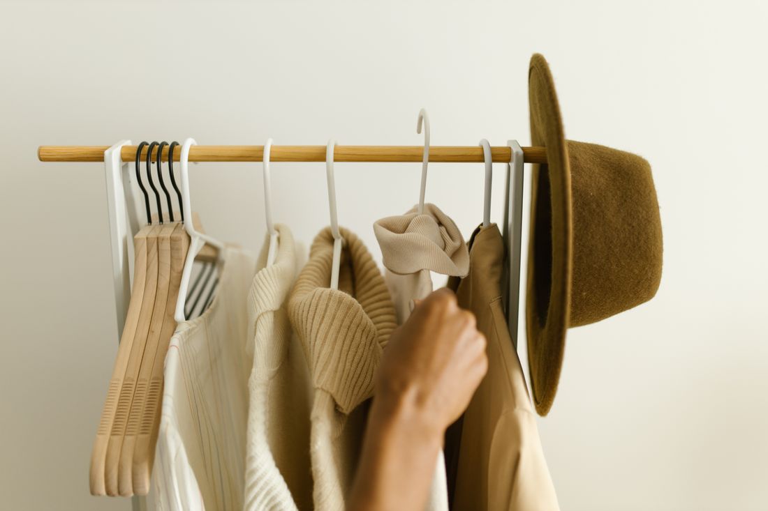
Before wardrobe gets decided, it is worth actually looking at the space the portrait will be shot in, not describing it from memory. A studio corner can look completely different in photos than it does day to day, and a color that seems neutral in person can pull warm or cool once it is lit. A five-minute walk-through of the actual shooting spot, ideally with a phone camera in hand, tells you more than a mental inventory of "the walls are white-ish" ever will.
Match wardrobe to the work, not just the room
If the portrait includes the artist's work in the background, the wardrobe conversation gets one layer more specific. Now color is not just about the room, it is about the palette of the pieces themselves.
Wardrobe that clashes hard with the work's palette pulls focus in an unhelpful direction, and wardrobe that matches the work too closely can make the artist visually disappear into it, which is its own kind of problem for a portrait meant to show a person. A neutral or gently complementary tone tends to solve both issues at once: it lets the eye register the artist as a distinct, readable figure, while still letting the work behind them read clearly for what it is.
This is one of the few places where it is worth testing rather than guessing. Hold the shirt or sweater up near the piece it will be photographed against, in the actual light of the room, and look at it the way a camera will see it rather than the way memory says it should look. Colors behave differently under studio strobes than they do in daylight from a window, and a tone that reads as a soft neutral in one kind of light can shift noticeably warmer or cooler in another.
Why texture and fit matter more than artists expect
Color gets most of the attention in wardrobe conversations, but texture and fit do more quiet work than artists usually expect. Well-fitted basics in natural fabrics (cotton, wool, linen, a good midweight knit) tend to hold up under both studio strobes and natural window light in a way that synthetic or ill-fitting pieces often do not.
Baggy clothing can obscure the body's actual shape and posture in a portrait, which sounds minor until you see two versions of the same photo side by side: one where the artist's presence reads clearly, and one where the silhouette goes shapeless and the person gets lost inside their own clothes. Synthetic fabrics have a separate problem. They can pick up shine and flatten out under strong light in a way natural fibers generally resist, turning a shirt that looks fine in the studio's ambient light into something with a distracting sheen on camera.
None of this requires an expensive wardrobe. A well-fitted, clean cotton shirt beats an expensive but boxy or synthetic piece almost every time in front of a camera. Fit and fabric are two of the cheapest wardrobe upgrades available, because they usually mean reaching for the right thing already in the closet rather than buying anything new.
How many outfit options to actually bring
Bring two or three options, not ten. This is a practical number we come back to often, because it strikes the right balance: enough for the photographer to adjust for the background, the light, or a change of setup within the studio, without turning the session into a wardrobe change marathon that starts to feel like a fashion shoot.
A useful way to build that short list is to vary one variable at a time rather than bringing three completely different looks. A neutral top with two different layers. The same trousers with two different tops. A slightly warmer option and a slightly cooler one, in case the light in the space reads differently than expected once the camera is actually rolling. This gives real flexibility without asking anyone to plan for every possible scenario in advance.
From a production standpoint, this also keeps the session moving. Every wardrobe change costs time: stepping away, changing, re-checking hair and light, resettling into a natural pose. Two or three well-chosen options usually solve the problem in one or two changes, while ten options tend to produce decision fatigue on set and a portrait that looks less natural because the artist has spent the last twenty minutes second-guessing a shirt instead of just being themselves in front of the camera.
Planning wardrobe when the portrait has more than one job
A single portrait session often has to serve several different uses at once: a bio page, a press kit, a gallery submission, sometimes a social profile. Each of those contexts carries a slightly different register, even if the difference is subtle. A press photo can afford to feel a touch more considered. A bio page photo usually wants to feel the most like an ordinary studio day. A gallery submission sits somewhere in between, professional but still recognizably the working artist.
Wardrobe planning gets more useful when it accounts for this upfront rather than after the fact. If the two or three options include a slightly more polished piece and a slightly more casual one, the resulting portraits give whoever is selecting images later something to choose from, rather than forcing one image to stretch across every use it eventually needs to cover.
This is also where it helps to think ahead about crop and use rather than just the outfit. A portrait destined for a small circular headshot format on a directory site does not need the same wardrobe consideration below the waist that a full-length bio photo does. Knowing where an image is likely to end up changes what is worth spending time on.
Do you need a stylist for this, or not
Not always, and it is worth saying that plainly. A stylist is not a requirement for an artist portrait the way it might be for a fashion editorial or a branded campaign. Sometimes the honest, useful answer is exactly the one at the top of this guide: wear what you already wear to the studio, make sure it is clean and well fitted, and trust that.
A quick styling consult earns its place in two specific situations. The first is when an artist is genuinely nervous about wardrobe and keeps circling the same question without landing on an answer. A short outside conversation can resolve that faster than another hour of staring into a closet. The second is when the portrait needs to serve multiple registers, as described above, and it helps to have someone thinking specifically about how two or three options will read across a bio page, a press file, and a gallery submission at the same time.
Outside of those two cases, most artists already know their own wardrobe better than anyone brought in for a day could. The job is less about picking new clothes and more about editing down the ones already there.
Frequently asked questions
Should an artist wear something new for a portrait?
Usually not. A slightly elevated version of what the artist already wears in the studio tends to read as more authentic than something bought for the occasion. New, unworn clothing often looks stiff on camera and can feel like a costume rather than a true likeness.
What colors work best for an artist portrait?
Solid colors and simple silhouettes generally photograph better than patterns or logos, especially against a busy studio background. Beyond that, choose a tone relative to the work itself: a neutral or complementary color lets both the artist and the artwork read clearly, rather than clashing or getting lost in it.
How many outfit options should an artist bring to a portrait session?
Two or three options is enough. That gives the photographer some flexibility to adjust for the background or the light without turning the session into a fashion shoot, which is not the goal of an artist portrait.
Do I need a stylist for an artist portrait?
Not always. Sometimes the honest answer is to wear what you already wear to the studio, cleaned and well fitted. A quick styling consult helps more when an artist is nervous about wardrobe, or when the portrait needs to serve several uses, like a bio page, press, and a gallery submission, that call for slightly different registers.
Does fabric and fit actually matter for a portrait?
More than most artists expect. Well-fitted basics in natural fabrics tend to hold up better under studio or natural light. Baggy or synthetic pieces can look flat or shiny on camera in a way that is hard to fully correct afterward.
Let the clothes support the work.
We plan wardrobe for artist portraits the same way we plan everything else on set: around the person and the work, not around the idea of a photoshoot.
Explore styling services →