
Most artists spend real time thinking about how the work will be hung, lit, and sequenced, and then decide what to wear to the opening the night before, sometimes the hour before. That's a reasonable order of priorities, the work matters more, but it leaves the outfit question to instinct at exactly the moment there's least time to think it through, and least time to notice how the room's lighting will actually treat it.
The stakes are lower than a wardrobe emergency, but they're not zero. Guests photograph the artist standing near the work all night, under lighting built for the paintings rather than for faces, and those photos are often the ones that circulate afterward, on social media, in a gallery's own recap, sometimes in press coverage. What the artist wore, and how it actually held up under gallery light and a camera, becomes part of the visual record of the show whether that was the plan or not. This guide covers how to think through that decision without overbuilding it: what the outfit is competing with, how gallery lighting changes what reads well, and a few practical failure points worth checking before the night of the opening.
The two ways this usually goes wrong
One failure mode is disappearing entirely, dressing so neutrally that the artist becomes hard to pick out from the crowd at their own event. That sometimes is exactly the right instinct for the work, but it also means guests who want to meet the artist, ask a question, or get a photo have to actively hunt for them in the room. In photos taken across the night, an artist who has disappeared into the crowd often just is not in many of them at all. The other failure mode is the opposite: an outfit so bold or so formal it becomes its own subject, pulling attention away from the art and toward the person wearing it in a way that undercuts the point of the evening.
Neither failure comes from bad taste. Both usually come from not having thought about the question at all, and defaulting to either whatever is clean or whatever feels most special. Neither of those is actually solving for the room the outfit will be standing in, or for the camera pointed at that room most of the night.
What gallery lighting actually does to an outfit
Track lighting in a gallery is aimed at the art, not at the people standing in front of it. Most of the room runs on directional spots angled down onto the walls, so a guest standing near a piece gets sidelight and overhead light instead of the even, forward light most people are used to seeing themselves in. That angle throws shadows under the brow, the nose, and the chin, the same shadow pattern that makes a phone photo from an opening look different from a phone photo taken almost anywhere else.
The color of that light matters too. Most galleries run warm-white bulbs to make paintings look inviting rather than clinical, and that warmth shifts colors in a way that is easy to miss in a mirror at home and obvious the second a photo gets taken. A gray that reads neutral in daylight can pick up a faint yellow cast under gallery track lighting, and a white shirt can pick up the same warmth standing a few feet from a spotlit canvas.
Exposure is the last factor. A camera meters for the room it is looking at, and a bright, evenly lit painting next to a person in dimmer ambient light creates real contrast. Stand close to a spotlit piece and a face can go slightly dark in the resulting photo. Stand in the gaps between fixtures and the opposite happens. We shoot these rooms constantly, and it is useful context for why an outfit that looked right getting dressed can look slightly off in the photos that actually circulate afterward.
Relating to the work without matching it
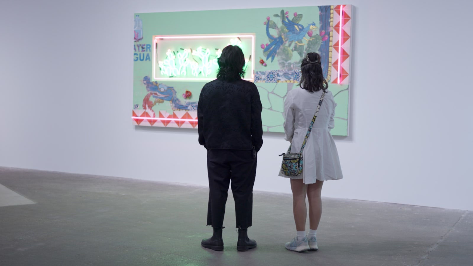
A useful middle path is picking up one loose element of the work, a color family, a texture, a general mood, without trying to match it precisely. An artist showing warm, textured abstract paintings might reasonably lean into a warm neutral palette with some texture of its own, a knit, a raw hem, without needing the outfit to literally echo the canvases on the wall.
Trying to match too precisely usually backfires. An outfit built to exactly mirror the show's palette starts to read as a costume, something worn for the event rather than something the artist would naturally wear, and that gap is often more noticeable in photos than it felt getting dressed. Photographed side by side with the work, an exact match tends to flatten the person into the background rather than complement it, which is the opposite of what most artists actually want from the pairing. A single fabric texture, visible weave, raised stitching, a worn leather surface, tends to survive that side-by-side photo better than a color match ever does, because texture reads as a person rather than a backdrop.
How dressed up is too dressed up
The general target is a slightly dressier version of how the artist actually dresses day to day, not a different, more formal person entirely. A studio-based painter who lives in denim and worn sweaters does not need to show up in a suit to seem serious about the evening. A cleaner version of that same wardrobe, better fit, fewer visible stains, a considered layer added, usually reads as more authentic and more photogenic than a costume change into formalwear nobody is used to seeing them in.
The exception is a show or venue with its own dress expectations, a benefit gala tied to an opening, a more formal institutional space. In those cases it is worth finding out what the room expects before deciding to override it, since standing out for being underdressed is a different problem than standing out on purpose. A quick question to the gallery ahead of time settles this faster than guessing, and it also settles what a photographer covering the night should expect to see when the artist walks in, and it settles it once instead of leaving the artist to guess from across the room.
Why comfort is a styling requirement, not a compromise
An opening usually means two to four hours standing, talking, moving through a crowded room, and sometimes helping with last-minute logistics right up until doors open. An outfit that looks great in a mirror but pinches, rides up, or requires constant adjustment becomes a visible distraction for the person wearing it well before anyone else notices anything is wrong.
This is worth testing in advance, not discovered in real time. Actually standing, walking, and reaching in an outfit before the night of the opening catches problems, a jacket that restricts movement, shoes that are not broken in, a hemline that needs constant adjusting, while there is still time to solve them. It also matters for the photos. A hand tugging a hem or a shoulder working itself out of a strap shows up in the background of shots taken of someone else entirely, and it shows up in posture too. Someone who is uncomfortable tends to stand differently than someone who is not, and that reads in almost every photo from the night, not just the posed ones. A body that is relaxed photographs as relaxed, and a body that is bracing against a pinched waistband or a slipping strap photographs as exactly that, however good the outfit looked standing still.
What to do about color, print, and camera behavior
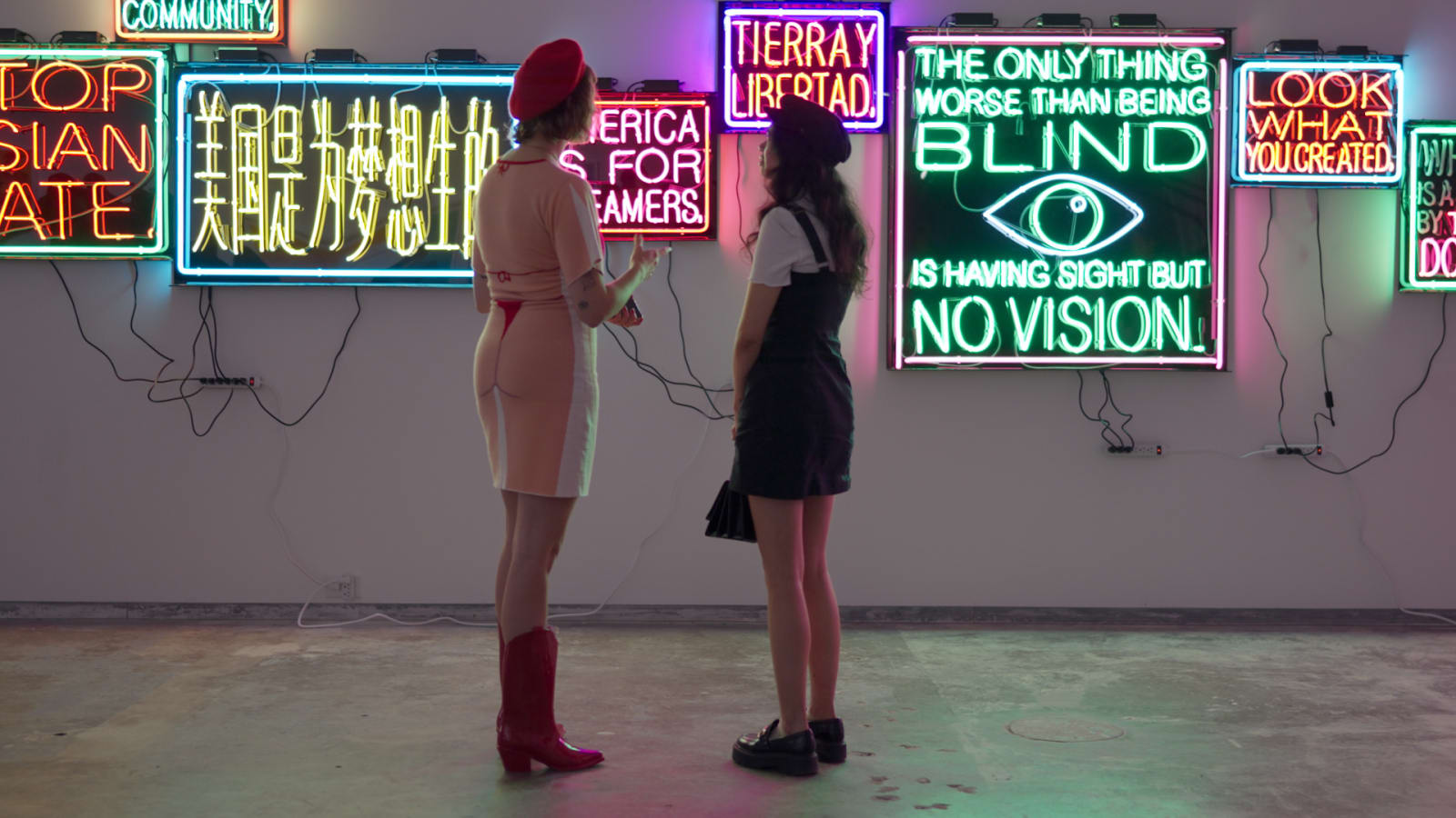
Bold color and pattern are not automatically wrong, but they carry more weight in a gallery setting than almost anywhere else, since the walls are specifically designed to hold the room's visual attention. A loud print that reads as confident at a party can pull focus away from the art in a white-walled gallery in a way that feels, even unintentionally, like competing with the work.
Fine stripes and tight repeating patterns cause a separate, more technical problem. Small, regular patterns can shimmer or create a rippling moire effect once a camera sensor is involved, an artifact that is not visible to the eye in the room but shows up plainly in photos. Solid heavy black tends to lose its fabric detail under gallery lighting and reads as a flat silhouette in photos, while pure white can blow out against a white wall under a bright spotlight, losing texture the same way. A mid-tone with some visible weave or knit texture holds up better on camera than either extreme, and it photographs the same whether the shot is candid, posed, or grabbed quickly on a phone.
A practical middle ground is one considered statement element, a strong color, an interesting texture, a distinctive accessory, rather than several competing for attention at once. One deliberate choice reads as intentional. Several at the same time starts to read as an outfit that could not decide what it wanted to say.
The long-night test
A simple way to stress-test an outfit choice before the night of the opening: imagine the last thirty minutes of the event, after several hours of standing and talking, helping close things out, maybe carrying something or moving a piece of furniture back into place. An outfit that still looks and feels fine at that point was the right choice. One that is already wrinkled, untucked, or uncomfortable by then was probably chosen for how it looked getting dressed, not for how the whole evening would actually go.
This same test matters for photos specifically. The best photos from an opening, the ones most likely to get used afterward, often happen later in the night, once the room has relaxed and genuine moments start happening more than posed ones. Those are also the shots most likely to end up on a phone, unposed and unplanned, taken by a guest rather than anyone hired for the night. An outfit that is already fighting the artist by that point shows up in exactly the photos that matter most, and there is no fixing it after the fact.
Group shows change the calculation
A solo show gives one artist full permission to be the visual focus of the room. A group show changes that math, since several artists are sharing the same space and the same audience's attention. An outfit that would be perfectly reasonable at a solo opening can read as attention-grabbing at a group show if it pulls focus away from the collective program toward one person.
The adjustment is not necessarily toning everything down. It is checking in, informally, with the other artists or the gallery about the general tone of the evening, so nobody ends up wildly over or underdressed relative to everyone else on the wall. A quick conversation beforehand solves this more reliably than guessing, and it also helps in group photos, where a wildly mismatched wardrobe among the artists reads as disorganized even when nothing else about the show is. A gallery that plans to line the artists up for one photo together benefits from knowing, ahead of time, roughly what that line will look like, since a group photo is one of the images most likely to get reused later, in a recap post or a follow-up show announcement.
Planning it earlier than the night before
The single most useful change is timing: deciding on the outfit, and actually trying it on and moving around in it, at least a few days before the opening rather than the night before. That gives enough runway to notice a problem, a poor fit, a color that does not photograph the way it looked in the store, and actually fix it, instead of discovering it while getting dressed with an hour to spare.
It is worth trying the outfit on under something other than daylight if possible, since the gallery's evening lighting will read differently than a bedroom or a store fitting room. It is a small planning step that gets skipped constantly, mostly because the outfit feels like the least important decision in a week full of install logistics and last-minute framing fixes. It usually takes less time than any of those other decisions, and it is one of the only parts of opening night the artist has full, uncomplicated control over. Everything else on the calendar that week, install, framing, last-minute wall text, tends to depend on someone else's schedule. The outfit does not.
A slightly dressier version of what they normally wear, with one loose connection to the work rather than an exact match. The goal is looking considered without disappearing or becoming the subject. Comfortable enough to stand and talk for hours, and tested in advance rather than decided the night before, since gallery lighting and camera exposure both treat an outfit differently than a mirror at home does. Yes. Track lighting is aimed at the walls, not at faces, so guests standing near the art get side and overhead light that throws shadows a normal room would not. The bulbs usually run warm, which shifts how colors read, and cameras exposing for a bright painting can leave a nearby face slightly dark. None of this is something to fully control, but it explains why an outfit can look different in photos than it did getting dressed. It is safe in the sense that it rarely clashes with the work, but safe is not the same as right for every show. All-black can flatten an artist into the background of their own event, which is sometimes exactly right and sometimes a missed chance to be findable in a crowded room. On camera, heavy black can also lose its fabric detail under gallery lighting and read as a flat silhouette rather than an outfit. Anything that requires constant adjustment, anything so new it has not been tested for comfort, and anything with a print or color loud enough to compete directly with the work for a viewer's attention. Fine stripes and tight repeating patterns are also worth avoiding, since they can shimmer or ripple once a camera sensor is involved, an effect that is not visible to the eye in the room itself. We plan styling for artist portraits the same way we plan the rest of the shoot, around who you are and what you make, not around looking photographed.Frequently asked questions
What should an artist wear to their own gallery opening?
Does gallery lighting actually change what looks good in photos?
Is all-black still a safe choice for a gallery opening?
What should an artist avoid wearing to their own opening?
Wardrobe should point back to the work, not away from it.