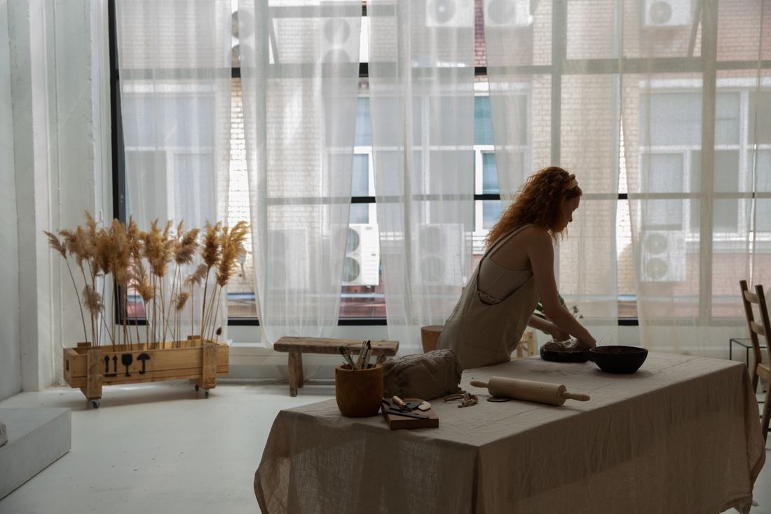
A paint-stained apron can be the strongest wardrobe choice in an artist's portrait, or the weakest one, and the difference has nothing to do with how the clothes look off camera. We treat real work clothes as a styling decision with its own craft: which piece, how much of the wear stays visible, what sits next to it, and whether the background actually backs up the story the clothes are telling. Get that right and the portrait looks unmistakably like the person who made the work. Get it wrong and it looks like a costume pretending not to be one.
Paint-stained work clothes strengthen a portrait when the stains, the outfit, and the setting all support one story, and weaken it when they're worn exactly as-is with no styling behind them. Treat real work clothes as a deliberate choice, not a default: which piece, how it's cleaned, what's layered around it, and how the portrait's eventual use should shift the call.
Do paint-stained work clothes ever belong in a professional portrait?
Yes, when the stains and wear are doing real work in the frame, not just standing in for authenticity. A studio apron or worn denim can read as more honest than a clean outfit, but it still has to be chosen and checked like any wardrobe piece, not grabbed off a hook on the way out the door.
The instinct to reach for the stained apron usually comes from a good place: artists want the portrait to look like their actual life, not a rented version of it. In our experience, that instinct is right more often than it is wrong. A canvas apron with real drips, jeans worn soft at the knee, boots that have stood at an easel for years, these carry a kind of visual proof a styled outfit cannot fake.
But real does not mean automatic. Work clothes can also look tired, poorly lit, or visually noisy in a way that competes with the artist's face. A stain in the wrong spot pulls the eye. A stretched-out collar can read as careless rather than lived-in. The clothes still have to earn their place in the frame the same way any other wardrobe choice does.
The honest version of this decision is not "wear your real clothes" or "wear something styled." It asks what the clothes need to prove, then checks whether the garment does that job well enough to survive a camera. Sometimes it does, exactly as it is. Sometimes a slightly adjusted version, cleaned in one spot or paired with one considered piece, does the job better.
When do work clothes make the portrait stronger, and when do they undercut it?
Work clothes strengthen a portrait when the wear on them matches the story the portrait is telling, a painter's apron in a working studio, a sculptor's dust-marked jacket next to actual tools. They undercut the portrait when the setting does not back them up, when the clothes look borrowed for the shoot instead of evidence of the work itself.
The strongest version we see is when the clothes and the location are the same story: the actual studio, real tools nearby, an apron that clearly belongs to that room. Away from that context, on a plain backdrop or a rented space, the same apron can read as confusing rather than credible, because nothing else in the frame confirms it belongs to anyone in particular.
Lighting changes the read too. Flat, even light smooths out texture and can make real wear look like a print on new fabric. Directional light that catches the raised edge of dried paint or the worn nap of denim tends to make the same garment look unmistakably real, because the camera is showing depth instead of just color.
Session type matters as much as setting. A portrait meant to sit next to an artist's actual practice, a studio feature, a process piece, benefits from work clothes staying close to exactly as they are. A portrait meant to introduce someone to people who have never seen the work in person often needs the same honesty with a little more intention behind it, so the clothes read clearly on a first look rather than needing context the viewer does not have yet.
What does "just wear what you always wear" get wrong?
It skips the styling decision entirely and assumes any version of an artist's daily clothes will automatically read as authentic on camera, when a camera is far less forgiving than a mirror. What looks lived-in and comfortable in the studio can look messy, dated, or simply hard to read once it is lit, framed, and shown at portrait size.
Photographs compress detail in ways daily life does not. A subtle color shift that nobody notices in the studio can shift further under studio light or a phone camera's white balance. A pattern that reads as texture in person can turn into visual noise at a smaller crop. Fabric that hangs naturally when standing and moving can bunch or fold oddly the moment someone holds still for a portrait.
"Wear what you always wear" also treats the decision as already made, when in practice an artist usually owns several versions of their working outfit: a favorite paint-marked shirt, a slightly newer one, one that is honestly past its useful life. Choosing among those options is still a styling choice, even if every option came from the same closet the artist wears to the studio every day.
The useful version of this advice is narrower than it sounds: identify the specific piece that carries the clearest evidence of the work, check it against the light and the background ahead of time, and confirm the fit still sits the way it is supposed to. That is styling. It just starts from a closet instead of a rack of options nobody has worn yet.
How does a stylist actually work with real work clothes?
A stylist treats real work clothes the same way as any other wardrobe option: laid out ahead of time, checked against the light and the background, and paired deliberately rather than worn exactly as they came off the studio floor that morning. The clothes stay real. The choices around them do not happen by accident.
In practice that means reviewing more than one option from the artist's actual working wardrobe rather than assuming the first apron pulled off the hook is the right one. It means checking where the strongest stains and wear sit on the body, and whether that spot reads well in the specific pose and crop planned for the session. A mark on a sleeve usually helps. The same mark crowding the collar usually competes with the face.
It also means small, honest adjustments: rolling a cuff so a hand is visible, tucking or untucking one layer so the silhouette reads clearly instead of shapeless, choosing which of two similar aprons has cleaner lines even if both have comparable wear. None of this hides the work clothes' history. It makes sure the camera can actually see it.
The point is not to make real clothes look styled in the sense of polished. It is to make sure the same decisions that go into any wardrobe choice, fit, placement, what pairs with what, still happen when the wardrobe in question already exists in the artist's closet instead of on a rack brought in for the day.
Should the stains be cleaned up or left as they are?
Neither answer is automatically right. Some stains stay because they are the honest record of the work, and some get lightly addressed because a heavy patch of dried paint in the wrong spot pulls focus away from the artist's face. The decision is about where the eye lands first, not about hiding evidence of the work.
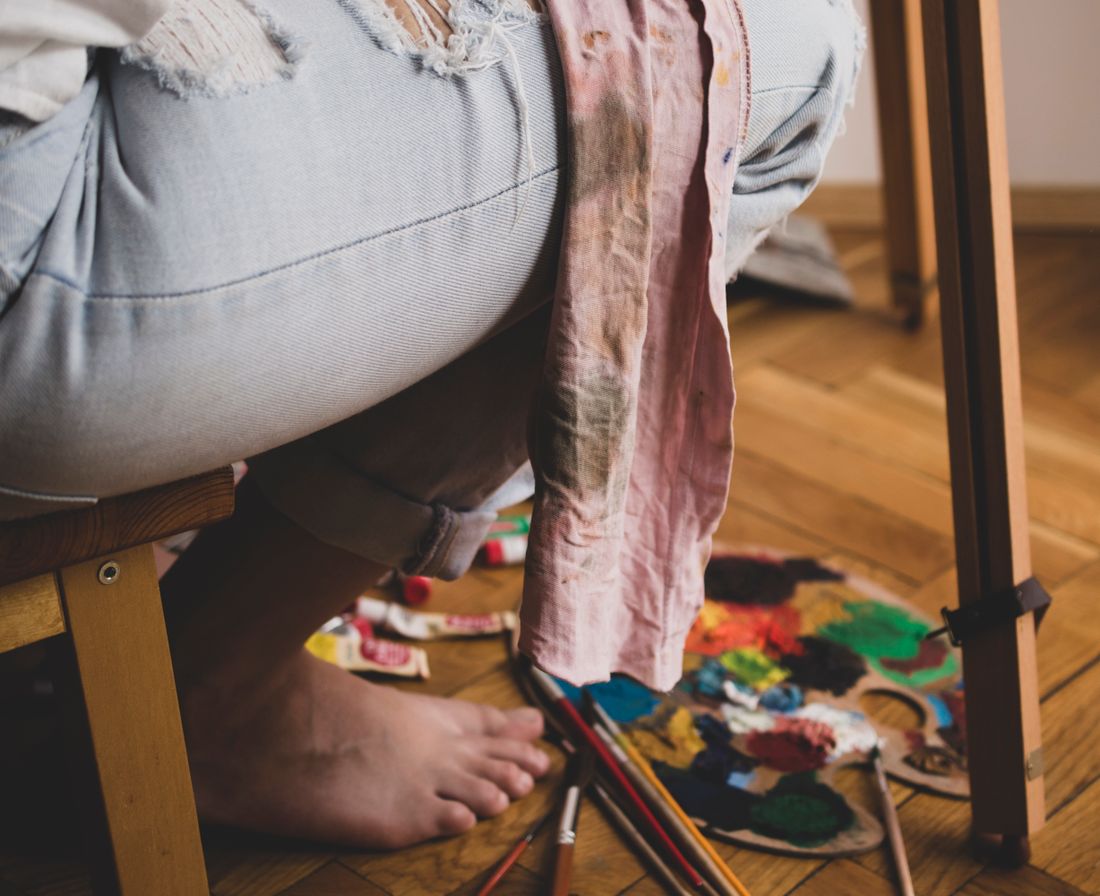
Stains placed on the hands, forearms, or torso usually support the portrait without needing any adjustment. They sit exactly where a viewer expects evidence of studio work to show up, and they photograph as proof rather than distraction. Stains that land near the collar, across the chest at eye level, or anywhere close to the face tend to compete with the one thing the portrait actually needs people to look at.
Full cleaning is rarely the answer, since it can flatten a garment's whole character and leave it looking new in a way that contradicts the reason it was chosen. A more common move is a light, targeted adjustment: brushing off loose material that reads as dirt rather than paint, or choosing a different angle so a distracting mark falls out of the strongest sightline instead of scrubbing it out entirely.
The test that holds up across most sessions is simple: does this particular stain, in this exact position, make someone look longer at the work behind the artist, or does it make them look away from the artist's face. The answer decides whether it stays untouched, gets angled out of the frame, or gets lightly addressed before the camera comes out.
How do you layer real work clothes for a portrait without changing what they are?
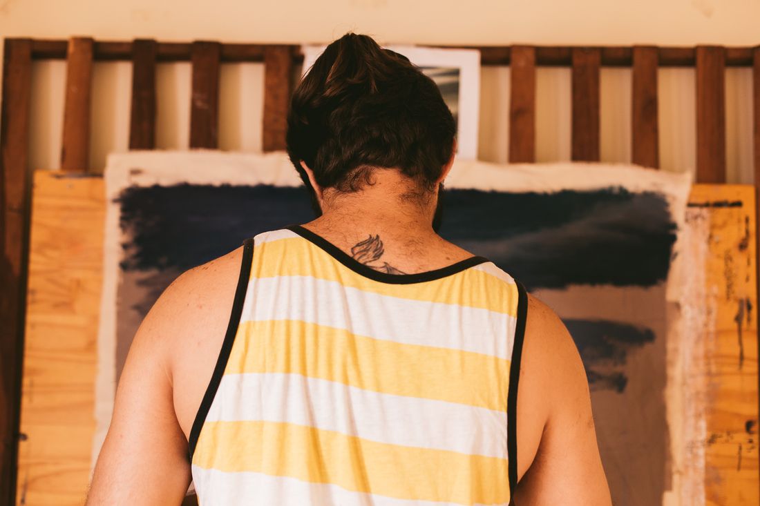
Layering real work clothes means adding one or two considered pieces around the stained core item, not replacing it: a plain shirt underneath a marked apron, a simple layer near a worn jacket, so the eye has one clear anchor instead of stains competing across the whole outfit. The work clothes stay the visible proof. The layering keeps the rest of the frame calm enough to support them.
The practical version of this is restraint. One plain piece under or beside the marked garment usually does more than a second textured or patterned item would. Two busy pieces next to each other, even if both are genuinely part of the artist's working wardrobe, tend to fight for attention in a way that makes the portrait feel cluttered rather than lived-in.
Rolled sleeves are a common small move worth mentioning on their own. Rolling a cuff exposes a hand and forearm, which usually shows more evidence of real work, paint under a nail, dried marks on skin, than the sleeve fabric alone would. It also opens up the silhouette so the outfit reads clearly instead of as one solid mass of fabric.
Color still matters even when the goal is honesty rather than polish. Keeping the layered pieces close in tone to the stained garment lets the stains themselves become the visual detail that stands out, instead of getting lost against a busy palette or lost entirely against a layer that is too close in color and value to the marks it is supposed to be supporting.
How does the background change whether work clothes read right?
Work clothes read as honest when the background confirms them, real tools, an actual working surface, uneven studio light, and they read as staged the moment the background contradicts them, a plain unbroken backdrop or a tidy space that has nothing to do with paint. The background is doing half the storytelling work the clothes are supposed to carry on their own.
An actual studio does most of this automatically. Paint-flecked floors, worn work surfaces, and tools sitting where they normally sit all quietly confirm that the apron on the artist's body is not a prop. A stylist's job in that setting is mostly restraint: keep the frame from getting so cluttered that the clothes stop being the clearest thing in it, not add credibility that is already there.
A plain or neutral backdrop asks more of the clothes, since nothing around them is confirming the story. In that setting, well-placed, well-lit wear can still read as genuine, but it has less help from its surroundings, so choices like light direction and stain placement carry more weight than they would in a real working space.
Color relationships matter too. A wall or backdrop close in tone to the stained garment can swallow the very marks the portrait is meant to show. A background with enough contrast, without competing for attention, lets the wear stay visible instead of blending into the surface behind it.
How does the portrait's downstream use change the answer?
A portrait meant for a personal archive or a studio-practice feature can lean further into real, worn work clothes than a portrait meant for a grant application, a press kit, or a gallery's front-facing bio page, where a slightly more composed version of the same honesty tends to serve the artist better. The clothes usually stay the same. How far toward "exactly as worn today" the styling goes should shift with the use.
Audience is the biggest factor. A curator or reviewer looking at dozens of applications in one sitting has less context than a studio visitor standing in the room, so a portrait built for that setting benefits from clarity over rawness, work clothes still present, but chosen and lit so the story reads in a few seconds rather than needing the room around it to make sense.
Longevity matters as much as audience. A portrait meant to represent an artist for years, on a website or a bio page, needs work clothes that will still make sense out of the specific moment they were worn in, rather than a piece so specific to one project or one season that it dates the image faster than the artist's actual work changes.
None of this argues against real clothes. It argues for matching how literally "real" the portrait needs to look to where that portrait is actually going to live, and choosing the specific piece, the specific stain, and the specific setting with that destination already in mind before the shoot happens.
Frequently asked questions
Should artists wear their actual work clothes for a portrait?
Often, yes. Real work clothes, an apron with genuine paint, jeans worn soft from studio time, tend to read as more honest than a rented or overly polished outfit. The stronger practice is treating them as a deliberate wardrobe choice: picking the specific piece, checking it against the light and background, and confirming the stains sit somewhere that supports the portrait instead of distracting from it.
Is it okay to wear a stained apron in a professional photo?
Yes, when the stain placement and the rest of the outfit are considered rather than accidental. A stain near the hands or torso usually reads as proof of the work. A stain crowding the collar or face pulls attention away from the artist instead. The apron itself is fine to wear; what matters is where on the body the wear sits and what it is paired with.
What if an artist doesn't have work clothes that photograph well?
That is common, and it does not rule out the honest-clothes approach. A stylist can look for a similar but slightly cleaner version of the same garment type, or add one plain, considered layer around the piece so the existing wear reads clearly instead of looking chaotic against everything else in frame. The goal is not a flawless apron. It is one wear pattern the camera can actually resolve.
Can a stylist bring in work-clothes-style pieces instead of an artist's own?
Yes, and it is sometimes the better call, particularly when an artist's actual clothes are too worn to photograph cleanly or too new to show any real history yet. A stylist can source a similar garment with honest, natural wear built in, and let the artist's own accessories or a hand tool carry the specific, personal detail the sourced piece cannot provide on its own.
Do work clothes work for every kind of artist portrait?
No. They tend to work best when the setting, the implied activity, and the clothes all agree with each other, a studio portrait shot near real materials, for instance. For a gallery opening portrait, a press headshot, or a formal bio image, a more composed outfit usually serves the artist better, even if one piece of the real working wardrobe still makes a small appearance.
Wardrobe should point back to the work, not away from it.
We plan styling for artist portraits the same way we plan the rest of the shoot, around who you are and what you make, not around looking photographed.
Explore styling services →