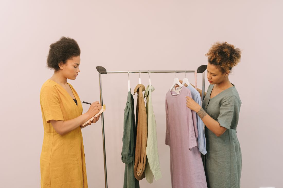
Not every styled shoot starts from a blank moodboard. Plenty of clients arrive with a color palette already fixed, a logo placement rule already written down, and a brand tone a marketing team spent months settling on before a stylist ever got the brief. That version of the job looks completely different from building direction out of nothing. The constraints aren't obstacles to work around, they're the actual starting point, and the real skill is knowing what still moves inside them.
Styling inside an existing brand guide means treating a client's locked color palette, logo rules, and tone as the shoot's real starting point rather than the moodboard. A stylist chooses wardrobe, props, and set dressing from within those boundaries, and the work becomes about finding the range still open inside rules the client already wrote.
What Does Styling Inside a Client's Brand Guide Actually Mean?
Styling inside a brand guide means every wardrobe, prop, and set choice has to work inside rules the client set before the shoot was ever booked. Instead of inventing a direction from open possibility, a stylist works from a palette, a logo policy, and a tone that already exist on paper.
Most brand guides come out of a marketing or design process that had nothing to do with photography. They usually spell out an approved color range, logo clear space and placement rules, sometimes a typeface, and a general sense of the tone the brand wants to project, warm and approachable, or clean and minimal. None of that was written with a specific shoot in mind, and a stylist reading it for the first time is translating a document built for other purposes into decisions about clothing, fabric, and the objects that will sit in frame.
A moodboard built from scratch starts with the opposite problem, too many open directions and no fixed reference point yet. Working from an existing brand guide flips that. The reference point already exists, and the job becomes figuring out what still needs deciding once the fixed parts are subtracted, which pieces of clothing, which textures, which props read as part of the brand rather than working against it. That subtraction is real work, not a shortcut, and it usually takes longer than starting from nothing would suggest.
What Does a Brand Style Guide Usually Decide Before Styling Starts?
A brand style guide usually decides the color range, the logo rules, and the general tone before a stylist gets involved. Those three pieces set the outer edge of what a shoot can look like, and everything a stylist adds afterward has to sit comfortably inside them rather than compete with them.
The color range is usually the most specific piece, a defined set of hex values or Pantone references tied to the brand's own materials, sometimes narrow enough to rule out entire categories of clothing on sight. A palette built around a cool blue and white doesn't leave much room for warm orange or busy pattern, no matter how well either would photograph on its own. That narrowing happens before a single garment gets pulled, just from reading the guide.
Logo rules tend to be the most literal, spelling out clear space, minimum size, and where the mark can and can't appear, which matters directly if a shoot includes signage, packaging, or a storefront in frame. Tone is the vaguest of the three and the hardest to apply directly, a word like approachable or premium that has to get translated into an actual texture, color temperature, or styling choice before it means anything on set. Reading all three together before the first fitting is what keeps later choices from contradicting a rule nobody flagged out loud.
How Does a Locked Color Palette Change Wardrobe and Prop Choices?
A locked color palette changes wardrobe and prop choices by removing entire color families from consideration before a single item gets pulled. Instead of choosing what looks best in isolation, a stylist is choosing what looks best while also sitting inside a narrow, already-decided range, which is a different and more limited exercise.
When color is fixed, texture and material start doing more of the work that color would normally carry. A palette locked to neutral tones can still read as warm or cold, soft or structured, depending on whether the fabrics are wool and linen or matte synthetic. Props follow the same logic, a stack of ceramics photographs differently from a stack of glass even inside the exact same color range, and that difference becomes one of the few remaining levers a stylist has left to pull.
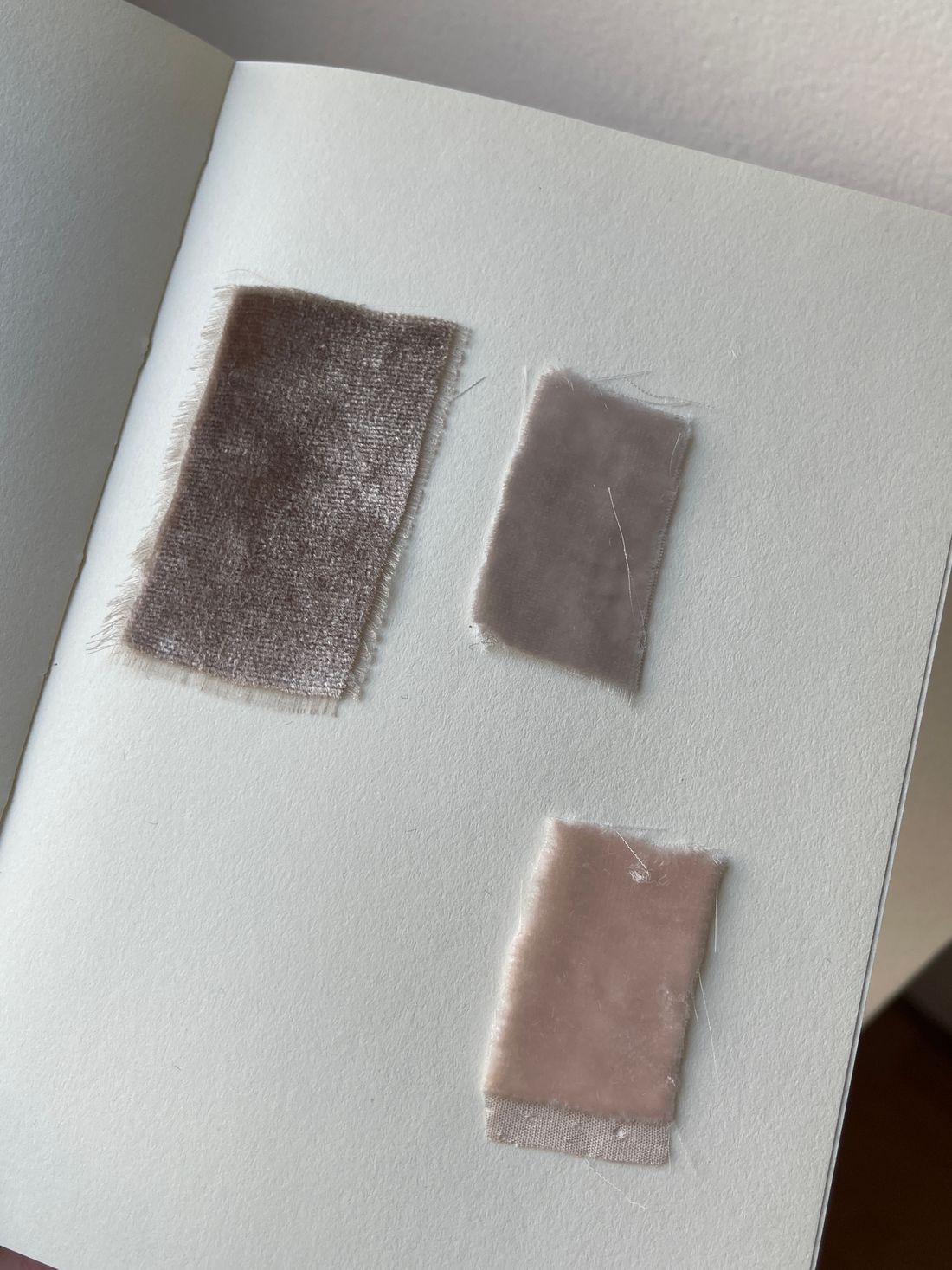
A near-miss color is often the riskier mistake, a shade close enough to the approved palette that it looks fine on a screen but reads as slightly off once it sits next to the brand's actual materials in frame. Checking a garment or prop against the brand's own swatch, not against memory of the palette, is a small habit that catches most of those mismatches before the shoot day rather than after. That check takes minutes and saves an entire reshoot conversation later. We keep a printed swatch in the kit for exactly that reason, next to the rail rather than back in a bag.
What Do a Brand's Logo Rules Actually Restrict on a Shoot Day?
A brand's logo rules mostly restrict what can share the frame with the mark: required clear space, minimum size, approved background colors, and which surfaces it's allowed to appear on. On a shoot day, that usually shows up as decisions about what not to place near a sign, a garment, or a branded set piece.
Clear space rules mean a stylist can't drape a scarf, hang a garment, or set a prop close enough to a printed logo that it crosses into that protected zone, even accidentally in the corner of frame. If a shoot uses branded merchandise or signage as a background element, that clearance has to be checked at the actual camera angle, not just in the room, because a wide lens can pull an object into the zone that looked safely clear to the eye standing next to it.
Minimum size and background color rules matter most when a logo sits inside the actual set, not just on a product. A mark that has to sit on white or on the brand's own color can rule out a patterned backdrop or a colored wall a stylist might otherwise reach for. None of this is a stylist's rule to interpret loosely: the brand's own guide is the source, and a shoot that treats it as a suggestion risks images the client can't actually use. A quick check against the guide before a set piece gets placed is faster than reshooting around a logo that turned out to be too close to a patterned backdrop.
Where Does a Stylist Still Have Real Freedom Inside a Brand Guide?
Real freedom usually survives in texture, silhouette, layering, and the small objects a brand guide never mentions at all. A palette or a logo rule fixes color and placement, but it rarely says anything about fabric weight, garment shape, or the props that fill the rest of the frame, and that's where a stylist's actual judgment still operates.
Two shoots built on the exact same approved palette can look completely different depending on whether the wardrobe leans structured or relaxed, matte or shiny, minimal or layered. A guide that specifies a cool gray-blue range says nothing about whether that gray-blue should show up as a crisp cotton shirt or a soft brushed knit, and that decision changes the entire feel of the image without ever touching a rule written down anywhere.
Composition and set dressing carry a similar amount of open ground. Where an object sits in frame, how much negative space surrounds it, whether a shot is tight or wide, none of that is dictated by a color palette or a logo policy. Working inside constraints doesn't mean working inside a script. It means the fixed points are already chosen, and the stylist's job narrows to making everything around them feel considered rather than arbitrary. That's often what makes two brands built on a similar palette still look distinct once the shoot is finished. We treat that open ground as the actual creative brief once the fixed rules are out of the way.
How Does Prep Change When Styling Starts From a Guide Instead of a Moodboard?
Prep starts differently when a brand guide already exists: the first step is reading the guide closely instead of gathering inspiration images, and pulling swatches, garments, and props against its rules rather than against a mood. The moodboard, if one still gets built, becomes a translation tool rather than the starting point.
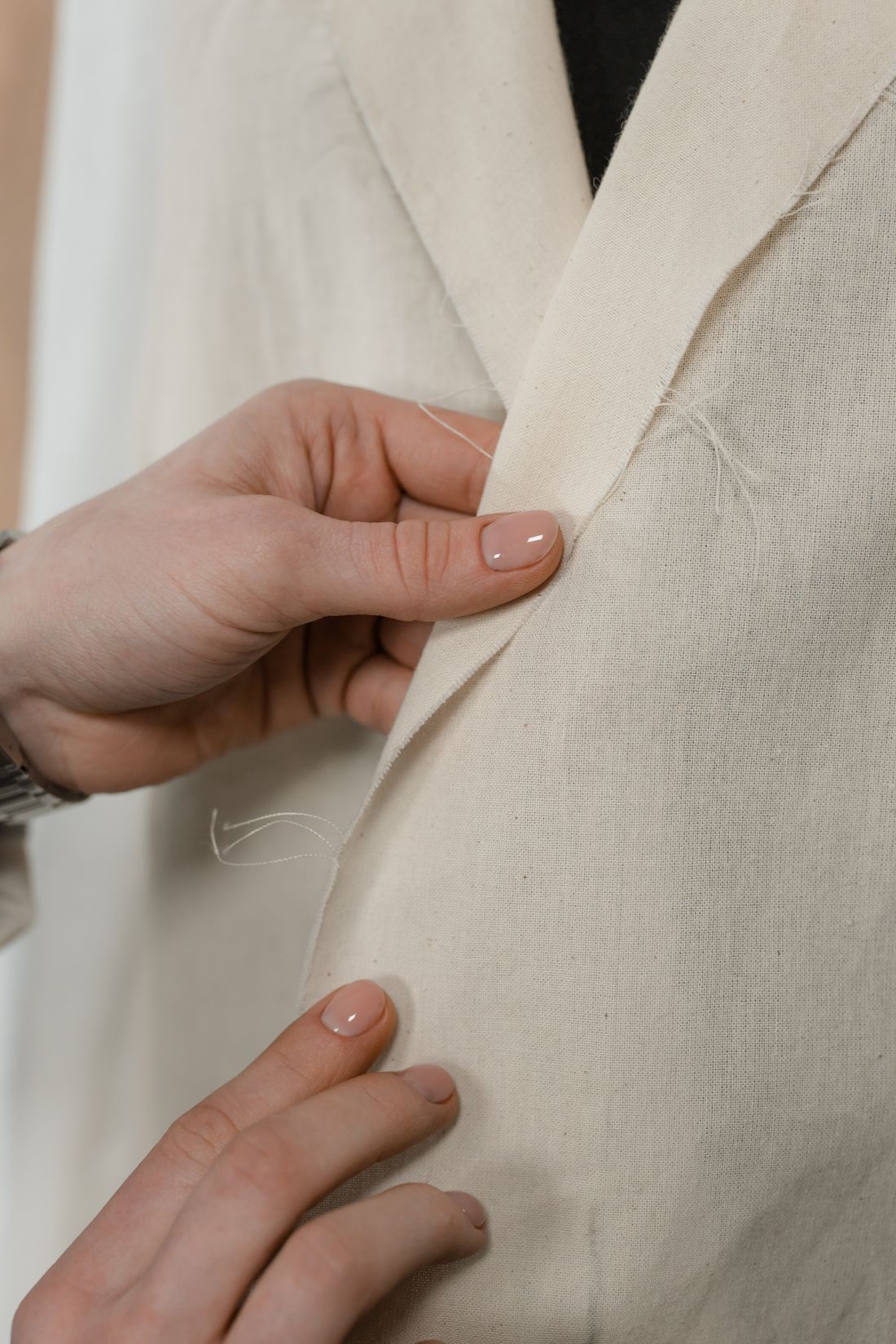
That changes what a fitting looks like too. Instead of laying out a wide range of options to see what feels right, a stylist arrives at a fitting having already filtered out anything that clashes with the palette or crowds a logo zone, so the fitting becomes a narrower conversation about fit, texture, and how pieces sit together rather than a wide search for direction. It's a faster process in some ways and a slower one in others, since some checking work moves earlier.
Approvals also move differently. A moodboard built from scratch usually gets approved once, broadly, before a shoot. Working from a brand guide often means the client's own marketing or brand team already signed off on the rules years earlier, so the shoot-specific approval is narrower too, mostly confirming that a particular application reads correctly rather than debating the direction itself. That narrower conversation tends to move faster, once everyone is actually looking at the same document. We've found that clarity up front, everyone anchored to the same written rules, cuts down on the kind of last-minute note that used to arrive the night before a shoot.
What Happens When a Brand Guide Is Incomplete or Contradicts the Shoot?
When a brand guide is incomplete or contradicts what a shoot actually needs, the honest move is to flag the gap to the client rather than quietly guessing or improvising a rule that was never written. A guide that covers digital marketing might say nothing about photography-specific concerns like fabric sheen, and that silence needs a real answer, not an assumption.
Most brand guides were built for logos on a website or a printed brochure, not for what a garment looks like under studio light or how a color shifts on fabric versus a screen. That gap shows up constantly: a guide that specifies a hex code but never says whether a matte or glossy finish reads as more on-brand, or one that fixes a palette but never addresses what happens when none of the approved colors exist in a fabric that also fits the shoot's silhouette.
Resolving that gap isn't the stylist's call to make alone, since the guide belongs to the client's brand, not to the shoot. The right move is naming the specific conflict clearly, an approved color that doesn't exist in the fabric a concept needs, or a logo rule that a set idea would break, and letting the client decide how to close it. That conversation usually takes minutes once it's framed as a specific choice instead of a vague concern, and it's a far better use of everyone's time than discovering the mismatch after the images are already delivered.
How Does Working Inside a Brand Guide Change Timeline and Communication?
Working inside a brand guide usually shortens the creative-direction conversation but adds a verification step earlier in prep: checking every wardrobe and prop choice against the actual guide document before it reaches a fitting. That trade tends to move the shoot's overall timeline earlier rather than shorter, since more decisions get locked before the call time rather than during it.
Communication also runs through a different person on the client side. A moodboard conversation usually happens directly with whoever booked the shoot. A brand guide conversation often loops in whoever owns the brand's visual identity, sometimes a marketing manager, sometimes a design team, and that person may not be in the room on shoot day at all. Getting their sign-off on specific applications before the shoot, not after, avoids a late note that arrives once images are already being edited.
None of this makes the work smaller than building a moodboard from nothing, it just moves where the effort sits. Less time goes into inventing direction, and more goes into reading, checking, and confirming against a document that already exists. A shoot built this way tends to run smoothly once prep is done properly, precisely because most of the hard decisions were made before anyone walked onto set. That's the actual trade a client is making when a brand guide replaces an open brief, not less creative work, just work redistributed to a different point in the calendar.
Frequently asked questions
What is a brand style guide, in the context of a styled shoot?
A brand style guide is a document a client's marketing or design team built to keep their visual identity consistent across everything they publish. For a styled shoot, the parts that matter most are the approved color palette, logo placement and clear-space rules, and a general description of tone. It wasn't written with photography in mind, so a stylist reads it for what it fixes rather than expecting shoot-specific instructions.
Does a brand style guide replace the need for a moodboard?
Not entirely. A brand guide fixes color, logo rules, and general tone, but it rarely addresses fabric, silhouette, prop selection, or composition. A moodboard can still get built from those fixed points, but it functions differently, translating a written set of rules into specific visual references rather than inventing direction from open possibility. The guide sets the boundary, the moodboard shows what still fits comfortably inside it.
What if the client's brand guide doesn't cover wardrobe or styling at all?
That's common, since most guides were built for logos, websites, and print, not photography. When that gap shows up, the honest step is naming it directly to the client rather than guessing what they'd want: a specific color question, a fabric finish question, or a prop choice that isn't addressed anywhere in the document. The client's own brand team makes that call, since the guide belongs to their identity, not to the shoot.
Can a stylist push back on a brand guide's color rules?
A stylist can flag a real conflict, like an approved color that doesn't exist in a fabric the concept needs, but the guide itself belongs to the client, not to the stylist. Pushing back looks like naming the specific tension clearly and letting the client's brand team decide, not quietly substituting a different color because it photographs better. The rules exist for reasons outside any single shoot.
How does styling inside a brand guide affect how many options get pulled for a shoot?
It usually narrows the pull rather than widening it. A fitting built from open possibility often brings a broad range of colors and textures to see what feels right in the room. A fitting built from a brand guide starts pre-filtered, since anything clearly outside the approved palette or clashing with logo placement rules already got ruled out during prep, leaving a smaller, more targeted set of real options.
Not sure what to wear for your portrait session?
We build the wardrobe plan around your actual work and how you present it, so the clothes support the portrait instead of competing with it.
Explore styling services →