
A moodboard can feel like real progress. Everyone agrees the images are beautiful, the palette is right, the mood is exactly what the shoot needs. Then the stylist sits down to actually build the wardrobe and realizes the board never told them what to buy, what to pull, or what to bring. It looked like alignment. It functioned like a guess.
A moodboard a stylist can use is legible as instructions, not just as a feeling. It shows the garment clearly instead of a mood, names the exact detail each image is for, flags which references are aspirational versus literal, states the real constraints, and includes a short 'not this' section that's often more useful than the yeses.
What images actually belong on the board?
A moodboard's job is to show a stylist what to buy, borrow, or pull, not just what a room agreed felt right. That starts with the images themselves. A backlit silhouette, a motion-blurred frame, a deep-shadow editorial shot might set a mood in five seconds of scrolling, but none of it tells a stylist what the collar looks like, where the seam sits, or whether the fabric has any weight to it. The garment disappears into the atmosphere around it.
Pick images where the piece is actually legible. That usually means:
- The full garment in frame, not cropped at the shoulder or cut off by the edge of the photo
- Light that shows the fabric's real colour and texture, not a filter or a sunset doing the work
- A visible closure, collar, or seam if that detail matters to the look
- More than one angle when the shape is complicated, since one photo rarely shows a garment's whole construction
A board built this way looks less like an editorial spread and more like a set of citations. That's the point. Every image should hold up if a stylist zooms in and asks what they're actually looking at. If the honest answer is a feeling, the image belongs somewhere else, a separate folder for tone, not the working board a stylist will source against.
Why does each image need a one-line reason?
Every image on a working board should carry a short note saying which specific thing earned it a spot: the colour, the silhouette, the fabric weight, a single detail like a collar or a cuff. Not this feeling. A feeling doesn't tell anyone what to source.
Without that note, a stylist has no way to know what a photo is actually asking for. A reference might be on the board because of one exact shade of rust, but read without a caption, it reads as a request for the whole outfit, the shoes, the pose, the hair. That mismatch rarely surfaces until fitting day, when everything sourced technically matches the photo and still isn't what anyone meant.
The note doesn't need to be long. Colour only. This silhouette, not this fabric. The way it falls at the hem. A few words under each image is enough, and it takes far less time to write than it takes to unwind a wrong pull later. Jasmine, our stylist, treats a board without these notes as unfinished, no matter how good the images are on their own. The goal is a board a stylist who has never spoken to anyone on the shoot can still read correctly.
How do you mark an image aspirational versus literal?
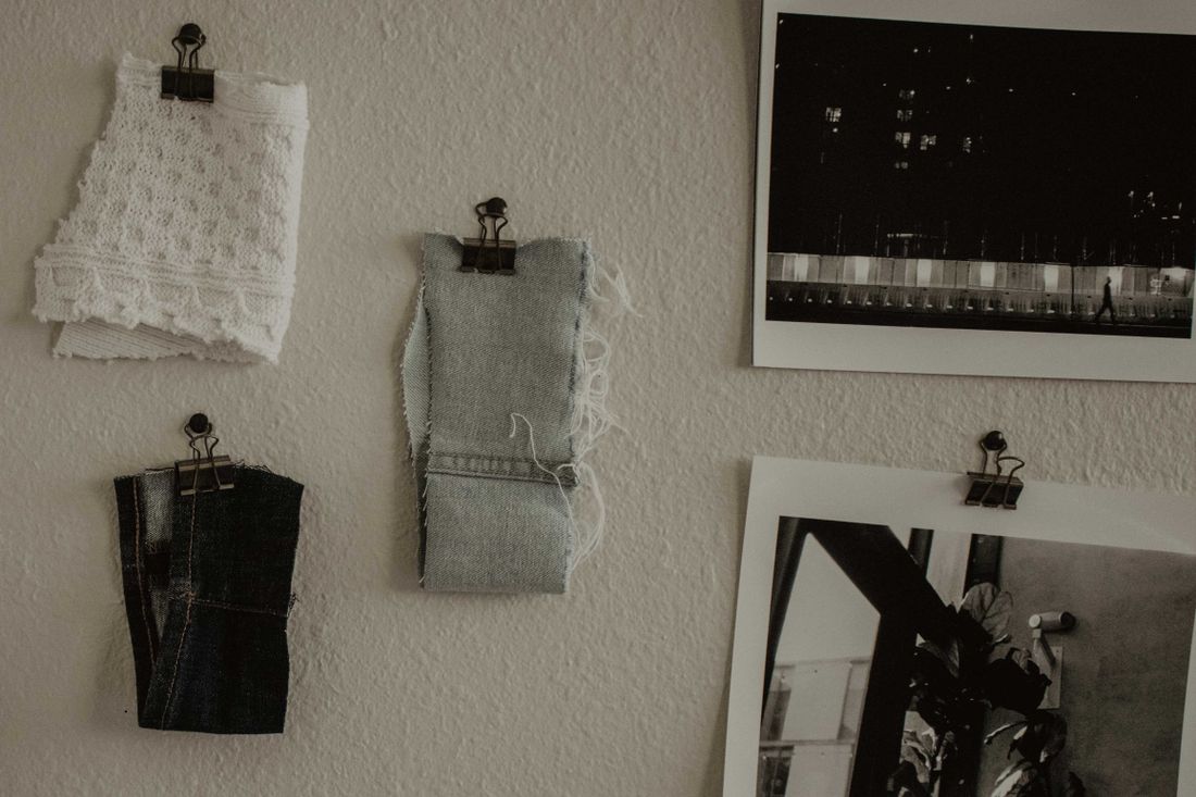
Mark every image as either aspirational or literal, because a stylist treats the two very differently and has no way to tell them apart without a label. An aspirational reference sets a general direction. A literal reference is something to match closely.
An aspirational image might be an old editorial spread, shot on a different body, in light nobody can recreate on the day. It earns its spot for the attitude, not because anyone expects to reproduce it piece for piece. Read as literal, it sends a stylist hunting for an exact garment that may not exist anymore. A literal reference works more like a swatch, a specific silhouette the shoot actually needs, and it deserves to be treated as a target rather than a suggestion.
A simple visual cue works: a border, a small tag, a separate row on the page. Anything that keeps the two from blurring into one pile of images everyone likes. Mixing them without saying which is which is one of the fastest ways a board goes wrong. Either the stylist over-invests chasing something unreachable, or under-invests in the reference that actually mattered.
What constraints have to be on the page, not in someone's head?
A working board states what the person will not wear, what the day physically requires, the weather, and the colours already present at the location. These usually live in someone's head and never make it onto the page, which means the stylist finds out about them only after sourcing against a board that never mentioned them.
Jasmine, our stylist, asks for this list before she opens a single reference image, because it changes what's even worth pulling. A person might rule out certain fabrics or necklines for reasons that have nothing to do with the concept, and that rules out more of the board than any aesthetic choice would. A shoot that involves walking, sitting on the ground, or moving quickly needs wardrobe built for that, which a still photo of someone posed perfectly will never show. Weather changes what's wearable outdoors regardless of what the references suggest. And a location already has colour in it; a clean neutral that reads well in a white studio can vanish or clash against a brick wall.
None of this needs a long document, just a short list next to the board: what's off the table, what the day requires physically, the forecast, and two or three colours already at the location. It turns the board from a taste exercise into a plan built for the actual conditions the wardrobe has to survive.
What belongs in a 'not this' section?
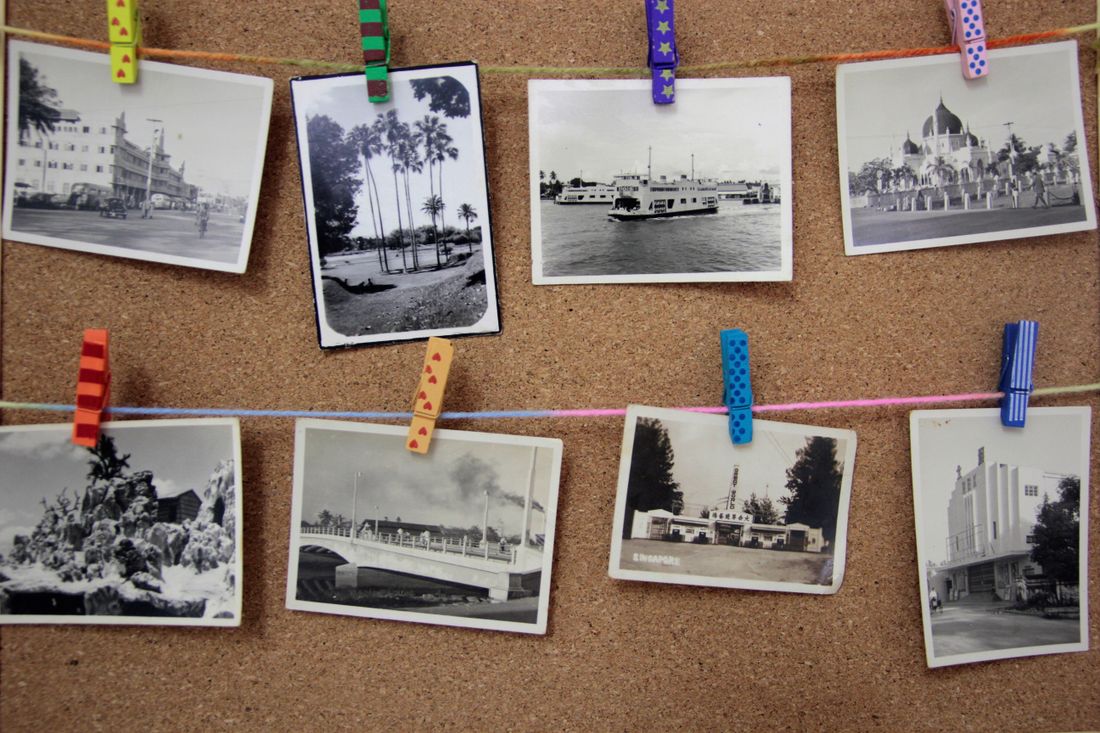
A short set of images labeled not this is often more useful than the whole board of yeses. It shows a stylist exactly what direction has already been ruled out, so nobody re-proposes it two weeks into sourcing.
This isn't a rant page. It's a handful of references, the same way the yes images are, each with one line saying why it's off the table: a silhouette that's been used on the last few shoots for this client, a colour that will clash with the venue's walls, a fabric that photographs cheap under the lighting the shoot is using. A single labeled no image communicates in seconds what would otherwise take a paragraph of description, and it does the job a hundred more yes images can't: it draws the actual edge of the board.
A useful reference here is a general example, a garment shape or a colour family, not a specific photographer's runway image pulled apart and republished as a don't. The point is the direction, not the source. Keep the not this section small, two or three images is usually plenty, and label each one with the specific reason it's out. It's the fastest way to stop a stylist from spending a week sourcing toward something the shoot already said no to.
When should the board actually get built?
Build the board before wardrobe gets chosen, not after. A board assembled to justify pieces that are already bought or pulled can't do the one thing a moodboard is for, which is catching problems and options while there's still time to act on them.
This sounds obvious and still happens constantly, because a board takes real time to build well and wardrobe decisions have their own deadline pressing on them. Someone pulls pieces first because the fitting is booked, then builds a board afterward for the deck or the approval chain. It might look organized. It can't change anything, because the decisions it's supposed to inform are already locked.
A rough board built early, even an unlabeled folder of saves with a few notes scrawled next to them, still leaves room to catch a wrong colour or a budget mismatch before money moves. That's worth more than a polished board built after the fact. Who signs off on the budget the board is sourcing against is its own conversation, and one worth having before the board gets built, not during fitting week when it's too late to change course.
Let the clothes support the work.
We plan wardrobe for artist portraits the same way we plan everything else on set: around the person and the work, not around the idea of a photoshoot.
Explore styling services →