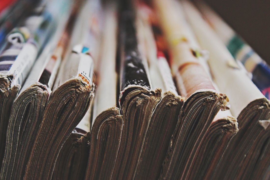
A shoot that looks perfect on a phone screen can still fail once it becomes ink on a printed page. Fine pattern can ripple into moiré, saturated color can shift or dull, and fabric texture that read as a soft detail online can turn into the loudest thing in the frame once it is printed large. None of this is a flaw in the photography. It is simply what happens when an image leaves a backlit screen and becomes something viewed by reflected light, often bigger and closer than a feed ever puts it. Naming print as the final use before wardrobe gets pulled is what keeps these differences from becoming a surprise after the shoot.
Fine pattern, strong saturation, and certain fabric textures behave differently once an image moves from a backlit screen to a printed page, so styling for print has to account for moiré risk, color shift, and texture at scale before the shoot, not after a proof comes back wrong. Naming the final use early lets wardrobe choices protect the piece instead of leaving it to chance.
What Changes About Styling When the Final Use Is Print, Not Social?
When a shoot is heading toward a printed page, a book jacket, or an exhibition catalog instead of a phone screen, styling has to account for how fabric, pattern, and color actually translate into ink on paper. Fine detail, strong saturation, and texture behave differently in print than they do backlit on a screen, and that gap needs to shape wardrobe choices before the shoot, not after the files come back from the printer.
Most styling instinct is trained on social media, where an image lives at a few hundred pixels wide, gets compressed by a platform, and glows from behind a screen. A printed piece asks something different of the same photograph. A magazine spread, a catalog, or a book jacket is viewed by reflected light, often close up, and often at a size a phone was never meant to reach. A pattern or color that reads as a pleasant texture on a feed can turn into visual noise once it is scaled up and printed.
This does not mean choosing plainer clothes out of caution. It means naming the final use early, before wardrobe gets pulled, so the stylist is choosing pattern scale, color, and fabric with the actual output in mind. A shoot briefed only as "content" defaults to what performs on a screen. A shoot briefed as print from the start gets wardrobe decisions that were never a gamble in the first place.
Why Does a Fine Pattern Look Fine on Screen but Fail in Print?
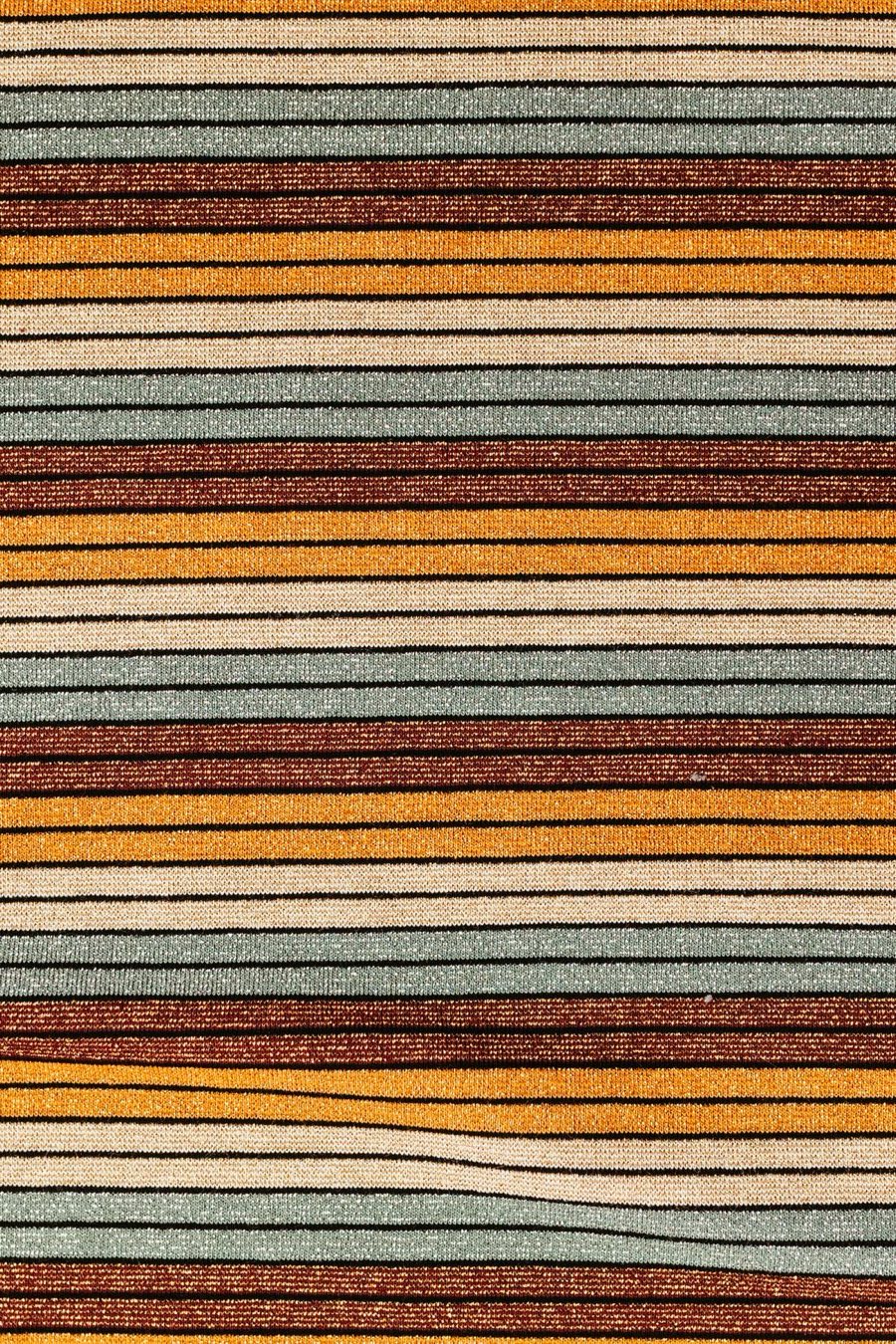
A fine, repeating pattern such as a narrow stripe, houndstooth, or herringbone can interact with a printing process the same way it interacts with a camera sensor: two regular patterns overlapping at close frequencies can create a distracting rippling effect called moiré. A screen displaying a compressed image often hides this. A printed page, especially at a larger size, tends to reveal it.
This is a physical interference pattern, not a styling opinion. It happens when the repeating lines in a garment fall close to the repeating structure used to reproduce the image, whether that structure is a camera sensor's pixel grid or a printing process's own dot pattern. The finer and more regular the pattern in the fabric, the more likely it is to collide with one of those grids somewhere along the way, and a photographer cannot always predict exactly where that collision will show up until the image is enlarged or proofed.
In practice, this means treating fine, tight patterns as a genuine risk for print work, not a minor aesthetic preference. A broader stripe, a looser weave, or a pattern with some irregularity in it tends to hold up far better once it leaves a screen. This is one of the clearest, most testable differences between styling for social content and styling for a piece that is actually going to be printed, and it is worth flagging to a client before wardrobe gets finalized rather than after a proof comes back wrong.
What Happens to Color Once It Moves From a Screen to a Printed Page?
Color on a screen is built from light shining directly at the viewer, while color on a printed page is built from ink reflecting light off paper. Those are different physical processes, and certain saturated colors, particularly deep blues, bright purples, and some vivid reds, can shift or lose punch once a file moves from one system into the other.
This is not a flaw in a photograph or a printer. It is simply how the two mediums are built. A screen can display a wider, more vivid range of certain colors than most printing processes can reproduce, so a garment that looks electric on a phone can come back from print looking noticeably quieter. Mid-tones, warm neutrals, and richly saturated but not extreme colors tend to survive the move far more predictably than colors sitting at the outer edge of what a screen can show.
For a styling decision, the practical takeaway is to treat very high-saturation wardrobe as a print risk worth discussing rather than assuming, and to build in time for a real print proof before committing to a final color story. We are not a print production house and do not manage color separation ourselves, but naming this risk at the styling stage, and asking a client's printer what process and paper stock they plan to use, is part of protecting the shoot before the wardrobe is even confirmed.
How Does Fabric Texture Change Once It's Printed at a Larger Size?
Fabric texture that reads as a pleasant, subtle detail on a small screen can become the dominant visual element once a photograph is printed large, on a poster, a catalog spread, or a gallery wall. Weave, sheen, and surface irregularity all get magnified along with everything else in the frame, and a texture chosen for a phone-sized image does not always hold up at a larger physical scale.
A phone screen compresses an enormous amount of visual information into a small area, and the eye naturally smooths over fine texture at that size. A printed piece removes that compression. A slightly wrinkled linen shirt, a loosely knit sweater, or a fabric with visible sheen can suddenly read as busy, uneven, or reflective in a way it never did in a preview on a laptop. This is especially true for large format prints meant to be viewed up close, where every fiber and seam becomes part of the composition rather than a background detail.
The practical adjustment is to think about texture the way a stylist already thinks about pattern: in terms of scale and where the final piece will actually be seen. A fabric that photographs cleanly at arm's length from a phone deserves a second look once the plan is a print that someone will stand in front of, closer and larger than a screen ever puts them.
What Does Styling for a Book Jacket or Cover Actually Require?
A book jacket or cover shoot needs wardrobe that holds up next to type, not just wardrobe that photographs well on its own. Designers usually need clean negative space for a title, author name, and any cover copy, so busy pattern, high contrast, or a cluttered silhouette near the top or sides of the frame can work directly against the layout the image is meant to serve.
This is a different brief than a portrait meant to stand alone. A cover image is one piece of a larger design, and a designer will often need room to place text without fighting the subject for attention. Solid, richly colored wardrobe against a plain or controlled background tends to give a designer the most usable space to work with, while fine pattern near the edges of the frame limits where type can sit without becoming hard to read.
Because this is such a specific, practical constraint, it is worth asking early whether a shoot is headed toward a jacket or cover, and if so, roughly where the title and author copy are expected to land. We stay in our own lane on the design and typesetting itself, but building wardrobe and framing around that known negative space from the start avoids the more expensive fix of restyling or reshooting once a designer discovers the image does not leave room for the words.
Why Does a Print Proof Matter Before the Wardrobe Gets Finalized?
A print proof, or even a simple test print on the intended paper stock, shows how a specific pattern, color, or fabric is actually going to behave once it leaves a screen, before the full shoot commits to that wardrobe. Seeing a swatch or a sample image on paper catches problems a monitor cannot, at a point when swapping a garment still costs almost nothing.
In practice, this means treating a proof as part of pre-production planning rather than an afterthought handled once final images are already delivered. A stylist or photographer flagging a risky pattern or a highly saturated color can suggest testing it against the actual print process a client plans to use, whether that is a home printer, a professional print shop, or a publisher's own production pipeline, rather than guessing and hoping it holds up.
We do not run the print process ourselves and do not advise on paper stock, color separation, or press settings, that decision sits with the client's printer or publisher. What we can do is ask the question early, note where a wardrobe choice carries real print risk, and encourage a proof before the wardrobe is locked, so the shoot day itself is not the first time anyone finds out how a garment actually prints. A short conversation at the start of a project is far cheaper than reshooting once a finished piece comes back from the printer looking different than anyone expected.
What Changes About the Shoot Day Itself When Print Is the Target?
A shoot day built for print usually moves a little slower and checks wardrobe more closely under different conditions than a shoot built purely for social content. That can mean reviewing frames on a larger monitor rather than a phone, paying closer attention to fine detail near the edges of the frame, and confirming a garment's color and pattern once more before moving on to the next setup.
Because a printed piece is often the final, harder-to-revise version of an image, there is less room for a small styling issue to get fixed later the way a quick repost or a caption edit can cover for a social miss. A wrinkle that reads as texture on a small screen might need real attention on set if the final use is a large print. That does not make the day more stressful, it just means checking the right things at the right size, rather than trusting a small preview screen to tell the whole story.
Many of the same styling fundamentals still apply: solid, well-fitted wardrobe still photographs cleanly, and a calm, well-prepared set still produces the best images. What changes is the review process during the day itself, built around the size and medium the image will ultimately live in, not the size it happens to preview at on set. A team that already knows the final use is print tends to catch these small adjustments early, on set, where they cost nothing more than a moment's attention.
How Should a Client Brief a Shoot Meant for Print, Not Social?
A client planning a print outcome should say so at the very start of the brief, not after wardrobe and mood boards are already built around a social-first assumption. Naming the final use, the approximate print size, and whether the image needs to leave room for text, such as on a book jacket or a cover, lets styling account for pattern, color, and texture from the first conversation.
In practice, a brief that only says "we need photos" tends to default to social norms, since that is the most common use case a stylist and photographer see day to day. A brief that says "this is going on a book jacket" or "this is being printed at four feet wide for a lobby" gives the team real, specific constraints to plan around instead of a general sense of quality to aim for.
The clearest version of this brief names three things: where the image will ultimately appear, roughly how large it will be printed, and whether text or design elements need to share the frame. With those three pieces of information up front, wardrobe, framing, and even the review process on shoot day can be built around the actual destination of the image, rather than adjusted after the fact once a proof reveals a problem that was avoidable from the start. It is a short conversation that saves the whole team from guessing what "good" is supposed to mean for this particular piece.
Frequently asked questions
Why does a pattern that looks fine on Instagram sometimes fail in print?
A fine, repeating pattern such as a narrow stripe or herringbone can interfere with the regular grid used to reproduce an image, whether that grid belongs to a camera sensor or a printing process. This creates a rippling effect called moiré. A compressed image on a screen often hides it, while a larger printed page tends to reveal it, which is why the same wardrobe can look completely fine online and distracting once printed.
Do all colors shift the same amount when a photo moves from screen to print?
No. Mid-tones, warm neutrals, and moderately saturated colors tend to move from screen to print fairly predictably. Colors at the outer edge of what a screen can display, particularly deep blues, bright purples, and some vivid reds, are more likely to look quieter or shifted once reproduced in ink on paper, since screens and printing processes reproduce color through different physical methods, one by projecting light and the other by reflecting it off paper.
What should a client tell a stylist if the final image is going on a book jacket?
Say so at the start, along with a rough sense of where the title and author copy will sit on the cover. That lets the stylist choose solid, controlled wardrobe with usable negative space near the top or sides of the frame, instead of a busy pattern or high-contrast look that fights a designer for room once the type gets placed on top of the image.
Is a print proof really necessary before a shoot with print wardrobe risk?
A proof or a simple test print on the intended paper stock is the clearest way to see how a specific pattern, color, or fabric will actually behave once it leaves a screen, at a point when swapping a garment still costs almost nothing. Skipping this step means finding out how a wardrobe choice prints only after the full shoot, and the full budget, is already spent.
Does styling for print mean choosing plainer clothes overall?
Not necessarily. It means naming the final use early enough that pattern scale, color, and fabric get chosen with the actual output in mind, rather than defaulting to whatever performs well on a screen. Solid, richly colored, well-fitted wardrobe still photographs cleanly for print, and the goal is an informed choice made with the destination in mind, not an automatically more cautious or plainer wardrobe by default.
Wardrobe should point back to the work, not away from it.
We plan styling for artist portraits the same way we plan the rest of the shoot, around who you are and what you make, not around looking photographed.
Explore styling services →