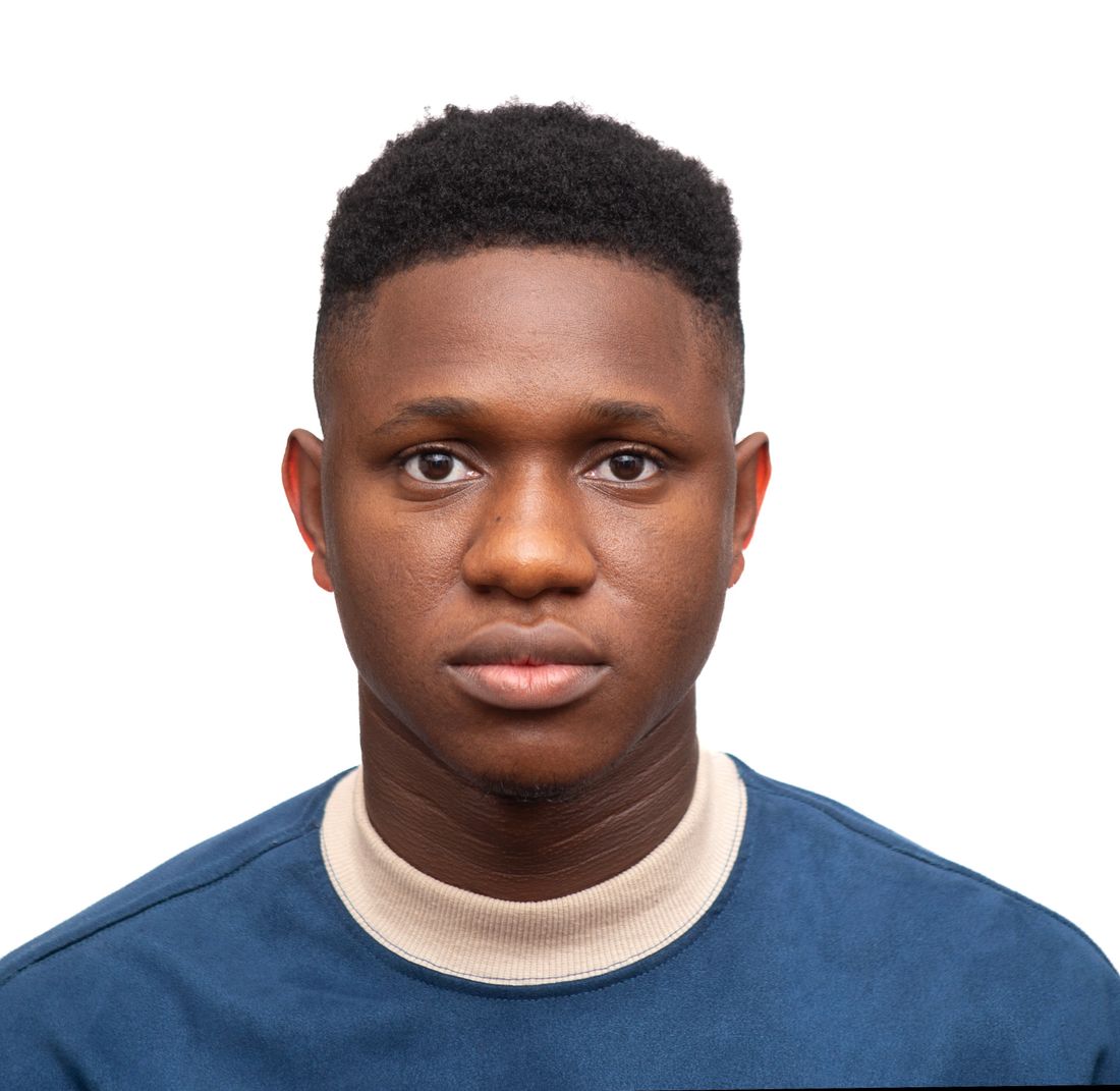
A jacket portrait doesn't get judged the way most portraits do. It runs at a couple of inches, sometimes in a single ink color, cropped by a designer who was never in the room and never asked what the light was doing that afternoon. It also doesn't retire on a normal schedule: festival programs, interview requests, and press mentions keep pulling this same file for years after the sitting wraps, long after the author's hair, glasses, or whole look have changed. Treating it like a standard sitting is where most author photos go wrong.
A jacket portrait is a print job before it's a portrait: it runs small, often in one ink color, cropped by someone who wasn't at the shoot. Plan for a thumbnail-size crop, shoot several frames and distances in one sitting, and choose wardrobe and background that won't read as dated when the file resurfaces years later.
What does a publisher usually ask for in an author portrait?
Publishers commonly ask for a high-resolution file, a simple or plain background, a vertical crop with room above the head, and both color and black-and-white versions. None of this is a fixed industry standard. It varies by publisher and imprint, so the safest move is confirming the actual brief before the shoot, not assuming one.
Confirm the specifics rather than guessing. Ask whether the art department wants a vertical-only crop or also a square and horizontal option for other collateral, whether they need the file delivered as a layered TIFF or a flattened JPEG, and what resolution they actually use for jacket printing versus what they use for a website bio. Ask, too, whether the jacket will run in full color or a single ink color, since a single-color plate reads contrast very differently than a color photo does on screen.
It also helps to ask when in the production schedule the photo is due, since a jacket photo often has to be locked months before the book ships, well ahead of the interview requests and festival programs that will use the same file later. A short list of these questions, sent before the shoot instead of after, saves a reshoot when the file that looked right on a monitor doesn't hold up on the actual cover stock. It's also reasonable to ask whether the publisher's marketing team needs a separate set of images for social and press use, since that request sometimes arrives well after the jacket file has already been delivered and archived.
Why is a jacket portrait a different frame than a beautiful full-resolution photo?
A jacket portrait gets judged at a couple of inches on a bookstore table or a phone screen, not at full resolution on a monitor. A frame that reads as striking in a large file can go flat, murky, or illegible once it's shrunk, cropped, and sometimes printed in a single ink color instead of full color.
Contrast and separation matter more here than fine detail. A subtle expression or delicate lighting gradient that reads beautifully at full size can disappear entirely once the same file is reduced to spine-adjacent thumbnail size, especially if the jacket design drops it into one flat color. High-contrast lighting between the face and the background, and a clear separation between hair and backdrop, survive that shrink far better than soft, even lighting that looks polished on a big screen.
This isn't a reason to shoot flatter or less interesting portraits. It's a reason to check the frame at the size it will actually be seen, not just the size it will be reviewed. Pulling a test crop down to a couple of inches on a phone, the way a reader would actually encounter it, catches problems a full-screen review never will, before the file is locked and sent off to the art department. A simple habit helps here: view the portrait at actual jacket size on a phone before calling the sitting finished, not just on a laptop screen where every frame looks sharp and considered.
How do you shoot one sitting so it covers every crop the jacket might need?
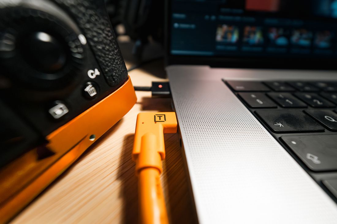
Shooting for multiple crops means capturing the same setup at several distances and orientations in one sitting: a tight head-and-shoulders frame, a slightly looser three-quarter frame, and a version with extra headroom on both sides. That range covers a vertical jacket crop, a square bio photo, and a wider website banner without a second booking.
The habit worth building is shooting wider than feels necessary and letting the crop happen later, rather than framing tight in camera and hoping the designer needs exactly that composition. A designer working on a jacket layout needs room to move the subject within the frame, add type, or shift a crop to accommodate a title running long. A frame shot tight to the subject with no negative space gives them nothing to work with.
It's worth shooting a few frames with the subject's eyes in different positions relative to the frame, too, since some jacket layouts place text where the top of a tight crop would otherwise sit. None of this needs to be explained to the author in technical terms during the sitting. It just means budgeting extra minutes in the same setup to move the camera back, then in, then back again, rather than treating the sitting as done after the first strong frame. This also means agreeing on a shot order before the camera comes out, tight first or wide first, so nobody loses track of which distances have already been covered once the sitting is underway and the light or the author's energy starts to shift.
What wardrobe choices hold up under a book jacket's simple printing?
Wardrobe for a jacket portrait should be simple, solid-colored, and low-contrast enough to survive a single-ink print run: no busy patterns, no logos, no trend pieces tied to one specific year. A plain shirt or sweater in a mid-tone color reads clearly whether the jacket prints in full color or drops to one ink.
Patterns and fine textures are the first thing to go wrong at small size or low ink coverage: a fine check or herringbone can moiré or turn to visual noise once it's shrunk and reprinted, and a busy print competes with the face for attention even at full size. A solid color, or a simple, large-scale texture, holds its shape under both conditions.
The longevity problem matters here too. Wardrobe that reads as clearly tied to a specific season or trend, a cut, a color that was everywhere for one year, dates the photo faster than the author's face does, since faces age gradually and a trend look dates the moment it stops being current. Neutral, classic pieces the author would still recognize as themselves in five years are the safer bet, even if they feel less exciting in the room on shoot day. It's worth having this conversation with the author well before the shoot date, since most people don't think about jacket longevity when picking an outfit, and a quick note beforehand avoids showing up in something that looks great in person but won't hold up once it's printed small and left on a shelf for years.
Why does a jacket photo need to be planned for reuse years down the line?
A jacket photo rarely stays confined to the jacket. The same file gets pulled for interviews, festival programs, panel bios, and press mentions for as long as the book stays in print, often years after the sitting. Planning for that reuse upfront avoids a portrait that feels stuck in a specific year every time it resurfaces.
This is different from most portrait sittings, where a refresh every year or two is normal and expected. A jacket photo doesn't get refreshed on that schedule. It's attached to a specific edition of a specific book, and it will keep appearing next to that book's name in searches, catalogs, and archives long after the author has changed their hair, their glasses, or their whole look.
The practical response isn't to shoot something generic or safe to the point of blandness. It's to avoid choices that anchor the photo too tightly to one moment: a hairstyle that reads as clearly of-the-era, a heavy filter or retouching style that will look dated faster than the person does, or a background detail that places the photo in a specific, identifiable year. A portrait that looks like the author, rather than like a trend the author was wearing that year, ages the slowest. It's worth deciding early whether the goal is a portrait that photographs the author exactly as they are right now, or one built to age gracefully across several years of reuse, since those two goals sometimes call for slightly different choices on set.
What background and setting choices survive being shrunk to a couple of inches?
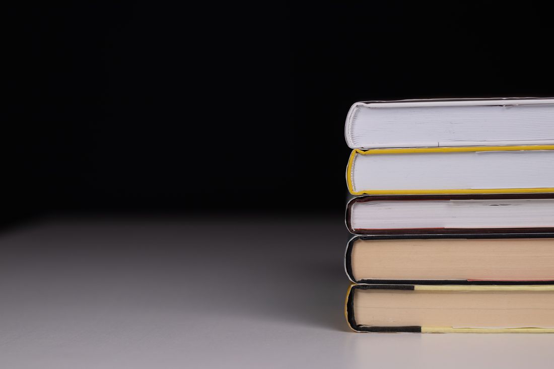
A background for a jacket portrait needs to hold up small, so a plain, low-detail setting, a solid wall, an even gradient, a softly blurred background, generally survives the shrink better than a busy or highly textured one. Detail that reads as interesting at full size usually just reads as noise at jacket size.
This doesn't mean every jacket portrait needs a flat studio backdrop. A bookshelf, a window, a textured wall can all work, but they need to be shot with enough separation and softness that the detail recedes rather than competes once the image is small. A background sharp enough to read as a specific, busy room at full resolution often turns into visual clutter the moment it's reduced to spine height.
It's worth remembering that most jacket crops leave very little room around the subject to begin with, so a background that needs space to read, a wide shot of a whole studio or a detailed still life, rarely survives the crop a designer will eventually apply. A simpler setting gives the designer more to work with, not less, because there's less in the frame that has to be cropped around or dropped out entirely. Testing this in advance is simple enough: shrink a sample frame down to roughly the size of a paperback spine and look at it from across the room, the way a browsing reader actually would, before locking in a final background choice for the sitting.
How much expression range does a jacket portrait actually need?
A jacket portrait needs a narrower range of expression than most portrait sittings: a few genuinely warm, approachable options and a few more serious, composed ones, rather than a wide spread of moods. A publisher or designer is typically choosing one static expression that has to represent the author consistently across a book's entire run.
This is worth explaining to the author before the sitting, since a portrait session built around big, changing expressions, laughing, looking away, caught mid-gesture, produces frames that are lovely individually but hard for a publisher to choose from when they need one consistent image to represent the whole book. A tighter range gives the art department fewer, clearer options rather than a wide, scattered set.
A useful way to think about it: shoot toward two or three expression families, not two or three individual frames. Within a slightly warmer, more approachable family, get several variations, a small shift in the mouth, the eyes, the angle of the head, and do the same within a more serious, composed family. That gives the publisher a real choice between two directions instead of one frame that happened to turn out well and nothing to compare it to. It also helps to shoot the last few frames of each family a little more relaxed than feels necessary, since a slightly looser expression at the very end of a sequence often reads more naturally once it's been cropped tight than one captured at the start, before the author has settled into the sitting.
What technical delivery specs should you send along with the images?
Along with the images, send a short note covering resolution, color profile, file format, and exactly which frame is the recommended lead choice, since a publisher's art department is often working from a folder of options without the context of the sitting. A one-page delivery note prevents the wrong crop or a low-resolution version becoming the default.
Include the raw or lightly edited high-resolution files rather than only a web-sized export, since the publisher's printer will need more resolution than a website ever will, and it's harder to ask for a bigger file later than to send one file that covers both uses now. Confirm the color profile they want, most print workflows expect something specific, and don't assume the file that looks right on a laptop screen will convert cleanly.
It also helps to flag which frames were shot as pairs or sequences, so the art department knows a tight crop and a looser crop of the same setup exist together, rather than treating every file as a standalone option. A little context delivered alongside the images, which frame is the safest default, which ones share a setup, saves a round of emails later when someone on the publishing side is choosing under a deadline. None of this needs to be complicated. A short, plain-language note attached to the delivery, written once and reused for the next book if the same publisher comes back, does more to protect the images than any amount of technical polish on the files themselves.
Frequently asked questions
Do we need to ask the publisher anything before a jacket portrait session?
Yes. Confirm the crop and orientation they need, whether they want both color and black-and-white versions, the resolution and file format their printer expects, and when the file is due relative to the print schedule. Publisher requirements vary, so treat any list of specs as a starting point to confirm rather than a universal standard. A short conversation before the shoot is far cheaper than a reshoot after a file doesn't fit the layout.
Should a jacket portrait be shot in color or black and white?
Shoot both, or shoot in a way that both hold up, since many jackets still run in black and white, or in a single ink color, even when the interior and marketing use full color. A color file that also reads well converted to grayscale gives the publisher flexibility, while a portrait that depends on a specific color for its impact can lose that impact entirely once it's reduced to one ink on the actual cover.
How many crops should we plan for in one sitting?
Plan for at least three: a tight head-and-shoulders crop, a looser three-quarter frame, and a version with extra room around the subject on all sides. That range typically covers a vertical jacket crop, a square bio photo for a website or program, and a wider banner image, without needing a second booking later when a new use for the photo comes up unexpectedly, which happens more often than authors expect once the book is actually out in the world.
What should an author wear for a jacket portrait?
Keep it simple: solid colors in a mid-tone, no busy patterns, no logos, and nothing tied too specifically to one year's trends. A plain shirt, sweater, or jacket the author would still recognize as themselves in five years reads more clearly at small size and ages more slowly than something fashionable in the room on shoot day but dated by the time the book goes to a second printing.
Why does a jacket photo matter more long-term than a normal portrait?
A jacket photo attaches to one specific book and keeps resurfacing next to that book's name in interviews, festival programs, and press mentions for as long as the book stays in print, often years after the sitting. Most portraits get refreshed on a normal schedule; a jacket photo doesn't, since it's tied to a specific edition rather than to the author's current look at any given moment.
Let's find out which one you actually need.
We shoot both refresh sessions and full new concepts, and we'll tell you honestly which one your portrait needs before we book anything, not after.
Explore portrait sessions →