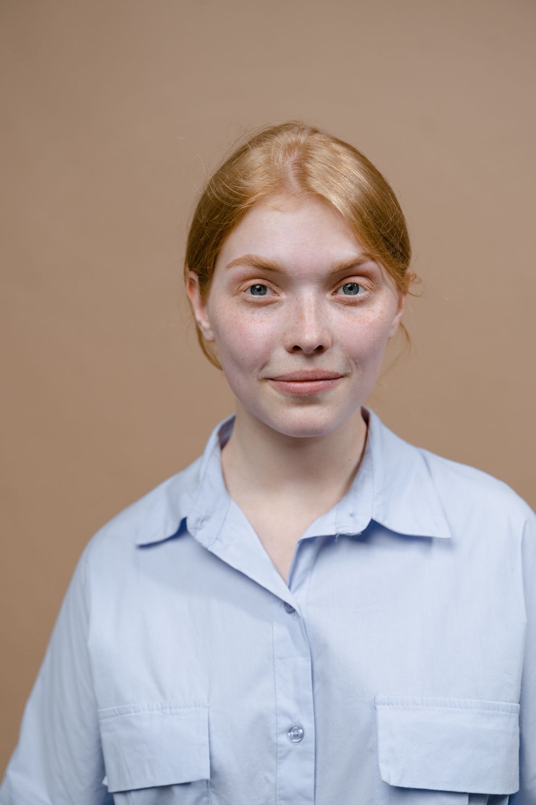
An application portrait doesn't have to carry a room. It has to sit quietly next to a statement and a set of work samples and agree with both, while a reviewer gives it a few seconds before moving on to the proposal that actually decides the outcome.
A residency or fellowship portrait works differently than a public-facing one because a jury looks at it for seconds, beside a statement and work samples, deciding whether to fund an applicant. It needs to match the file specs, agree with the proposal's tone, and stay out of the way of the work.
What does a jury actually look for in an application portrait?
A jury looks at an application portrait for a few seconds, next to work samples and a statement, while deciding whether to give an applicant time, space, and money. The portrait's job is to read as consistent with everything else in the packet, not to carry the application by itself.
That changes what the image needs to do. A public-facing portrait can carry mood, atmosphere, or a personal style on its own, because it's usually the only thing a viewer sees at that moment. An application portrait sits inside a stack of dozens or hundreds of other packets, reviewed in a single sitting by people trained to move fast. Panelists are checking that a face matches the name on the statement, that the presentation looks professional, and that nothing pulls attention away from the samples that actually carry the decision.
This is also why an application portrait rewards restraint over personality. A portrait built to stop a scroll or hold a gallery wall is solving a different problem than one built to sit next to ten images of finished work and get out of the way. The goal isn't to disappear, it's to read fast and let the panel's attention move to where it needs to go next: the proposal, the images, the budget line. A portrait that takes five extra seconds to parse is five seconds the work didn't get.
Why does the portrait need to agree with the work samples?
An application portrait gets read alongside the work samples and statement, not on its own, so a mismatch between how the applicant looks and how the work looks reads as a small inconsistency a reviewer notices without fully naming. The portrait should feel like it comes from the same person as the proposal.
Consider a sculptor whose statement describes a scrappy, material-driven studio practice, paired with a portrait shot like a corporate executive headshot: sharp suit, gradient backdrop, retouched skin. Nothing about that image is wrong on its own. It's wrong here, because it contradicts the practice the statement is describing. A reviewer who has read fifty of these in an afternoon notices the gap even if they can't articulate why the packet feels slightly off.
The fix isn't a dramatic wardrobe change or a prop-heavy studio scene. It's tonal agreement. If the proposal is quiet and process-focused, the portrait should be quiet too: simple background, natural expression, clothing the applicant actually works in. If the practice is more performative or public-facing, a bit more presence in the portrait is honest, not a liability. The test worth applying before a session: would someone reading the statement first be surprised by this face? If the answer is yes, the portrait needs to move toward the statement, not away from it. That alignment is worth checking before the shoot, not after the images come back.
What crop and file specs do these applications usually require?
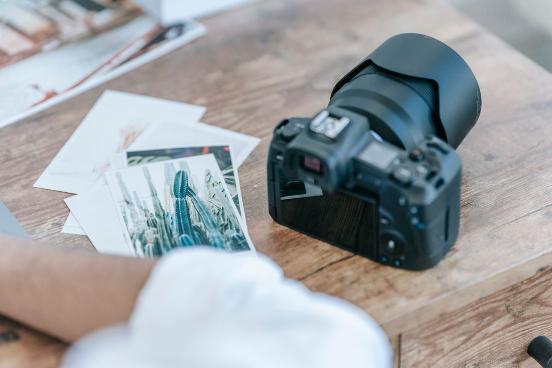
Many residency and fellowship applications specify a square or head-and-shoulders crop, a maximum file size in the low single-digit megabytes, and exactly one image slot for the portrait, separate from the work-sample uploads. These aren't creative preferences. They're panel-review software and file-storage limits that shape the image before anyone opens it.
A square crop pushes the composition toward a tighter, more centered frame than most portrait sessions default to, so wide environmental shots with the subject small in the frame often get force-cropped by an application portal in ways nobody planned. A generous headshot crop, cheek-to-collar or a bit wider, tends to survive an unpredictable auto-crop far better than a three-quarter or full-body composition.
File size caps matter more than they seem to at first glance. Many portals set the limit around 2 to 5 megabytes per image, which is well below what a modern camera produces straight out of the shoot. Uploading a full-resolution file that gets silently rejected, or degraded by the portal's own compression, is a common and avoidable failure point. Export a version sized and compressed specifically for the upload field, check it against the stated limit before submitting, and keep the original, uncompressed file for anything else the portrait gets used for later. When a program publishes exact numbers, follow them precisely rather than approximating, since portals often reject files that miss the stated limit by even a small margin.
How much studio or environment context belongs in the portrait?
When a residency is evaluating a practice, some environmental context in the portrait can support the application, but the application portrait itself usually isn't the place for a full studio scene. That's what work-sample images and process photos, when the application allows them, are for. The portrait's job stays narrower: show the applicant clearly.
A plain wall, a doorway, or a corner of a workspace with soft, unbusy light in the background gives a portrait a sense of place without turning it into a second work-sample image competing with the actual work. Materials, tools, or works-in-progress visible behind the applicant can read as informative in a studio-visit photo and as clutter in an application portrait, because the crop is tighter and the viewing time is shorter. Detail that reads as authentic at full size can read as noise once it's compressed into a small square thumbnail in a review portal.
If the application specifically invites a studio or process image as a separate upload, that's the place to show the environment in full. Keep the portrait itself simpler than the temptation suggests: a clear, well-lit, unbusy frame that a reviewer can process in a glance, saving the fuller picture of the practice for the parts of the packet built to hold it. A single simple detail, a sliver of wall color or a hint of natural light, usually says enough about place without competing with the face in front of it.
Can a polished portrait work against a materially modest practice?
Yes. When a proposal describes a scrappy, low-budget, or materially modest practice, a highly produced portrait, dramatic lighting, a styled set, retouching, can quietly undercut the proposal's credibility before a reviewer reads a single word of the statement. The portrait becomes evidence that contradicts the story the application is telling.
This isn't an argument against good lighting or a well-run session. It's a reminder that production value reads as a signal, and reviewers read signals fast. A panel evaluating a request for modest project funding, told through a proposal about working with found materials or a shoestring studio setup, can register a glossy, heavily art-directed portrait as a mismatch, whether or not that reaction ever gets written down anywhere. The image doesn't need to look cheap. It needs to look honest to the scale of the work being proposed.
The safer default across most residency and fellowship contexts is a clean, well-exposed, unfussy portrait: good light, a simple background, natural color, minimal retouching. That reads as professional without reading as expensive, and it agrees with almost any proposal, modest or ambitious. Save the more elaborate, styled version of a portrait, if there's a reason to shoot one, for the applicant's website or public materials, where it doesn't sit directly beside a funding request. A modest portrait paired with a modest proposal simply reads as coherent, which is the quality a panel is actually screening for at this stage.
Can one session cover the application crop and later portrait needs?
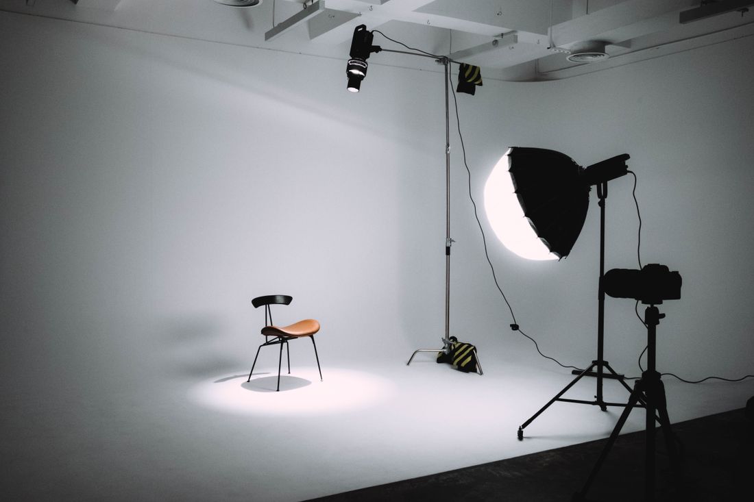
One well-planned session can produce both. The approach is to shoot a simple, well-lit setup that satisfies the tightest application requirements first, square-friendly framing, plain background, direct expression, then use the remaining time in the same session to shoot looser, more varied frames for a website, press kit, or future application.
Start with the constrained version. Shoot several takes of a straightforward head-and-shoulders composition against a simple background, checking as you go that a square crop from the center still works, since that's the version most likely to satisfy a portal's requirements without a scramble later. Getting this part right first means the file most applications actually need is locked in early, not left to whatever frame happens to crop well after the fact.
Once that's covered, widen out. A few three-quarter or environmental frames, a different expression or angle, maybe one frame with a hint of the workspace, give the applicant a small library to draw from for the pieces that don't have a jury reading them in five seconds: an artist website, a press bio, a future grant that wants a different crop than this one did. One session, planned in that order, produces a usable application image and a small set of options, instead of a single photo that has to do every job at once. Booking slightly more time than the application alone requires is what makes that second pass possible.
What should an application portrait avoid signaling?
An application portrait should avoid signaling more production budget, more polish, or a different scale of practice than the proposal describes. It should also avoid anything distracting enough to become the thing a reviewer remembers instead of the work: costume-like styling, an unusual pose, or a busy background competing for attention.
Distraction is the more common failure mode. A portrait doesn't need to be dramatic to pull focus away from a statement, it just needs one element a reviewer's eye catches on: a strong graphic pattern in the clothing, a background detail that reads as odd at thumbnail size, an expression that feels performed rather than natural. None of these are disqualifying on their own. They just cost the portrait its main job, which is to be read and set aside quickly so attention moves to the proposal.
The other thing worth avoiding is a portrait that looks recycled from an unrelated context, an old event photo, a screenshot from a video call, a group photo cropped down to one face. These often carry visible tells, odd lighting, low resolution, a crop that doesn't quite work, that read as an afterthought next to a carefully written statement. A modest but purpose-shot portrait, even a simple one, generally reads as more considered than a repurposed image, regardless of how good the original photo was. Simple, current, and specific to this application beats dramatic every time.
When should the portrait session happen relative to the deadline?
Book the portrait session at least two to three weeks before a residency or fellowship deadline, not the week of. That buffer covers scheduling, a same-day or next-day turnaround on the files, and enough time to notice if a portal's crop or file-size requirement needs a re-export before the applicant is submitting everything at once.
Deadline-week scheduling compresses every downstream step. A photographer's calendar may not have room on short notice, and even a fast turnaround leaves no slack if the exported file gets rejected by an upload portal for being too large, the wrong aspect ratio, or the wrong file type. Discovering that problem the night something is due turns a five-minute fix into a genuine scramble, at the exact moment an applicant should be focused on the statement and work samples instead.
The other advantage of scheduling early is that the portrait stops being an afterthought squeezed in after everything else is finished. A session booked with time to spare can be planned properly, matched intentionally to the tone of the proposal, checked against the specific application's crop and size requirements, and exported correctly, rather than shot in a rush and uploaded without a second look. Treat the portrait as one of the first pieces locked in, not the last box checked before submitting. Early scheduling is a small, almost administrative habit that quietly protects the rest of a strong application.
Frequently asked questions
Can I reuse a headshot I already have instead of shooting something new?
Sometimes, if the existing portrait agrees with the tone of the current proposal, meets the application's crop and file-size requirements, and is recent enough to look like the applicant now. If the existing image was shot for a different context, styled, corporate, or several years old, a new session built around the current application is usually worth the time. A quick side-by-side comparison against the current statement is a fast way to check whether it still fits.
Does the portrait need to be in color, or is black and white acceptable?
Most residency and fellowship applications don't specify a color requirement, so either works as long as the image is clear, well-exposed, and consistent with the rest of the packet. Color is the safer default when nothing is specified. Black and white can work well if the applicant's other materials or working style lean that direction already. If unsure, color is the more flexible choice, since it works across nearly every review format a program might use.
What should I do if the application doesn't specify a crop or file size?
Default to a square or head-and-shoulders crop and a file under roughly 2 megabytes, since that satisfies the largest share of application portals without a resubmission. When no spec is given, the safer assumption is a tighter, smaller file rather than a large, loosely cropped one that might get auto-cropped or rejected unpredictably. Testing the exported file on a phone screen before submitting is a quick way to confirm it still reads clearly at a small size.
Should the portrait show me holding or standing near my work?
Usually not, unless the application specifically asks for a process or studio image as a separate upload. Mixing the work into the portrait frame can compete with the actual work samples elsewhere in the packet and complicate the crop. Keep the portrait about the applicant, and let the dedicated work-sample images carry the work. If a program wants context, it usually asks for it directly in a separate upload, rather than leaving it to the portrait to imply.
How far in advance should I book the portrait session before a deadline?
Two to three weeks out is a reasonable buffer for most applicants. That covers finding a session time, getting the files back, and catching any crop or file-size mismatch with enough time to fix it. Booking during deadline week leaves no room for a scheduling conflict or a rejected upload to become a real problem. Earlier is safer, since a fast turnaround doesn't help if the files still need a size or crop fix at the last minute.
A portrait that's aged doesn't always need a full reshoot.
We'll look at what you have and tell you honestly whether a refresh session covers it or the work calls for a new concept.
Explore portrait sessions →