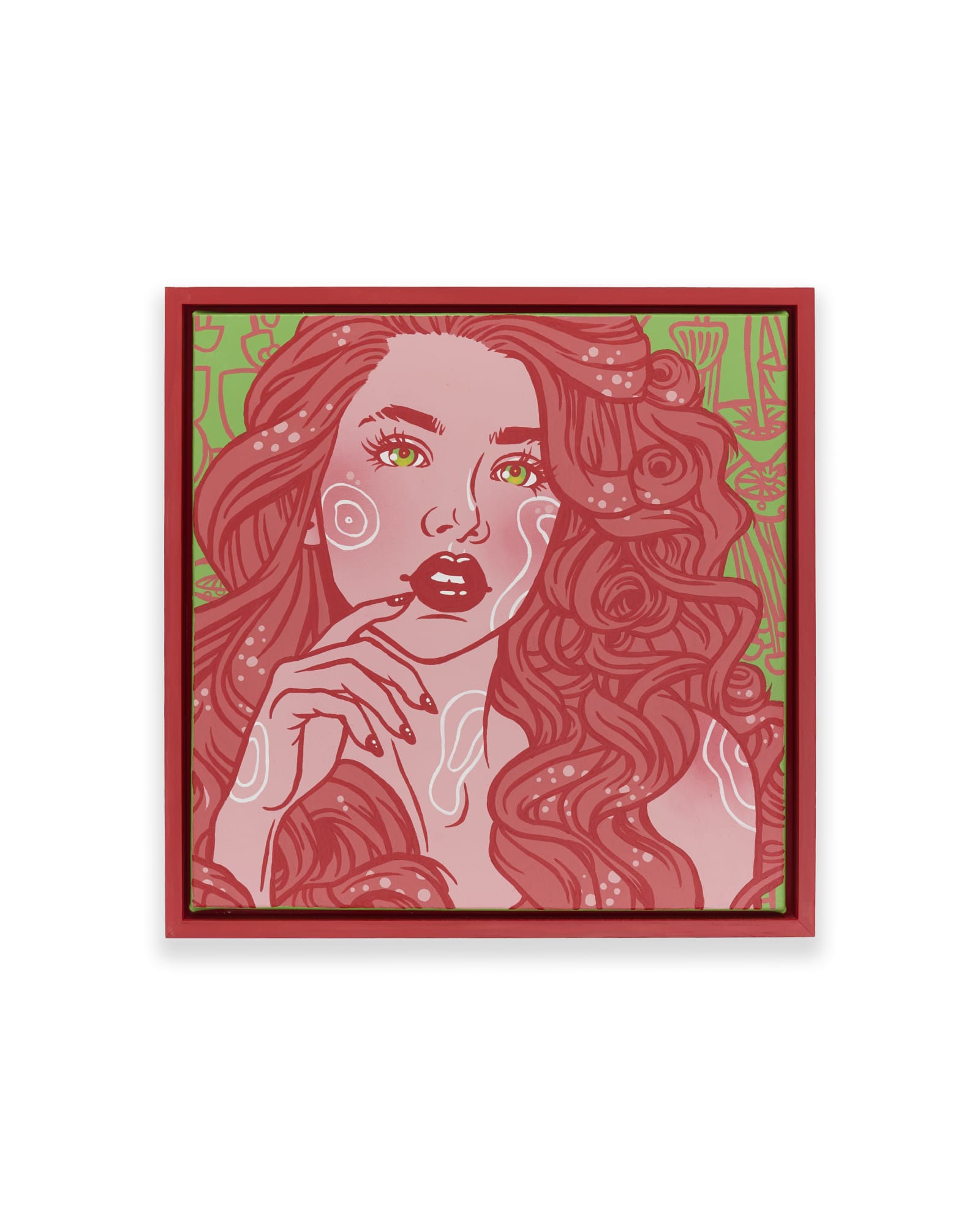
Most open call portals set their own limits: a maximum file size, a fixed pixel dimension, a naming pattern, sometimes exactly one image per work with no detail shots allowed. A master file that looks strong on your own site can come back rejected, distorted, or recompressed into something worse once it reaches that portal. This checklist covers what to prepare before you export: a master file worth keeping, a full view that reads clearly at any size, color and exposure that hold up under compression, and a submission file built to the actual rules of the call in front of you.
The gap is rarely about the art. A master file can be accurate, well lit, and properly color corrected, and it can still look wrong after a portal resizes it, strips its color profile, or crushes it down to fit a size cap. That is a translation problem, not a judgment on the work. The fix is not one dramatic edit. It is a short list of ordinary steps, done in the right order, so the file that leaves your computer still looks like the file you made.
What to check before you open the submission portal
Every open call, juried show, residency application, and grant portal sets its own upload rules, and they rarely match from one platform to the next. Some cap the file at a set number of megabytes. Some require an exact pixel dimension or a specific file type, usually JPEG, sometimes TIFF. Many ask for a naming pattern built from your name, the artwork title, and a view type. A number of platforms allow exactly one image per work and say plainly no detail shots, no installation views, no framed context, just the piece itself.
Read the actual instructions before you export anything. It sounds obvious, and it is still the step most often skipped, because the artwork itself is finished and the upload feels like an afterthought. Open the submission guidelines, note the size cap, the dimension requirement, the file type, the naming rule, and the number of images allowed, then write them down somewhere you will actually look while exporting.
The requirements vary enough between platforms that memorizing one call's rules will not help with the next one. What stays constant is the process: build a strong master file first, then create a submission version to that specific call's exact specification. Editing an already-compressed file to fit each new call, over and over, is how quality quietly erodes with every reuse.
Keep a master file separate from what you upload
A master file is the highest quality version of your documentation: full resolution, corrected color, no compression beyond what the camera or scanner produced. It lives on your own drive, not inside any submission portal, and it is the file every future application, print request, or website update should draw from.
The submission file is different. It is a copy made for one portal's rules, exported to that platform's pixel dimension and file size cap, and treated as disposable once the deadline passes. Confusing the two is where most quality loss happens. An artist resizes the master down for one call, then resizes that already-smaller file again for the next call, and again after that. Each pass loses a little sharpness and a little color accuracy, and the artist rarely notices because no single step looks dramatic on its own.
Keep the master untouched. Duplicate it, then compress and resize the duplicate to the call's specification. Label the export clearly, the artist name, the artwork title, and the platform, so you are never guessing months later which file is the real one and which is a submission copy. This one habit protects the archive more than any single editing decision, and it makes every future application faster, because you are exporting from a clean source instead of rebuilding from whatever survived the last upload.
When the portal allows one image, protect the full view
Many open calls allow exactly one image per work. When that is the rule, the full view has to carry the entire piece on its own, with no detail shot or installation photo to fill in what it misses.
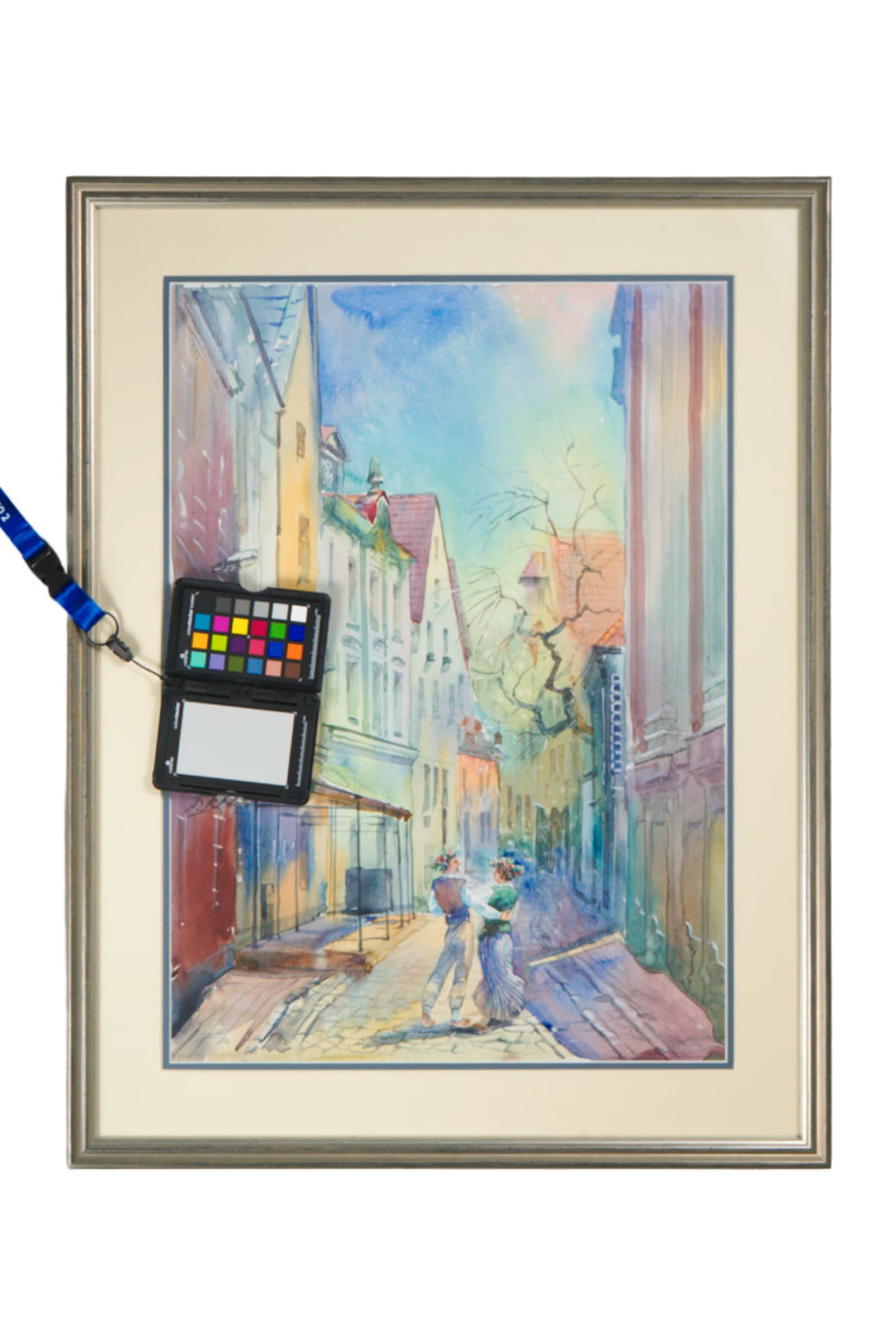
Photograph the work squarely, with the camera centered and the sides parallel, so the shape reads honestly rather than tilted or trapezoidal. Crop tight to the artwork edge unless the frame is genuinely part of the piece, in which case a clean, evenly lit frame with no wall showing around it can be the right choice, as long as the framing does not pull attention from the work itself.
Even lighting matters more here than in a multi-image application, because there is no second photo to correct a shadow or a hot spot. Check the corners as carefully as the center. A single dark corner or a stray reflection reads very differently when it is the only image a juror sees.
Before exporting, open the file at the size the portal will actually display it, not full screen on your own monitor. A full view that looks sharp and confident at that size is doing its job. One that needs the viewer to squint or guess at the edges is asking them to trust something the image has not actually shown them.
Match color and exposure before you compress
Color and exposure problems get worse, not better, once a portal compresses your file. A slightly cool white balance or a mildly crushed shadow might be forgivable in a full-resolution master. Run that same file through a portal's automatic resizing and JPEG compression, and the same small error often becomes visible banding, a shifted color cast, or lost shadow detail.
Correct exposure and color balance at capture, using a neutral reference in the frame if you have one, rather than trying to fix a flawed original through heavy editing later. Export your submission file in the sRGB color profile unless the portal specifically asks for something else. sRGB is the profile most browsers and upload systems expect, and a file exported in a wider profile can look correct on your own calibrated screen while shifting noticeably once it reaches a portal built around sRGB.
Save the export at a reasonable JPEG quality setting rather than the smallest possible file size. If the platform enforces a hard size cap, reduce the pixel dimensions slightly before dropping the quality setting further, since heavy compression at full resolution tends to introduce more visible artifacts than a smaller file saved at higher quality. Reopen the exported file afterward and check it at full size, not just as a thumbnail, before it goes anywhere near the upload button.
When a detail shot helps, and when the portal doesn't want one
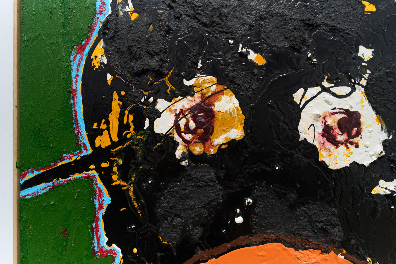
A detail image earns its place when the full view genuinely cannot explain something: a raised texture, a stitched seam, a layering technique, a material behavior that only reads up close. It should answer a specific visual question, not simply repeat the full view at a more dramatic crop.
Some portals do not want a detail at all. If the application specifies one image per work, or limits uploads to the finished piece, submitting a detail instead of, or alongside, the full view can work against you rather than for you. Follow the platform's stated limit before deciding what the work needs.
When details are allowed, keep the color and exposure consistent with the full view. A detail photographed under different light, or edited with a heavier hand, can make the same piece look like two different objects to a juror moving quickly through a large stack of submissions. Choose the crop from what the piece actually needs someone to understand, not from whichever corner happens to photograph best.
A short naming, export, and final-check list
Before you upload anything, run through a short list. It takes a few minutes and catches most of the mistakes that come from rushing a deadline.
- Confirm the exact file type the portal accepts, usually JPEG, and export to it rather than assuming your default format will pass.
- Match the pixel dimension or file size cap exactly, checking the actual exported file rather than the setting you think you used.
- Name the file the way the platform asks, typically your name, the artwork title, and a view type, without decorative punctuation or version numbers that make the package hard to sort later.
- Confirm the color profile is sRGB unless the call specifies otherwise.
- Open the finished export at full size on your screen, not just as a thumbnail, to confirm it is sharp, upright, and free of dust spots or stray reflections.
- Upload one work first if the portal allows it, then check the preview before submitting the rest, since some platforms crop thumbnails or reorder images in ways you cannot predict from your own files.
A file sitting in the right folder is not the same as a file that has actually survived export and upload intact. The extra few minutes spent confirming both is usually shorter than the time it takes to fix a missed deadline.
Give your collection a record that holds up.
We document artwork the way an adjuster or appraiser would actually want to see it: full views, accurate color, condition detail, and a system that keeps every file tied to the right record.
Explore artwork documentation →