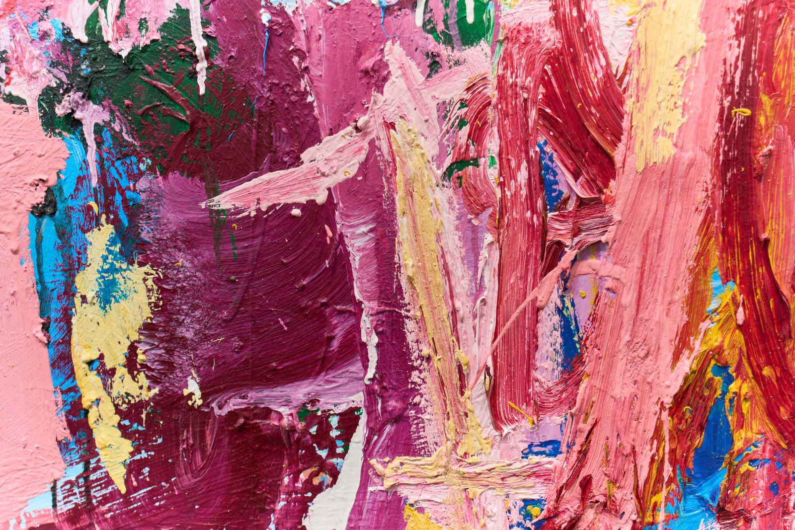
Yes, but only when the piece has surface, edge, scale, or construction information that the full-frame photograph compresses away. A flat, evenly finished piece gains nothing from a detail shot, and paying for one on that kind of work is a line you can cut.
Detail shots are not sold as a per-image add-on here. They come bundled into the Standard tier, which is a hero shot plus two chosen details for $85, against $50 for a hero shot alone in the Essential tier. That is $35 for both the record shot and two purposeful crops, not a per-detail price. Pay it when the surface, edge, or scale needs explaining. Skip it when the full view already says everything.
The short answer on artwork detail shots
A detail shot earns its cost when it shows something the full-frame photograph cannot: thick paint catching light across ridges, a stitched or collaged edge, a handmade frame, a faint pencil line under paint, or a mark that becomes unreadable once a large piece is shrunk to fit a screen. In those cases, yes, pay for the detail.
A detail shot is not worth paying for on a flat, evenly finished piece, a print, a photograph, or any work where a second crop only repeats what the full view already shows. That is a real no, not a hedge. Adding a detail there spends money to make a simple piece look more complicated than it is.
The full view is always the primary record. A detail is supporting evidence, not a replacement. If you are only going to buy one image, buy the full view.
That is the whole test, and it holds regardless of budget. Paying for a detail because the shoot already includes it, or skipping one to save money on a piece that actually needs it, both miss the point. The next section breaks down what that $35 difference between a hero shot alone and a hero shot with two details actually buys.
What a detail shot actually costs
Detail shots are not priced as a separate line item here. They live inside two of our three documentation tiers. Essential is one color-accurate hero shot, color-corrected and print-ready, for $50. Standard is that same hero shot plus two separate hi-res detail shots, also color-corrected and print-ready, for $85. Gallery adds a 15 to 30 second video clip to the Standard deliverables for $135.
So the honest number is $35: what it costs to move from a full view alone to a full view plus two chosen details. That is not $17.50 a detail sold individually, it is the price of the tier jump. If a piece genuinely needs more than two details, that goes beyond the published tiers and gets scoped as a custom conversation rather than a per-file add-on.
A few other costs affect the same invoice. A polarized lighting setup for glazed or framed work is $200 flat per session, not per piece. Rush delivery under three business days adds a quarter to the total. Every NYC documentation booking has a $500 minimum, which is really an invitation to bring a few more pieces to the same session rather than a surcharge. Book 10 to 19 pieces and the per-piece rate drops by a tenth.
When detail shots are worth paying for
Texture is the clearest case. Thick paint, impasto, and heavily layered surfaces catch light differently across their ridges, and a straight full view flattens that into a single even read. A raking-light detail restores what the surface actually does.
Large work is a second case, for a different reason. A wall-size painting has to shrink so far to fit a browser window that marks substantial in person disappear entirely. One detail can put the artist's hand back into the record.
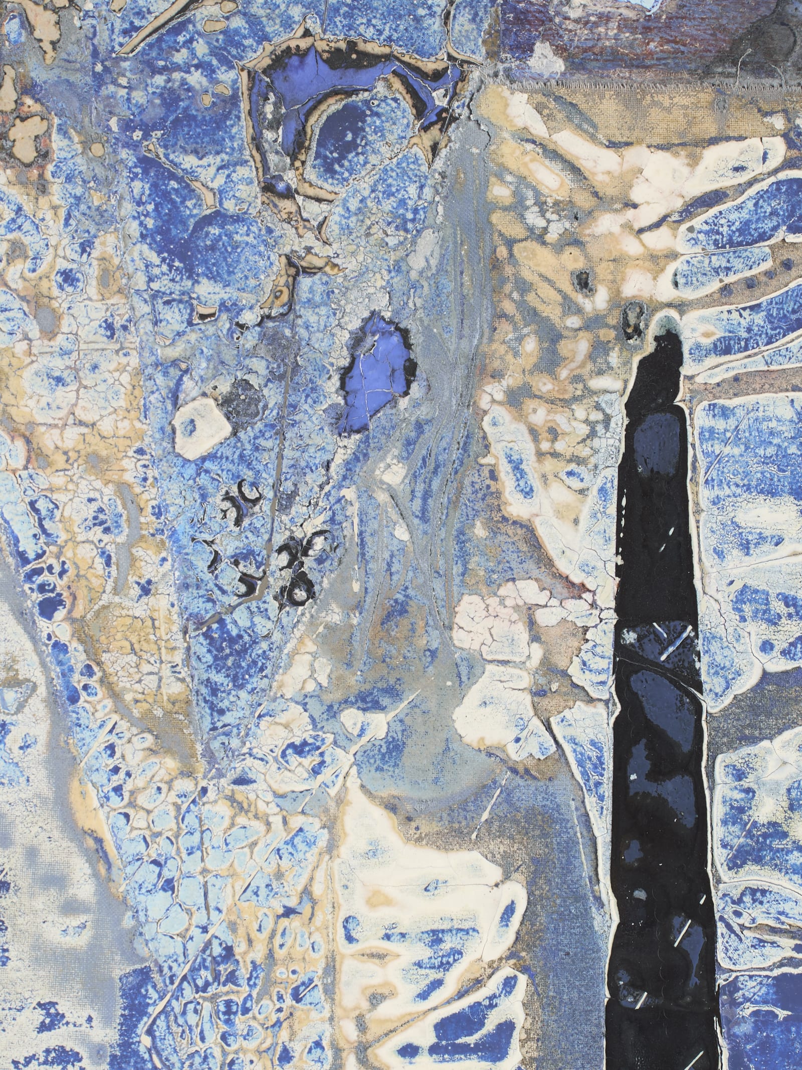
The edge is a third case. Wrapped canvas, an exposed stretcher, a handmade frame, layered panels, or an irregular border can all change how a piece reads, and a straight-on full view hides every one of them.
Small and delicate work belongs here too, and not because of size alone. A small drawing with pressure changes, erasure, embossing, or a faint silverpoint line can lose exactly the quality that makes it worth documenting once it is compressed into one broad, evenly lit photograph.
When to skip them and keep the $35
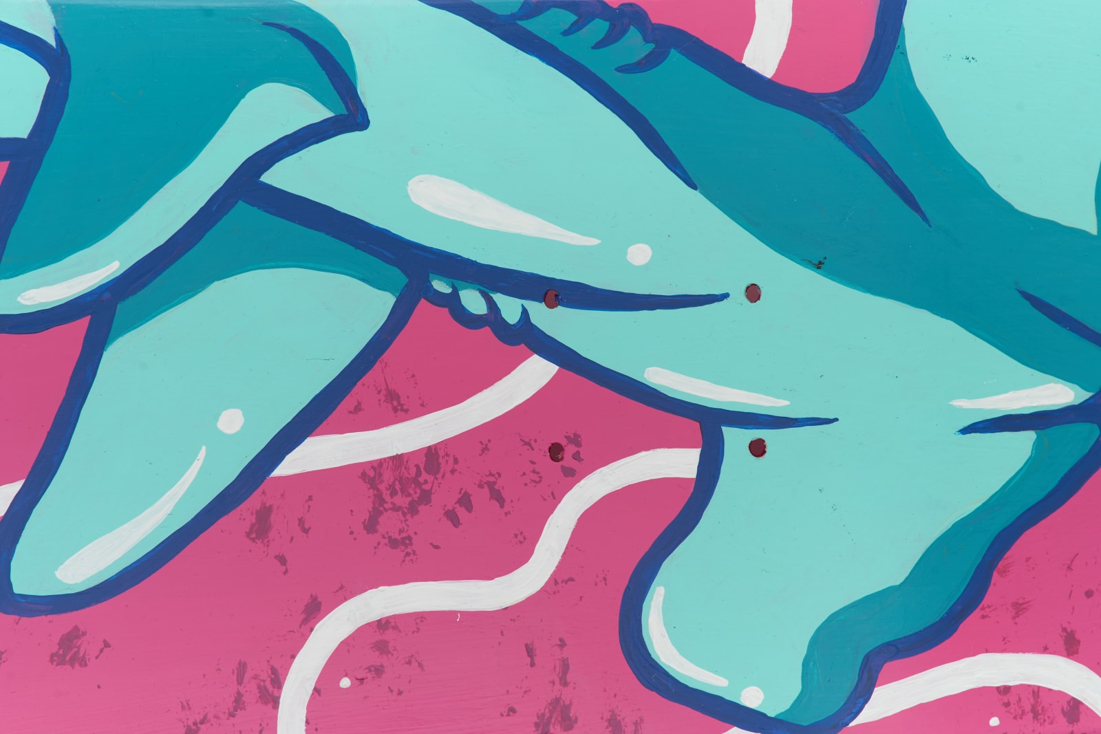
Flat prints, graphic paintings, photographs, and any work with an intentionally even surface usually gain nothing from a crop. If the full view already shows everything the piece has to offer, a detail just adds a file, and the Essential tier is the honest choice.
Skip a second or third detail when it repeats information the first one already gave. Three crops of similar brushwork are not more convincing than one. Pick the strongest example and stop there.
A detail can also be misleading rather than just unnecessary. Cropping removes scale, orientation, and the surrounding color relationships, and a small mark can start to look like the subject of the piece under a tight enough frame. That is a reason to be selective, not a reason to buy insurance in the form of extra images.
When an open call, gallery, or archive publishes exact image requirements, those come first. Some systems want one primary image only. Buying a detail shot that a submission form does not even accept is money spent on a file nobody will open.
How many details to plan, and how that lands on the invoice
Most paintings and mixed-media pieces are well served by one to three details, and that is a planning range, not a rule. A simple, flat piece may need zero. A complex object, textile, book, or multi-panel work may need more because several views are required to explain how it is built.
The Standard tier's two details fit the common case. If a single piece needs a third or fourth detail, or if a body of work has several pieces that each need more than two, tell us before the shoot so it can be scoped honestly instead of discovered mid-session.
If you are documenting several pieces at once, the math changes in your favor. The $500 NYC booking minimum is easiest to clear by bringing more pieces to one session rather than booking a single piece on its own, and 10 to 19 pieces earns a modest discount on the per-piece rate, with 20 or more moving to a custom quote. Either way, the extra details cost less per piece the bigger the session gets.
What to tell us before we book the shoot
Say what the photographs are for. A website, a gallery submission, a press package, an archive, or a condition record each changes which details are worth including and how they should be cropped.
Point out the material qualities that matter before we arrive. Delicate gloss shifts, metallic passages, very dark surfaces, raised collage, translucent layers, soft pencil, or unusual edges let us plan light and camera position instead of finding the difficulty after the setup is already built.
If you are bringing a group of pieces, send a short priority list marking which ones need detail coverage and what each detail should explain. That list is also what turns into an accurate quote, since it tells us whether the group fits inside the Standard tier or needs a custom scope.
Leave room for us to suggest a different crop or lighting approach once the work is in front of the camera. Reviewing one complete set early in the session, full view and detail side by side, is what settles the visual standard for everything that follows, and it costs nothing extra.
Make sure your archive means something when someone asks for proof.
We photograph the work the way an insurer or gallery registrar wants it documented, straight views, correct color, and condition callouts you can actually point to later.
Explore artwork documentation →