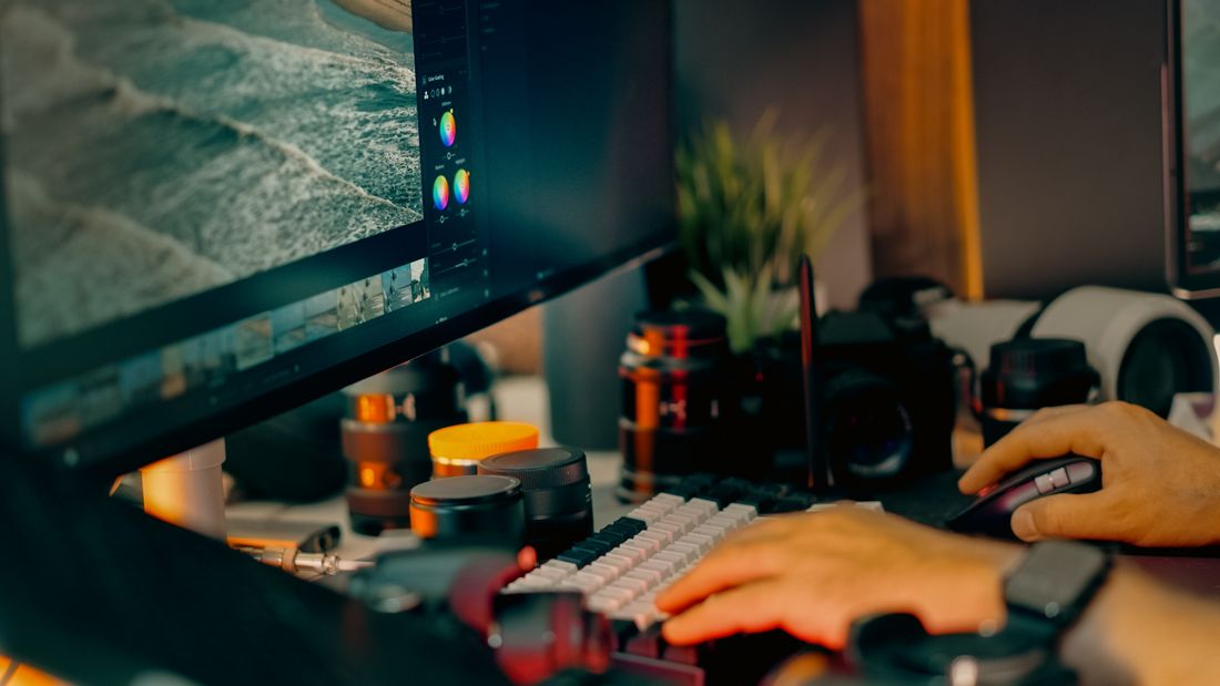
A painting can feel balanced, deep, and precise in person, then turn strangely flat or loud on a screen. The useful question is not whether screens are imperfect. It is which part of the image changed the work, and what can still be controlled.
This guide separates the practical decisions so you can see what actually changes, what can be planned, and what is simply part of working with real images in real places. For related production support, explore our artwork documentation.
The short answer: the photograph is interpreting the work
Artwork looks wrong online when the capture, edit, export, website, or viewing screen changes a visual quality that matters. Colors shift toward warm or cool. Dark values close up and lose their separation. Whites that should read clean and neutral turn grey, cream, or faintly blue. Surface texture can disappear into a flat sheen, or glare can invent texture that was never really there. A crop can make a composition feel cramped even when every color measures close to the original.
The important part is that these are separate changes with separate causes. Treating them as one vague color problem makes the fix harder to find. A faithful image comes from a chain of small decisions, capture, edit, export, upload, and the screen it finally lands on, and each link can either protect the work or quietly reinterpret it.
The screen at the end of the chain will always vary. A calibrated laptop and an average phone will never agree completely, and that is not a failure to fix. You cannot calibrate every phone in the world. You can build a clean, neutral master file and make careful web versions from it, which gives the work a stable starting point before the internet adds its own opinions.
Lighting changes more than brightness
Lighting decides which surfaces become visible at all. Even illumination helps color and shape read consistently across a flat work. Light coming strongly from one side can exaggerate canvas weave, brushwork, wrinkles, impasto, or frame shadows. That can be useful for a detail image, but it distorts the primary record if it shows up there instead.
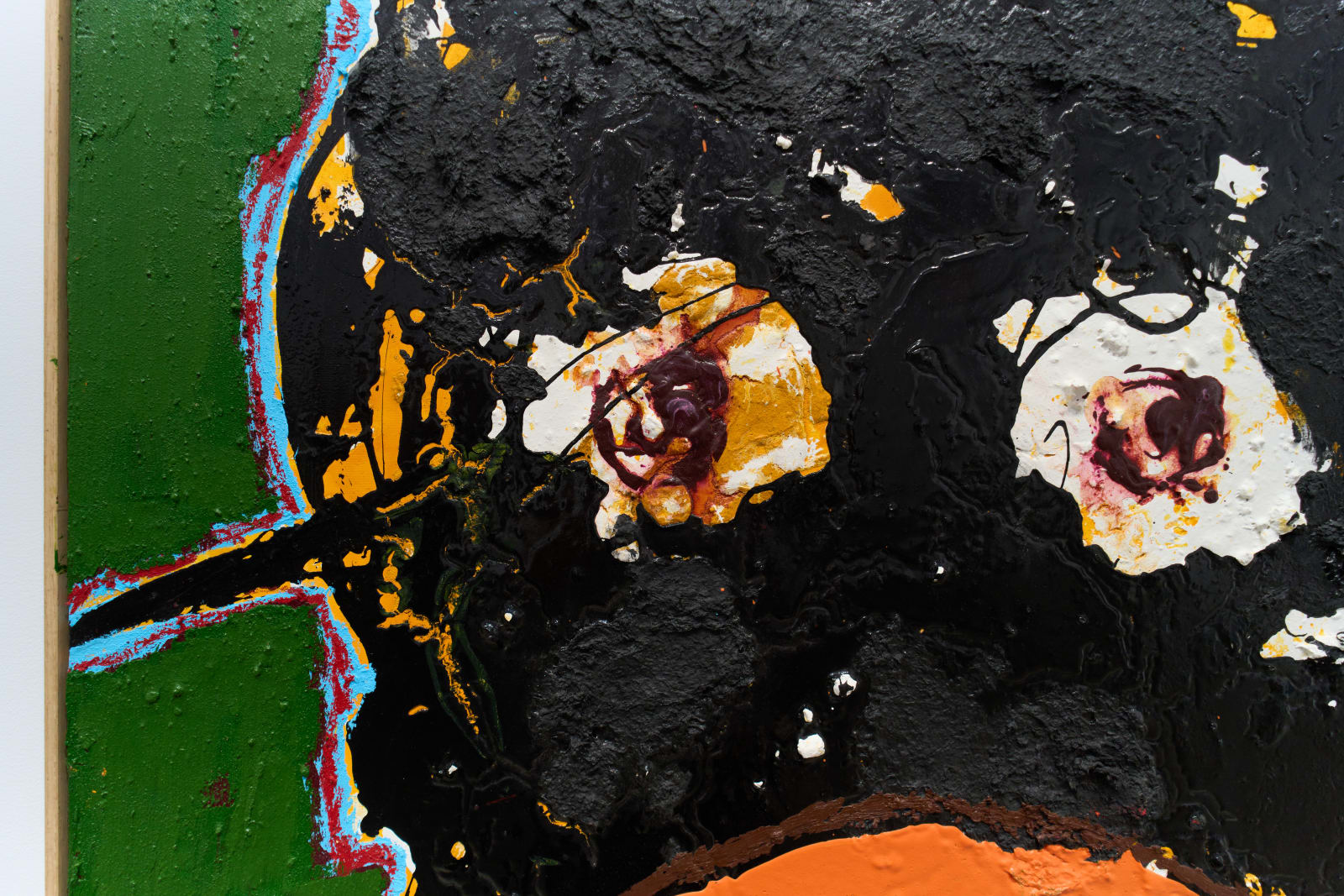
Glossy paint, varnish, resin, glass, metal leaf, and dark passages all reflect the room back at the camera. A bright patch on the wall can read as a pale area in the artwork that was never actually pale. A dark reflection can swallow real detail entirely. The camera records the art and whatever the surface sends back at the same time, and it cannot always tell the two apart.
The right setup depends on the material. Flat, matte work often responds well to even light placed symmetrically on both sides. Reflective and glazed work usually needs larger light sources, different angles, a controlled room, or polarized lighting, which is why documenting glass or heavy varnish is priced as its own setup rather than folded into a standard shoot. The goal is never to erase the material's real character. It is to separate that character from accidental glare.
Color balance can move the whole painting
A small color balance shift affects every color in the frame at once, which is why it is the complaint that shows up most. Warm light pushes whites toward cream and cool blues toward grey. Mixed daylight and indoor light can create different color casts across the same piece if the shoot moves between them. Automatic camera settings can also drift between frames, which makes a series look inconsistent even when the works belong together and were shot minutes apart.
A neutral color reference photographed under the same lighting gives the edit an anchor. It does not replace judgment, since pigments and screens are complicated, but it establishes what neutral should actually look like before any correction happens. From there, the file gets checked against the original under controlled light rather than against a memory of it.
Strong editing is usually quiet editing. A file should not become more dramatic because a saturation slider felt ambitious that day. The real question is whether the digital image preserves the relationships inside the work. A muted red should stay muted beside a brighter one. A grey should not turn blue simply because blue reads as crisper online.

Dark and light values need room to breathe
Cameras and screens can hold a wide range of tones, but web files usually get viewed in bright rooms on small, glossy devices. Deep shadows merge into a single block. Pale texture disappears into white before anyone notices it was there. If the original capture clips either end of that range, no amount of editing recovers information that was never recorded in the first place.
This matters most for dark paintings, works on paper, subtle monochromes, and pieces with glossy black areas, all places where the texture and the tone are doing the same job. A file can look punchy at first glance while quietly losing the small differences that made the original interesting up close.
A careful exposure protects that detail first, before anything gets prepared for casual viewing. The web version can then be built for normal screens without rebuilding the artwork around a phone. There is a real difference between making a file legible and making the work louder than it is. The first serves the artist. The second starts a new collaboration nobody asked for. Checking the histogram at capture, not just the screen preview, catches a clipped edge before the shoot ends rather than after the file has already been edited and exported.
Cropping and camera position change the composition
If the camera is not square to a flat artwork, parallel edges start to lean. One side reads longer than the other. A rectangle becomes a trapezoid without anyone touching the crop tool. Software can correct some of that perspective, but the correction stretches pixels, and the composition can still feel subtly off even after the math checks out.
Cropping matters just as much. A full documentation image needs the complete edge of the work, with enough breathing room around it to confirm the true shape before a clean crop gets made later. Cropping into the piece too early removes intentional margins or changes how forms sit near the boundary, and that damage is not always visible until the file is compared side by side with the original.
Framed work adds another decision. Sometimes the useful record includes the frame, glass and all. Sometimes the art needs its own clean image separate from it. These are different files answering different questions, which is why one photograph, however good, should not be asked to carry every future use on its own.
Texture can disappear or become the whole story
Texture needs context to read correctly. A straight, evenly lit view explains the complete work. A raking-light detail shows brushwork, stitching, paper tooth, cracks, relief, or material depth that the full view cannot carry at that scale. Using only the detail shot makes the work hard to place. Using only the flat, even view can make real material choices vanish entirely, which is its own kind of misrepresentation.
The strongest set includes both. The primary image stays neutral and descriptive, close to how the piece actually reads in person. Detail images are allowed to be more specific about surface and scale. This keeps the documentation honest while giving galleries, collectors, and casual viewers a closer look at why the physical object matters beyond the thumbnail.
Sharpening can invent texture that is not there, especially after a file has already been reduced for the web. Too much sharpening produces bright edges and brittle detail. The image looks crisp at a glance, but the surface starts reading like it was translated into a different material entirely, canvas reading like plaster, paper reading like plastic, and neither serving the actual work.
The website can change a good file, and every screen agrees on nothing
A well-made master file can still suffer on the way up. Website systems resize images, compress them, strip color information, or serve a thumbnail larger than it was ever meant to appear. Social platforms usually apply another round of compression on top. Screens then add their own brightness, contrast, and color settings before a single viewer even sees the piece, which is a large part of why the same file looks different on every screen it lands on.
Prepare separate web files instead of uploading the largest archive file everywhere and hoping the system handles it well. Use a standard web color space, sensible dimensions, and enough quality to preserve gradients and fine texture. Keep the full-resolution master untouched in a folder no website ever gets to compress. The small file has one job online. The master has a much longer life beyond it.
Check the page on more than one normal device, but do not chase perfect agreement between all of them, because that agreement does not exist. Look instead for major shifts, crushed shadows, strange crops, soft detail, and visible compression artifacts. Consistency across the artist's own site matters more than winning an argument with every screen ever manufactured.
A practical fidelity check
Start with the original artwork beside a calibrated or dependable display in neutral light. Compare the whole image before zooming in anywhere. Does the composition breathe the same way. Do the light and dark relationships feel intact. Does one color suddenly dominate the frame. Does the surface read as the same material it actually is.
Then check the edges, corners, neutral areas, fine transitions, and any place where glare or shadow could be hiding information. Review the web export separately from the master file. A correct master does not guarantee a correct upload, and the two failures look identical from a distance.
If the image still feels wrong, name the exact difference instead of settling for a vague impression. Too warm is actionable. Flat is useful once you identify whether contrast, surface, or scale is what actually disappeared. Something is off is emotionally accurate and technically useless. The more specific the observation, the cleaner the correction that follows it.
Before the documentation session, note the uses that matter most. A gallery submission, archive, website, reproduction file, insurance record, and press request can each need a different view or crop. Photographing for those needs together is usually simpler than discovering later that the only available file hides the frame, loses the edge, or cannot support a close detail. A short delivery list protects the artwork from being asked to perform a job it was never photographed to do.
One more check belongs outside the calibrated room. Open the finished page on an ordinary phone and laptop under normal light. This is not a color-grading session. It is a reality check for whether the main relationships survive contact with an actual screen. If one device makes the image slightly warmer, that is expected and not a problem. If the work becomes unrecognizably dark, aggressively saturated, badly cropped, or visibly compressed across more than one device, return to the export or website settings before touching the master file.
Build a small set of files with different jobs
A single digital file rarely serves every future use well. Keep a high resolution master with the full tonal and color information intact. Create a clean web version for the artist website. Prepare separate crops only when a platform or layout truly requires them. If reproduction is planned, confirm the printer's specifications first instead of assuming the website file can simply become larger through confidence.
File names should connect the image to the artwork record. Artist name, title, year, view, and a simple version marker are more useful than a folder full of final, final two, and final use this one. Keep the documentation metadata, dimensions, medium, and credit information nearby even when it does not live inside the visible image itself.
Detail views should be labeled as details, plainly. Installation views should not replace the primary documentation file. Framed and unframed views should be easy to tell apart at a glance. This protects the work as images move between an artist, gallery, designer, press contact, archive, or application portal, all of which want a slightly different file.
Keep the original master separate from every future edit. A website redesign, new crop, publication request, or printer can then begin from the strongest possible source. Digital files tend to outlive the exact reason they were first made. A clear, well-labeled set gives future uses real options without asking anyone to reconstruct the artwork from an old, compressed download years later.
Frequently asked questions
Why does my artwork look more saturated online?
Screens emit their own light, and many devices ship with vivid display settings turned on by default, which pushes color past what the artwork actually shows. Editing choices, color profiles, and platform compression add more variation on top of that. Building a neutral master first, exporting a standard web version from it, and comparing the uploaded file against the original under controlled light catches most of the drift before a viewer ever sees it.
Can a phone photograph artwork accurately?
A phone can make a useful reference image in even light, especially for planning shots or quick records nobody will scrutinize closely. For portfolios, reproduction, archives, sales, or a detailed submission, a controlled camera position, deliberate lighting, a color reference, and careful file preparation give a far more dependable result than a phone can manage on its own, particularly on glossy or dark work.
Should artwork photos show texture?
Yes, whenever texture is genuinely part of the work rather than incidental to it. Use a neutral full view for the primary record, then separate detail images to show brushwork, relief, stitching, paper, or reflective material at a scale the full view cannot carry. One lighting setup rarely explains every quality of a physical object equally well, which is exactly why documentation sets usually need more than a single frame.
Why do framed artworks show reflections?
Glass and glossy surfaces reflect whatever sits in front of them, including studio lights, windows, walls, and the camera itself. Changing the size and angle of the light source, controlling what is in the room, and using polarized lighting when the situation calls for it can reduce reflections substantially while keeping the frame, the glass, and the art underneath all looking believable rather than artificially clean.
Why does my artwork look different on every screen?
Every screen sets its own brightness, contrast, and color balance, and there is no single setting that makes them agree. A calibrated monitor and an average phone were never going to match exactly, and that gap is not a defect to chase down and eliminate. What is worth chasing is a neutral master file and a properly prepared web export, since those catch real problems, crushed shadows, wrong crops, visible compression, that show up on nearly every screen at once.
Build a paper trail your insurer can't argue with.
We shoot artwork documentation the way an appraiser or adjuster actually reads it, full views, true color, condition notes, and files that stay tied to the right piece.
Explore artwork documentation →