
Most artists find out they got the wrong files at the worst possible moment. A gallery asks for a print-ready image the night before install, an insurer wants a high-resolution record, or a catalog editor needs something that will not fall apart when it is printed at twelve inches. The shoot went fine. The problem is the handoff.
Good art documentation does not stop when the camera stops. The files still have to arrive in a form you can actually use, each one doing a specific job. This checklist is what we wish every artist had in hand before approving a delivery folder, covering the file types, the color profiles, and the folder structure that decide whether a good shoot keeps paying off later.
Start with what the files need to do
Before you check formats and sizes, ask a simpler question. What does this artwork need to do next? A piece headed for a website has different needs than a piece headed for a printed catalog, an insurance file, or a fine-art reproduction run. One master image can serve all of them, but only if it was captured and exported with those futures already decided.
Tell your photographer the destinations you already know about before the shoot, not after: website, social, gallery submission, print catalog, grant application, insurance record, reproduction. If you booked without settling that question, see our guide on what to ask before you hire a documentation photographer. This post picks up after the fact, once the files have landed and you are checking the delivery against what you actually need.
Our own sessions deliver color-corrected, print-ready images at every tier, so the quality of the capture usually is not the part you need to check. What varies by delivery is the packaging. That is what this checklist covers.
Master files: the ones you protect
The master file is the cleanest, highest-quality version of the image. It is uncropped for any single layout, full resolution, minimally compressed, and treated as source material. You should receive one master per artwork, and you should not use it for daily posting. It is the negative, not the print. Everything else can be made from it.
Ask for masters as TIFF or high-quality JPEG at full resolution. TIFF is lossless and ideal for archives and print; a high-quality JPEG is smaller and fine for many uses. If the work will ever be reproduced or printed large, TIFF is worth the storage. Keep these files somewhere stable and back them up, because a master you cannot find is just a rumor of a good image.
If you only remember one rule, keep master files separate from web files from day one. The single most common file disaster is a compressed web image quietly becoming the only copy of a sold painting.
Web files: small, fast, and replaceable
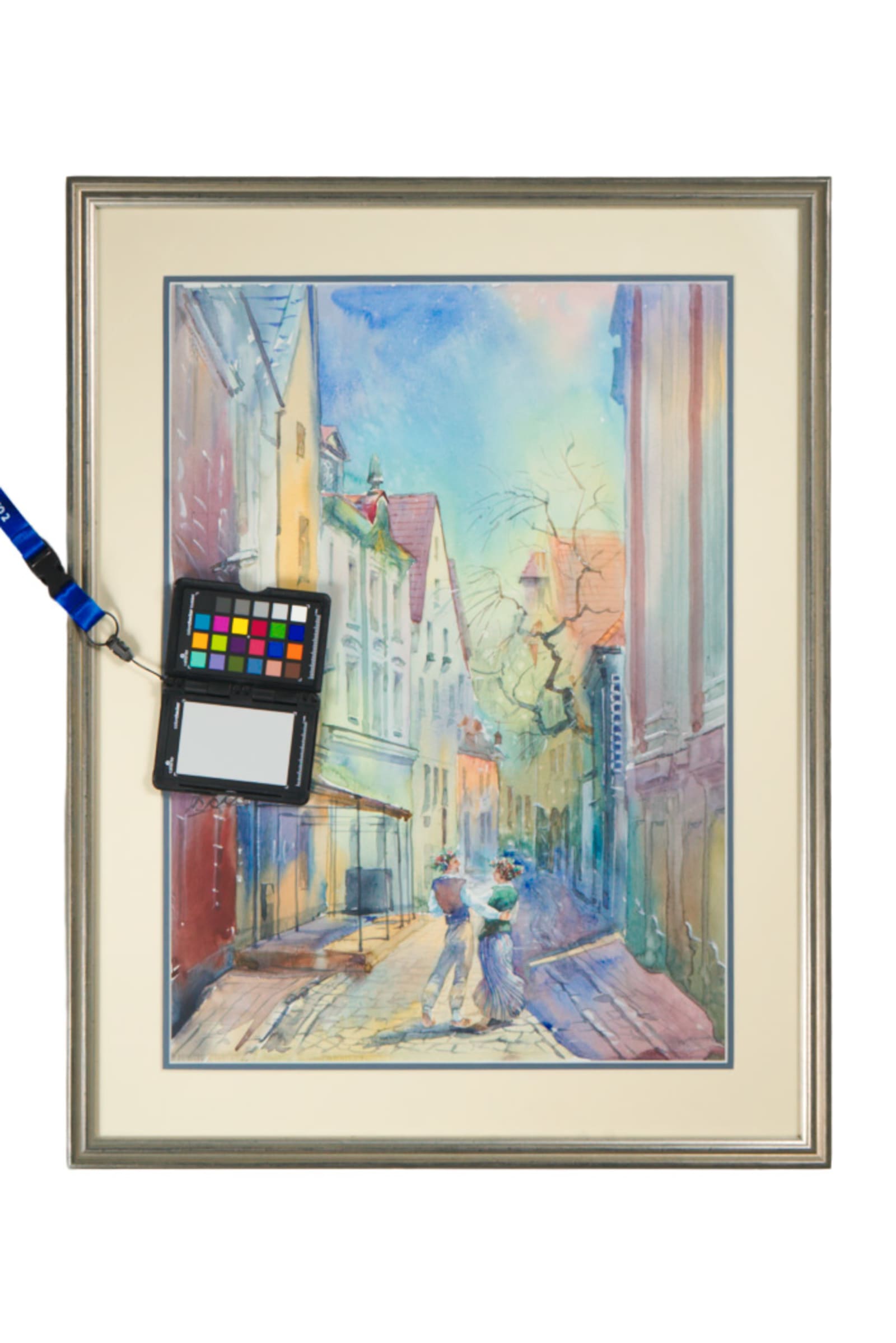
Web files are the working copies. They are sized for a page, compressed for fast loading, and named for where they live. They are meant to be replaced, resized, and regenerated. You want these delivered alongside the masters so you are not exporting them yourself under deadline, but you should never treat them as the record.
A useful web file is usually a JPEG somewhere around 2,000 pixels on the long edge, in sRGB, saved at a quality that looks clean without being enormous. That is plenty for a website, a submission portal, or an email. If someone needs it bigger later, you make it from the master. That is the whole reason the master exists.
Ask for these by name, not by assumption. A photographer who hands you only the masters is leaving you to make your own web exports later, usually under deadline and without the original settings on hand. A delivery that already includes ready-to-use web files saves that work and keeps the sizing and color consistent across your whole site or portfolio.
Print and reproduction files
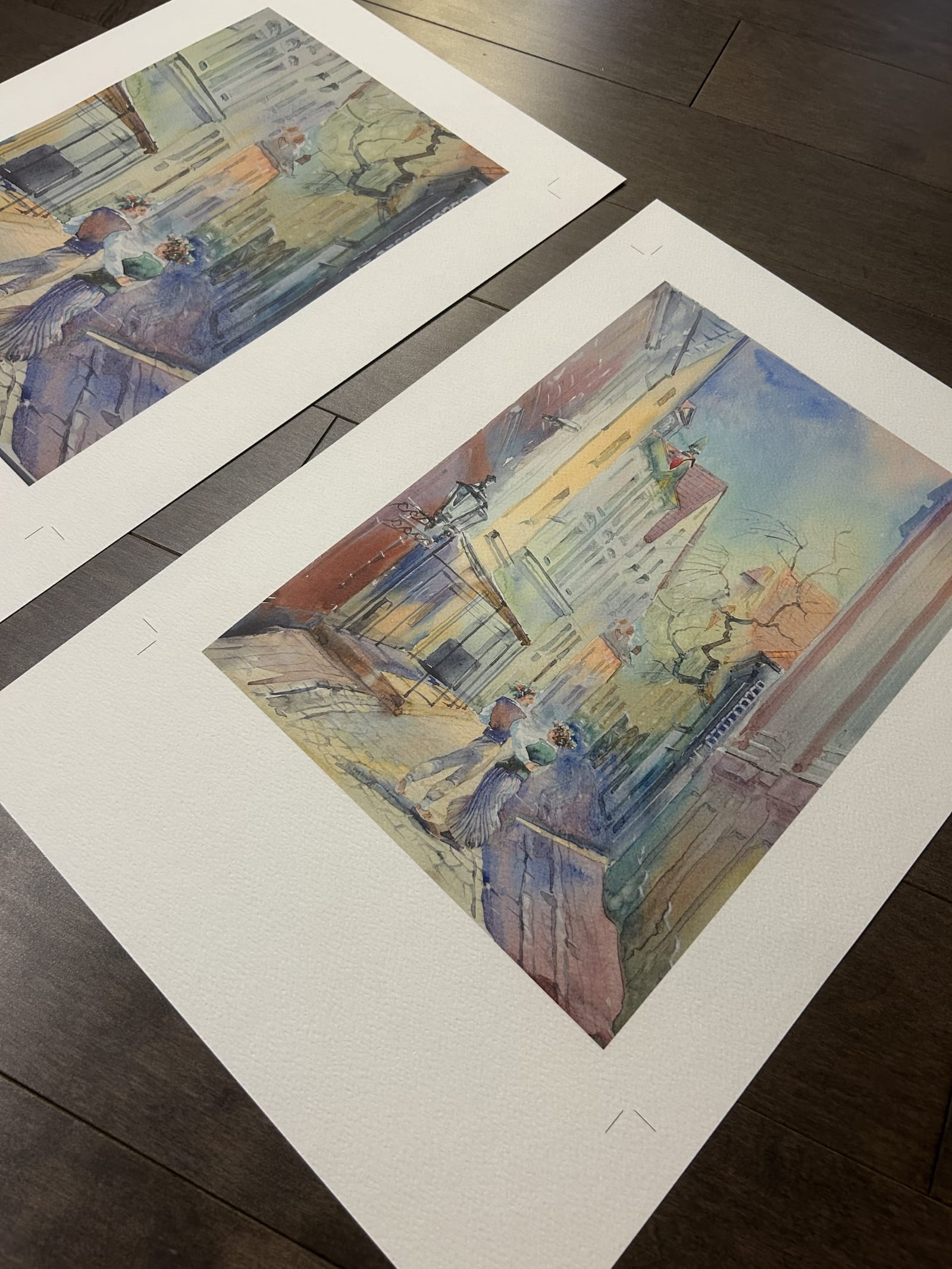
Print and reproduction files are a different animal, and they are where most delivery folders come up short. If your work will appear in a printed catalog, a press feature, or a fine-art print run, you want files prepared for physical output: full resolution, 300 DPI at the intended print size, and a color profile suited to print rather than screen.
Reproduction, where a print is meant to stand in for the original, is the most demanding case. It leans on accurate color, even lighting, and enough resolution to hold detail at scale. It is worth naming this out loud before the shoot. Reproduction-grade capture is decided with the lights and the camera, and a small export afterward cannot fully rescue a capture that skipped that step. If reproduction is part of your practice, ask for a clearly labeled reproduction file kept separate from your web and archive copies.
Ask what print size the file was actually prepared for. A file sized at 300 DPI for an eight-by-ten print does not automatically hold up at three feet across; resolution and intended output size travel together. If you already know a piece is headed for a large print or a catalog spread, say so before the shoot so the capture can be planned around it.
Color space, and why it bites later
Color space is the quiet variable that causes loud problems. Files delivered in one color space and opened somewhere that expects another can shift in ways that make blues sulk and reds panic. For the web you generally want sRGB, the safe default for screens. For print, a wider space such as Adobe RGB or a print-specific profile holds more of the color range a printer can use.
The profile also has to travel with the file, not just sit in your head. Every image should carry an embedded ICC profile that tells any screen or printer how to read its color numbers. A missing profile does not mean no color. It means software has to guess, and the default guess is usually sRGB. If that guess is wrong, the shift shows up the moment someone else opens the file. A warm painting can read cool. A deep red can go flat and muddy. That is the familiar it looked fine on my screen problem, and it almost always traces back to a missing or stripped profile.
You do not need to become a color scientist. Ask one plain question. Which files are sRGB for screen, which are prepared for print, and does each one actually carry its embedded profile? A good photographer will already have made that decision and can answer in a sentence. If nobody can answer it, that is worth noticing before the files become your permanent record.
How the files should arrive
Delivery is not just a download link. It is the difference between a folder you can use in a year and a folder you have to decode. Ask for files named consistently, connecting each image to the artwork title or an inventory number, with the file type or use included when it helps. Camera-number filenames like IMG_4471 are fine for a memory card and useless as a permanent record.
A clean handoff usually means organized folders (masters, web, and print or detail kept separate), sensible file names, and a short note on what each set is for. If you keep records for a collection, insurance, or an estate, that structure matters even more; our post on documenting collections for insurance and legacy goes deeper on that. The goal is a folder a stranger could open and understand, because in six months, you are effectively that stranger.
Whatever the download method, cloud link, shared drive, or a physical drive for a large body of work, ask that the folder structure survives the trip. A zip file that dumps two hundred images into one flat folder with no separation between masters and web files pushes the sorting work back onto you, at the exact moment you have the least context for doing it well.
What to check before the photographer packs up
Some of this is easiest to catch on delivery day, while the photographer is still on-site or still easy to reach. Open a handful of files on a laptop, not a phone screen, and spot-check that the count matches what was shot, that nothing reads obviously cropped wrong, and that the file or folder names already make sense to you. If a piece has both a hero shot and detail shots, confirm both are actually in the folder and not just described in an email.
Once you approve the delivery, ask that it includes the following.
- One master file per artwork, full resolution, TIFF or high-quality JPEG.
- Web files in sRGB, sized for pages and portals, ready to use as-is.
- Print or reproduction files at 300 DPI with a print-appropriate embedded profile, when you need them.
- A stated color space for each set: sRGB for screen, a print profile for print, each one embedded in the file itself.
- Consistent file names tied to the artwork title or an inventory number, not camera numbers.
- Organized folders and a one-line note on what each set is for.
None of this is glamorous. It is the boring layer that decides whether your work looks right the day someone important opens it on a screen you do not control. Get the files right once, and the shoot keeps paying off for years.
Give your collection a record that holds up.
We document artwork the way an adjuster or appraiser would actually want to see it: full views, accurate color, condition detail, and a system that keeps every file tied to the right record.
Explore artwork documentation →