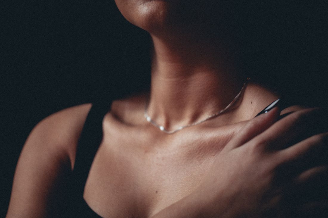
A jewelry or accessories campaign has a small object with a very large job. The piece has to catch the eye, while the person wearing it still needs to feel like a person and not a display stand with a pulse. That changes the styling brief from dressing someone well to building a quiet visual field around one small point of attention. Wardrobe, hair, hands, neckline, and pose all become part of the object’s frame.
Styling a jewelry or accessories campaign means treating the person as the visual background around a small object. Wardrobe, hair, neckline, hands, and pose should give the piece contrast and space while keeping the wearer present. When the person adds more visual noise than useful context, a product-only setup is the cleaner choice.
What changes when the person becomes the background?
Styling a jewelry or accessories campaign means treating the person as the visual background around a small object. Wardrobe, hair, neckline, hands, and pose should give the piece contrast and space while keeping the wearer present. When the person adds more visual noise than useful context, a product-only setup is the cleaner choice.
Most wardrobe styling starts with the person. Their proportions, taste, movement, and point of view shape the look, while the clothing helps the viewer understand who they are. An accessory campaign reverses that order. The person still matters, but their job inside the frame is to give the object a believable place to exist and a human scale to read against.
That inversion changes the questions asked during a fitting. Does the neckline leave a clean opening around the piece? Does a sleeve create a useful edge near a bracelet? Does the hair fall across the earring at the exact angle the camera will use? These are not finishing details. They decide whether the object has a clear visual entrance.
The person should not disappear completely. A face, hand, shoulder, or gesture can give the campaign warmth and context. The aim is quieter than that. The wearer supports the object without turning into a second subject competing for the same sentence in the image. The frame should feel human without asking the viewer to choose between the wearer and what they are wearing.
How should wardrobe color and texture support a small accessory?
Wardrobe should create enough contrast for a small accessory to separate from the body without becoming a second focal point. Plain or lightly textured pieces usually give the object more room to read, while color should be chosen in relation to the accessory, the skin, and the campaign background rather than from the clothing rack in isolation.
Exact color matching can make an accessory disappear into the clothing around it. The opposite extreme, a loud color chosen only because it photographs with energy, can make the garment the first thing a viewer notices. A useful middle ground is a controlled difference in value or temperature, a warm piece against a cooler field, or a dark edge that gives a pale object a clean outline.
Texture needs the same restraint. A heavy knit, sharp pleat, busy print, or glossy fabric can create a second layer of information directly beside a small object. The issue is not that texture is forbidden. It is that texture should have a job, such as creating a soft surface behind a hard edge, instead of asking the viewer to inspect two unrelated details at once.
Check the look through the actual camera, not only in a mirror. A fabric that feels quiet across a fitting room can become the busiest shape in a close portrait, especially once the crop removes most of the outfit and leaves only a shoulder or collar as the object's immediate surroundings.
Why do neckline and hair decisions matter so much?
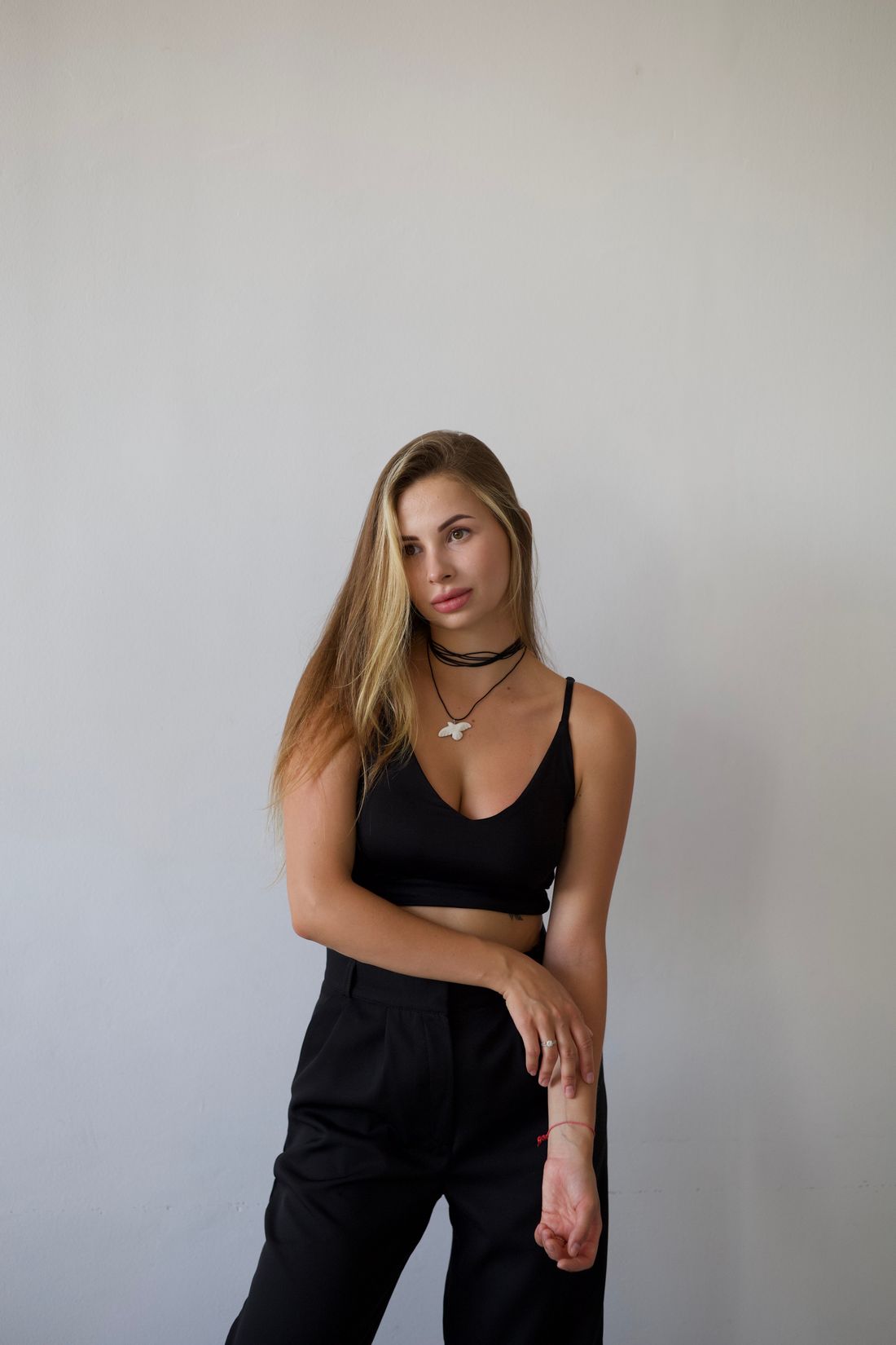
Neckline and hair determine the immediate shape around jewelry worn near the face, neck, or ear. A clean opening gives the accessory a readable boundary, while loose hair, a busy collar, or a competing edge can interrupt it. These choices should be tested together because the final frame sees them as one connected shape.
A neckline does not have to be bare to be useful. A high, simple collar can create a strong field behind a pendant, and an open neckline can let a necklace sit inside the frame without getting trapped against a seam. The decision depends on where the piece rests and which edge helps it stay legible. What matters is that the garment's opening was chosen for the accessory rather than inherited from an outfit selected first.
Hair has a similar relationship to earrings and neck pieces. A clean sweep can reveal a small form, while a few strands crossing the exact point of interest can make the object read as an accidental glint. That does not mean every campaign needs slicked-back hair or a rigid beauty look. It means the hair needs a deliberate place to stop, move, or fall.
Skin and makeup sit inside this frame too. The finish should support the campaign's level of polish without adding a second reflective surface beside the accessory. A quick check from the intended crop catches competing highlights and flyaways before they become the most obvious thing in a small image.
How should hands and gestures be styled around an accessory?
Hands should give an accessory a natural place to be seen without presenting it like a label. The strongest gesture usually has a reason inside the pose, resting, reaching, holding, or touching lightly, so the object remains connected to a person instead of floating as a separate product demonstration.
Hands are especially important because they can become the frame around a ring, bracelet, watch, or small object worn on the wrist. A cramped grip makes fingers look like they are hiding the piece. An overextended display pose makes the image announce the accessory too loudly. A relaxed hand with a clear line of sight gives the photographer more options while keeping the wearer believable.
Gesture also changes the apparent scale of a piece. A hand held close to the body can make an accessory feel integrated into a portrait. A hand brought forward toward the lens can turn the same object into the whole subject, which may be exactly right for one frame and too much for the rest of the campaign. That difference belongs in the shot plan, not in a last-minute improvisation.
Keep nails, cuffs, and nearby seams in the same conversation. A bright manicure, a heavy sleeve edge, or a twisted cuff can pull the eye away from the accessory before the viewer has understood what it is. The goal is not to remove personality from the hand. It is to make sure the personality supports the object rather than competing with it.
How do you keep the wearer visible without losing the focal point?
The wearer stays visible through expression, posture, and a clear relationship to the frame, while the accessory remains the first detail the viewer can identify. That hierarchy comes from scale, contrast, focus, and gesture working together. It is not created by making the person's face blank or forcing the object directly into the center.
A close crop can lower the face's visual volume while keeping the person present. Turning slightly away, letting the shoulder carry part of the composition, or placing the hands near the edge can make room for a small object without flattening the portrait into a diagram. The right choice depends on whether the campaign needs intimacy, attitude, movement, or a simple record of the accessory on a body.
Focus is part of the styling decision, even though it happens through the camera. A piece near the ear may need the face to fall gently away. A hand-held object may need the eyes and mouth to become quieter parts of the frame. This does not mean every background must dissolve. It means the sharpest information should agree with the campaign's reason for existing.
Look at the image at its intended delivery size. A hierarchy that feels clear on a large monitor can collapse when a small social crop removes the shoulder or trims the hand. Build a few frames with breathing room, then a few tighter options, so the object has a visual home across the campaign rather than only in one carefully protected composition.
When is a product-only setup the cleaner choice?
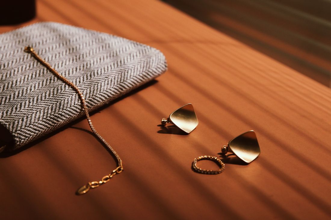
A product-only setup is cleaner when the campaign needs the accessory's shape, finish, or arrangement to carry the entire message and a person would add more visual decisions than useful context. It is especially useful for detail-led frames, lineups, or images where the viewer needs to inspect the object without reading expression, skin, or wardrobe first.
Keeping the person in frame creates a particular kind of meaning. It shows scale, wearability, attitude, and a relationship between object and body. That can be valuable when the campaign is about how the accessory enters a life. It also creates extra variables, hair crossing the piece, skin tone changing its contrast, a sleeve hiding an edge, or a gesture making the object feel posed.
A product-only setup removes those variables, but it does not automatically make the photograph easier. The object still needs a surface, a shadow, a composition, and enough space to show what makes it visually distinct. The difference is that every decision now belongs to the object rather than being negotiated with a person in the frame.
Many campaigns need both. A clean still life can establish the object with no distractions, while a restrained worn frame gives it scale and human context. Decide which job each image has before styling the day. Otherwise the team can spend a lot of time making a person disappear from a frame that never needed a person in it.
What should you test before the campaign shoot begins?
Test the complete look through the intended camera and crop before the campaign begins. Put the accessory on the person, arrange the wardrobe, set the hair and hands, then check what the frame actually prioritizes. A fitting-room mirror answers how the look feels in person. The camera answers whether the object can be read.
Start with the frame the campaign needs most. If the hero is a close portrait, test the exact neckline and hair placement that will surround the piece. If the campaign includes a hand detail, test the gesture with the real sleeve and nail finish. Small changes in distance can alter the balance between an object that feels integrated and one that looks pasted into the picture.
Check movement even for still photography. Ask the wearer to turn, lower a hand, adjust the shoulder, and return to the starting pose. The accessory may shift, catch a new highlight, disappear behind hair, or become more visible in a way that changes the styling decision. Still images are chosen moments, but the person still has to move between them.
Review the look both as a large frame and as a small crop. Then record the decisions in a brief, including the approved wardrobe, hair direction, hand positions, and which images are intended to be product-only. That record gives the shoot a shared visual reference instead of asking everyone to remember a fitting from a week earlier.
How should styling decisions stay consistent across the campaign?
Campaign consistency comes from repeating the visual rules, not from making every frame identical. Keep the relationship between accessory, person, color, crop, and background recognizable while allowing the wearer to change position or expression. The audience should feel a clear family across the images, not eight versions of the same frozen pose.
Write down the rules that matter most. One look may depend on an open neckline and a clean sweep of hair. Another may depend on a sleeve ending below a bracelet and a hand resting at the waist. These details are easy to lose when the team moves from a hero frame to a tighter crop, so a short styling reference can protect the visual idea without turning the day into a stack of rigid instructions.
Keep the accessory's role clear from frame to frame. If it is the quiet focal point in one image, do not let an unrelated garment detail become the loudest element in the next unless that change is intentional. Color, texture, and pose can vary, but the campaign needs a reason for the variation. Otherwise the set starts to look like separate outfits photographed near the same object.
We'd build the final selection around that system. A strong campaign usually has a few images that explain the piece immediately, a few that let the person bring in atmosphere, and at least one frame where the object can stand on its own. Styling works best when those roles are decided before the clothing is pulled, not after the gallery arrives.
Frequently asked questions
How do you style a person so jewelry stays the focus of a campaign image?
Give the jewelry a controlled visual field. Choose wardrobe with enough contrast and quiet texture, keep hair and neckline from crossing the piece, and direct hands into a natural gesture that leaves the object visible. The person should still feel present through posture or expression, but the sharpest, clearest information in the frame should belong to the accessory. Test the complete look through the actual camera and crop before the shoot.
Should a jewelry campaign include both worn images and product-only images?
Often, yes, because the two image types answer different questions. A worn image gives the accessory scale, movement, and a human context. A product-only image lets the viewer inspect its shape and arrangement without hair, skin, wardrobe, or expression competing for attention. Include both when the campaign needs both kinds of information. Choose product-only throughout when the person adds more decisions than useful context in the frame.
What should someone wear for a jewelry or accessories photoshoot?
Start with simple, unbranded pieces whose color and texture support the accessory instead of competing with it. The right choice depends on where the piece sits, the intended crop, and whether the campaign needs a strong contrast or a quiet tonal relationship. Test collars, sleeves, and fabric surfaces through the camera. A garment that feels neutral in person can become the busiest shape beside a small object once it is cropped tightly.
How should hair and hands be handled in jewelry campaign styling?
Hair should have a deliberate relationship to the accessory. It can clear an earring or create a controlled frame around a neckline, but stray strands should not cross the point of attention by accident. Hands should rest, reach, or touch with a believable reason, rather than presenting the object like a label. Test the exact gesture with the real sleeve, cuff, and accessory because small changes can hide or reveal the piece.
Is jewelry campaign styling different from macro jewelry photography?
Yes. Macro photography focuses on the technical challenges of recording a very small object, such as focus, surface cleanliness, and reflections at close distance. Campaign styling focuses on the visual relationship between the object and the person around it, including wardrobe, hair, neckline, hands, and pose. A campaign may use a close crop without becoming a macro documentation setup, and it may also include product-only frames for a separate visual job.
Let the clothes support the work.
We plan wardrobe for artist portraits the same way we plan everything else on set: around the person and the work, not around the idea of a photoshoot.
Explore styling services →