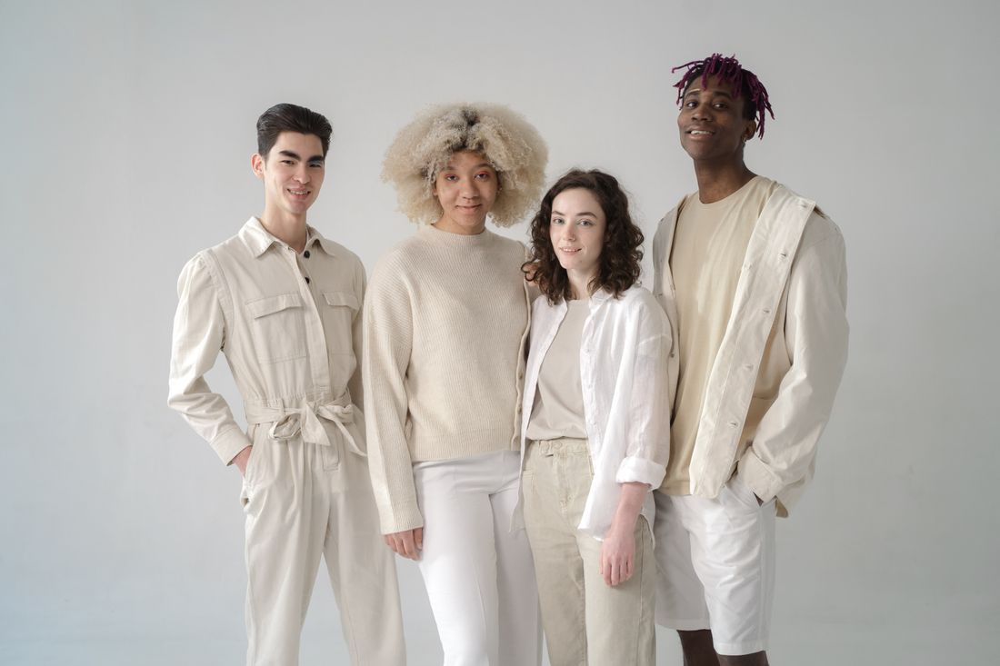
The easy fix for a group photo is putting everyone in the same color, and it works, technically. It also makes six independent practices look like a staff photo. The better job is finding the through-line that lets each person keep their own clothes and still read as one thing.
The fix is a through-line, not a dress code: a shared tonal range, a repeated texture, or a controlled contrast ceiling that lets six people keep their own clothes and still read as one group. Matching everyone in one color unifies a photo too, but it flattens six individual practices into a uniform instead.
Why "everyone wear black" backfires
Dressing a group in one identical color is the easiest way to unify a photo, and it works technically, but it also flattens six individual practices into one look, which reads as a staff photo, a team roster, or a uniform, not as a group of artists who each have their own visual language.
The uniform look isn't wrong, exactly. It's just the wrong tool here. Same-color dressing exists to erase individual variation on purpose: choir robes, wedding parties, a corporate headshot wall. A group of artists sharing a show is the opposite problem. The photo needs to say six people, six practices, one moment, not one company. Once everyone shows up in the same black turtleneck, the eye stops reading personality and starts reading policy, and the whole thing tends to look imposed from outside.
The instinct to reach for a dress code usually comes from a real fear, that six different outfits will look chaotic standing next to each other. That fear is fair; loose choices with no shared thread do read as noise in a single frame. The fix isn't less individuality, though. It's a quieter kind of agreement: a shared range instead of a shared item. Most bad calls on shoot day trace back to solving the wrong problem (treating cohesion as a wardrobe rule instead of a visual one).
What a through-line actually is
A through-line is one visual thread that repeats across every person in the frame without requiring them to wear the same thing: a tonal range everyone's clothes sit inside, a texture that shows up more than once, or a level of contrast the whole group agrees to stay under. It's the difference between matching and rhyming.
Tonal range is the most reliable version. Instead of "wear navy," the brief becomes "wear anything between charcoal and cream," which lets one person show up in a cream sweater, another in a grey jacket, another in an off-white shirt with dark trousers, and the photo still reads as one group because nothing jumps outside the range. Texture works the same way from a different angle: if three of six people happen to be in something with visible weave or worn-in fabric, that repetition unifies a frame more than color alone ever could, because it reads as a shared sensibility rather than a shared closet.
Contrast is the subtler lever and the one most groups skip. One person in stark black-and-white against a group in soft mid-tones will always pull the eye first, collective or not. A rough contrast ceiling (nobody in pure white against pure black) does more to make six people read as one thing than any single item of clothing could, and it protects everyone's actual style along the way.
Running the group conversation before shoot day
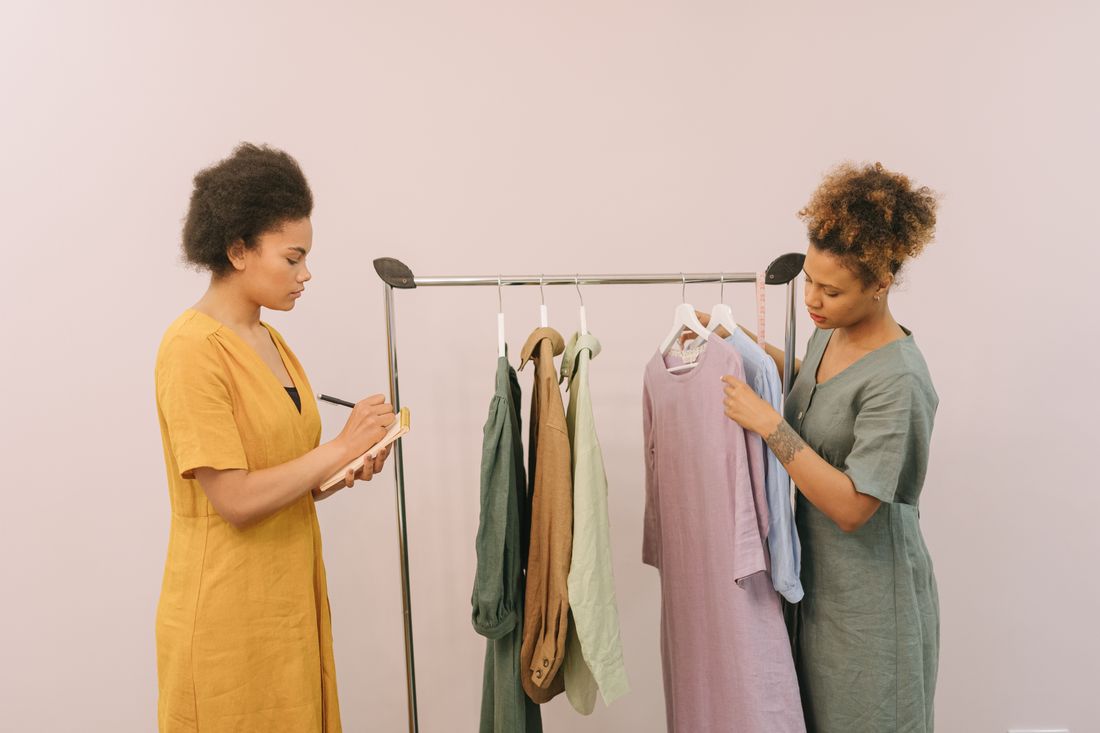
When a group shoot has no single decision-maker, the styling conversation works best as a short shared brief sent to everyone at once, asking for phone photos of what they're considering, rather than a back-and-forth that puts one person in the position of approving or vetoing what five others plan to wear.
A group brief works better than a discussion because nobody in a peer group wants to tell a colleague their outfit doesn't fit. That conversation gets avoided, or handled so gently nothing changes, and the mismatch shows up for the first time on set. A written brief sidesteps that by setting the range before anyone commits to an outfit, so the choice happens privately, not as a critique of what someone already picked. Asking for a photo of the actual garments, in daylight, catches problems a text description never will (a "navy sweater" closer to true blue, a "neutral" warmer than everyone else's).
It helps to name one person as the collector of those photos, who flags anything outside the range, even without authority to reject an outfit outright. A flag two days out is fixable. The same flag noticed for the first time before the shoot is not. Groups that arrive coordinated aren't the ones under a strict dress code. They're the ones who saw each other's choices in advance and had days to adjust one piece, not the whole outfit.
What to specify, and what to leave alone
Specify the range, not the item: a tonal band, a rough contrast ceiling, and one or two things to avoid (logos, loud pattern, anything that reads as costume). Leave the actual garments, fit, and personal style completely open. The more specific the brief gets about individual pieces, the less it feels like each person's own choice.
A useful test for any instruction is whether it describes a boundary or a garment. "Nothing brighter than a muted rust" is a boundary. It leaves room for six different interpretations. "Wear a cream sweater" is a garment. It removes the choice entirely and pushes the group back toward the staff-photo problem the exercise is trying to avoid. Boundaries preserve agency; garments erase it. The same logic applies to pattern and logo guidance: naming what to avoid, rather than what to wear, keeps an instruction from reading as a costume assignment.
Fit and footwear are usually safe to leave open entirely. A group photographed from the waist up rarely needs shoe coordination, and fit differences between six different bodies are exactly the variation the photo should show, not hide. Accessories deserve one line at most: keep jewelry and bags simple enough not to compete with faces, without specifying which ones to bring. Once a brief starts naming specific pieces, it has stopped being a through-line and started being a dress code again.
Texture as the unifying element clothing color can't be
Texture does coherence work that color alone can't, because it reads as a shared sensibility rather than a matching scheme. Linen next to raw denim next to a slightly nubby knit still looks like one considered group, where the same three pieces in three unrelated colors would look scattered even inside a tonal range.
Texture reads so differently from color because it photographs as quality rather than as a rule. A group can technically break the color brief and still look coordinated if the fabrics share a register. Worn-in, matte, natural-fiber pieces sit together comfortably even when their exact shades drift. The opposite is true too: pieces that match in color but clash in finish, a shiny synthetic jacket next to a matte wool coat, can look more mismatched than two different colors in the same soft fabric family. Texture does more of the actual visual work than anyone gives it credit for.
In a group brief, texture deserves one gentle nudge rather than a rule: something like "lean toward natural fabrics and worn-in pieces over anything shiny or overly crisp." That single line pulls six different closets toward a similar finish without dictating what anyone wears. It also tends to solve the pattern problem for free, since heavily textured fabric and busy print rarely coexist in the same garment. And unlike a color rule, a texture nudge is easy to check from a phone photo. The eye picks up finish almost as fast as it picks up hue.

Controlling contrast across six different closets
Contrast control means keeping the tonal spread within the frame narrow enough that no single outfit jumps out first. Agreeing, roughly, that nobody shows up in pure black next to someone in pure white, and that mid-tones make up most of what the group wears, so the eye settles on faces instead.
High-contrast outfits aren't wrong on their own; they're wrong in a group where five other people made softer choices. A single person in stark black-and-white will out-compete everyone around them for attention, regardless of how good that outfit looks alone. That's the part of contrast that's easy to miss when giving styling guidance one-on-one instead of thinking about the whole frame at once. An outfit can be styled correctly in isolation and still break the group photo.
The practical version of this guidance is simple: ask the group to stay inside a moderate tonal spread, and give anyone planning something at either extreme (all black, all white, a single saturated bright) a one-on-one note rather than a group-wide rule. Most people are glad to get that note early rather than find out on shoot day their outfit is pulling every eye away from the six others in the frame. The goal is making sure no single outfit is louder than the group itself, which is a far lower bar than uniform brightness and a much easier one for six different people to hit without feeling like anyone's individual choice got overruled.
The rescue kit: fixing a mismatch on the spot
A basic on-set rescue kit covers most of what goes wrong on shoot day: a few neutral scarves or wraps, safety pins, a lint roller, a steamer or a damp cloth, and one or two spare layers in mid-tone neutrals, ready for a color that reads brighter in daylight than it did on a phone screen.
Most on-set fixes are small and fast once the kit exists. A scarf or wrap in a neutral tone can visually mute an outfit that's too bright or too patterned without asking anyone to change clothes. A spare layer (a plain jacket or cardigan in the group's tonal range) can cover a shirt that turns out to clash once everyone's standing together, a problem that's genuinely hard to predict from photos alone. Wrinkles and travel creases are the most common issue by far and the easiest to solve, given a steamer or even a damp cloth and a few minutes before the group lines up.
The other half of the rescue kit is a person, not an object: someone whose job is specifically to look at the group as a group before the first frame, not just at each person individually. Six outfits can each get an individual thumbs-up and still not work together, and only a last look at everyone standing in the actual light catches that. Early enough that a scarf swap is still a two-minute fix, not a scramble.
Background and framing do half the coherence work
Background and framing do as much to make a group read as one thing as the clothing does. A plain, mid-tone wall or a background kept slightly out of focus removes visual noise the eye would otherwise sort through, and tighter framing puts more weight on faces and less on individual wardrobe detail.
A background with texture, clutter, or its own bright colors competes with a group's clothing for the same attention a through-line is trying to earn. Even a well-styled group can look scattered against a busy backdrop, because the eye is now sorting three separate problems (background, clothing, and faces) instead of one. A simple background does a large share of the unifying work for free, before styling even enters the conversation, which is why it's worth choosing before finalizing what anyone wears rather than after.
Framing distance matters just as much. A wide shot that includes everyone from the knees up puts clothing on equal footing with faces, so any mismatch reads clearly. A tighter composition (waist-up, people overlapping slightly rather than spaced evenly apart) shrinks how much of each outfit is visible and shifts the photo's weight toward expression and proximity. Overlap does quiet coherence work of its own: a group standing close enough to touch shoulders reads as one thing before anyone has evaluated a single stitch of clothing.
Frequently asked questions
What's the fastest way to unify a group photo without a strict dress code?
Give the group a tonal range instead of a specific color (for example, anything between charcoal and cream) plus one line about avoiding logos and loud pattern. That single brief does most of the coherence work a dress code would, while still letting each person wear their own clothes. Send it early enough that people can adjust before shoot day, not on it.
How many people can share one group photo before styling coordination gets too hard to manage?
There's no fixed cutoff, but coordination gets noticeably harder past six or seven people, mostly because more outfits means more chances for one to land outside the agreed range. Larger groups do better with a slightly wider tonal range, a designated person collecting outfit photos in advance, and a firmer background and framing plan, since clothing coordination alone gets harder to hold together as the group grows.
Should a group photo include people's own artwork, tools, or studio props?
Only if it serves the specific photo. A shared prop can unify a group visually, but it can also crowd a frame that's already working hard to coordinate clothing, faces, and background. If props are part of the plan, keep them simple and consistent in tone with everything else, and treat them as one more thing the through-line needs to cover, not an exception to it.
What if one person shows up in an outfit that clearly breaks the plan?
Reach for the rescue kit before reaching for a conversation about wardrobe choices. A neutral scarf, a spare layer, or a slight framing adjustment usually solves it without singling anyone out. If nothing in the kit helps, a last look before the first frame is the moment to catch it, ideally with a quiet, practical note rather than a group discussion held in front of everyone else.
Does the same styling approach work for a photo of two people versus six?
The same tonal-range and contrast principles apply, but a two-person photo has far less room for one outfit to disappear into the group, so small mismatches show more clearly. With only two people, it's worth using a slightly tighter tonal range and a direct one-on-one check before the shoot, since there's no larger group left to absorb an outlier the way a bigger frame can.
Let the clothes support the work.
We plan wardrobe for artist portraits the same way we plan everything else on set: around the person and the work, not around the idea of a photoshoot.
Explore styling services →