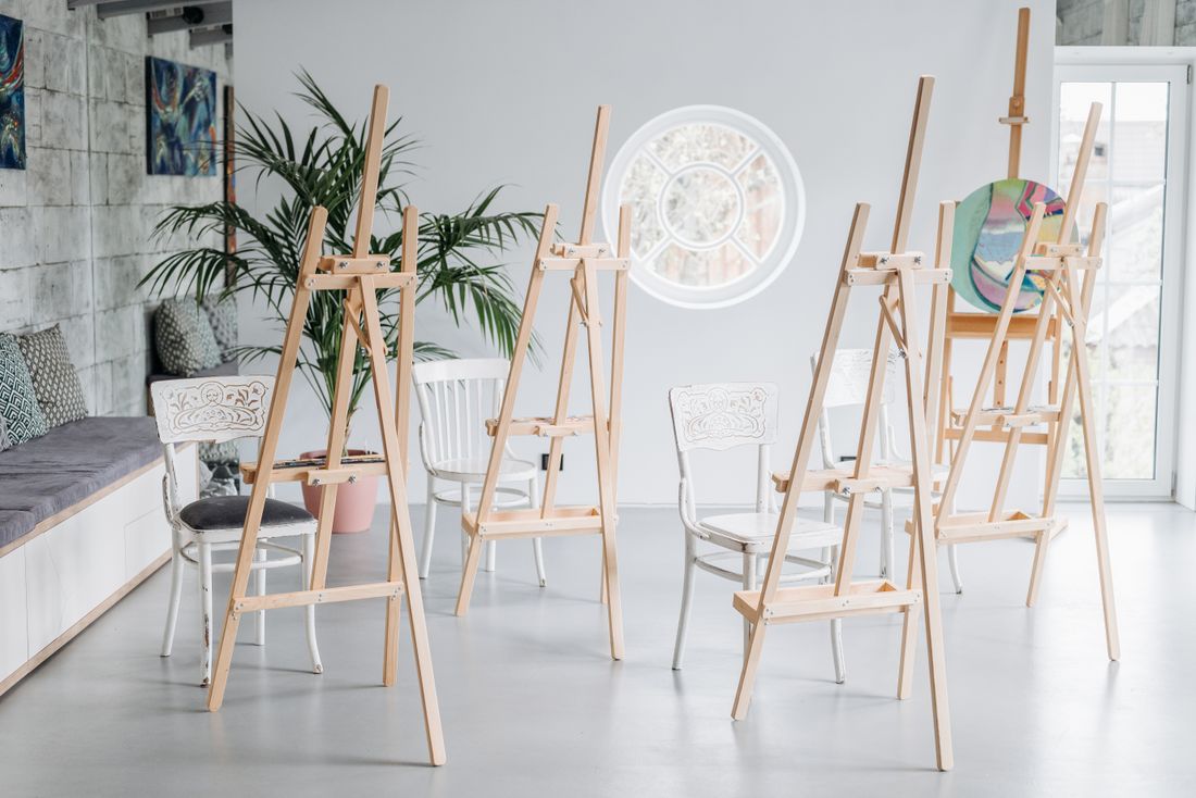
A workshop or class photo set has an audience the session itself never had: everyone still deciding whether to sign up for the next one. They weren't in the room, so the photos have to do the convincing a friend's recommendation usually would, answering a narrower set of questions than “was this a nice event”, will I actually be able to do this, will I be the only beginner in the room, what do I have to show for two hours of my time. Answer those from the pictures alone, and the shot list changes before anyone picks up a camera.
Workshop and class photography for future enrollment has one job: let someone who wasn't there answer three questions from the pictures alone, can I do this, will I fit in, and what will I leave with. That reframes the shot list around proof: the room, hands mid-task, the instructor teaching, and finished results people are holding.
Who is a workshop or class photo set actually for?
A workshop's photo set isn't for the people who were in the room. They already know whether to come back. It's for the person who wasn't there, deciding whether to register, answering three questions from the pictures alone: will I be able to do this, will I be the odd one out, and what do I walk away with.
A normal event recap doesn't work this hard. It documents that something happened, for people who already know what the thing is. Enrollment photos do the opposite: explain what the thing is, prove it's approachable, and prove two hours produces something worth having, to a stranger scrolling past on a phone. That's a persuasion job wearing a documentation costume.
Once that's the brief, the shot list becomes a checklist against those three questions instead of "capture the vibe." A wide room shot answers "will I be able to do this" by showing what's provided. Hands mid-task at a beginner's skill level answer it again. A range of ages and skill levels answers "will I be the odd one out." A finished piece in someone's hands answers "what do I walk away with." None of it is complicated to shoot. It just has to be decided before the first frame, not discovered afterward while sorting through what got shot.
The rest of this comes down to covering those three questions on purpose, plus the practical layer beneath them: consent without stalling class, shooting without becoming a distraction, and why a nonprofit's funder photos rarely match what its enrollment page needs.
What should the room and setup photos prove?
The room and setup photo isn't decoration, it's the answer to "what am I actually signing up for." A clean wide shot of the space, materials laid out, tools visible, enough stations for the group size, tells a prospective student exactly what's provided before they ever ask. It's the photo doing the job a supply list usually does, just faster.
This is where workshop coverage often defaults to the wrong instinct: a tight, styled shot of one perfect station, or a photo taken before the materials are unpacked. Neither answers the real question. A prospective student isn't wondering whether the studio looks nice in isolation. They're wondering whether there's a seat for them, whether the tools look approachable, and whether the room feels like somewhere they'd spend a Tuesday evening.
The most useful version is wide enough to show scale, the number of stations, and the general flow of the room, without needing to be styled first. A room mid-setup, with materials already distributed and light coming in naturally, does more work than a tidied hero shot. If the space has a feature that matters to the class, natural light for painting, ventilation for fumes or dust, that's worth including too. It answers a question a beginner might not think to ask.
One frame rarely covers it. A wide establishing shot plus a closer one of a single station, tools and materials in place, gives an enrollment page two honest options instead of one photo carrying the whole argument.

Why do hands mid-task beat a finished, expert shot?
A photo of hands mid-task at a beginner's skill level does more for enrollment than a photo of finished, expert work ever will, because it shows the actual step a newcomer would be standing at, not the ceiling they're intimidated by. Someone deciding whether to sign up is picturing their own hands in that frame, not the instructor's.
This is a counterintuitive instinct to fight in the moment, because the most visually striking thing in the room is usually the most skilled work in progress: an advanced student's piece nearing completion, or the instructor demonstrating a technique cleanly. Those are the shots that look best in isolation. But they're also the shots that make a first-timer think this isn't for me, because there's no visible step between "I've never done this" and what's in the frame.
The stronger choice is a photo of someone early in the process, hands shaping something rough, materials still messy, the object not yet resembling its finished form. It reads as achievable specifically because it isn't polished. A beginner looking at rough, in-progress hands can picture their own hands there next month. A beginner looking at a nearly finished, technically clean piece usually can't, and the photo quietly does the opposite of its job.
Getting this shot means working close to the table without hovering, and being ready during the early minutes of a session when most hands are still at that rough, early stage, rather than waiting for something that looks more "finished" later on. The less polished moment is the one actually worth capturing.
How do you tell a teaching photo from a performing one?
An instructor photographed teaching, rather than performing, is the difference between a photo that shows guidance actually happening and one that shows someone posing next to their own work. The tell is contact: hands near a student's hands, eyes on what the student is doing, not on the camera or an audience that isn't there.
A lot of instructor photography defaults to the performance version by accident, because it's the easier shot to get. An instructor demonstrating alone, mid-technique, facing the room, reads as competent but doesn't show teaching, it shows a solo skill. It's the photographic equivalent of a lecture rather than office hours, and prospective students can usually tell the difference even if they couldn't name it.
The more useful version happens in the in-between moments: an instructor leaning over a student's table to adjust their grip, pointing at a specific spot on someone's work, answering a question mid-sentence. None of that is staged, and none of it needs to be, because it happens constantly in any class that's actually teaching rather than just demonstrating. It just requires being close enough, and patient enough, to catch it instead of waiting for a cleaner, posed moment that doesn't actually show what a class session feels like.
This photo answers a real hesitation for a first-timer: will someone actually help me if I get stuck, or am I on my own once the demo's over. A photo of hands-on guidance mid-session answers that question directly, in a way a caption promising individual attention can't.
Why does the range of people in the room matter to the photos?
Showing the actual range of ages and skill levels in the room answers a question most workshop photography never addresses: will I be the only person there like me. A prospective student isn't evaluating the craft alone, they're evaluating whether the room will feel comfortable to walk into.
This is easy to get wrong by accident, not on purpose. A photographer naturally gravitates toward the most visually confident moments in a room, which often clusters around whoever looks most at ease in front of a camera, or whoever's work looks most striking mid-process. Shoot only those moments and the resulting set can quietly suggest a narrower room than the one that actually exists: younger, more experienced, more uniform than the class actually was.
The fix is deliberate, not corrective. Across a session, working the room means getting frames from more than one table, more than one age range, more than one visible skill level, including the participant who's clearly newer and a little unsure. That's not a lesser photo, it's the photo that tells a hesitant first-timer the room has space for someone exactly like them. A set that only shows the most polished students is a narrower promise than the class actually makes.
This matters for institutions more than it might seem, since a program's real audience is often wider than its usual marketing photos suggest. A photo set that reflects who genuinely shows up, rather than who photographs best, tends to be the more useful version for enrollment, even with a little more intention built into a single session.

Why photograph the finished piece in someone's hands, not on a table?
A finished piece photographed in the hands of the person who made it answers the last question a prospective student has: what do I actually walk away with. A tabletop shot of the same object, however well lit, answers a different question, one about the object, not about the experience of making it.
The distinction matters because enrollment photos aren't selling the object, they're selling the outcome of two hours spent in that room. A finished bowl on a shelf could have come from anywhere. The same bowl, a little uneven, held by the person who shaped it that afternoon, is specific to the class in a way no still life can replicate. It tells a viewer this is what an ordinary session produces, not what a professional's version looks like.
This shot works best when it isn't overly composed. A slightly rough result, held naturally rather than presented like a product, does more honest work than a perfect piece staged against a clean background. Prospective students aren't expecting gallery-quality outcomes from a first class, and a photo that oversells the result can quietly undersell the room, since it sets an expectation the actual session probably won't meet on a first try.
Hands are enough here; a face isn't required to make the photo land, and keeping the frame close to the object and the hands holding it keeps the focus on the outcome itself rather than on any one person's reaction to it. The object is doing the talking.
How do you handle photo consent without interrupting the class?
Photo consent for a workshop needs to be settled before the session starts, not negotiated mid-class, with an easy way to opt out without a conversation. A heads-up at the start, plus a visible signal (a colored dot on a name tag, a spot near the door), does more than asking table by table once cameras are out.
Some participants genuinely don't want to appear in marketing material, for reasons ranging from a workplace policy to simply not wanting their photo taken that day, and that preference deserves handling without singling anyone out. The organizer or instructor is usually the right person to raise it at the start of class, since it comes from someone the room already trusts, rather than a photographer who's effectively a stranger asking a personal question in front of everyone.
Working without interrupting instruction is the other half of this. The goal is to move through the room like a quiet observer, not an event photographer working a crowd: no flash unless the room genuinely needs it, no asking someone to redo a step for a better angle, no positioning that blocks a student's view of a demonstration. If a moment requires interrupting the class to get it, it usually isn't the moment worth having.
In practice, this means shooting more from the edges and gaps of a session than from the center of it, catching real moments as they happen rather than manufacturing them. A class that never notices the camera is the one that produces the most honest photos anyway.
Why are the last twenty minutes the most valuable, and how is a grant report different from an enrollment page?
The last twenty minutes of a workshop are usually the most valuable stretch to photograph, because that's when finished pieces exist, energy is relaxed, and people are naturally showing their work to each other unasked. Earlier in a session, there's little to show yet; by the end, the room is full of the exact proof an enrollment page needs.
That's also when a nonprofit's two different photo needs diverge. A grant report generally needs evidence: attendance, participation across the population a funder cares about, the program actually happening as described, sometimes paired with specific documentation a funder requires. Those photos can be plainer and more literal, since their job is proof, not persuasion, and they're read by someone who already knows what the program is.
An enrollment page needs the opposite instinct: fewer photos, chosen for how welcoming and achievable they look to someone who's never been in the room, prioritizing the range-of-people, hands-mid-task, and finished-result shots over anything that reads as institutional documentation. The same afternoon can produce both sets, but treating them as one shot list usually shortchanges both, since a photo built for a funder's proof rarely does the work of persuading a stranger to sign up.
Naming both needs before the session, not after, is what keeps a single hour of shooting from being split awkwardly between two audiences it wasn't built to serve. A short list agreed on in advance is what lets the last twenty minutes do double duty on purpose, instead of by accident.
Frequently asked questions
What should workshop photos actually prove to someone deciding whether to sign up?
Three things: that they'd be able to do it, that they wouldn't be the only beginner or the only person their age in the room, and that they'd walk away with something. Photos of the room and materials, hands mid-task at a beginner's level, a range of people actually present, and finished work in someone's hands answer those questions directly, without needing marketing copy to explain them.
Why photograph hands mid-task instead of a finished, polished piece?
A polished, expert result can make a first-timer think the class isn't for them, because there's no visible step between "I've never done this" and what's on screen. A photo of hands early in the process, rough and unfinished, materials still messy, reads as achievable because a beginner can picture their own hands doing the same thing next session. The rough, in-progress moment sells the class better than the impressive, finished one ever could.
How should photo consent be handled for workshop participants who don't want to be photographed?
Settle it before the session starts, not mid-class. A quick heads-up from the organizer or instructor, plus a simple, visible opt-out signal like a colored dot on a name tag or a spot near the door, lets someone decline without a conversation or being singled out in front of the group. Asking table by table once cameras are already out is the version that puts people on the spot and interrupts the class.
Why are the last twenty minutes of a class the most valuable to photograph?
That's when finished or nearly finished pieces exist, the room relaxes, and people naturally show their work to each other without being asked. Earlier in a session there's little finished to show; by the end, the room is full of the exact proof (results in hand, visible progress, relaxed energy) that an enrollment page actually needs. Planning to be there for it matters more than planning for the rest of the class.
What's the difference between photos a nonprofit needs for a grant report and photos it needs for its enrollment page?
A grant report generally needs evidence: attendance, participation across the population a funder cares about, the program happening as described, sometimes specific documentation a funder requires. An enrollment page needs persuasion instead: fewer photos, chosen for how welcoming and achievable they look to someone who's never attended a session. The same afternoon can produce both, but naming both needs before the shoot keeps one from quietly shortchanging the other.
One night, two openings, no dropped coverage.
We plan clustered opening nights before they turn into a scramble, whether that means a split schedule, a second shooter, or an early enough booking that the calendar never becomes the problem.
Explore event coverage →