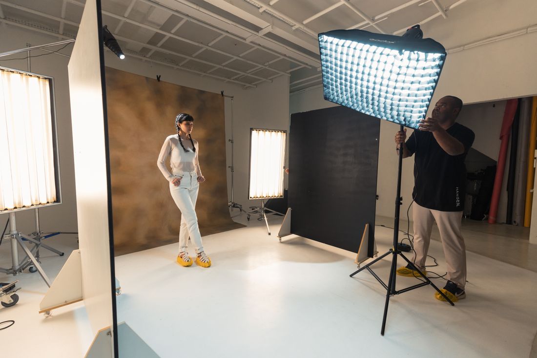
A press kit portrait and a website portrait solve two different problems, even though they're often shot on the same day of the same face. One is a working file built for a stranger who has never met the artist and needs it to drop cleanly into a layout they've already built. The other is an editorial choice that sets the tone of the artist's entire site the moment a visitor lands on the page. Treating them as one interchangeable photo is how an artist ends up with a portrait that half-serves both jobs and fully serves neither.
A press kit portrait is a neutral working file for a stranger on deadline, horizontal and vertical crops, room around the head, high resolution, a ready credit line. A website portrait is a stylized editorial choice that sets the tone of one page for a visitor who already wants to be there. Both can come from one planned session.
What Is a Press Kit Portrait Actually For?
A press kit portrait is a working file made for someone who has never met the artist and is usually on a deadline, a journalist, an editor, or a program coordinator building a page around someone else's words. Its job is to sit next to unpredictable text and layouts without complaint, not to express a personal aesthetic.
That single fact changes almost everything about how the file should look. A stranger opening it has a job to do: fill a slot in a layout, run it next to a headline they didn't write, or crop it against a deadline they can't move. They are not evaluating taste. They are checking whether the photo works in the space they already have.
In practice, the portrait needs to survive decisions the artist never gets to make. A magazine might run it wide across a page, a local paper might squeeze it into a two-column box, and a grant panel might print it in black and white on a shared printer. None of that involves the artist, and the file has to hold up regardless.
That's the real difference from a website portrait: a press kit portrait is judged by how little friction it causes a stranger, and a website portrait is judged by how well it represents the artist to someone who already wants to be there. Both are legitimate jobs. They are not the same job, and treating one as covering the other is where artists end up with an unusable file at the wrong moment.
Who Opens a Press Kit Portrait, and Why Does That Change the Shot?
The person opening a press kit portrait is usually a journalist, editor, or program coordinator working fast, without context, and without loyalty to any particular crop. They need a file that plugs into a layout they've already built, and they move on the moment it fits or doesn't.
That reader's incentives are almost the opposite of a visitor to the artist's own website. A visitor arrived on purpose, already curious, with time to look at one strong image and read the story around it. The press contact arrived because a piece needs a photo credit and a deadline is close. They are not there to be moved. They are there to be unblocked.
This is why the same image often fails in one context and works fine in the other. A tightly cropped, moody square that reads as confident on a homepage can be unusable to an editor who needs a horizontal frame with headroom for a headline, or a vertical frame for a narrow print column. The photo isn't wrong. It was built for the wrong reader.
Once that distinction is clear, the brief for each portrait gets easier to write. A press kit portrait should be built around the constraints of someone else's layout: multiple crops, a neutral background, room to work with. A website portrait should be built around what a visitor should feel in the first few seconds on the page. Naming who actually opens the file, before the shoot, keeps the two jobs from quietly merging into one compromised photo.
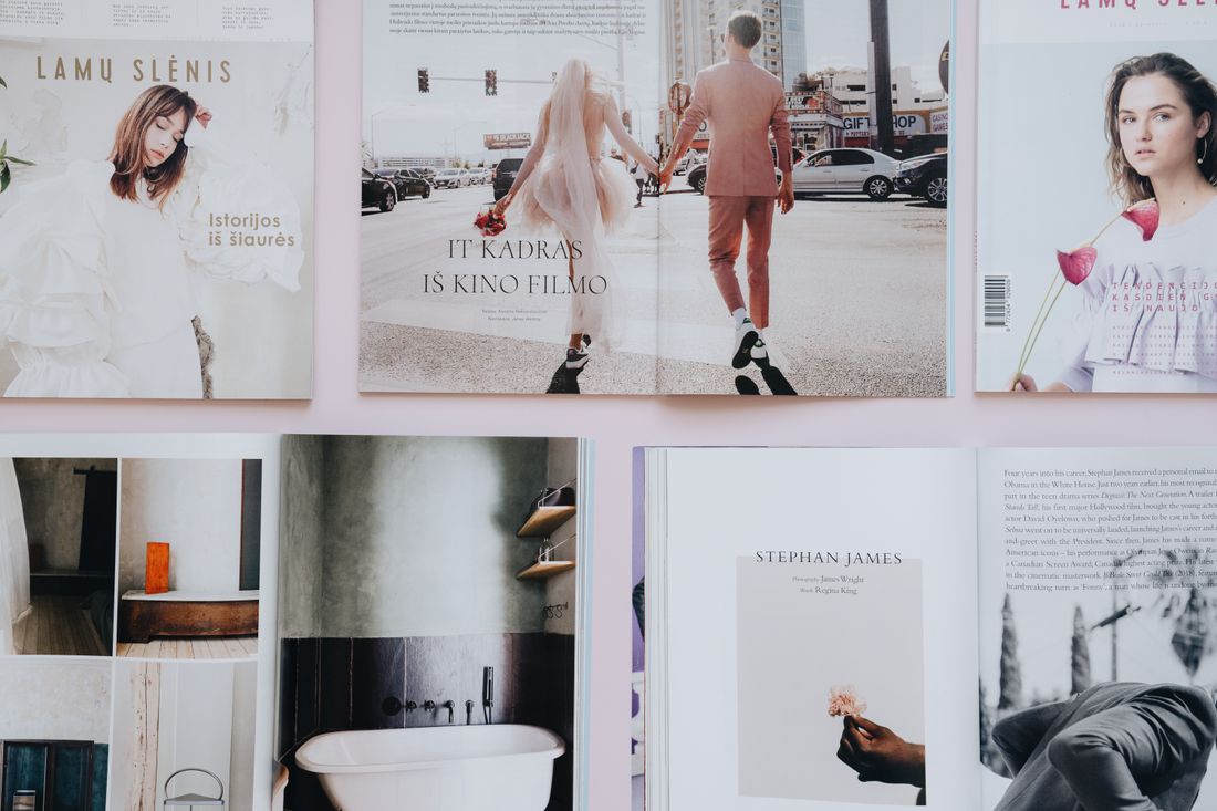
What Crops and Formats Does a Press Kit Portrait Need?
A usable press kit portrait needs at minimum a horizontal crop and a vertical crop from the same setup, shot with enough room around the head and shoulders that an editor can crop tighter without asking for a reshoot. Extra headroom costs nothing on the day and solves a real problem later.
The horizontal version covers wide layouts: a feature banner, a video thumbnail, a panel bio strip. The vertical version covers narrow print columns, mobile bios, and the headshot-style slot a directory or program guide expects. Shooting both from the same setup, same light, same expression, keeps them consistent as a set instead of reading like two spliced-together sessions.
The room-around-the-head part matters more than it sounds. A frame composed tight, with the subject filling most of the image, leaves an editor nowhere to go. If their layout needs the subject positioned left of center with space for a pull quote, a tightly cropped file simply can't do that. Shooting a little looser than feels necessary protects every future use of the file at once.
Resolution belongs on this list too. A press kit portrait should be delivered at a size that can run large in print, not just look fine on a phone screen. A file sized only for a website thumbnail will pixelate the moment a print outlet tries to use it at any real size, and that failure shows up on someone else's page, under someone else's name, with no chance to fix it.
Why Does a Press Kit Portrait Need to Stay Neutral?
A press kit portrait needs to stay visually neutral because it has to sit next to a headline, a pull quote, or a page design the artist has no control over and won't see until it's already published. A heavily styled or trend-specific look can clash with layouts it was never built to share.
This isn't an argument against personality in the photo. It's an argument against betting the file's usefulness on one specific visual moment. A saturated color grade, a very of-the-moment framing choice, or a background with strong pattern can look sharp in isolation and fight badly against whatever a designer places next to it. Neutral doesn't mean bland. It means the photo doesn't compete with elements it can't see coming.
Background choice does a lot of this work. A plain, evenly lit backdrop or a softly out-of-focus setting gives an editor room to place text, crop tighter, or drop the image into a colored template without the background fighting the design. A background with strong graphic elements or busy texture limits where the photo can go before it starts to look wrong.
Expression matters the same way. A natural, direct, unforced expression reads consistently next to a serious feature or a lighter community write-up. An expression built around one specific mood (dramatic, playful, intense) can read as tonally off wherever that mood doesn't fit. Neutral, here, isn't the absence of character. It's the version of the likeness that travels well.
What Does a Website Portrait Have to Do That a Press Kit Doesn't?
A website portrait has to set the tone of the entire site the moment a visitor lands on the page, before they've read a word. It's an editorial choice, not just a photo of the artist's face. The crop, background, and expression should match how the artist wants the work itself to be read.
This is where a website portrait can do things a press kit portrait deliberately avoids. It can be stylized. It can use a crop that only works at one exact size on one exact layout. It can lean into a color palette, a background from the artist's own studio, or a framing choice that would be a liability anywhere else, because on this page, it doesn't need to travel anywhere else.
The visitor already has context a stranger opening a press file doesn't. They arrived because they searched the artist's name, followed a link from a show announcement, or clicked through from social media. They're already curious, and the portrait's job is to reward that curiosity with a specific, considered image rather than a generic, safe one built to survive a hundred uses.
That's why the two files can't be interchangeable. Using the neutral press kit portrait as the site's main image undersells the work of building a page that feels considered. Using the stylized website portrait as the press photo hands an editor a file that fights their layout the moment it leaves the artist's own page. Each is doing a job the other is built not to do.
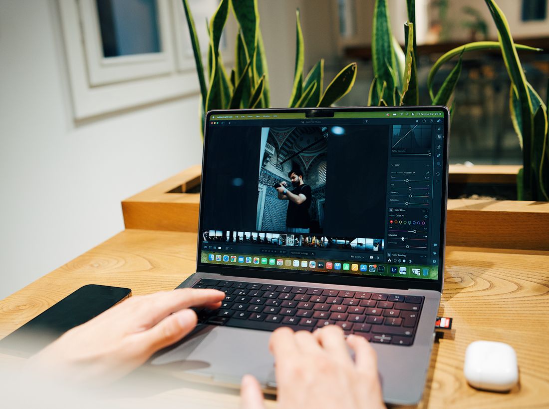
Can You Shoot a Press Kit Portrait and a Website Portrait in One Session?
Yes, both portraits can come from one session, as long as the shoot is planned with two distinct outcomes in mind from the start rather than treated as one setup reused twice. The two portraits usually come from different setups within the same session, not the same frame cropped two ways.
The order that tends to work is starting with the press kit setup: even, neutral light, a plain or softly blurred background, and both a horizontal and vertical frame with generous room around the subject. This is the more technically constrained part of the day, so it's worth doing it early, while the light and the artist's energy are still fresh.
Once the neutral set is covered, the session can shift into the website portrait, where more creative choices are on the table. This is the moment to bring in a studio background, a specific prop, natural light from a favorite window, or a framing choice tied to the work. Because the safe, portable version is already in hand, this part of the day can take real risks without leaving the artist without a usable photo.
The part that gets missed is the changeover in between. A different background, a wardrobe adjustment, or a move across the studio takes real time, and a session planned around one setup often runs out of room for the second. Building both into the same day means budgeting for that changeover from the start, not discovering the time is gone once the neutral shots are already done.
What Should Be in a Press Kit Portrait Package?
A complete press kit portrait package should include a horizontal crop, a vertical crop, both at print-ready resolution, on a neutral background, with a written credit line ready to paste into any layout. Everything in it should be usable by someone who has never spoken to the artist and won't ask a follow-up question.
The credit line is easy to forget and expensive to skip. Publications need to know exactly how to attribute the photo, the photographer's name, spelled correctly, in the format they expect. Handing that over as a plain text line alongside the files, rather than assuming it lives somewhere in an email thread, removes one more reason a photo gets delayed or dropped from a piece.
File naming belongs in this package too, even though it feels like a small detail. A file named clearly, with the artist's name and a version or crop indicator, is far more likely to get used correctly than one buried in a folder of generic camera-export filenames. An editor working across many artists in one week won't dig for context they weren't given.
Finally, the package should include both a color and, where useful, a black-and-white version of the same crop. Some publications run exclusively in grayscale sections, and having that version ready avoids a last-minute conversion done without the artist's input. The package isn't finished when the photo looks good. It's finished when a stranger can use it correctly without asking a single question.
What Should Be in a Website Portrait Package?
A website portrait package should include the final chosen crop at full web resolution, a version optimized for fast loading, and a clear sense of where on the site it belongs, since a homepage hero and an about-page portrait often call for different framing from the same shoot.
Unlike the press kit, this package doesn't need multiple crops for unknown future layouts. It needs the right crop for the layouts that already exist. If the artist's site has a wide homepage banner and a square thumbnail for a bio card, those are the two shapes worth finalizing, rather than a wide set of options nobody will ever use.
Alt text belongs in this package as a real deliverable, not an afterthought added during a later update. A short, accurate description of the image supports both accessibility and search visibility, and it's far easier to write well right after the shoot, with the context still fresh, than months later when someone is just filling in a blank field.
The last piece is a plan for when the image gets replaced. A website portrait represents a specific period of the artist's work and appearance, and it's worth deciding upfront roughly how long it should stay up before it starts to feel out of step with current work. That's not a reason to delay publishing it. It's a reason to treat the file as a living part of the site, not a one-time upload nobody revisits.
Frequently asked questions
Can I just use my website portrait for a press kit?
Not usually. A website portrait is often stylized, cropped tight, or built around one specific layout, which is exactly what makes it work on its own page. A press kit needs a horizontal and vertical crop with room around the head, on a neutral background, so it can drop into a layout the artist has never seen. The two files solve different problems, even when they come from the same session.
Does a press kit portrait need to be black and white?
No, but it helps to have both a color version and a black-and-white version of the same crop ready to send. Some publications and print programs still run exclusively in grayscale, and having that conversion done ahead of time, with the artist's input, avoids a last-minute edit made by someone unfamiliar with the photo. Color should still be the default file unless a publication specifically asks otherwise.
How high-res does a press kit portrait need to be?
High enough to run large in print, not just look sharp on a screen. A file sized only for web use will pixelate the moment a magazine or newspaper tries to print it at any real size. Deliver the press kit version at full camera resolution or close to it, and let the artist or an editor size it down for smaller uses rather than trying to size a small file up.
Do I need a different portrait for every publication I contact?
No. One well-planned press kit set, with a horizontal and vertical crop on a neutral background, should cover most outlets an artist reaches out to. The point of building it with generous room and a plain background is so it can adapt to different layouts without a new shoot for every request. A new session only becomes necessary when the artist's look or work has changed enough to date the old set.
How often should an artist update these portraits?
There's no fixed schedule, but a useful check is whether the photo still looks like the artist does now, next to a recent candid or a mirror. Website portraits tend to age faster because they carry more personality and a specific visual moment. Press kit portraits can last longer since they're built to be neutral, but both are worth revisiting once the artist's appearance or work has clearly moved on.
A portrait that's aged doesn't always need a full reshoot.
We'll look at what you have and tell you honestly whether a refresh session covers it or the work calls for a new concept.
Explore portrait sessions →