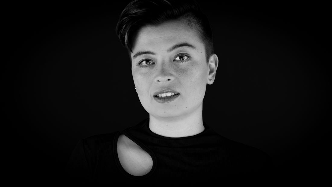
A portrait commissioned for a podcast or video series thumbnail is a different job than a portrait shot for print or a website, even though the request often arrives sounding identical. The file gets judged at a tiny size, in a crowded feed, cropped by a platform the photographer doesn't control, and usually gets a title placed over it later by someone who wasn't in the room. Getting this right starts with the producer's brief, not the photographer's lighting.
A guest portrait built for a podcast thumbnail needs to read instantly at a very small size: strong separation from the background, an open and immediate expression, and generous empty space around the head for a title that gets added after the shoot. The photographer needs to know the use is a thumbnail before the session starts, not after delivery, since that single piece of information changes framing, background, and how many crop options get handed over.
What Does a Guest Artist's Portrait Need to Work as a Podcast Thumbnail?
A thumbnail portrait needs to read clearly at a very small size, in a crowded row of other thumbnails, cropped square or wide by a platform the photographer never touches. That means strong separation from the background, an expression that lands in under a second, and open space around the head for a title someone else adds later.
Most portrait briefs start from the opposite assumption. A print portrait or a website hero gets looked at large and close, for a few seconds at least, so detail and nuance carry real weight. A podcast or video series thumbnail lives inside a scroll of other episodes, most skimmed rather than studied, and the image has to win attention before anyone reads the title next to it.
That changes what a good frame looks like. A subtle, held expression that photographs beautifully at full size can go flat once shrunk down to the size of a coin. A background with texture and depth that feels rich on a website can start competing with the guest's face once everything gets compressed into a small rectangle. None of this makes the usual portrait instincts wrong, it means a thumbnail is a separate brief with its own priorities.
A producer commissioning this kind of portrait is really asking for a different deliverable than a standard sitting. The photographer still needs good light, a comfortable guest, and a strong likeness. What changes is which frame gets chosen as the final, and how much room gets left around the subject for everything that happens to the image afterward.
Why Does a Thumbnail Portrait Need More Empty Space Than a Website Portrait?
A website portrait can fill most of the frame because nothing else competes with it once someone lands on the page. A thumbnail portrait usually gets a title, a guest name, and sometimes a network mark placed over it later, so the photographer has to leave real room for text that doesn't exist yet at the time of the sitting.
This is the most common gap between a portrait shot for a website and one reused as a thumbnail. A tight, chest-up crop filling the entire frame looks confident and finished on a page of its own. The same crop, handed to a producer building an episode graphic, leaves nowhere to put a name or episode number without covering the guest's face.
Empty space here isn't wasted space, it's working space. A wider frame with clear air above the head and to one side gives whoever builds the thumbnail somewhere to place a title without fighting the portrait for room. It also gives the producer options later, since a platform's layout can shift or a show can redesign its template, and a portrait with generous margins survives that change better than one shot tight.
The tradeoff is that a wider frame can feel less dramatic, next to a tightly composed portrait built to be admired at full size. That's a fair trade here. A producer isn't commissioning a portrait to be looked at as a standalone piece of art, they're commissioning a working asset that shares the frame with text, a logo, and whatever else the show's template adds.
What Kind of Expression Actually Reads at Thumbnail Size?
An expression that reads at thumbnail size is usually simpler and more open than the nuanced, held expression that works well printed large or on a full-bleed website hero. Direct eye contact and a clear, single emotional read, warm, curious, or focused, survive being shrunk down, while subtle half-smiles and quieter, closed expressions tend to disappear entirely.
This is a real shift from how most portrait sittings get directed. A photographer working on a press or gallery portrait often chases something more layered, an expression that rewards a longer look. That's the right instinct for a portrait meant to be studied. It's the wrong instinct for one that has to communicate its whole feeling before someone's thumb finishes scrolling past it.
A useful test during the shoot is simple: shrink a preview down on a phone screen and look at it the way a viewer actually will, small, next to other thumbnails, for a second or two. Expressions that felt strong on a full-size monitor sometimes go flat at that size, and expressions that felt slightly too broad in the room often turn out to be exactly what carries at a glance.
None of this means directing the guest toward a stiff, oversized smile. It means favoring clarity over subtlety when the two are in tension, and checking the shrunk-down version before calling the session finished. A guest who's an artist or performer, comfortable being looked at, usually adapts quickly once a producer explains why the ask differs from a normal portrait sitting.
How Much Control Does the Photographer Actually Have Over the Final Crop?
Once a portrait becomes a video series thumbnail, the platform, the show's graphic template, and whoever builds the episode art usually decide the final crop, not the photographer. The photographer's real job is delivering a file with enough room and enough separation that any of those later crops still works cleanly.
This is worth saying plainly because it resets expectations on both sides. A photographer used to controlling the final crop of a portrait, choosing exactly where the frame ends and how the composition balances, has to hand some of that control away for this use. The producer, meanwhile, is often the one actually making the crop decision later, sometimes weeks after the shoot, inside a template built by someone who never met the guest.
That handoff works best when it's acknowledged upfront rather than discovered after delivery. A photographer who knows the final crop is out of their hands can shoot and deliver in a way that protects the image either way, keeping the guest safely inside the frame at multiple reasonable crop points instead of composing for one perfect, final version that assumes nobody will ever touch it again.
The producer's side of this is just as real. Whoever builds the thumbnail later needs to know roughly where a face and shoulders sit in the file so a template's fixed text zone doesn't land across someone's eyes. A short conversation between photographer and producer about how the show's template usually places text solves this in minutes and avoids a frustrating recrop down the line.
What Should a Producer Ask For Before Booking the Portrait Session?
Before booking, a producer should tell the photographer plainly that the portrait is for a thumbnail, name the rough shapes the show's thumbnails usually take, square, wide, or both, and mention whether a title or logo gets placed over the image afterward. That short heads-up changes framing, background choice, and how tight the photographer crops in camera.
Producers sometimes leave this out because it feels obvious from the request, a portrait for a podcast episode. It isn't obvious to the photographer without being said, since the same request could just as easily mean a still for the show's about page or a press photo for an interview writeup, both of which get shot very differently than a thumbnail does.
A useful step is sharing one or two current thumbnails from the show, not as a style reference to copy exactly, but so the photographer can see how much space the template usually eats into the frame and where the text tends to sit. That single reference answers most of the framing questions a photographer would otherwise have to guess at.
It also helps to say who's building the final thumbnail graphic and roughly when. If that person is a separate editor working from the delivered files later, the photographer benefits from knowing the portrait needs to hold up on its own without them present to explain the crop choices. If the photographer is doing the whole thing themselves, that same conversation can happen naturally during the shoot instead of over email afterward.
What Should the Photographer Hand Over After the Shoot?
A thumbnail-ready delivery usually includes a handful of frames with generous headroom, rather than one tightly finished hero image, so the producer can crop later without requesting a reshoot. A couple of different expression options matter too, since an editorial team may prefer a different frame once they see it next to an actual title.
This is a departure from how a lot of portrait deliveries work by default. A photographer used to handing over one polished, final selected image, cropped and finished exactly as intended, is doing the producer a disservice here, even if that same approach is exactly right for a website or a print piece. A single fixed crop with little margin leaves no room to react if the platform's layout doesn't match what the photographer assumed.
Before sending anything, it's worth looking at the delivery the way it will actually be seen: shrunk down, small, sitting next to a title. A file that looks slightly loose at full resolution often looks exactly right once it's small and has text sitting over part of the frame. Judging the crop at full size alone is the easiest way to hand over a portrait that turns out too tight once it's actually in use.
A short note alongside the files helps too, flagging which frame the photographer thinks reads clearest at a glance and where the safest space sits for text. That doesn't remove the producer's ability to choose differently, it just saves them from guessing at something already worked out during the shoot.
What Usually Goes Wrong When a Portrait Wasn't Shot With a Thumbnail in Mind?
A portrait shot for a different purpose usually fails as a thumbnail in a specific, recognizable way: the subject is cropped too tight for a title to sit anywhere without covering their face, the background carries enough detail to compete with text, or the expression is subtle enough that it reads as flat once shrunk down. None of these are shooting mistakes in the original context, they're mismatches with a use the photographer never knew about.
This shows up most often when a producer reaches into an existing photo library rather than commissioning something new. The guest's press portrait might be a beautiful, tightly composed image built for a magazine feature or a gallery bio. Dropped into a thumbnail template, that same tight crop leaves the episode title nowhere to sit except over the guest's eyes or across their shoulder, which nobody wants.
The workaround producers usually reach for, shrinking the image and adding a colored bar or semi-transparent panel behind the text, is a real fix, but it's a patch on a portrait that wasn't built for this. It works, and it's reasonable when a new sitting isn't possible, but it rarely looks as considered as a portrait that had this use in mind from the start.
None of this is the original photographer's fault. They delivered exactly what the brief asked for. The fix isn't better shooting, it's earlier communication, telling the photographer up front that a portrait needs to double as a thumbnail, worth raising before any future session gets booked for a guest artist.
How Is a Thumbnail Portrait Different From a Press Photo or Website Portrait?
A press photo or website portrait can hold detail and nuance because the viewer has already chosen to look at it and has a few seconds to take it in. A thumbnail portrait has to do its entire job in the moment before someone decides whether to click, so legibility beats subtlety every time the two priorities are in tension.
That difference runs through nearly every choice in the brief. A press portrait can use a moodier, layered expression, since a reader looking at it has already committed some attention. A thumbnail portrait needs an expression that reads instantly to someone who hasn't committed yet. A website portrait can fill its frame edge to edge, since nothing competes with it on the page. A thumbnail portrait needs margins for text that arrives later, from a different person, on a different day.
None of this means a thumbnail portrait is a lesser version of a proper one. It's a different working document with its own honest requirements, closer to a piece of production design than a standalone piece of portraiture. Treating it that way, rather than as a smaller, cropped-down version of a website or press portrait, is what produces a thumbnail that holds up once it's sitting in a real feed next to a dozen other episodes.
For a producer commissioning the work, the most useful move is naming the use plainly at the start, thumbnail, not press, not website, so the photographer can build toward the right target from the first frame instead of retrofitting a different portrait after the fact.
Frequently asked questions
Can the same portrait session produce both a website portrait and a podcast thumbnail?
Usually, yes, if the photographer knows both uses upfront. A single sitting can cover a tighter, more detailed frame for the website and a wider, more open frame with extra margin for the thumbnail, since the guest, light, and setup stay the same either way. What matters is naming both uses before the shoot so the photographer plans the range of crops rather than delivering one fixed final image that only serves one of the two.
Does the guest artist need to pose differently for a thumbnail portrait?
Not dramatically, but the direction shifts. A photographer usually asks for a clearer, more open expression than they might for a press portrait, since subtle expressions tend to flatten out at small size. Posture and framing lean toward simple and centered rather than moody or heavily cropped. Most guests, especially performers used to being photographed, adjust to this direction quickly once it's explained as a practical need rather than a style note.
What background works best behind a guest for a thumbnail portrait?
A plain, uncluttered background works best, since anything busy competes with the title text added later. A single flat color or a soft, even wall gives the strongest separation between the guest and whatever gets placed over the image afterward. Backgrounds with visible texture, pattern, or depth can look great in a full-size portrait and still cause real problems once the frame gets shrunk down and text lands on top of it.
Should the photographer shoot square instead of the show's normal aspect ratio?
Shooting a bit wider than any single target ratio is usually the safer move, rather than committing to square specifically. A wider frame with the guest positioned centrally can be cropped down to square, wide, or another shape later without losing anyone's head or shoulders. Locking into one exact shape during the shoot only works well if the producer is certain that shape won't ever change.
How many images should a producer expect back from a thumbnail-focused portrait sitting?
Expect a small handful of finished options rather than a single hero image. A few different expressions, each with enough surrounding room to crop safely, gives a producer or editorial team room to choose once they see a frame sitting next to an actual title. One tightly finished final image, however well made, leaves no room to react if the first choice doesn't work once it's in the template.
Let's find out which one you actually need.
We shoot both refresh sessions and full new concepts, and we'll tell you honestly which one your portrait needs before we book anything, not after.
Explore portrait sessions →