THE LIGHTROOMSTUDIO · NYC
Menu
Start a project

Portrait Composition

Should Your Artwork Be in Your Portrait?

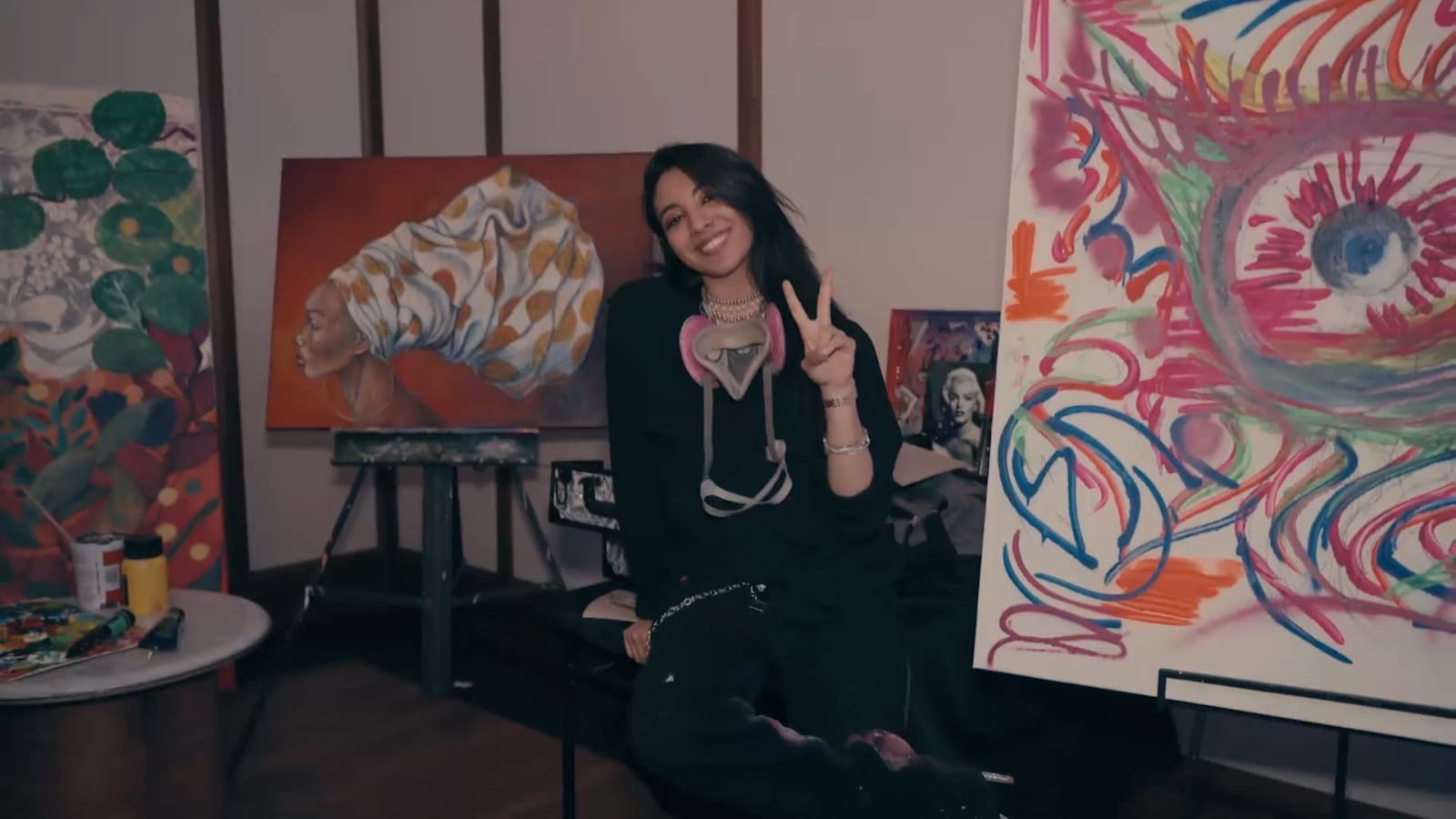
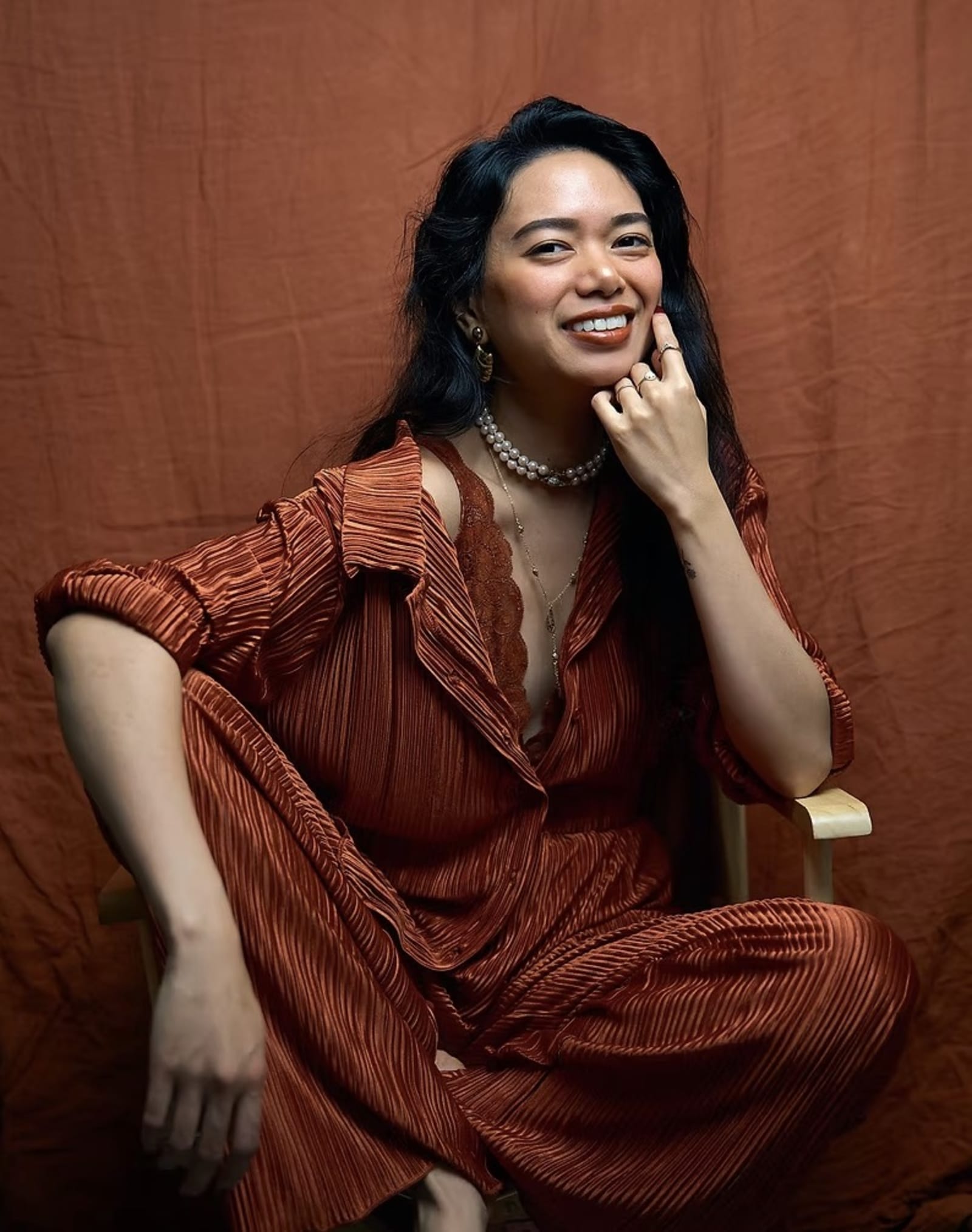
Every artist portrait that includes a piece of work is making the same quiet decision: is this a portrait of a person, or a portrait of a person standing near an object. Most of the time nobody plans that choice on purpose. The painting was already leaning against the wall, the sculpture was on the stand, and it seemed easier to leave it in frame than to move it. That default works some of the time and works against the photo the rest of the time. The difference usually comes down to a handful of specific decisions: how much of the work is visible, how far the subject stands from it, and what the photo actually needs to do once it leaves the shoot.

By The Lightroom StudioPublished August 17, 2026Updated August 17, 2026
A man in a dark coat standing small in front of a large, ornately framed classical painting on a gallery wall
Photo by ArtHouse Studio via Pexels. A generic example of a large artwork overwhelming a figure in frame, not a Lightroom Studio client session.

Every artist portrait that includes a piece of work is making the same quiet decision: is this a portrait of a person, or a portrait of a person standing near an object. Most of the time nobody plans that choice on purpose. The painting was already leaning against the wall, the sculpture was on the stand, and it seemed easier to leave it in frame than to move it. That default works some of the time and works against the photo the rest of the time. The difference usually comes down to a handful of specific decisions: how much of the work is visible, how far the subject stands from it, and what the photo actually needs to do once it leaves the shoot.

Artwork belongs in a portrait when it shows something the person alone can't, like scale, material, or process, and it works against the portrait when it's brighter, busier, or larger than the subject. Composition choices like distance, aperture, and cropping decide which one wins. A plain background is often the stronger, more durable choice, and the photo's intended use should decide the call before the shoot starts.

Should Your Artwork Be in Your Portrait at All?

Artwork belongs in a portrait when it adds context a viewer needs and can't get any other way, and it doesn't belong when it's there out of habit or because a blank wall felt boring. The honest test is whether removing the artwork would remove information, or just remove decoration.

Most artists default to including the work because it feels like proof: here is what I make, and here I am standing next to it. That instinct isn't wrong, but it treats the portrait like a label rather than an image. A portrait with the work in frame should be doing more than confirming the person is an artist. It should show something about how the artist relates to the work: scale, material, process, or setting that a plain headshot can't convey.

The decision isn't really about taste. It's about function. A portrait used on a gallery wall label needs different information than a portrait used as a bio photo or a festival submission thumbnail. The artwork earns its place in the frame when it answers a question the viewer would otherwise be left asking. It costs the portrait something when it just fills space behind the subject.

A useful way to check: describe the portrait out loud without mentioning the art. If the description still makes sense and still sounds like a real portrait of a person, the artwork is optional in that frame. If the description falls apart without the painting or sculpture in it, the work is probably doing real compositional work and deserves to stay.

When Does Including Your Artwork Strengthen the Portrait?

Artwork strengthens a portrait when it shows something the person alone can't: scale next to a large piece, texture next to a heavily worked surface, or a working relationship between hands and material. The work should read as context for the artist, not as a second subject competing for the same attention.

Scale is one of the clearest reasons to include a piece. A ten-foot canvas or a floor-standing sculpture is hard to describe in words and impossible to feel from a headshot. Standing the artist next to it, even partially in frame, gives a viewer real information about size that a caption can't replace. The same logic applies to installations, where the artist's presence is the only way to show how a body moves through the piece.

Texture and material work the same way on a smaller scale. A close, three-quarter portrait next to a heavily worked canvas or a raw clay surface lets the viewer register something about the physical work behind the image, not just the finished result. That reads differently than a plain studio backdrop, because it ties the person to a specific, visible practice.

The work also strengthens the portrait when it shows a relationship rather than a display: hands mid-process, a partially finished piece, tools still in use. That framing keeps the art secondary to the person while still letting it earn its place in the shot. The moment the artwork becomes the reason to look at the photo instead of the person, the balance has shifted the other way.

An artist seated near a window in a sunlit studio, with a large painting and work materials visible in the background
Photo by Alina Rossoshanska via Pexels. A generic example of a studio portrait with artwork as supporting context, not a Lightroom Studio client session.

When Does the Work Compete With or Overwhelm the Subject?

The work overwhelms the portrait when it pulls the eye away from the person, usually because it's brighter, busier, or larger in the frame than the subject. A viewer's attention goes to the strongest visual signal first, and a saturated painting or an ornately framed piece will usually win against a person standing quietly in front of it.

This is a common mistake in artist portraits: centering a large finished piece behind the subject because it's the strongest work in the studio, then wondering why the portrait reads as a photo of the painting with a person in front of it. Color is usually the culprit. A wall of saturated reds or a high-contrast abstract will out-compete a face for attention almost every time.

Ornate framing does the same thing differently. A gilded frame or a heavy shadow box adds visual weight that pulls the eye toward the object rather than the person standing near it. The same problem shows up with busy gallery walls, where multiple pieces crowd the background and compete with each other before they compete with the subject.

The fix isn't always removing the art. Sometimes it's changing the relationship: shooting from farther back so the piece reads as environment rather than centerpiece, opening the aperture so the work softens behind the subject, or choosing a quieter piece to stand near instead of the boldest one in the room. The goal is a frame where a stranger's eye lands on the person first, not the reverse.

What Composition Choices Keep You as the Subject When Art Is in the Frame?

Depth of field, camera distance, and where the subject stands relative to the work all decide whether a person or a painting reads as the subject. Placing the artist off-center from the artwork, using a wider aperture to soften the piece behind them, and keeping the person closer to the camera than the work all keep attention where it belongs.

Distance from the camera is the simplest lever. A subject standing several feet in front of a piece, rather than flush against it, naturally reads as closer and larger in the frame, which keeps them as the visual anchor even with a large work behind them. The moment the artist and the artwork sit on the same plane, the eye has to work harder to decide which is the subject.

Aperture does similar work optically. A wide aperture that keeps the person in sharp focus while letting the background artwork soften into color and shape turns the piece into atmosphere rather than a second point of focus. This is often the single most effective adjustment, because it doesn't require moving anything in the room.

Framing choices matter too. Placing the subject off-center rather than dead-center in front of a piece avoids the symmetrical, plaque-like composition that reads as documentation rather than portrait. Cropping tightly enough that only a portion of the artwork is visible, rather than the entire canvas, also helps, since a partial glimpse of color or texture reads as context while a full reproduction of the piece competes on equal footing with the person next to it.

When Is a Plain Background the Stronger Choice?

A plain background is the stronger choice when the portrait needs to work across many contexts, when the available work isn't strong enough to hold up as a backdrop, or when the goal is a clean read of the person's face and presence without anything else asking for attention. A work-free portrait is a legitimate outcome, not a fallback.

A portrait that needs to travel across a bio page, a press kit, a grant application, and a conference badge all at once benefits from staying simple. Artwork in the frame ties the image to a specific piece or period, which can look slightly wrong the moment that piece sells or stops representing the current direction of the work. A plain background doesn't carry that risk, and it doesn't need updating every time the studio changes.

Not every studio or every piece photographs well as a backdrop, either. A space with harsh overhead lighting, visible clutter, or work that isn't finished enough to be shown is not a good candidate for an in-context portrait, even if the artist prefers to be photographed near their own work. In that case, a plain background isn't a compromise. It's the version of the portrait that actually looks intentional.

There's also a simple visual argument for it: a clean background puts full weight on expression, posture, and light on the face, without anything competing for a second read. For artists whose primary need is a strong, flexible headshot rather than a documentary image of their practice, that clarity usually serves them better than an artwork-heavy portrait would.

A close portrait of a woman against a plain gray studio background, with no artwork in frame
Photo by Andrea Musto via Pexels. A generic example of a plain-background portrait, not a Lightroom Studio client session.

How Should the Photo's Intended Use Drive This Decision?

The intended use should decide the composition before the shoot starts, because a bio photo, a press kit image, gallery wall text, and a social post ask the portrait to do different jobs. Knowing which use matters most, before the shoot, decides whether artwork belongs in the frame.

A bio photo, the one used on a website's about page or a submission form, usually benefits from staying simple. It gets seen next to a lot of text, often small, and needs to read clearly at a glance. A busy background competes with legibility at that size, so a cleaner composition, with or without a soft hint of the studio, tends to hold up better.

A press kit photo can carry more context, since it's often paired with a full write-up and gives the viewer time to look. This is where an in-context portrait, artist near a specific piece or in a recognizable studio setting, does real work, because press coverage benefits from a photo that says something specific about the artist's practice rather than a generic likeness.

Gallery wall text photos are usually small and printed at low resolution next to a label, so fine background detail gets lost at that size. The safest choice is often the simplest one: a clear, well-lit portrait that reads even when shrunk down. Social posts have the most room to experiment, since they're seen briefly and paired with a caption that supplies whatever context the image alone doesn't carry.

How Much of the Artwork Should Actually Be Visible in the Frame?

Enough of the artwork to be recognizable as art, not enough to be readable as a specific finished piece, is usually the right amount. A partial view, a soft crop, or an out-of-focus edge gives the viewer texture and color without turning the portrait into a second photograph of the painting itself.

A full, sharp, evenly lit reproduction of a piece inside a portrait tends to read as two images stapled together: a documentation shot and a headshot sharing one frame. That's rarely the intent, but it's the visual result when the whole canvas is visible and in focus at the same time as the subject. The viewer's eye has two complete things to look at instead of one.

Cropping the artwork at the edge of the frame, letting part of it run off the side or top, keeps it present without letting it compete on equal terms. The same goes for partial visibility behind the subject's shoulder or body, where the person naturally blocks part of the piece. That kind of overlap reads as a real moment in a real room, rather than a staged pairing of two separate subjects.

Focus does the rest of the work. A piece that's slightly soft behind a sharply focused subject reads as environment, the way a blurred street reads as a location rather than the subject of a street photo. The goal isn't to hide the artwork. It's to make sure a viewer understands, without thinking about it, which part of the frame they're supposed to be looking at first.

How Do You Decide, Before the Shoot, Whether Artwork Belongs in the Frame?

Decide by starting with the primary use of the photo, then checking whether a specific piece adds real information for that use or just fills the background. If the artwork answers a question the plain portrait couldn't, include it. If it's there because the studio felt empty without it, leave it out.

Start with how the photo will actually be used most often, not the ideal use it might someday have. A single portrait rarely needs to do everything, and trying to make one image serve a bio page, a press kit, and a gallery label at once usually means it does none of those jobs particularly well. Picking the dominant use narrows the composition question fast.

Next, ask what the artwork would actually communicate if it stayed in frame. Scale, material, and process are real reasons to include a piece. A vague sense that the photo needs to look more artistic is not. If the honest answer is that the work is there to fill space or prove a credential, it's worth testing the shot without it first.

It also helps to shoot both versions when there's any doubt: one with the work in frame, one without, using the same light and the same framing distance. Comparing them side by side usually makes the right answer obvious in a way that arguing about it in the abstract doesn't. Whichever version keeps the eye on the person first is generally the one that should ship, regardless of which one felt more interesting to shoot.

Frequently asked questions

Can the same portrait work for both a bio photo and a press kit?

Sometimes, but it's not guaranteed. A bio photo usually needs to read clearly at a small size next to text, which favors a simpler composition. A press kit photo has more room to carry context, including artwork in the frame. If one version has to serve both, lean toward the simpler composition, since a clean portrait scales down well but a detailed, artwork-heavy portrait often loses its point once it's shrunk.

Does a blurred painting in the background still count as artwork in the portrait?

Yes, and it's often the better version of that choice. A softened, out-of-focus piece behind the subject still communicates color, texture, and setting without competing for sharp focus with the person's face. It reads as environment rather than a second subject. The tradeoff is that a specific piece becomes harder to identify once it's that soft, so this works better when the goal is atmosphere rather than documenting a particular work.

Should the artwork in a portrait be a finished piece, or can it be work in progress?

Either can work, and they communicate different things. A finished piece in frame reads as a statement about completed work, which suits a portrait tied to a show or a body of work. A piece in progress, still on an easel or on the wheel, reads as process and suits a portrait meant to show how the artist works rather than what they've already made. Match the choice to what the photo needs to say.

Should artwork stay out of a portrait so it doesn't need to be reshot as the work changes?

That's a real reason to lean toward a plain background, but it's not automatic. A portrait tied closely to one piece can start to feel out of date once that piece sells or the artist's direction shifts. If the portrait needs to stay usable for years without updating, a plain or lightly textured background ages better than a specific, recognizable painting or sculpture standing behind the subject.

Does including artwork in a portrait work better for painters and sculptors than for other kinds of artists?

It tends to work more naturally for artists whose work is visually distinct and easy to photograph, like painters and sculptors, since a canvas or a form reads clearly in frame. Artists working in less visual mediums, sound, performance, or conceptual work, often get more from a plain-background portrait paired with strong captioning, since the work itself doesn't translate as cleanly into a single static image behind them.

What Makes a Creative Portrait Feel Like You?How to Prepare for an Artist Portrait SessionDoes Your Portrait Need a Refresh, Not a Whole New Concept?
Back to the Journal →

Let's find out which one you actually need.

We shoot both refresh sessions and full new concepts, and we'll tell you honestly which one your portrait needs before we book anything, not after.

Explore portrait sessions