
A portrait of a collector, an advisor, or a foundation head photographed among the work they've assembled looks simple to plan and goes wrong in specific, repeatable ways. It isn't an artist portrait, because the person didn't make anything on the wall. It isn't a corporate headshot, because the room is a home or a foundation, not an office. Getting it right means treating the relationship between the person and the collection as the actual subject, then making every decision on set in service of that.
A collector portrait works when it photographs the person, not the collection: one recognizable piece rather than a crowded wall, warmer and more relaxed than a finance headshot, more composed than an artist caught mid-work, lit separately from the art itself, and cleared for publication before the shutter ever clicks.
What Makes a Collector Portrait Its Own Genre
A collector portrait sits between two familiar genres and belongs to neither one. It isn't an artist portrait, because the person in the frame didn't make anything hanging on the wall behind them. It isn't a corporate headshot, because the setting is a home, or a foundation, not an office. Treat it as either and the picture goes wrong in a predictable way.
Shot like an artist portrait, the collector reads as a stand-in for someone else's authorship, posed the way a painter poses next to their own canvas, which looks off the moment a viewer realizes the collector didn't make the thing on the wall. Shot like a headshot, the art becomes wallpaper: a backdrop chosen for status rather than meaning, cropped tight enough that a major work and a poster read the same. Both mistakes import a formula built for a different relationship between subject and object.
What actually distinguishes this genre is the relationship being photographed: someone who chose, lived with, and often paid close attention to work they didn't make. That's a curatorial relationship, not a creative one, and it should read on camera as attentiveness rather than authorship, a person who notices things, who put a room together on purpose. The subject looks like someone who lives with good decisions, not someone auditioning to be an artist or a chief executive.
Once that relationship is the actual subject, everything else that follows, how much art to show, how to light it, how to frame it, comes from getting that one distinction right first.
Photograph the Person, Not the Collection
The single biggest mistake in this genre is answering the wrong question. The brief is a portrait of a person; too many end up as a portrait of a collection with a person standing in it, easy to do because the art is usually more visually interesting than a person standing still.
That mistake shows up in small ways. The frame gets composed around the wall instead of the face, so the strongest painting sits dead center and the person drifts to one side of it. The person gets asked to look at the art instead of the camera, which reads as reverence toward the object rather than character in the subject. The lighting gets set for the art's color and glare first, and the face gets whatever falls off it as an afterthought. Each choice is small; together they add up to a picture where the collection is the subject and the collector is the caption underneath it.
The fix isn't hiding the art, it's making every decision in service of the person. Where they stand relative to a piece should say something about how they relate to it: close and turned toward it if genuinely intimate, more open and facing the camera if the point is simply that this is their home. Expression and posture carry more weight than any single work on the wall. A collector portrait that works tells you, at a glance, that this is a specific person with a specific way of occupying a room, and the art is evidence of that, not a substitute for it.
How Much Art Should Actually Be in the Shot
One recognizable work almost always beats five. A single piece gives the eye something to register and return to; a wall of art gives the eye a puzzle to solve, and portraits aren't puzzles, the viewer either resolves the face first or gives up trying. Most collector portraits benefit from choosing one anchor work, or none at all, rather than representing the whole collection in a single frame.
There are three honest options, and each does a different job. A single, deliberately chosen piece, visible, in focus, close enough to read, signals that this particular work matters to the sitter, and suits a shoot where the piece has a real connection to them: something they fought to acquire, something tied to how they started collecting. A wall as texture, several works soft-focused or partially cropped behind the subject, signals depth and range without asking the viewer to catalogue anything, and suits a foundation head or advisor whose story is breadth rather than one object. A suggestion of art, a frame edge, a plinth, negative space that implies more just outside it, signals restraint and works when the room itself, not any single piece, is doing the talking.
What doesn't work is trying to do all three at once. A wall of several recognizable paintings competing behind a person in sharp focus reads as inventory, useful for a condition record, wrong for a profile piece. Deciding before the shoot which job the image needs to do is most of the work; framing follows from that choice, not the other way around.
A Portrait Isn't the Same as Documenting the Collection
A portrait that includes a piece of art is not the same product as documenting that art, and it's worth being clear about which one a client is actually booking. A collector portrait exists to photograph a person; the painting behind them is supporting context, lit for the face, often soft, cropped, or partially out of frame. It isn't a color-accurate, print-ready record of the work itself.
Real documentation is its own line item, priced per piece. An Essential tier at $50 gets one color-accurate hero shot, color-corrected and print-ready. Standard at $85 adds two separate hi-res detail shots. Gallery at $150 adds a 15 to 30 second video clip. Glazed or framed work carries a flat $200 polarized-lighting setup fee per session, not per piece. NYC bookings carry a $500 minimum, positioned as room to bring a few more pieces to the same session rather than a surcharge. Collections outside the city, in Fairfield County, Westchester, or the Hamptons, are quoted per visit instead, since access, volume, and travel vary too much for a published flat rate.
A collector who wants both, a portrait for a profile piece and real records of what's on the walls, is booking two different things, even if they happen on the same visit. Saying so up front avoids the more common misunderstanding: a client assuming the portrait session already produced usable documentation of the collection, when it didn't.
The Right Register: Warmer Than Finance, More Composed Than the Studio
The right register for a collector portrait sits in a narrow band between two familiar extremes: warmer and more relaxed than a finance headshot, more composed and intentional than an artist photographed mid-work in their own studio. Miss in either direction and the portrait misrepresents the relationship it's meant to show.
A finance-headshot register, arms crossed, direct stare, hard light, dark suit, reads as institutional authority, which is the wrong claim for someone whose defining trait here is taste rather than title. It flattens a collector or foundation head into a generic executive, indistinguishable from any other portrait shot for an annual report. The art behind that kind of pose looks incidental, like a prop dropped in afterward, because the body language is telling the viewer this is a person at work, not a person at home with what they've chosen.
The opposite failure comes from over-correcting into artist-in-studio energy: a loose, mid-gesture pose, raw natural light, an unposed moment supposedly caught in progress. That register belongs to someone shown making something, and a collector isn't making anything in this frame; borrowing the posture without the underlying activity reads as performance rather than authenticity.
The register that actually fits sits between them: seated or standing with weight settled rather than braced, expression open rather than guarded, posture that says this room is theirs without saying they're on display in it. Warmer light than a corporate set, tighter composition than a studio candid. At-home, not presenting, a phrase worth returning to on set whenever a pose starts drifting toward either extreme.
Where These Portraits Get Used, and Why That Decides the Crop
Where a collector portrait will run decides its crop before the shoot even starts, because a foundation's site, a press piece, an advisory firm's team page, and a catalogue essay each want a different shape from the same setup. Planning for one placement usually leaves the image unusable for the others without a reshoot.
A foundation or institution's site typically wants a wide, environmental frame, the person situated in a room that communicates scale and mission, often run large on a landing page. A press piece runs smaller and needs a tighter vertical that still reads at thumbnail size, where a wide environmental shot collapses into an unreadable strip of wall and a small face. An advisory firm's team page usually wants something closer to a considered headshot with just enough environment to signal art expertise rather than a law office, a fragment of a frame or a plinth edge, not a full room. A catalogue essay can support a more editorial image, since the surrounding text carries context a standalone web image doesn't have.
Because these needs conflict, it's standard for both a vertical and a wide of the same setup to get requested from one sitting, not as a luxury but because the client doesn't yet know every place the image will run, and a single crop rarely serves a foundation site, a press outlet, and a firm's own page equally well. Building that flexibility into the shoot, composing so a clean vertical already exists inside the wide frame, costs almost nothing on the day and saves a second session later.
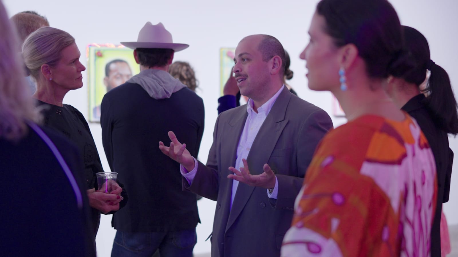
The Practical Problems: Light, Glass, and Flattening
Three technical problems come up in almost every collector portrait, and all three trace back to the same root cause: the room was lit for looking at art, not for photographing a person standing in front of it. Solving them is a lighting and positioning problem, not a styling one.
Artwork is usually lit to minimize glare and render color accurately, even, diffuse light, often from above or from picture lights mounted close to the frame. A person standing in that same light gets flat, shadowless illumination that does nothing for a face; portraits need directional light that shapes a face with visible falloff, close to the opposite of what protects a painting's surface. The fix is usually a second, separate light for the person, metered independently from whatever is already lighting the wall.
Glazed or varnished pieces reflect whatever is in front of them, including the photographer and the light stand, a problem often invisible to the eye and obvious the second the image is reviewed. Shooting at a slight angle to the glass, rather than dead-on, and checking the frame on a tethered screen before finalizing a pose, catches this before it becomes a reshoot.
Standing a person directly in front of a painting, flush against the wall, flattens both: the person loses depth because there's no shadow separation from the background, and the painting loses depth because it reads as backdrop rather than object. Real distance between subject and wall, even a foot or two, lets each keep its own dimensionality, and lets the photographer control what stays sharp.
Permissions and Discretion
A collector portrait almost always shows more than the sitter's face: named artists on the walls, evidence of what they can afford, often the inside of a private home. Agreeing on what can be published, and what stays private, is part of the job, not a step handled after delivery.
The privacy risk is specific, not abstract. A window in the background can place a home on a particular street once someone crops in on it. A visible security panel or alarm keypad tells a stranger something the sitter never meant to publish. A neighboring building or another family's car in a driveway can identify people who never agreed to appear at all. And the art itself discloses something too: a recognizable piece in a specific room says what that room, and that collection, are worth. A wide interior shot picks all of this up by default unless someone is watching for it on set.
The relevant questions are practical, not legal, and get answered before the shutter clicks. Which specific works the sitter is comfortable having publicly associated with them, since a recognizable piece effectively confirms ownership. Whether the room, a window view, or the general location should be identifiable at all, or needs to stay generic enough that it can't be narrowed further. Whether the images are for one specific use or need broader rights for press and future use, which changes what gets shot.
The working discipline is to agree on this before the shoot, walking the space with the client, noting which pieces and which views are fair game, and who is allowed to publish where. In practice, addresses, the full names of any lending institutions, and anything that could identify the location from an image alone stay out of captions and alt text by default, unless the client has said otherwise. Discretion isn't a caveat added at the end, it's the frame the whole shoot gets planned inside from the first conversation.
The Advisor Version: When the Room Isn't Theirs
An art advisor's portrait solves a harder version of the same problem: the room isn't theirs, the collection isn't theirs, and the portrait still has to look like it belongs to them. It has to establish expertise and access without pretending to a relationship with the art the sitter doesn't actually have.
This changes several decisions from the collector version. The art in frame should read as evidence of range and access, the ability to move through serious rooms and collections, rather than personal history, since an advisor gazing intimately at a specific painting can look like they're claiming a collector's own relationship to it. A more open, less possessive posture usually reads correctly: present, engaged with the work, but not standing in for its owner. Where the room is a client's home, permission gets an extra layer, the collector's own consent for their space and art to appear at all, confirmed in writing before any image is used anywhere.
This is exactly the kind of portrait a whole-collection documentation day tends to produce as a byproduct. An advisor commissions a full day photographing a private collection, and somewhere in that day there's also a portrait to make, in a home that belongs to someone else entirely, with a team that traveled in for the day and has no ongoing presence in the room afterward. Treating that portrait with the same discretion as the collection itself, nothing published without sign-off from whoever actually owns the walls, is what keeps the advisor relationship, and the access it depends on, intact for the next job.
Frequently asked questions
Should the collector look at the camera, or at a piece of art?
Most of the time, at the camera. Looking toward a piece can work if the connection between the person and that specific work is the actual point of the portrait, but as a default it reads as reverence toward the object rather than character in the subject, the shift this genre is meant to avoid. If a piece genuinely matters to the story, direct the gaze on purpose; otherwise let the person meet the camera.
How many artworks should actually be visible in one portrait?
Usually one, or none at all. A single recognizable piece gives the viewer something to register and return to, while a wall of several competing works turns the image into an inventory shot rather than a portrait. Choose one anchor piece with a real connection to the sitter, or let the art recede into soft, unreadable texture behind them, and decide which before the shoot rather than during it.
Do glazed or framed pieces cause problems during the shoot?
Yes, reliably. Glass and varnish reflect whatever is in front of them, including the photographer, the light stand, and the room itself, and it's often invisible to the eye until the image is reviewed. Shooting at a slight angle to the glass rather than straight on, and checking a tethered frame before finalizing the pose, usually solves it without needing to remove or reposition the piece itself.
What if the collector doesn't want certain pieces publicly identified?
That's a normal request, and it gets handled by walking the space before shooting and agreeing, piece by piece, what can appear on camera and what can't. It's easier to leave something out of the frame from the start than to try to obscure or crop it out later. The same conversation covers whether the room's location should be identifiable at all in captions or alt text.
Is an advisor's portrait different when the room isn't their own home?
Yes. An advisor's portrait has to establish expertise and access without implying a personal relationship to work that belongs to someone else, so the posture usually reads more open and less possessive than a collector's own portrait. It also needs an extra layer of permission: the collector whose home and art appear must separately agree to their inclusion, confirmed in writing before anything is published.
Not sure if you need a refresh or a whole new concept?
We shoot both, and we'll say plainly which one fits your portrait before anything gets booked, not after the invoice.
Explore portrait sessions →