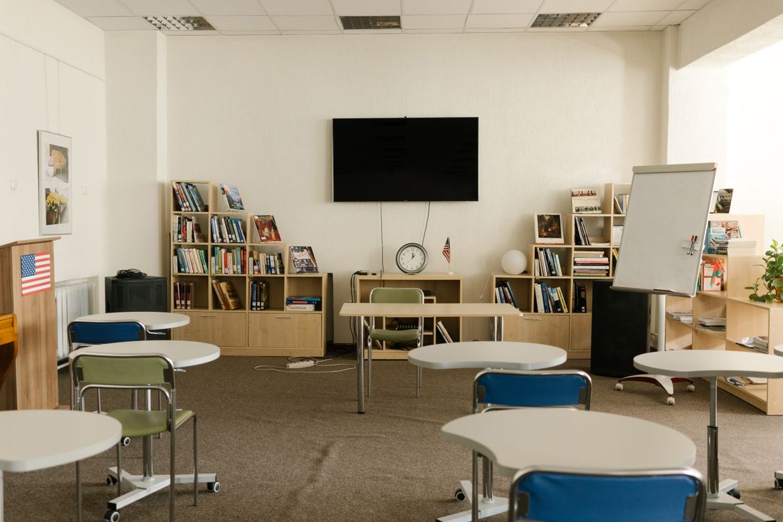
An artist's portrait can be strange, quiet, or deliberately unreadable, and it will still work. A program director's portrait cannot. It has to satisfy a funder, a board, an artist deciding whether to apply, and a stranger who found the organization through a search. And it has about a second to do all four.
A program director's portrait needs to communicate institutional competence and genuine investment in the work at the same time. That usually means a setting connected to the program rather than a neutral studio, an open and level expression rather than an enigmatic one, and a wardrobe register that reads as neither corporate nor costumed.
The Portrait Is Doing Two Jobs at Once
A program director sits between two worlds that judge people differently. Funders, boards, and institutional partners are assessing whether this person can run a program, manage a budget, and be trusted with a grant. Artists, applicants, and participants are assessing whether this person actually cares about the work or is simply administering it.
Those two audiences read the same photograph in different directions. A portrait that leans hard into institutional polish can read to artists as someone who processes applications. A portrait that leans hard into creative informality can read to a funder as someone who has not yet been given real responsibility. Neither is fair, and both happen.
The portrait that works holds both at once, which is a real brief rather than a vague aspiration. It looks like a person who is comfortable in a room with artists and comfortable in a room with a board, and the visual signals for that are specific: setting, posture, expression, and how much the frame is trying.
There is a third audience that rarely gets named: the organisation's own staff and board. A leadership portrait quietly tells people internally how the organisation sees itself, and a set of images that looks noticeably more corporate than the work the organisation does can land awkwardly with the people delivering that work. It is a small effect, and it is real.
Where the Artist Portrait Playbook Stops Working
Artist portraits get to be ambiguous. Looking away, a shadowed face, an unexplained gesture, a frame that withholds. These read as interiority when the subject is someone who makes things, and they often make a better photograph. The viewer is being invited to be curious.
A program director does not benefit from that invitation. Someone deciding whether to submit an application or release a grant is not looking to be intrigued; they are looking for a reason to believe. Ambiguity in that context reads as distance, and distance reads as an institution rather than a person.
The practical translation is that the eyes should generally be in the frame and looking at the camera, the expression should be legible rather than enigmatic, and the light should let the face be seen clearly. That sounds conservative because it is. The room for invention in this portrait is in the setting and the register, not in obscuring the subject.
And Where It Differs From a Gallerist's
A commercial gallerist's portrait is selling judgment and access. The implicit claim is that this person knows what is good and can put you near it, which supports a polished, slightly reserved register (the visual equivalent of a well-hung room).
A nonprofit program director is selling something closer to stewardship. The implicit claim is that resources handed to this person will reach artists and audiences rather than being absorbed. That is a warmer claim, and it survives a less immaculate frame. A little visible activity in the background does more good here than it would in a gallerist's portrait.
The difference matters for setting most of all. Where a gallerist is often best photographed in the gallery, a program director is frequently better photographed where the program happens (a workshop room, a studio, a rehearsal space, a site) because that setting is the evidence behind the claim.
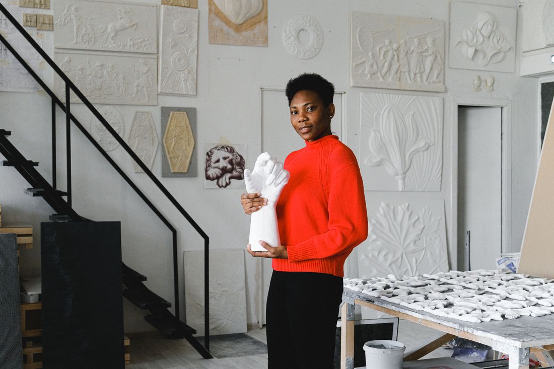
Choose a Setting That Is Evidence, Not Decoration
The strongest program-director portraits are made somewhere the program actually occurs. Not staged mid-activity, and not in front of a wall of unrelated artwork chosen for its color, but in a real room that the organization uses. The setting is doing argumentative work: this is a real thing, in a real space, with real people in it.
That does not require the room to be busy or beautiful. A quiet workshop between sessions, a corner of a studio, a doorway, a stack of materials. Anything with genuine texture and a plausible relationship to the job. The failure mode to avoid is the borrowed generic office, which reads as a stock photograph of an administrator and quietly undercuts the whole claim.
Where a neutral studio portrait is genuinely needed (some funder templates and press kits ask for one), it is worth shooting both in a single session rather than choosing. The neutral version handles the forms; the environmental version handles the website, the annual report, and every request where the image has to persuade.
The practical constraint is access. Program spaces are usually in use, and photographing during a session raises consent questions about participants that a portrait shoot should not be creating. The workable answer is almost always to shoot in the room between sessions, when the space still carries evidence of use (materials out, chairs where people left them) without anyone in it who did not agree to be there.
It also helps to shoot more than one setting on the day. A program space, a doorway or corridor, and a plainer wall for the neutral version can usually be covered in the same hour if they are in the same building, and having the range means the organisation is not stuck with a single frame when the annual report wants something different from the website.
Wardrobe: Neither Corporate Nor Costumed
Wardrobe carries more signal in this portrait than in most, because it is the fastest read of which world the subject belongs to. A full corporate register can push a nonprofit leader into a register their own applicants find alienating; a deliberately artistic register can read as trying to pass as one of the artists.
The useful target is what the person actually wears to work on a day they might meet a funder and an artist in the same afternoon. That is a real outfit most program directors already own, and it is almost always the right answer. Solid tones, nothing that fights the setting, no strong pattern that will date the photograph.
The one thing worth adding is a second option. A slightly more formal layer available in the frame (a jacket that can go on or come off) produces two usable registers from one session, which covers both the board deck and the program page without a second shoot.
Expression: Warm, Level, Not Performing
The expression brief is narrower here than for most portraits, and the word that gets closest is level. Not a broad smile, which can read as promotional; not a serious executive face, which reads as remote. Something in between that suggests a person who is listening and is not nervous.
Getting there is mostly about time rather than direction. Ten minutes of ordinary conversation before the camera does anything serious does more than any instruction, because the expression that works is the one a person has when they are talking about work they care about, not the one they produce on request.
Posture follows the same logic. Slightly turned rather than square-on, weight settled rather than braced, hands doing something plausible rather than arranged. The aim is a photograph that looks like the person was standing there, not one that looks like the person was placed there.

Where This Portrait Actually Ends Up
The destinations are more varied than for an artist portrait, and they pull in different directions. A staff page, a grant application, an annual report, a conference program, a press release, a panel listing, sometimes a board packet. Some are printed, most are small, and almost all are cropped by someone else.
That argues for the same practical discipline any working portrait needs: shoot with margin around the head so a square crop survives, deliver more than one aspect ratio, and keep a high-resolution master for the printed report. Nonprofit annual reports still get laid out at print resolution more often than people expect.
It also argues for consistency across a leadership team. Program directors rarely appear alone (they appear in a row with an executive director and a development lead), and a page where one portrait was made in a studio and two were cropped from event photos looks exactly as ad hoc as it is. Shooting the group in one session is usually the cheapest fix available.
Print deserves a specific mention because nonprofit annual reports remain one of the few documents that still routinely get laid out and printed properly. A portrait supplied only as a web-sized file will either be enlarged badly or replaced with something older, and neither outcome is what the organisation wanted when it commissioned the session.
How Often This One Needs Redoing
Program roles change more often than artistic practices do, and the portrait should follow the role rather than a schedule. A new program, a significant expansion, a move into a different building. Any of those is a reasonable trigger, because the setting in the old portrait may no longer describe the job.
The other trigger is a change in who the organization is talking to. An organization moving from local funding to national applications is presenting to strangers rather than to people who already know the staff, and a portrait made for the first audience often reads as too casual for the second.
Absent either, a refresh every few years is enough. The failure mode worth avoiding is not an old photograph. It is a photograph of a person doing a job they no longer do, in a room the organization no longer occupies, still being sent to funders.
One practical habit helps more than any rule: keep the selects, not just the finished files. A different crop, a slightly different expression, or the alternate setting from the same session frequently answers a new request without any shoot at all, and those frames are usually sitting unused rather than lost. Organisations that keep them tend to go years longer between sessions without ever looking out of date.
The last thing worth planning for is departure. People move between organisations, and a portrait made in a specific program space is tied to that organisation in a way a neutral one is not. That is generally a feature rather than a problem, but it is a reason for the individual to also have a version they can take with them, which costs nothing to shoot at the same time.
Frequently asked questions
How is a nonprofit program director's portrait different from an artist's?
An artist's portrait can be ambiguous, shadowed, or withholding and still work, because the viewer is being invited to be curious. A program director is being assessed by funders and applicants looking for a reason to believe, so ambiguity reads as institutional distance. The eyes should be visible and engaged, the expression legible, and the setting connected to the actual program.
Should a program director be photographed in a studio or on location?
On location, in a room the program actually uses, wherever possible. The setting functions as evidence that the work is real. A neutral studio version is still worth shooting in the same session, because some funder templates and press kits require one. The failure mode to avoid is a borrowed generic office, which reads as a stock photo of an administrator.
What should a nonprofit leader wear for a portrait?
Roughly what they would actually wear on a day they might meet a funder and an artist in the same afternoon, which is usually an outfit they already own. Solid tones, nothing that fights the setting, no strong pattern that will date the image. Bringing a slightly more formal layer that can go on or come off produces two usable registers from one session.
Should a whole nonprofit leadership team be photographed together?
Ideally yes, in one session. Program directors almost never appear alone (they appear in a row alongside an executive director and a development lead), and a staff page mixing a studio portrait with two crops from event photos looks exactly as improvised as it is. One session with a consistent setup is usually the cheapest fix available.
How often should a program director's portrait be updated?
Follow the role rather than the calendar. A new program, a significant expansion, or a move to a different building are all reasonable triggers, because the setting in the old portrait may no longer describe the job. A shift from local funding to national applications is another, since the newer audience does not already know the person.
Portraits for the people who make the program run.
We photograph directors, curators, and teams where the work actually happens, with a register that holds up in front of a board and in front of an artist.
Explore portraits →