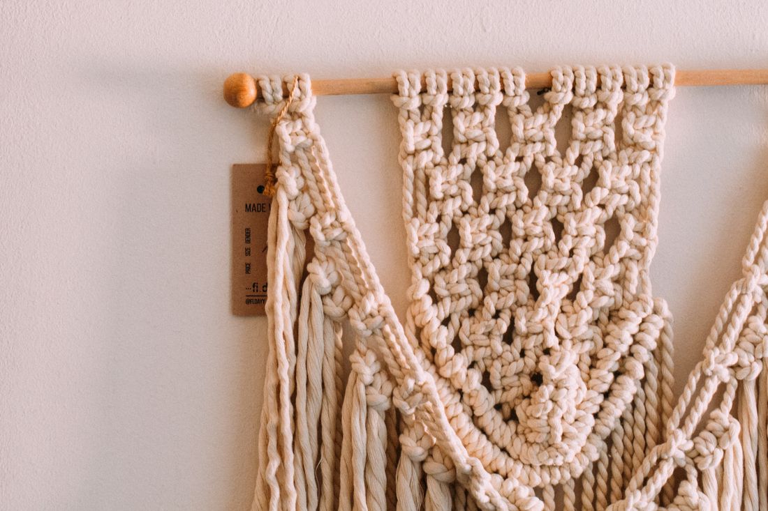
Most documentation lighting has one job: show the work exactly as it is, evenly, without the light itself becoming part of the read. Fiber art breaks that rule on contact. A woven, knotted, or hand-built textile piece isn't just color and shape on a surface; it's structure, and structure only shows up when light hits it at an angle. Flatten that light out for accuracy and the piece goes flat with it, the weave disappearing into a smooth wash of color that could be a printed reproduction of itself. This is the specific tension fiber work creates that flat paintings and even most sculpture don't, and it needs its own answer.
Fiber art needs two kinds of light because the technique that reveals its texture, raking light across the surface, is the same technique that ruins color accuracy by throwing shadow into every gap. The usual fix is two lit versions of the same piece: one even and color-true, one angled to show the hand-built structure underneath.
Why Does Raking Light Fight the Color-Accuracy Standard the Rest of Documentation Follows?
Raking light, angled low and close to the surface, is what makes weave, pile, and knot structure visible, because it throws a tiny shadow behind every ridge and thread. That same shadow is exactly what a color-accurate reference shot is built to avoid, since shadow variation across a surface reads as color variation once a file is used for reproduction.
Standard documentation lighting for a flat painting or a print wants the surface lit as evenly as possible from both sides, so no part of the piece is brighter or darker than any other part for reasons that have nothing to do with the actual pigment. That's what makes a file trustworthy for color matching, printing, or a jury comparing it against the real object later.
A textile piece has actual three-dimensional structure sitting on top of its color: the raised ridge of a weft thread, the depth of a pile, the shadow inside a knot. Light it evenly enough to satisfy the color-accuracy standard and all of that structure disappears, because even light is specifically the kind of light that doesn't cast the small shadows structure needs to read.
Neither approach is wrong. They're answering different questions. One file proves what color the piece actually is. The other proves what the piece is actually made of. Fiber art is one of the few mediums where a single lighting setup genuinely can't do both jobs at once, which is why it usually needs two.
Why Do We Usually Shoot Two Lit Versions of the Same Piece Instead of Picking One?
Two lit versions exist because a client rarely needs only one thing from a documentation set: they need an accurate color reference for reproduction, insurance, or a catalog, and they need an image that actually shows what the piece feels like in the room. One even, color-true frame and one raking, texture-revealing frame together cover both without compromising either.
Trying to split the difference with one setup, lighting angled just enough to hint at texture without fully committing, usually satisfies neither need. The color read is close but not locked, since any angled light still introduces some shadow drift across the surface. And the texture read is muted, since a light angled to protect color accuracy isn't raked low enough to really carve out the weave.
In practice, the accurate version becomes the reference file: the one used for a catalog listing, an insurance record, or anywhere the piece needs to match itself exactly if reproduced or compared later. The raking version becomes the file that actually sells or explains the work, the one that shows a juror, a collector, or a gallery visitor why the piece is hand-built rather than printed.
The two versions aren't a compromise or an extra expense tacked on for its own sake. They're answering two genuinely different questions a single frame can't hold at once, which is a normal thing to plan for once a piece is understood as fiber art rather than as a flat, printable surface.
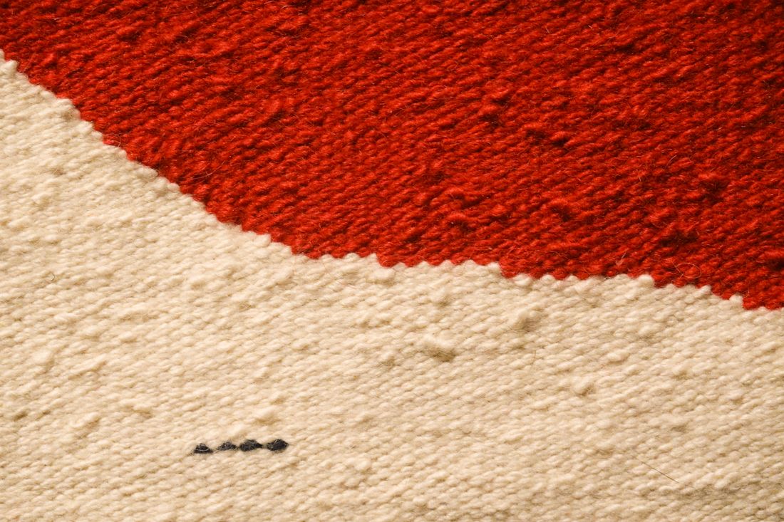
Hanging, Laying Flat, or Mounting on a Form: How Does Support Change What the Camera Sees?
A textile's own weight changes its shape depending on how it's supported, so the same piece can look different hung, laid flat, or draped over a form. Hanging lets gravity pull the piece into its natural drape, often the truest read of how it's meant to be seen, but it can also stretch a piece that wasn't built to hang.
Laying a piece flat on a table or the floor removes gravity's pull entirely, which is useful for showing the actual proportions, edges, and weave structure without any drape-related distortion, but it can flatten out dimensional work, like a piece with heavy fringe or a raised surface, into something that photographs thinner than it really is.
Mounting on a form, a body form for wearable fiber work, or a simple armature for sculptural pieces, splits the difference: it lets the piece take on something close to its intended shape while giving it consistent support that a flat lay or a bare hang can't. This matters most for pieces built to be worn, draped over furniture, or displayed with volume rather than as a flat panel.
None of these choices is automatically correct. The decision comes from how the piece is actually meant to be encountered. A wall tapestry usually wants to hang. A finely detailed weaving where edge-to-edge accuracy matters usually wants to lie flat first, with a hanging version added second if the piece is meant to be seen that way in use.
Why Do We Tension or Steam a Piece Before We Ever Turn On a Light?
Fiber holds the memory of however it was folded, rolled, or stored, so a piece that arrives creased or slack will photograph exactly that way unless it's tensioned or steamed first. No amount of lighting fixes a fold line sitting across a weave; it has to be addressed before the camera is even set up.
Tensioning, gently pulling and pinning or clipping a piece so it sits at its intended width and length, matters most for anything meant to hang flat, like a tapestry or a woven panel. Without it, the piece can sag unevenly or show wrinkles that have nothing to do with its actual construction, which then reads in the photograph as a flaw in the work rather than a flaw in the setup.
Steaming relaxes fold and storage creases out of the fiber itself, which is different from ironing: steam works with heat and moisture rather than direct pressure, so it's less likely to flatten texture that's supposed to stay raised, like pile or a dimensional stitch. This step usually happens well before the shoot, since a piece needs time to settle into its relaxed shape rather than being photographed mid-steam.
This is prep work, not styling. The goal isn't to make the piece look better than it is; it's to remove handling artifacts, a shipping crease, a storage fold, that aren't actually part of the work, so the photograph shows the piece as its maker intended rather than as it happened to arrive.
Why Does Weave Structure Sometimes Alias Against the Camera Sensor, and What Do We Do About It?
A tight, regular weave pattern can conflict with a camera sensor's own regular grid of pixels, producing moiré: a shimmering, rainbow-tinted false pattern not actually in the textile. It happens when the weave's repeating structure is close in scale to the sensor's pixel spacing, so the two patterns interfere the way two window screens do when overlapped.
Moiré is most likely on fine, tight weaves photographed at a distance where the individual threads are small in the frame but still regular enough to catch the sensor's own grid. Looser weaves, heavier textures, and anything shot close enough that individual threads are clearly resolved tend to avoid it, since the interference pattern needs both structures to be roughly the same scale to show up.
The most reliable fix is changing scale before the shot: moving the camera slightly closer or farther, or adjusting focal length, until the weave and the sensor's grid stop lining up. A small change is often enough, since moiré is sensitive to exact spacing rather than general distance. Slightly softening focus can also help, though it trades away some genuine sharpness to do it.
What doesn't reliably fix moiré is more light or a different angle; it's a resolution and scale problem, not an exposure or lighting problem. Catching it on the shoot day, by checking a test frame at full zoom before committing to the full set, is what keeps it from turning into a reshoot.
What Detail Shots Actually Prove a Piece Is Hand-Built Fiber Work?
The selvedge, or finished woven edge, the knot structure holding a piece together, the depth of any pile, and the reverse side of the work are the details that prove construction in a way a full-piece shot can't. A wide hero shot proves what the piece looks like; these close details prove how it was actually made.
The selvedge matters because it's where a weaver's hand and tension control show most clearly, an edge that's even and deliberate reads as skilled construction, and it's a detail that's simply invisible at documentation distance. A knot detail does similar work for macrame, tapestry, or any fiber piece built from tied or wrapped structure, since the knot itself is often the technical signature of the piece.
Pile depth, relevant for anything with raised loops or cut fiber, needs a close, often side-angled shot to actually register in a photograph, since depth is exactly the dimension a flat, straight-on frame compresses away. Without a dedicated detail shot, a deep, dimensional pile and a shallow, printed-looking surface can end up looking identical online.
The reverse side answers a question buyers and jurors ask that a front-only set can't: is the back as carefully finished as the front, and does the construction match what the front implies. For hand-built fiber work especially, an honest reverse-side shot is often what separates documentation that reads as thorough from documentation that reads like a product photo.
How Does Sheer or Translucent Fiber Work Change the Lighting Setup?
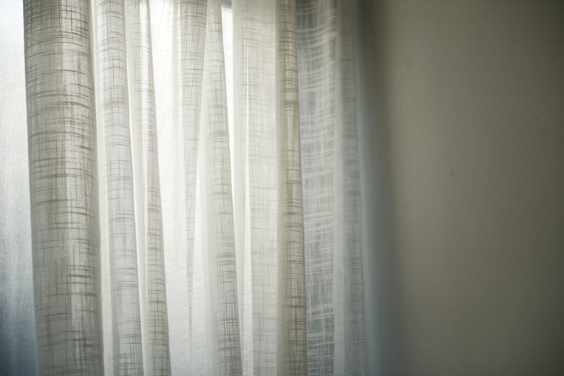
Sheer and translucent fiber work needs light passing through the piece as well as across it, because a light aimed only from the front photographs the surface while missing the openwork, thread density, and translucency that define the piece. A single backlight, sometimes combined with a softer front light to keep detail from washing out, usually resolves both at once.
Cross light alone, the kind used on an opaque tapestry or a solid weave, treats a sheer piece like it has no depth to reveal, since there's nothing for the light to rake across in the open, loosely constructed sections. The result is a photograph that shows color and rough shape but misses the actual quality that makes the piece sheer in the first place: how light behaves once it's inside and passing through the fiber.
Backlighting introduces its own risk, since too much light from behind can blow out thin sections entirely or flatten color into near-transparency, losing the piece's actual hue. Balancing a controlled backlight against a softer front or side light is usually what keeps both the translucency and the true color intact in the same frame, rather than sacrificing one for the other.
This is really the same core tension the rest of fiber documentation runs into, just inverted: instead of raking light revealing structure at the cost of color accuracy, backlight reveals translucency at the cost of the same thing. The fix is the same instinct, too, more than one lit version, adjusted for what this particular piece needs light to do.
What Does a Complete File Set for One Piece of Fiber Art Actually Contain?
A complete set usually includes a color-accurate hero shot; a second version lit with raking or, for sheer work, backlight to show structure; a selvedge or edge detail; a knot or construction detail; a pile-depth or texture detail for anything raised; and a reverse-side shot. Together they cover color, construction, and how the piece behaves in light.
Each file is answering a distinct question, the same way a ceramic piece's file set needs more than one angle to represent a three-dimensional object. The accurate hero shot answers what color and overall composition the piece actually has. The raking or backlit version answers what it's made of and how it catches light in person. The detail shots answer construction questions a full-piece frame is too far away to resolve.
Consistency across the set still matters even though two different lighting approaches are involved. Background, framing distance for comparable shots, and color calibration should stay steady so a viewer can tell the difference is intentional, an accuracy shot next to a texture shot, rather than the result of an inconsistent process.
None of this needs to be elaborate to be complete. A short, deliberate list, accurate version, texture or backlit version, selvedge, a construction detail, a reverse-side shot, covers what most galleries, jurors, and collectors actually need to understand a piece of fiber work they can't hold and turn over themselves.
Frequently asked questions
Why can't one lighting setup handle both color accuracy and texture for fiber art?
Color accuracy needs even light with minimal shadow, since shadow variation reads as false color variation once a file is used for reproduction. Texture needs raking or angled light, which creates shadow on purpose to reveal weave and structure. These are opposite requirements on the same surface, which is why fiber art usually needs two separate lit versions instead of one setup trying to split the difference between them.
Should a tapestry or wall hanging be photographed hanging or laid flat?
It depends on how the piece is meant to be seen. A piece built to hang usually needs a hanging shot, since gravity's pull on the fiber is part of its true shape. A flat-lay version can still be useful for showing exact proportions and edge-to-edge weave structure without any drape-related distortion adding ambiguity to the read, especially for finely detailed weaving where precise measurements genuinely matter to a buyer or juror.
What causes moiré patterns when photographing woven fabric?
Moiré happens when a tight, regular weave pattern is close in scale to the camera sensor's own pixel grid, and the two patterns interfere with each other, producing a shimmering false pattern not actually in the textile. Small changes in camera distance or focal length usually resolve it, since it's a scale problem, not a lighting problem. Checking a test frame at full zoom before shooting the full set catches it early.
Why does the reverse side of a fiber piece need its own photograph?
The reverse side answers a construction question a front-only shot can't: whether the back is finished with the same care as the front, and whether the construction actually matches what the front implies. For hand-built fiber work, an honest reverse-side shot is often what separates a documentation set that reads as thorough from one that reads like a product photo, and it's the kind of detail buyers and jurors specifically look for.
How is photographing sheer or translucent fiber art different from opaque weaving?
Sheer work needs light passing through it, not just across it, since a front-only or raking light misses the translucency and openwork that define the piece. A controlled backlight, often paired with a softer front light to prevent thin sections from blowing out entirely, is usually needed alongside or instead of the raking light used on solid, opaque textiles, where structure is the whole reason for lighting the piece that way.
Build a paper trail your insurer can't argue with.
We shoot artwork documentation the way an appraiser or adjuster actually reads it, full views, true color, condition notes, and files that stay tied to the right piece.
Explore artwork documentation →