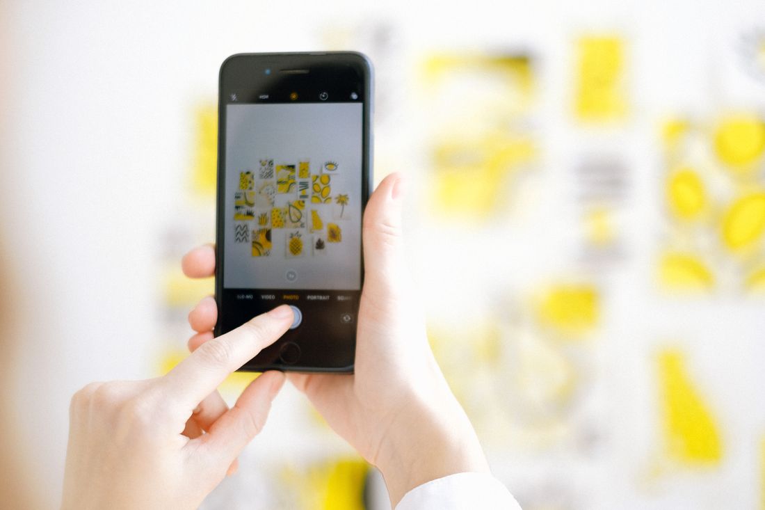
Most artists have a phone photo of a piece that looked perfectly usable until it sat next to a properly documented version of the same work. Nothing about the phone photo was wrong, exactly. It just wasn't built to survive what came next: a print run, an insurance claim, a submission that gets viewed next to other artists' files. The differences between a phone photo and professional documentation aren't about one being generically better. They show up in specific places, and a phone is genuinely the right tool for plenty of them.
A phone photo and professional documentation differ in color accuracy under mixed light, lens geometry on flat work, dynamic range on dark or glossy surfaces, resolution for print, and consistency across a body of work. None of that makes a phone photo useless, just suited to some jobs and not others.
What actually differs between a phone photo and professional documentation?
A phone photo and a professional documentation photo can look identical on a small screen and still fail differently once the file has real work to do. The gap shows up in color accuracy under mixed light, lens geometry on flat rectangular work, dynamic range on dark or glossy surfaces, resolution for print, and consistency across a body of work.
None of those differences are about a phone being a lesser camera in some abstract sense. Modern phone cameras are genuinely capable, and for a huge share of what artists need day to day, a phone photo does the job completely. The differences only become visible under specific conditions: side by side with another piece, blown up for print, viewed by someone who needs to judge condition or authenticity from the image alone.
That's the honest way to think about the comparison. A phone photo and a documentation photo aren't playing the same game most of the time. They only start competing directly when a file has to do something a snapshot was never built to do, and that's usually the moment an artist notices the gap for the first time, often later than they'd like.
The rest of this piece goes through each difference specifically, plus where a phone is still the right call. The test that actually matters isn't quality in the abstract. It's what the file has to survive next.
How does color accuracy break down under mixed lighting?
Color accuracy breaks down under mixed lighting because a phone's camera software is built to guess at a pleasing overall image, not a neutral record of the actual pigment. A room lit by both daylight from a window and a warm ceiling fixture gives the phone two competing light sources to reconcile, and it usually splits the difference in a way that shifts the true color of the work.
Professional documentation controls the light source itself instead of asking software to average an imperfect situation after the fact. A single, known light (or a couple of matched, known lights) removes the guessing entirely, so the color that hits the sensor is closer to the color actually on the canvas or paper.
This matters most for artists whose work depends on subtle color relationships: a near-black that's actually a very dark blue, two warm neutrals that read differently to the eye but almost identically to a phone's auto white balance. A landscape or a bold graphic piece can tolerate more color drift before anyone notices. A quiet, tonal painting usually can't.
The tell is usually retrospective. An artist notices a printed catalog image looks slightly off, or a buyer asks why the piece in hand doesn't match the online listing, and traces it back to a photo taken under whatever light happened to be in the room that day rather than light chosen for the job.
Why does lens geometry matter for flat, rectangular work?
Lens geometry matters for flat, rectangular work because a phone's wide lens introduces distortion that's barely noticeable on a person or a room but becomes obvious the moment the subject is a perfect rectangle. A painting shot slightly off-angle, or too close with a wide lens, comes out with edges that bow or corners that don't sit square, even when the photographer thought they held the phone straight.
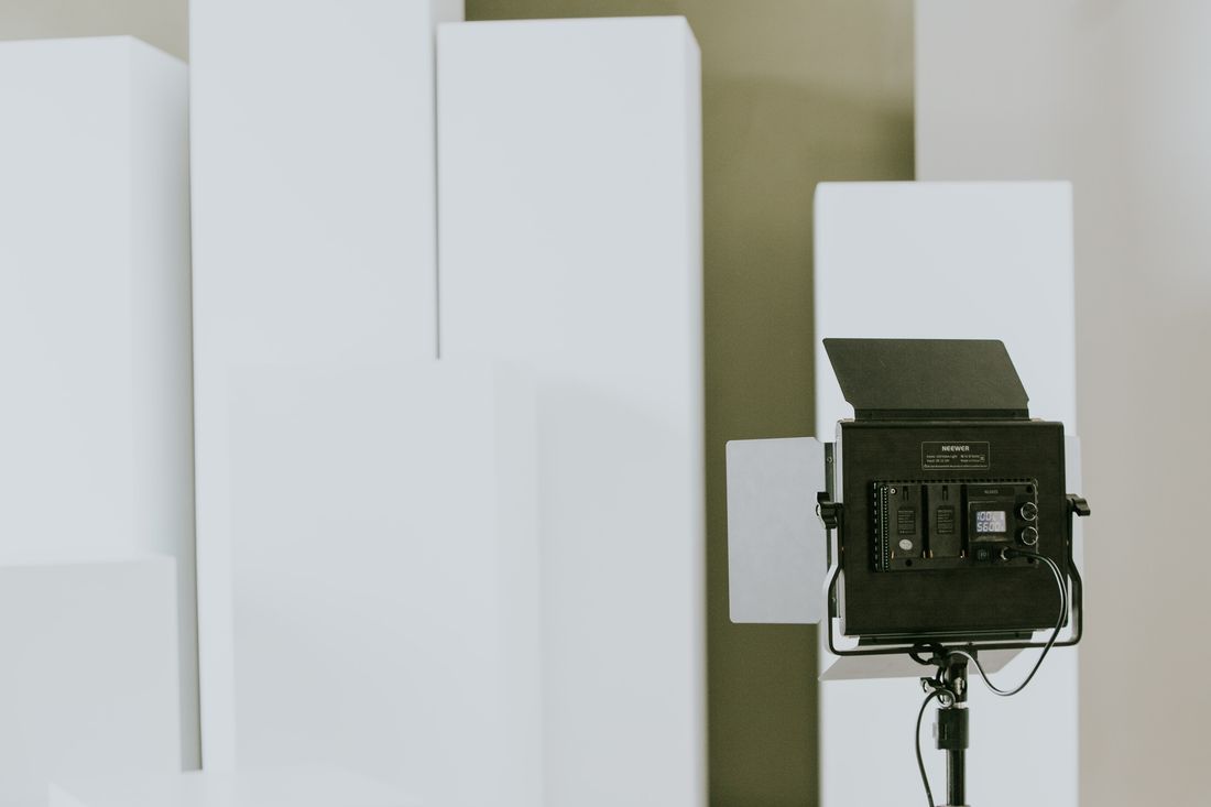
Professional documentation uses a longer, flatter lens and more working distance specifically to avoid this. Stepping back and using a longer focal length keeps straight lines straight and corners square, the same way a longer lens keeps a portrait's proportions honest instead of exaggerating whatever's closest to the glass.
The problem compounds with framed and glazed work, where a slightly off-axis phone shot also catches more reflection and glare than a properly positioned camera would. Two problems that are individually manageable, distorted geometry and stray reflection, tend to show up in the same phone photo at once.
Most artists don't notice the distortion until they crop the image for a specific use and the piece suddenly looks subtly wrong: not blurry, not miscolored, just slightly off in a way that's hard to name until someone points out the corners aren't actually square. That's a geometry problem, not a resolution problem, and it needs a different fix than a better phone would provide.
What happens to dynamic range on dark or glossy surfaces?
Dynamic range breaks down on dark or glossy surfaces because a phone's sensor and its automatic processing have to compress a wide range of brightness into one exposure, and dark, reflective, or heavily varnished work pushes that compression past what looks natural. Deep shadow areas lose detail, and glossy highlights blow out into flat white patches with nothing recoverable underneath.
A varnished oil painting, a glazed ceramic piece, or a dark sculpture photographed under a single overhead source all share the same problem: the brightest reflection and the deepest shadow are further apart than one frame can hold cleanly. Phone software tries to fix this automatically through computational processing, and the fix often makes the image look “corrected” in a way that no longer matches the actual surface.
Professional documentation manages this with controlled, diffused lighting and manual exposure decisions built around the specific piece, rather than a phone's general-purpose algorithm guessing at what a typical photo should look like. That control is what keeps texture visible in a dark corner of a canvas or keeps a glossy glaze from turning into a blown-out white patch.
This is one of the harder differences to fix after the fact. A color shift can sometimes be corrected in editing if the original file has enough information in it. Detail that never made it into the file because of a blown highlight or a crushed shadow is usually gone for good.
How much does resolution actually matter, and for what?
Resolution matters in proportion to what the file has to survive: a social post or a quick reference tolerates far less detail than a large print, a licensing request, or a submission that gets reviewed at full size on someone else's screen. The question isn't whether a file is technically high-resolution. It's whether it holds up at the size and use it's actually headed toward.
A phone photo, viewed at typical screen size, can look completely sharp and clean. Push that same file toward a print, a zoomed detail crop, or a gallery's submission portal that expects a specific file size and dimension, and the limits show up fast: softness, visible compression artifacts, a flattened, over-processed look from the phone's own sharpening.
We covered this in more depth in a separate piece on what resolution artwork actually needs, since the honest answer depends heavily on the use case rather than a single number every artist should hit. The short version: match the file to its destination before assuming bigger is automatically better or that a phone file is automatically insufficient.
The mistake runs in both directions. Some artists over-worry about resolution for uses that never needed it, like an Instagram post or a private studio reference. Others assume a phone photo will scale up fine for a print or a licensing request without checking, and find out otherwise only after the file has already been submitted or sent.
Why does consistency across a body of work matter?
Consistency matters because a body of work gets judged as a set, and a set built from photos taken in different rooms, at different times of day, on different phones, reads as uneven even when every individual piece is well made. A collector, curator, or grant reviewer scrolling through mismatched lighting and color temperature notices the inconsistency before they notice the work itself.
Phone photos taken over months or years naturally drift: a different room's light, a different phone model with different processing, a habit of shooting outdoors on sunny days and indoors under lamps the rest of the time. Nothing about any single photo is wrong. The problem is that they don't agree with each other once they're placed side by side in a portfolio, a website, or a submission.
Professional documentation sessions build consistency in deliberately: same lighting setup, same white balance, same distance and angle relationships from piece to piece, even across a session that spans many works. That consistency is often the actual product an artist is paying for, more than any single image being sharper or more accurate in isolation.
This is the difference that's hardest to fix retroactively. Color and exposure can sometimes be corrected piece by piece after the fact, but matching a whole archive of inconsistent phone photos into one coherent-looking set usually takes more editing time than a single documentation session would have taken to shoot properly in the first place.
When is a phone actually the right tool for the job?
A phone is the right tool whenever the file's job is speed, reference, or low stakes rather than accuracy under scrutiny: studio progress shots, social posts, quick reference for a collector conversation, or an insurance-adjacent snapshot taken fast before a piece gets crated and moved. None of those uses benefit meaningfully from the setup time a documentation session requires.
Progress photos are the clearest case. An artist tracking a painting across several sessions doesn't need color-accurate, geometry-corrected files; they need a fast, honest visual record of where the piece stood at each stage, and a phone captures that instantly without interrupting the actual work.
Social content works the same way. A platform that compresses and recolors every image on upload erases most of the accuracy gap anyway, so the extra control of a professional setup often doesn't survive the platform's own processing. A well-lit, well-composed phone photo frequently looks just as good once it's been through that compression as a more careful file would.
Quick reference before a move or a shipment is a smaller but real case too: a fast, complete set of phone photos taken right before a piece gets packed can matter more, in a pinch, than a technically perfect file taken weeks earlier. Timing sometimes beats accuracy. The honest move is knowing which job is in front of you before picking up whichever camera happens to be in the room.
What does the file actually have to survive next?
The real test for any documentation photo isn't its quality in the abstract, it's what the file has to survive next: a print, an insurance claim, a jury or grant panel, a licensing request, or simply sitting next to another artist's properly documented work in the same review. Naming that destination before the shoot is what actually decides which tool belongs in your hand.
An artist who knows a piece is headed toward a print run or a submission with strict technical requirements is better served booking documentation ahead of that deadline, not scrambling afterward when a phone file doesn't clear the bar. An artist tracking daily studio progress or posting for an audience that will never zoom in doesn't need to think about any of this at all.
The editorial jeopardy is almost always the same: a phone photo looks completely fine in isolation, on its own screen, in its own moment. The problem only surfaces later, when it sits next to an accurate file, gets blown up for print, or gets compared against a submission that was documented properly from the start. By then, reshooting is slower and more expensive than planning ahead would have been.
The practical habit worth building is simple: match the tool to the file's actual destination, decide that early, and treat a documentation session as a scheduled part of finishing a body of work rather than a reactive fix once something has already gone wrong.
Frequently asked questions
Can I edit a phone photo to fix color accuracy after the fact?
Some correction is possible if the original file has enough information in it, but editing can't recover detail that was never captured, like a blown-out highlight or a crushed shadow. Color shifts from mixed lighting are more fixable than dynamic range loss. If a piece is genuinely color-sensitive, correcting a documentation photo shot under controlled light is far easier than correcting a phone photo shot under whatever light happened to be available.
Is a phone photo ever good enough for a print?
It depends entirely on the print size and how closely someone will view it. A small print viewed at a normal distance can hold up fine from a well-lit phone photo. A large print, or one that will be viewed up close, is much less forgiving of the geometry, resolution, and dynamic range limits a phone photo tends to carry. Match the file to the specific print before assuming either way.
Why do two phone photos of the same painting look different in color?
Because the lighting in the room almost certainly changed between the two photos, and phone cameras adjust their white balance automatically based on whatever light is present at that moment. A photo taken near a window at noon and one taken under a lamp that evening will read differently even though nothing about the actual painting changed. Controlled, repeatable lighting is what prevents this drift.
Does documentation quality actually matter for social media posts?
Usually not much, since most platforms compress and recolor images on upload, which erases a large share of the accuracy a professional file would otherwise carry. A well-lit, well-composed phone photo often looks just as good after that compression as a more carefully shot file would. Documentation quality matters far more for prints, submissions, and anywhere a file gets viewed at full size or scrutinized closely.
How do I know if a specific piece needs professional documentation?
Ask what the file has to do next. If it's headed toward a print, an insurance record, a jury submission, or anywhere it will be judged next to other properly documented work, book documentation ahead of that deadline. If it's a progress shot, a social post, or a quick reference for your own use, a well-lit phone photo is genuinely the right tool and doesn't need anything more.
Build a paper trail your insurer can't argue with.
We shoot artwork documentation the way an appraiser or adjuster actually reads it, full views, true color, condition notes, and files that stay tied to the right piece.
Explore artwork documentation →