
The question usually gets framed as a preference, natural light versus studio light, like choosing a side. It's more useful to think of it as two different tools that solve two different problems. Natural light is good at telling the truth about a color in a specific moment. Studio light is good at telling the same truth twice, on a Tuesday and again three months later.
A well-diffused north-facing window can absolutely be good enough, for a single accurate shot of a matte or flat piece taken with some care about the hour and the weather. It stops being enough the moment a file needs to match something else: a reshoot, a series, an archive, or a record that has to hold up if someone ever asks how the color was captured. This guide covers what each light source actually gets right, where each one quietly works against a shoot, a side-by-side on the differences that matter, how the artwork's own surface should shape the decision, and a fast way to land on an answer.
Is a north-facing window actually good enough?
The honest answer is that a north-facing window is good enough for some artwork documentation and not good enough for other kinds, and the difference isn't about the window. It's about what the file needs to do after the shoot.
If a piece needs one accurate photo for a website, a submission, or a single social post, a well-diffused north-facing window can produce a genuinely usable, color-true image. North light is indirect skylight rather than direct sun, so it tends to read as a calmer, more neutral color than a south or west-facing window at most hours.
Where it stops being enough is anything that has to match something else: a reshoot months later, a series of pieces meant to look consistent side by side, or a file that has to hold up if an insurer or a curator ever asks how the color was captured. Daylight through a window is not one fixed light source. It's a value that drifts by the hour and by the weather, and nothing about a north exposure fixes that.
So the real question isn't whether a window is good light. It's whether this shoot needs to happen once, or needs to be repeatable. That distinction decides more of the answer than which direction the window faces.
What a north-facing window actually gets right
Good window light, diffused rather than direct, produces a soft and even quality that's genuinely hard to fake with strobes. It wraps around texture instead of carving into it, which suits paper works and flatter surfaces particularly well.
North-facing windows in particular avoid the worst of what direct sun does to a shoot. Because the light is bounced skylight rather than a beam hitting the piece, there's no hard shadow edge and no blown highlight to fight. On a piece with a matte surface, that alone can produce a clean, accurate-looking file with very little correction needed.
It's also the most accessible option there is. A window and a bit of diffusion, plus a reasonably overcast or indirectly bright hour of the day, cover a real share of documentation needs, especially for an artist photographing their own finished work for a portfolio rather than for an archive.
None of that makes it a lesser version of real lighting. For a single accurate shot, taken with some care about the hour, window light can hold its own against a studio setup.
Where window light works against the shot
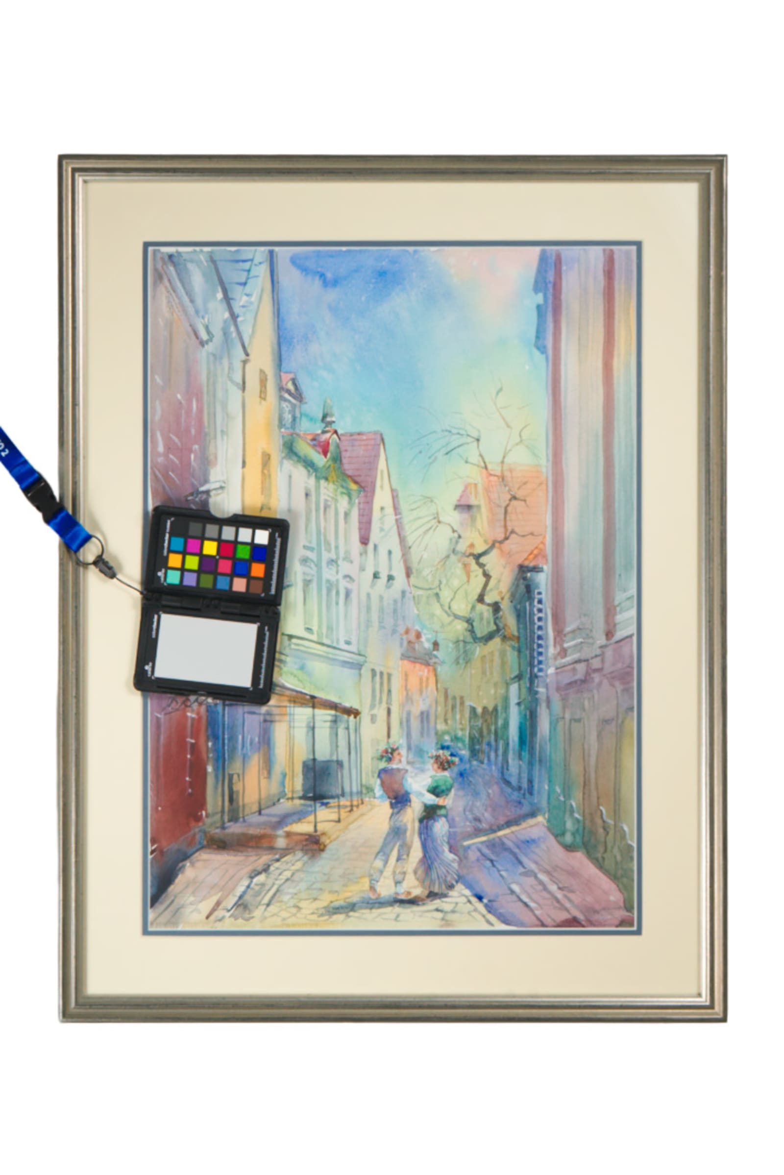
The same window that reads as neutral at 10am on a clear day can read noticeably warmer or cooler an hour later, and cloud cover changes it again without warning. Daylight color temperature isn't fixed. It moves through a wide range across a normal shooting window, roughly 5,000K under a clear afternoon sky up toward 7,000K or higher once cloud cover or open shade takes over. A file that looks true at the start of a session can drift measurably by the end of it, and nothing about that drift is visible to the eye in the moment.
Size makes it worse. A single window is a single light source, and light falls off with distance from it. On a large canvas, the edge closest to the window reads brighter and warmer than the edge further away, an unevenness a small piece never reveals because its whole surface sits at roughly the same distance from the light.
Glazed or varnished work adds a third problem: there's no way to control where a window's reflection lands on the surface. Move the piece, move the camera, and the hot spot from the glass or the varnish moves with it, sometimes landing directly over the part of the piece that matters most.
And none of it can be repeated on command. The light from last Tuesday isn't a setup that can be written down and rebuilt. It's a moment, and a shoot that needs to match a result later, an archive, an insurance file, a body of work meant to look consistent, can't rely on a moment.
What studio light gets right
Studio light's core advantage is that it doesn't move unless someone moves it. Once a lighting setup is measured and positioned for a piece, that exact position, angle, and output can be logged and rebuilt on a different day, in a different season, and still produce a matching file.
Photographic strobes built for this kind of work are also daylight-balanced, generally close to 5,500K, so the color they produce doesn't drift the way a window does across a session or across months. That stability is the entire point of a studio setup, more than any claim that it simply looks better.
Positioning two lights at matching angles, usually around 45 degrees off the piece on each side, gives real control over glare on varnish, hot spots on metallic paint, and shadows that would otherwise hide texture instead of describing it. A window can't be angled. A strobe can.
For heavy impasto, resin, glass, or high-gloss finishes, that control isn't a preference. It's often the only practical way to get an even, accurate file without a blown reflection eating into the piece.
Natural light vs. studio light, side by side
The differences aren't abstract, and they show up in the same handful of decisions on every shoot. Laid out plainly:
| What matters | Window light | Studio light |
|---|---|---|
| Color consistency | Drifts with time of day and cloud cover, sometimes within one session | Fixed once the strobes are set, repeatable months later |
| Evenness on a large piece | Falls off with distance from the window, uneven on anything wider than a few feet | Two matched sides can be metered to read even across a large canvas |
| Reflection and glare control | No way to move or angle the source, the hot spot moves with the piece or the camera | Lights can be angled around 45 degrees per side to steer glare off the surface |
| Repeatability across a series | Nearly impossible to recreate exactly, the light itself was a one-time moment | Setup can be logged, written down, and rebuilt on a different day |
| What it's honestly good for | A single accurate shot of a matte or flat piece, done with care | Anything that needs to match a previous shoot or hold up to scrutiny later |
None of these rows makes one source universally better. They show which problem each one is actually built to solve.
Matching the light to the surface
The surface of the piece is usually the strongest signal for which light source belongs on it. Reflective and glossy surfaces, high-gloss varnish, resin work, glazed ceramics, tend to need the angle control that only studio light provides to manage glare consistently.
Matte, flatter surfaces, gouache, most works on paper, unvarnished acrylic, are more forgiving and can do well under either source, which makes the decision more about the shoot's purpose than the medium's demands.
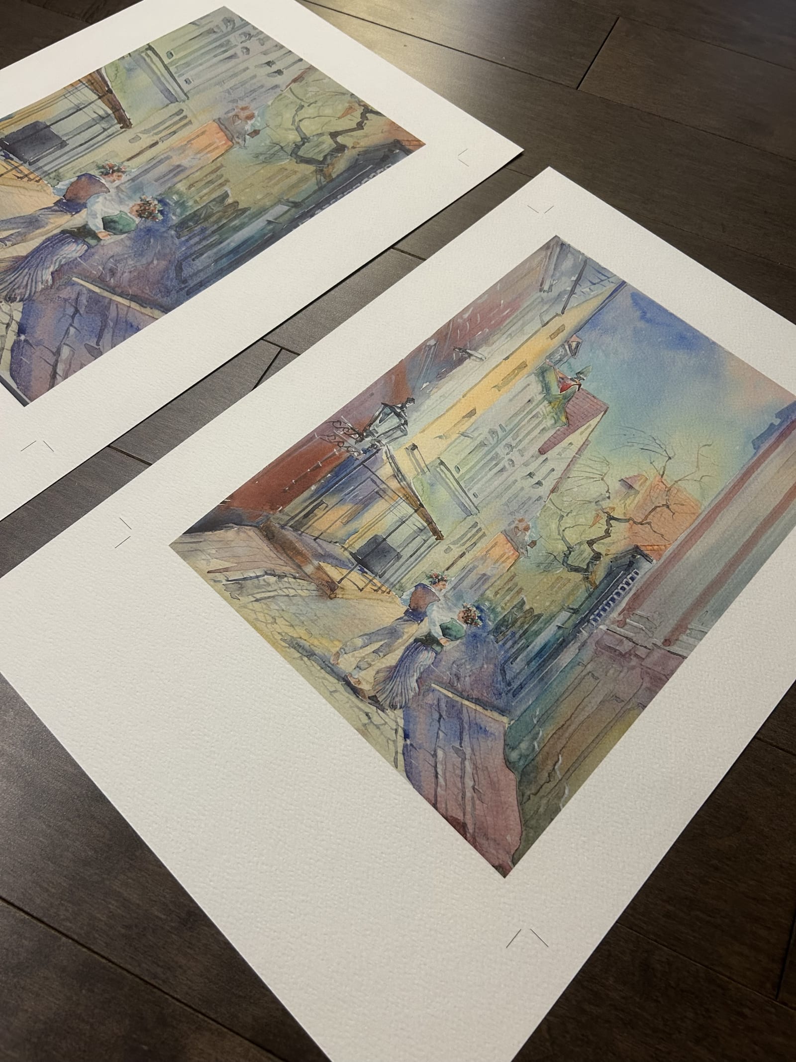
Heavily textured or three-dimensional surfaces, thick impasto, sculptural relief, mixed media with real depth, are where the choice matters most, because the direction and softness of the light changes how much of that texture actually reads in the final file. A single overhead window light can flatten texture that an angled studio light reveals clearly.
Glazed or framed-under-glass work deserves its own note. Window light reflecting off glass is close to impossible to control, since the reflection source and the piece can't be moved independently of each other. Studio light, positioned off-axis from the glass, solves that directly.
A fast way to decide
Start with the question that actually matters: does this file need to be recreated later. If yes, studio light is almost always the safer call, because it can be measured, logged, and repeated. If the need is a one-time shot, window light can be just as accurate and considerably faster to arrange.
Next, look at the surface. Glossy, reflective, or heavily textured work leans toward studio light for the control it offers over glare and shadow. Flat, matte work has more freedom to go either way.
Last, be honest about what the file is actually for. A quick update for a process post or a personal portfolio doesn't need the same rigor as a piece heading into an archive, an insurance record, or a body of work that has to match across a series. Matching the effort to the stakes isn't cutting corners. It's the same judgment a documentation photographer makes on every shoot before a single frame gets taken.
Make sure your archive means something when someone asks for proof.
We photograph the work the way an insurer or gallery registrar wants it documented, straight views, correct color, and condition callouts you can actually point to later.
Explore artwork documentation →