Every documentation photographer promises color accurate files. Almost none of them explain what actually produces that, which makes it nearly impossible for an artist to tell a real process from a confident one. The promise is built from five specific steps, done in order, and skipping any single one is invisible until the file leaves the photographer's own screen.
Color accuracy is not one setting or one skill. It is five linked steps: a reference target shot in the artwork's actual light, a camera profile built from it, a calibrated display, a working color space wide enough for saturated pigment, and an export step that either preserves or discards all of it.
What Does "Color Accurate" Actually Mean in a Documentation Photo?
"Color accurate" describes a photograph whose colors match how the artwork looks in person, checked against a reference standard rather than judged by eye. It isn't one setting or one skill. It's the output of five linked steps, and a file can look convincing on a screen while skipping every one of them.
The phrase gets used constantly because it sounds like a guarantee, and clients repeat it back without a clear sense of what actually produces it. That gap is the whole problem. A photographer who owns a good camera and edits confidently can produce a file that looks right to them and still be meaningfully off, because looking right on one uncalibrated screen proves nothing about how the file behaves anywhere else.
The chain that actually earns the phrase runs in a fixed order: a reference target shot in the same light as the piece, a camera profile built from that target, a calibrated display to judge the result honestly, a working color space wide enough to hold what the artwork contains, and an export step that carries all of it through to the delivered file. Break any link and the promise stops meaning anything, even if the rest of the workflow is excellent.
The sections below walk that chain in order: what each link actually fixes, what happens when it's skipped, and where the honest limits sit even when every step is done right.
What Is a Reference Target, and Why Does It Have to Match the Room's Light?
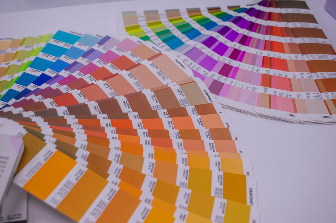
A reference target is a card with known, measurable color patches, photographed in the exact same light falling on the artwork. It gives the camera something with a documented correct answer, so a color shift caused by the lighting or the sensor becomes visible and correctable instead of invisible and assumed.
The card is usually shot in the same frame as the piece, or right before and after it, so both share one lighting condition on record. Without it, the photographer is trusting their eyes and their monitor to catch a color problem that light itself is causing, and eyes adapt to a lighting condition far more readily than a camera sensor does. A room lit with mixed daylight and gallery track lighting can look neutral to a person standing in it for twenty minutes while still pushing a noticeable color cast into every file shot under it.
This is also why the target has to reflect the piece's actual light, not some generic studio setup photographed once and reused later. Light changes shoot to shoot, room to room, even hour to hour as daylight shifts through a window. A target read once under one lighting setup and applied to a different session is solving last week's problem, not today's.
Skipping this step doesn't necessarily produce an obviously wrong photo. It produces a photo with an unverified color relationship to the actual artwork, one nobody checked, which is a quieter and harder failure to catch than a photo that's visibly off.
What Does a Camera Profile Actually Correct?
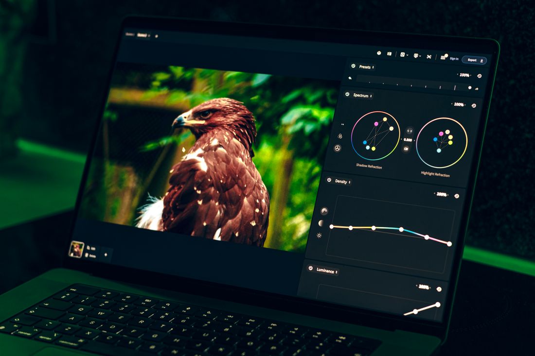
A camera profile is a correction built from the reference target's file, comparing what that specific camera and lens recorded against the target's known values, then applying that correction across the whole image. It fixes the particular way a given sensor, under that particular light, renders color slightly differently than the human eye does.
Every camera sensor interprets color a little differently, because sensors, lens coatings, and in-camera color science all vary by manufacturer and model. Two cameras photographing the identical painting under identical light can produce two files with a real, measurable difference between them, neither one arbitrarily wrong, just built on a different starting interpretation. A generic factory color profile, the default baked into most editing software, is tuned for an average case, not for the piece actually in front of the lens.
Building a profile from the reference target shot in that session narrows the gap for this specific camera, this specific light, and this specific shoot, rather than relying on an average that was never built with this room or this artwork in mind. It's a correction, not a creative choice, and that distinction matters: it's solving a measurable discrepancy, not applying a look.
This step is invisible in the final image in the best way. Nobody looking at a well-profiled file sees the correction happening; they just see color that holds up when checked against the actual piece, rather than color that merely happened to look plausible on the day it was shot.
Why Does an Uncalibrated Monitor Undo Everything Upstream of It?
An uncalibrated monitor undoes every step before it because every editing decision, exposure, color balance, saturation, gets made by eye against that screen. If the screen itself is drifting warm, cool, too bright, or too contrasty, the photographer is correcting a file to match a lie and calling the result finished.
This is the single most common failure in documentation photography that otherwise looks careful: a beautiful file that reads correctly on the photographer's own screen and noticeably wrong everywhere else, a client's laptop, a printed proof, a gallery's projector. The file didn't change between those views. The screen it was judged against did, and nobody caught that until it mattered.
Consumer displays vary meaningfully out of the box, and even a genuinely good monitor drifts over weeks and months as its backlight ages, slowly enough that the person using it every day doesn't notice the shift happening. A hardware calibration device, not a by-eye adjustment or a built-in preset, measures the actual light coming off the screen and corrects it against a known standard on a regular schedule.
Everything upstream, the target, the profile, can be done perfectly and still produce a bad file if the person editing it is looking at an inaccurate screen while making the final calls. Calibration doesn't add anything to the image. It makes the judgment applied to the image trustworthy, a quieter but no less essential job than any of the steps that came before it.
Why Does the Working Color Space Matter for Saturated Pigment?
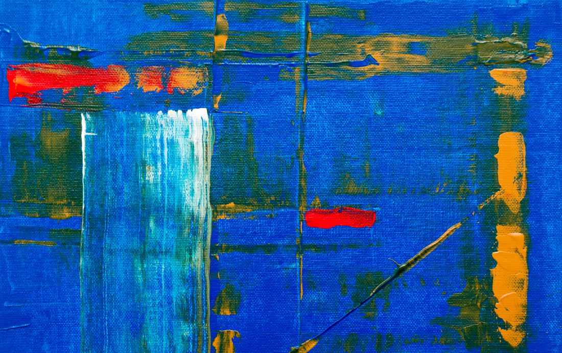
A working color space is the range of colors a file is allowed to describe, and a narrow one physically cannot hold what a saturated pigment actually contains. Push a vivid red or a deep cadmium yellow through too small a space and the file clips it toward the nearest color it can represent, not the true one.
No matter how well every earlier step was done, this one still governs what survives. The narrowest common space, built for consistent screen display, was never designed around the extremes some pigments reach. Many contemporary paints, especially saturated synthetic reds, oranges, and some blues, sit at or past the edge of what that narrower space can describe at all. A wider working space, standard in professional editing, holds more of that range, which is why documentation work generally edits in the wider space and converts down deliberately at export, rather than starting narrow and losing information nobody can get back later.
The consequence of the wrong choice is specific: a clipped color doesn't look like an error. It looks like a normal, slightly duller version of the same hue, which is exactly what makes it easy to miss during a quick review and hard to catch afterward, once the more accurate version is already gone from the file.
This step also explains why a working file and a delivered file are allowed to differ. The working space is chosen to hold everything the camera captured; what happens to it on the way out is a separate, deliberate decision, the subject of the next step.
How Does Export Either Preserve or Destroy Everything Before It?
Export is where a color-accurate working file either survives intact or gets quietly damaged, because converting to a delivery format means deciding what color space the final file carries, and whether that decision is made on purpose or left to a default. The same file can turn into a correct export or a wrong one based on this last step.
A file built correctly through every earlier stage still has to be converted for how it will actually be used, screens, print, a gallery submission portal, and each of those carries different real-world requirements. Converting to a narrower space for web delivery without checking what actually clips in that conversion can undo the exact protection the wider working space was providing. An embedded color profile that gets stripped somewhere in an upload or a resize can leave a technically accurate file displaying incorrectly anyway, because the destination no longer knows how to read it.
This is where the earlier steps most often get thrown away without anyone noticing. A photographer can nail the target, the profile, the calibrated edit, and the wide working space, then export on autopilot, and the file that reaches the artist is the one degraded version in an otherwise correct chain.
Asking specifically what happens at export, which color space, whether the profile stays embedded, whether the file gets checked after conversion, is one of the more revealing questions an artist can ask, precisely because this step stays invisible unless someone is deliberately checking it.
What Can't a Photograph Reproduce, Even With a Perfect Workflow?
No photograph fully reproduces a fluorescent pigment or metallic leaf, because a photograph is a flat, emissive image standing in for a physical, reflective surface, and some materials behave in ways that gap can't fully close. A careful workflow gets close and says so; it doesn't quietly imply a perfection no photograph can actually deliver.
Screens emit light directly at the eye. Paintings and objects reflect ambient light back, and their surface, texture, sheen, metallic flake, fluorescent pigment under UV, changes how they reflect it depending on the angle and the light source. A gold leaf detail that shifts and shimmers as a viewer moves in front of it has no single, correct static value to record, because the piece itself doesn't have one fixed appearance to begin with.
Fluorescent pigments are a related, separate problem: they emit some of their own light rather than only reflecting it, a genuinely different physical process than the reflective color a camera and a reference target are built to measure. No amount of profiling changes what a sensor is fundamentally able to record from a light-emitting surface behaving unlike anything else in the frame.
An honest workflow documents that gap instead of hiding it, sometimes literally, with a note on the file or in delivery about which colors or materials in a piece resist accurate reproduction. That's not a failure of the process. It's what the process looks like when it's run by someone who understands its actual limits rather than someone selling a promise no photograph can keep.
What Should You Ask a Photographer to Tell a Process From a Vibe?
Ask what specifically gets photographed alongside the artwork, what the camera profile is built from, whether the monitor is calibrated and how often, what working color space the files are edited in, and what happens to that color space at export. A real process answers all five without hesitation; a vibe answers with reassurance instead of specifics.
The clearest tell is how the question gets answered, not just what the answer is. "We always get accurate color" describes an intention. "We shoot a reference target in the room's actual light, build a profile from it, edit on a calibrated monitor, and check the export before delivery" describes a process, one that could be repeated by someone else and verified afterward. The second answer holds up under a follow-up question; the first tends to dissolve into more reassurance.
It's also fair to ask what the photographer does when a piece pushes past what a photograph can capture, a fluorescent pigment, a metallic surface, a color at the edge of the working space. Someone running a real process has an honest answer, because they've hit that limit before and know what it looks like. Someone running on confidence usually hasn't thought about it, since the question never came up until now.
This is also the natural moment to ask about turnaround, file formats, and what's included in delivery, questions covered in more depth in a companion piece on vetting a documentation photographer before booking one.
Frequently asked questions
What is a color-managed workflow, in plain terms?
A color-managed workflow is the chain connecting what a camera records to what a viewer eventually sees: a reference target read in the shoot's actual light, a camera profile built from it, a calibrated monitor for judging the edit, a working color space wide enough for the artwork's colors, and an export step that carries all of that through instead of discarding it at the last stage.
Can a photograph of a painting ever be exactly color accurate?
Not perfectly, and a workflow that claims otherwise is overselling. A photograph is a flat, emissive image standing in for a reflective, physical surface, so some materials, fluorescent pigment, metallic leaf, iridescent finishes, can't be captured with full fidelity no matter how careful the process. A good workflow gets close, checks that closeness against a reference target, and documents where the gap remains instead of pretending it doesn't exist.
Why does the same file look right on one screen and wrong on another?
Because the file was judged against one specific, unverified screen during editing, not because the file itself changed. An uncalibrated monitor running warm, cool, or too bright leads a photographer to correct color against an inaccurate reference, producing a file that only reads correctly on that one screen. A calibrated monitor removes that variable by measuring the screen against a known standard on a set schedule.
Do I need to ask about color calibration for images that are just going on Instagram?
It matters less for a quick social post and more for anything used to represent the work seriously: print, a gallery submission, an archive, insurance documentation, or a future sale. Even for casual use, running a reference target and a calibrated display costs a photographer almost nothing extra, so there's little honest reason to skip color management for some files in a shoot and not others.
What's the difference between a camera profile and a color space?
A camera profile corrects how one specific camera and lens recorded color under one specific light, built by comparing that file against a reference target's known values. A color space is a separate boundary defining which colors a file is allowed to describe at all. A profile fixes accuracy for a shoot; a color space determines how much of that accurate information survives being stored, edited, and exported.
Make sure your archive means something when someone asks for proof.
We photograph the work the way an insurer or gallery registrar wants it documented, straight views, correct color, and condition callouts you can actually point to later.
Explore artwork documentation →