Choose a studio headshot when you need control, consistency, and a portrait that can travel almost anywhere. Choose a location when the place adds useful atmosphere. Choose a work-context portrait when the process, tools, or room help explain what you do. For many creatives, the most useful set combines one clean headshot with one wider contextual image.
The choice should begin with the destination. A conference profile, agency roster, book jacket, gallery page, press feature, and personal website do not ask the same thing from a portrait. One needs quick recognition. Another needs enough detail to make a person and practice feel specific.
This guide compares the three settings without treating any of them as the sophisticated option. A plain background can be exactly right. A dramatic location can be exactly too much. For related production support, explore our creative portraits and branding films.
The setting changes the message
A headshot is often described as a photograph of a face and shoulders. That definition is technically useful and editorially incomplete. Distance, background, light, wardrobe, posture, and the amount of environment all affect what the portrait says before anyone reads the bio beside it.
A clean studio frame puts attention on expression, shape, and presence. It can feel direct, formal, minimal, warm, graphic, or quiet depending on the light and background. The absence of context is not the absence of a point of view. It simply asks the person to carry more of it.
A location adds information. A street, office, gallery, studio, home, theater, workshop, or plain wall inside a familiar building can make the portrait feel connected to a real world. That information is useful when it supports the work. It becomes noise when the viewer spends more time identifying furniture than meeting the person.
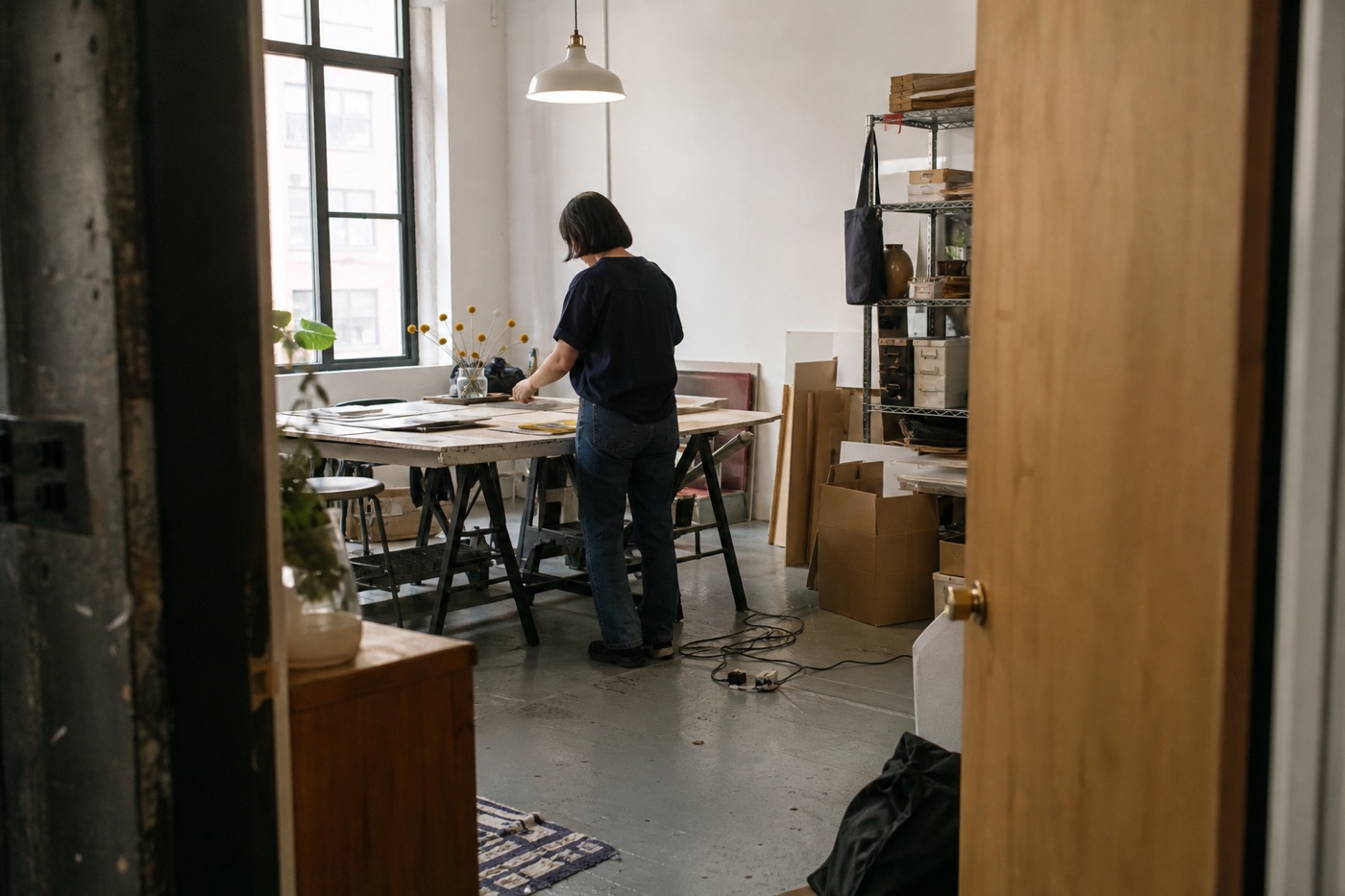
Work context goes one step further. It places the subject near the materials, tools, or actions that shape the practice. This can build trust and specificity, though it usually produces an environmental portrait rather than a traditional headshot. The difference matters because the image will be used differently.
Start with where the portrait will live
List the first three places the photographs need to go. A profile image may be shown at the size of a coin, which favors a close crop and a clear background. An About page has room for expression and environment. A press feature may need horizontal and vertical options. A speaker page may need open space beside the subject for event copy.
The placement also affects tone. A therapist directory, artist statement, architecture proposal, author bio, creative agency page, and performing-arts press kit each carry different expectations. The portrait should feel appropriate without flattening the person into a costume version of the profession.
Ask what the viewer needs to understand quickly. Is the person approachable. Is the work exacting. Is the practice physical, collaborative, private, public, playful, reserved, or deeply tied to a place. The image does not need to announce every trait. It should support the most important one without contradicting the rest.
Then check the technical shape. You may need one close vertical, one horizontal frame with space for copy, and one square-safe portrait. Planning those versions on set is more reliable than asking one excellent photograph to become every rectangle later. Cropping is useful. It is not a personality transplant.
When a studio headshot works best
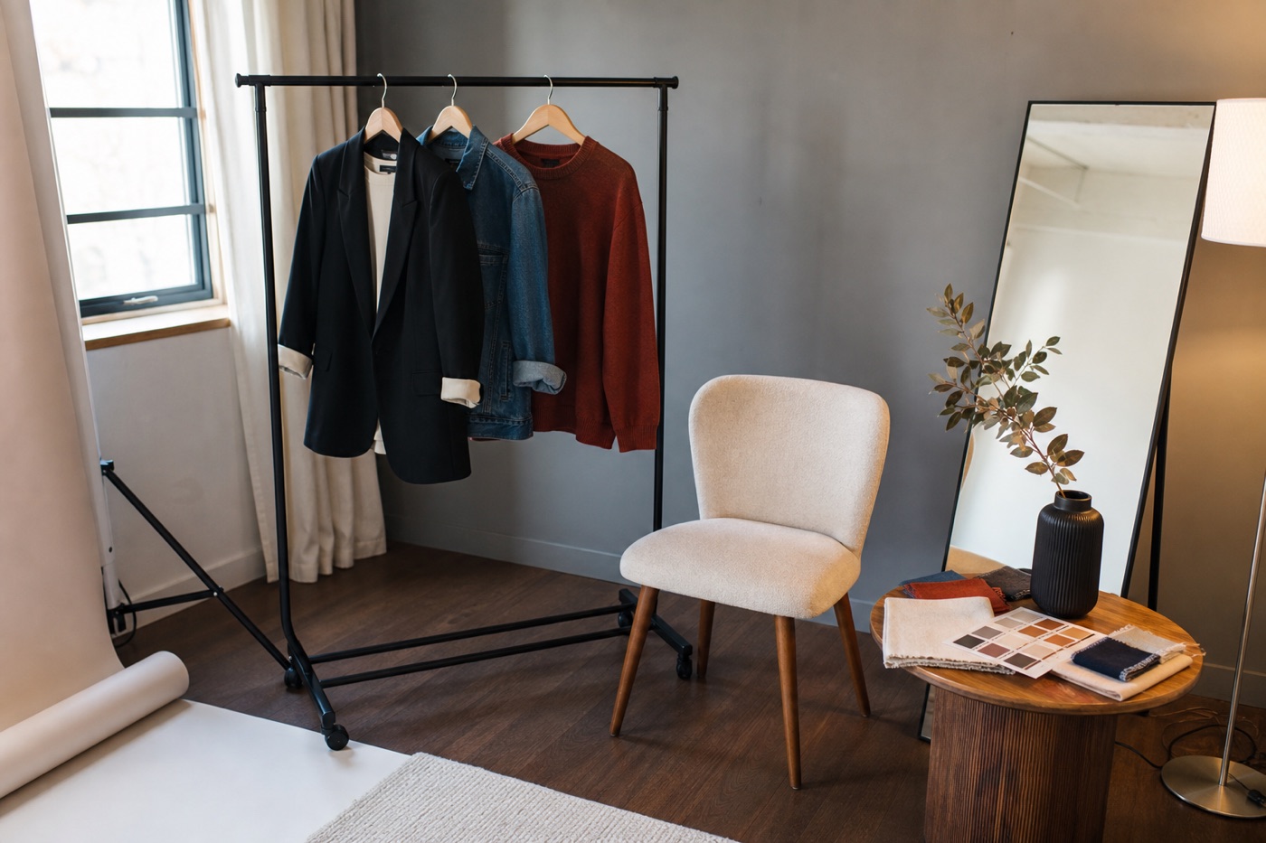
Studio is the strongest choice when consistency matters. A team page may need several people photographed over time with the same background and light. An actor, consultant, designer, therapist, writer, or artist may need a clean portrait that can sit comfortably inside many layouts. Controlled conditions make those needs easier to repeat.
Studio also keeps the session focused. Weather, public traffic, room clutter, changing daylight, and location permissions stop competing for attention. The photographer can make small adjustments to light, angle, distance, and expression while the visual structure stays stable.
This does not mean the result has to feel corporate. A warm paper tone, soft side light, stronger shadow, plain white, muted color, or close crop can each create a different kind of presence. The useful decision is not studio versus personality. It is how much visual information should come from the person and how much should come from the setting.
Choose studio when the portrait must remain flexible. It will be easier to place beside different colors, page sections, bios, and publication designs. A clean background also helps when the final image appears very small. The face remains legible instead of joining a committee of shelves, plants, windows, and passing bicycles.
When a location portrait earns its place
Location works when the place adds a useful layer that a plain background cannot. A neighborhood may connect an architect or designer to the city. A theater may matter to a performer. A gallery, office, home, or studio may establish how clients encounter the work. The location should answer a question, not merely look expensive in the distance.
The strongest location is often simpler than expected. A good wall, doorway, window, corridor, storefront edge, or quiet section of a room may give enough atmosphere while keeping the subject clear. The complete venue does not need to appear in every frame. Suggesting a place can be more effective than cataloging it.
Natural light can make a location portrait feel immediate, but it also changes. Time of day, weather, window direction, mixed bulbs, reflective surfaces, and neighboring buildings all affect the room. A scouting photograph helps the photographer understand what is available and what support may be needed.
Choose location when the setting is stable enough to plan and relevant enough to keep. If the business expects to leave the space soon, or the room no longer represents the work, a location-heavy portrait can date quickly. A less specific setting may give the image a longer useful life.
When work context is the useful answer
Work context is useful when the method is part of why someone chooses you. An artist beside a worktable, a stylist among edited options, a designer reviewing materials, a maker near tools, or a director inside a rehearsal space can show how the person relates to the practice. That connection can make the portrait feel earned rather than decorated.
Keep the action simple. One clear gesture, material, or decision is usually enough. A work-context portrait becomes difficult to read when the subject performs five tasks at once for the camera. Real work contains pauses and attention. The image can use them.
Context also gives people something natural to do. This can help a camera-aware subject settle into the session. Looking at a material, moving through the room, arranging an object, or returning to a familiar position may create more believable body language than holding a pose in an empty space.
The tradeoff is versatility. A wide process image may be strong on an About page and weak as a tiny profile avatar. It may also include details that become outdated. Treat it as a companion to a clear close portrait, especially when the image library needs to work across several platforms.
Should you combine more than one setting?
Often, yes. The most practical combination is a clean close portrait plus a wider environmental or work-context frame. The first handles recognition. The second carries story. They can share wardrobe, light quality, and color so the set feels related without repeating the same information.
A single location can sometimes provide both. A quiet wall or simple window area may become the clean headshot setting, while the worktable or larger room provides context. This keeps the production light and avoids spending the day traveling between places that each contribute one photograph.
Use a separate studio when the controlled image has an important standalone job or the real location cannot support it. The two settings should still belong to the same person. Consistent grooming, wardrobe logic, editing, and tone can connect them even when the backgrounds change.
Do not add a setting only to increase the file count. Two useful image families are stronger than six visual ideas that politely disagree. The set should help a viewer understand the person more clearly each time the distance changes.
Match wardrobe, light, and background
Wardrobe is part of the setting. A dark jacket may separate beautifully from a warm wall and disappear into a charcoal background. A detailed pattern may feel alive in a clean studio and compete with a busy workspace. Check the options against the real location before the session when possible.
Bring a small range rather than a portable identity crisis. A jacket, overshirt, sweater, dress, shirt, or accessory can shift the formality while the person remains recognizable. The goal is to support the destinations, not to create several unrelated characters before lunch.
Light should match the intended feeling and the practical environment. Soft frontal light can feel open and clear. Side light can add shape and quiet drama. Window light may connect the portrait to a real room. A stronger studio setup may help when color, consistency, or repeatability matters.
Background detail needs editing. Remove anything that pulls attention for the wrong reason, including readable private information, unrelated packaging, tangled visual clutter, or a bright object beside the face. Keep the details that explain the practice. A lived-in room does not need to become empty. It only needs a hierarchy.
Plan around practical NYC locations
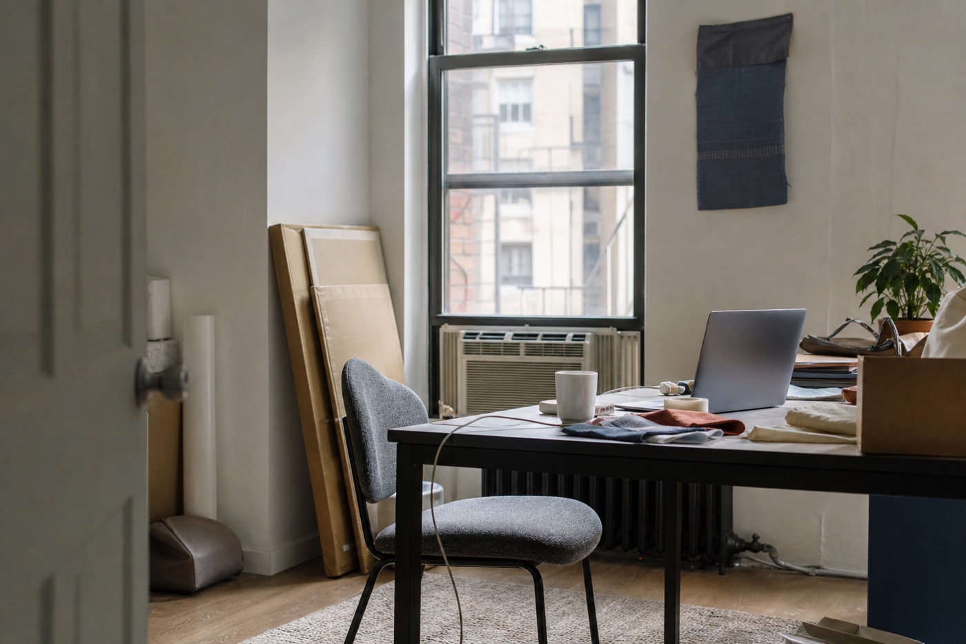
NYC gives creative portraits an enormous range of settings and a modest amount of cooperation. Sidewalk traffic, building access, narrow rooms, freight schedules, changing window light, noise, permits, and weather can shape the session before the first portrait is made.
Choose the smallest area that tells the story. A studio corner may be enough. A quiet block may provide the exterior feeling without moving through several neighborhoods. A lobby, roof, or shared space may require approval even when it looks casually available. Confirm access before building the visual plan around it.
Allow the location to be itself. Small rooms can create close, intimate portraits. Mixed light can be controlled or used deliberately. A crowded space may need a tighter angle rather than a larger production. The constraints often clarify the portrait once they are treated as facts instead of surprises.
Have a simple fallback. If the exterior becomes unusable, identify a wall, window, covered entry, or interior area that can still support the main portrait. The backup does not need to be visually equal. It needs to preserve the essential job of the image.
Build a short portrait brief
A useful brief can fit on one page. Name the audience, the first destinations, the setting options, the level of formality, and the qualities the portrait should carry. Include current website pages, layout screenshots, image dimensions, and any deadlines that affect delivery.
List the essential frames. This may include one close direct headshot, one warmer expression, one horizontal environmental portrait, one work-context frame, and one vertical image with space for copy. Add variations only when they solve a known use.
Share visual references for light, distance, color, and energy. Avoid treating someone else's portrait as a complete blueprint. Their room, work, face, wardrobe, and public role are different. References are most useful when they describe a quality rather than request an imitation.
Tell the photographer what would feel false. If you never work at a laptop, do not build the portrait around one. If the room is normally active, a completely empty setting may feel strange. If clients know you as informal and direct, an overly formal portrait may create distance before the conversation begins.
A simple way to choose
Choose studio when the portrait needs to be clean, controlled, repeatable, and easy to place. Choose location when the place adds atmosphere or identity. Choose work context when the process and environment help a viewer understand the value of the person behind the work.
If you need several uses, start with two distances rather than three locations. Make the close headshot that can travel. Then make the wider portrait that carries the specific story. This usually creates a more useful library without turning the session into a tour.
The right portrait setting should reduce explanation. It gives the viewer enough information to meet the person clearly, then gets out of the way. A headshot does not need to contain an entire creative practice. It only needs to open the right door.
FAQ
Is a studio or location better for a creative headshot?
A studio is better when you need a clean, controlled, repeatable portrait. A location is better when the setting adds useful information about your personality, audience, or work. Choose by the job of the portrait, not by which option looks more elaborate.
Can a headshot show a creative workspace?
Yes. A work-context portrait can include the studio, office, tools, materials, or process when those details help a viewer understand what you do. Keep the frame edited so the environment supports the person instead of becoming a visual inventory.
Should creatives get both a headshot and an environmental portrait?
Often, yes. A close headshot works well for profiles, directories, bylines, and small placements. An environmental portrait gives a website, press feature, or About page more context. The two images solve different jobs and can still belong to the same set.
What should creatives wear for a headshot?
Wear something that feels like your real working self at the level of formality your clients usually meet. Bring a small number of options that differ in color, layer, or shape, and check them against the planned background rather than choosing clothes in isolation.
Need the clean portrait and the context?
We make headshots and environmental portraits for artists, founders, and creative professionals in NYC, with each setting planned around where the images need to work.
Explore portraits and branding films →