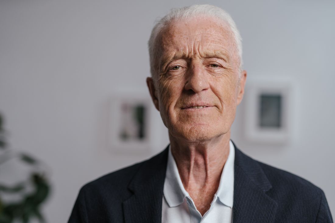
A board chair's portrait doesn't get to be about the chair. It runs next to a letter to donors and members, so it has to look calm, credible, and considered before anyone has read a single word of what the letter actually says.
A board chair's portrait for a nonprofit annual report needs to read as steady and accountable, not personal or promotional. It sits beside a letter to donors, members, and funders, so it should match the tone and format of the executive director's and staff portraits around it, and be built to survive a printed page, a small web crop, and a projected slide.
Who Actually Looks at a Board Chair's Portrait?
A board chair's portrait in an annual report is seen mostly by donors and members deciding whether to keep giving, by funders assessing an organization's leadership, and occasionally by press covering a gala or campaign. It reads more like a masthead photo than a personal keepsake, so it has to hold up under a skeptical, appraising glance.
That audience matters because it is not the same audience an artist's portrait or a staff photo answers to. A donor flipping past the letter from the board is not evaluating personality or creative range. They are looking for a face that matches the tone of the letter: composed, present, taking the organization seriously enough to show up for a photograph. A funder scanning the leadership page is checking that governance looks stable, not exciting. Press only sees the image if a story runs, and in that case it becomes the public face of the board for however long the story circulates.
Because the portrait gets this one job, once a year, in one document, it does not need to work as hard as a headshot that gets reused across a website, a bio page, and social profiles. It needs to sit quietly next to a letter and support it, not compete with it. That single, specific audience is what should drive every other decision about the sitting: the expression, the setting, and how much personality is allowed to show through.
What Register Does a Board Chair's Portrait Need?
The right register sits between a corporate headshot and an artist's portrait: composed and steady like a business photo, but warmer and less polished than a law firm bio picture, since the subject is a volunteer representing a mission, not an executive representing a company. It should read as accountable, not distant.
A pure corporate headshot, the kind built for a law firm directory or a bank's website, tends to flatten a person into a title. Hard light, a tight crop, a fixed half smile: useful for a directory, wrong for a nonprofit letter that is trying to build trust with people who give money because they believe in the mission, not because they are hiring a vendor. That register reads as transactional next to language about impact and gratitude.
An artist's portrait, on the other end, usually leans into personality, mood, or a specific creative point of view, because the artist's portrait is often selling the work through the person. A board chair is not selling their own creative identity. Somewhere in between sits the right frame: a calm, direct expression, natural but even light, a background plain enough not to distract, and posture that reads as present rather than performative.
The goal is a face a reader trusts within a second, without wondering what the photograph is trying to sell them. That trust matters more than polish. A slightly imperfect, natural expression usually serves the letter better than a flawless studio smile, because the reader is meant to believe the person, not admire the photograph.

How Do You Work Around a Volunteer Board Chair's Schedule?
Plan for a single short window, usually fifteen to twenty minutes, scheduled around whatever the chair is already doing: before a board meeting, around a site visit, or squeezed into a lunch break. A volunteer chair is not clearing an afternoon for a photo shoot, so the session has to be ready before they arrive, not built around their patience once they do.
In practice that means the setup, lighting, and background get built and tested before the subject walks in, using a stand-in or an empty chair to check exposure and framing. The chair's actual time in front of the camera goes toward a handful of clean, usable frames with small adjustments in posture and expression, not toward experimenting with concepts or waiting on gear. Wardrobe questions get resolved by email beforehand, not worked out on the spot.
It also helps to treat the sitting as the only chance you will realistically get. Board chairs rotate, travel, and have limited patience for a second attempt once the annual report deadline has moved on. Booking the session inside a date the chair is already committed to, rather than asking them to carve out separate time, is usually the difference between getting the photo and chasing it through reschedules.
Build in one honest fallback too: an alternate date the chair is already likely to attend, such as a fundraising walkthrough. A volunteer chair who cancels once is not being difficult; the production plan should absorb that reality rather than treat one missed slot as a crisis.
What Does the File Actually Need to Survive?
The file needs to hold up in three different places: a printed annual report page, a small web crop on a leadership or about page, and a slide projected at a gala or annual meeting. That means shooting at high enough resolution for print, with enough clean space around the subject to crop tighter for web without losing the composition.
Print is the least forgiving of the three. A file built only for screens can look soft or noisy once it hits a printed page, especially if the report uses matte or uncoated stock that absorbs more ink than a glossy magazine page would. Shooting on a plain, evenly lit background gives the file room to survive that shift without visible banding or muddy shadows in the background.
A slide is the opposite problem: it gets shown large, sometimes projected several feet wide in a room with uneven house lighting, so any softness or compression artifact becomes obvious fast. A vertical portrait with the subject positioned off-center, rather than dead-center, also gives a designer room to crop the same file into a square for a program booklet or a wide banner for a slide without reshooting. One well-composed, high-resolution file, shot with those three uses in mind from the start, avoids the scramble to reshoot or upscale a photo that was only ever meant for one screen.
How Should the Chair's Portrait Sit Next to the Executive Director's?
The two portraits should read as a matched set: same lighting approach, same background treatment, same general crop and scale, so a reader's eye does not register one as more important than the other before reading a word of either bio. The difference between the two roles should come from the text beside them, not from one photo looking more polished.
In practice, that usually means both are shot the same day if possible, on the same backdrop, with the same lighting setup adjusted only for each person's coloring and height. If the sittings happen weeks apart, matching becomes a discipline: the same background color, a similar crop from the waist or shoulders up, and a similar level of retouching restraint so one face does not look noticeably smoother or warmer than the other.
Where the two should differ is in energy, and only slightly. The executive director's portrait can carry a touch more warmth or approachability, since that role often faces staff, artists, and the public day to day. The board chair's portrait can sit a shade more formal, since the role is closer to governance and oversight. That is a matter of a few degrees of expression, not a different set or a different backdrop.
Scheduling both sittings together is worth prioritizing, because matching two portraits shot months apart under different light or against a backdrop that has faded is far harder than getting the timing right once. If a shared day is not possible, keep detailed notes on the setup so a later sitting can be matched deliberately.
How Should the Chair's Portrait Sit Next to the Staff Portraits?
The chair's portrait should feel related to the staff portraits without being identical to them, using a shared background and lighting family so the whole leadership section reads as one coherent set, while leaving the chair's frame slightly more formal to reflect that the role sits outside day-to-day staff operations.
Staff portraits, especially for program or curatorial roles, often carry more visible personality: a slight smile, a setting tied to the work, sometimes a prop that signals what the person actually does. A board chair's portrait works better plainer, because the chair's job in the report is closer to stewardship than to storytelling. Too much visual energy in that one frame can make it look like the chair is competing for attention with the people who run the programs day to day.
The practical fix is consistency of system, not sameness of pose. Use the same backdrop color and lighting family across every portrait in the leadership and staff section, so pages feel unified when a reader flips through in sequence, but let the board chair's crop and expression sit at the more restrained end of that same visual family. A reader should be able to tell the sections apart by role, not by photographic style.
This matters most on the page layout itself. When a designer places the chair's photo in a grid alongside staff headshots, any mismatch in white balance, crop height, or background tone stands out immediately. Shooting the whole set against the same fixed backdrop and light, adjusted only per person, is the simplest way to prevent that.
What Wardrobe and Background Choices Hold Up in Print?
A solid jacket in a mid-to-dark tone, a plain wall or a solid paper backdrop, and minimal jewelry are the safest choices, because they survive the widest range of uses: a printed page, a small web thumbnail, and a projected slide, without any pattern, logo, or fine detail breaking apart at a different size.
Fine patterns such as narrow stripes or small checks can create moire, a distracting rippling effect, once a file is printed at a small size or compressed for the web. A plain or simply textured fabric avoids that problem entirely. Bright or saturated colors can also shift unpredictably between a screen preview and a printed page, especially on uncoated stock, so a more neutral palette holds its color more reliably across formats than something high-saturation.
The background deserves the same restraint. A plain wall or a solid paper backdrop keeps the focus on the subject and gives a designer room to place text or a pull quote near the frame without fighting a busy setting. Anything with visible texture, artwork, or a window in the background risks distracting from the subject or reading as inconsistent with the more controlled portraits elsewhere in the report. Simple wardrobe and a simple background are not a lack of creativity here. They are what lets the file do its job in three different formats without a second shoot.
What Should the Organization Avoid Asking For?
Avoid asking for a portrait that leans into personal branding, a candid or environmental style borrowed from an artist's profile, or a pose built around a prop tied to the chair's day job. All three pull attention toward the individual in a way that outweighs the role the photo is actually there to support.
Personal branding language, the kind used for a founder's website or a speaker's bio, tends to push toward a distinct visual identity: a signature color, a recognizable pose, a setting that says something about the person's taste. That works for a founder building a following. It works against a board chair, whose portrait needs to feel replaceable by the next chair in a future report without the whole leadership page needing a redesign.
A candid or environmental portrait, showing the chair mid-conversation or in a setting tied to their profession outside the nonprofit, also introduces problems: it dates faster, it can read as an endorsement of that outside profession, and it rarely matches the more formal register of the staff and executive director photos around it. The safer request is the plainer one: a calm, well-lit, formal portrait that will still look appropriate next to next year's letter.
It is worth saying plainly to the chair, since they are often the one making the request. A restrained, generic-feeling portrait is not a missed opportunity for personality. It is the format doing its job: a photo that still makes sense once this year's campaign or headline has been forgotten, sitting quietly next to whoever holds the role next.
Frequently asked questions
Should a board chair's portrait look different from a staff portrait?
It should feel related, not identical. Use the same backdrop and lighting family so the leadership pages read as one consistent set, but keep the chair's crop and expression slightly more formal than the staff portraits around it. The chair's role sits closer to governance than to day-to-day program work, and the portrait can reflect that difference without breaking the shared visual system the rest of the report relies on.
How often should the board chair's portrait be updated?
Update it when the chair changes, when their appearance has shifted enough that the photo no longer looks like them, or when the existing file is too low resolution for how the report now uses it. There is no fixed schedule beyond that. A photo that still looks accurate and prints cleanly does not need replacing simply because a year has passed since the last sitting.
What if the board chair is uncomfortable being photographed?
Keep the session short, plan the setup fully before they arrive, and give simple, specific direction rather than asking them to relax or perform. Most discomfort comes from uncertainty about what to do with their hands, expression, or posture, not from the camera itself. A few clear, concrete instructions and a fast, low-pressure session usually produce a better result than a longer, more open-ended sitting.
Can the annual report portrait also be used on the organization's website?
Usually yes, if it was shot at a high enough resolution and with enough clean space around the subject to recrop. A vertical portrait with the subject off-center tends to work best across both uses, since it can be cropped tighter for a small web thumbnail without losing the composition that was built for a printed page or a projected slide at an annual meeting.
Who should give final approval on the board chair's portrait before print?
The chair should see and approve their own likeness, and whoever manages the report's design should confirm it matches the visual system used for the other leadership portraits. Routing it through both people before the file goes to the printer catches likeness concerns and layout mismatches early, when a reshoot or a color adjustment is still simple rather than a last-minute scramble against a print deadline.
A portrait that's aged doesn't always need a full reshoot.
We'll look at what you have and tell you honestly whether a refresh session covers it or the work calls for a new concept.
Explore portrait sessions →