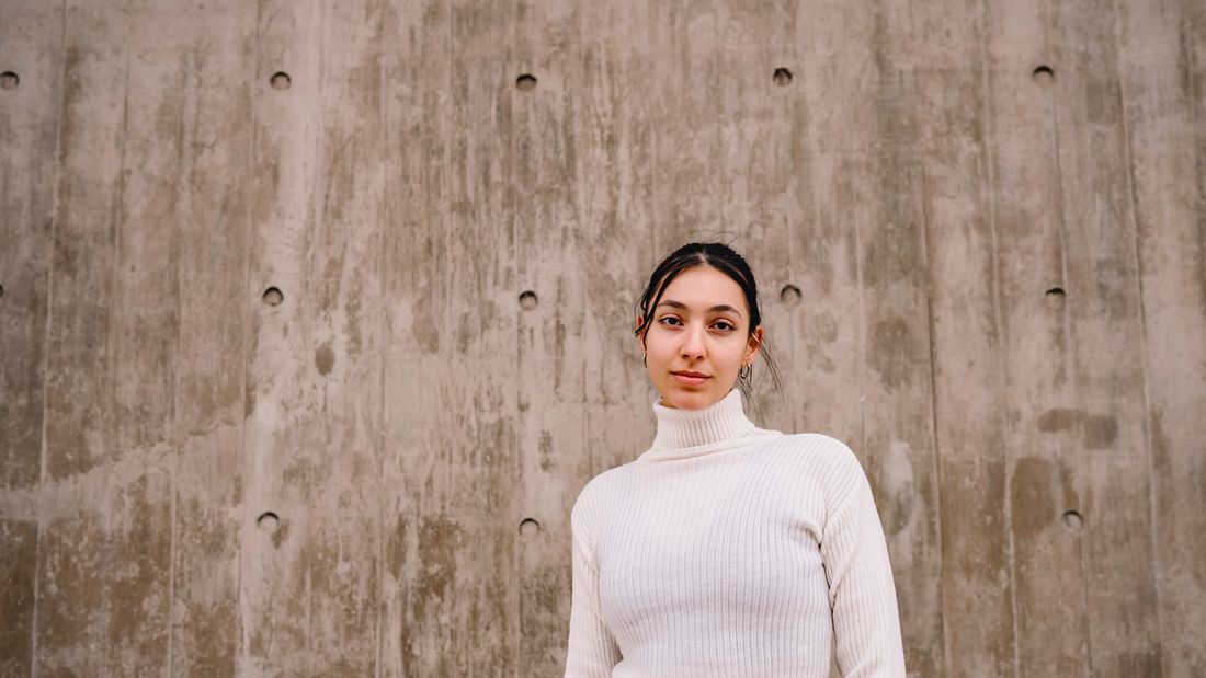
A faculty artist's portrait doesn't get to pick one audience. It has to read as warm next to a student quote in a viewbook and as credible next to an exhibition list in a gallery bio, and most offices only budget for one session to get both.
A faculty artist's portrait for a university needs to work in two different rooms at once: approachable enough for an admissions viewbook, credible enough for a gallery or press bio. The office gets one usable result only if both uses are named and planned before the session, not discovered after the first crop fails.
What Does an Admissions or Alumni Office Need From a Faculty Artist's Portrait?
An admissions or alumni office needs one portrait that can do two jobs at once: read as warm and approachable next to student quotes in a viewbook, and read as credible and serious next to a CV in an exhibition catalogue or artist bio. Planning for both uses in a single session avoids a second shoot later.
A faculty artist sits in an unusual position for a university communications office. The portrait might run beside a first-year admissions brochure quote about studio access, and the same file might also appear on a gallery's press page next to a list of exhibitions and grants. Those two placements carry different expectations, even though the office often only books one session and expects one usable result.
The office rarely names both uses out loud when the shoot gets scheduled. Admissions usually drives the request, since viewbooks and campus tours run on a yearly production calendar. The alumni or communications office often asks for the same file months later, once a faculty member wins a grant or opens a show, and discovers the viewbook crop does not read as serious enough for that context.
The fix is not two separate shoots. It is naming both audiences before the camera comes out, so the session produces a small set of frames built to serve either use without a reshoot. That means treating the faculty artist's portrait less like a single headshot and more like a short, planned set with two clear jobs in mind from the first frame.
Why Do a Viewbook Photo and a Gallery Bio Photo Do Different Jobs?
A viewbook photo and a gallery bio photo work for different readers with different questions. The viewbook reader is asking, would I feel comfortable with this person as a teacher. The gallery reader is asking, does this person's practice hold up. Warmth answers the first question; composure answers the second.
A prospective student or parent flipping through a viewbook is not evaluating a CV. They are scanning faces for a sense of who teaches at this school, and whether a studio class with this person sounds inviting. A slight smile, an open posture, and eye contact that reads as present rather than performed carry more weight there than any credential ever could.
A curator, journalist, or grant panel reading a faculty artist's bio page is doing the opposite work. They already know the person teaches somewhere. What they are checking is whether the portrait matches the seriousness of the exhibition list beside it. A portrait that reads as too casual, too bright, or too much like a campus tour photo can undercut a strong CV before anyone reads a line of it.
Neither register is wrong. They are simply built for different rooms. A viewbook lives inside a warm, recruiting context where approachability is the currency. A gallery bio lives inside a professional, evaluative context where restraint reads as credibility. The same face, lit and posed with both rooms in mind, can serve either one without feeling like it is performing for the wrong audience.
What Makes an Admissions Viewbook Photo Feel Approachable?
An approachable admissions photo needs open body language, a relaxed expression, and a setting that feels like campus life rather than a formal studio backdrop. The goal is a face a prospective student could imagine asking a question in office hours, not a face built to impress a donor.
Posture does most of the work here. Arms uncrossed, shoulders turned slightly rather than squared dead-on to the lens, and a natural stance rather than a stiff studio pose all read as approachable within a second of looking at the page. A genuine half-smile, not a held grin, usually beats a fully neutral expression for this specific use.
Setting matters almost as much as expression. A hallway, a studio corner, or a bright interior with some sense of place tends to work better for admissions material than a plain studio backdrop, since the viewbook reader is trying to picture campus life, not just a face. That said, the setting still needs to stay simple enough not to compete with the person or date the photo quickly.
Wardrobe should lean toward what the faculty member actually wears to teach, not a formal jacket pulled out for the occasion. A viewbook photo that looks staged usually reads as less trustworthy than one that looks like an honest moment caught between classes, even when both are carefully planned and lit the same way.
What Makes a Gallery Bio Photo Feel Credible?
A credible gallery bio photo needs a calmer expression, simpler light, and a background that will not date the image or distract from an exhibition list. The goal is a face that holds up next to a CV, a press release, or a catalogue essay without looking like a campus recruiting photo.
Expression should sit closer to composed than warm. A direct, steady gaze and a neutral or barely-there smile usually serve a bio page better than the open grin that works so well for admissions. The reader here is not deciding whether to enroll; they are deciding whether to take the artist's practice seriously, and an overly cheerful expression can undercut that read.
Light should be simple and even rather than dramatic or moody. A gallery bio photo does not need to compete with the artist's own work for visual interest. Even, flattering light that holds up in black and white, since many press outlets convert color photos for print, keeps the portrait useful across more contexts than a heavily styled setup.
Background choices should favor longevity over personality. A plain wall, a quiet corner of the studio without visible works in progress, or a neutral exterior all age better than a background full of specific objects or seasonal detail that will look dated the next time the file gets reused, which for a faculty artist can be years after the original session.
How Do You Plan One Session to Cover Both Uses?
Planning one session for both uses means booking slightly more time than a standard headshot, briefing the photographer on both destinations in advance, and shooting a small, deliberate range of expression and framing rather than one fixed setup repeated on a single background.
A single-purpose headshot session can run fifteen minutes. A session built to serve admissions and a gallery bio at once needs closer to thirty, mostly to allow two or three small changes in setup rather than one setup repeated. That might mean one sequence against a plain background for the bio use, and a second sequence in a hallway or studio corner for the viewbook use, without moving to a different day or location.
The office should tell the photographer both destinations before the shoot, not after reviewing the files. Knowing a photo needs to survive a black-and-white press reprint, and separately needs to feel warm enough for a recruiting brochure, changes lighting and expression choices from the first frame, not just the final selects.
It also helps to treat this as one continuous session rather than two unrelated bookings. The faculty artist only has to sit once, get comfortable once, and answer a short, specific brief once, which usually produces better, more natural results than asking them to return for a second sitting because the first one only planned for one use.
What Setting Works for Both a Viewbook and a Bio Photo?
A setting that works for both uses is simple, well-lit, and specific enough to feel real without becoming the subject. A quiet studio corner, a clean hallway, or a plain wall with soft natural light usually crops well for a viewbook layout and a bio page alike.
Extremely busy or highly styled settings tend to fail one use or the other. A cluttered studio full of in-progress work can look authentic in a viewbook spread but distracting on a bio page next to a formal CV. A stark white studio backdrop can read as credible for a bio but feel cold and impersonal for a recruiting brochure trying to sell warmth.
The middle ground is a setting with just enough texture to feel like a real place, a hallway with natural light, a corner of a studio with a wall visible behind the subject, without so much detail that it competes with the face or dates quickly. Soft, directional daylight usually serves both uses better than hard studio strobes, since it reads as natural in a campus context and clean in a press context.
One more practical note: shoot with enough surrounding space to allow different crops later. A tight, locked-in composition might work for one use and fail the other. Leaving room around the subject lets a designer crop tighter for a small viewbook thumbnail or wider for a bio page layout from the same original frame.
What Wardrobe and Expression Choices Survive Both Uses?
Wardrobe and expression that survive both uses stay simple, current, and true to how the faculty artist actually presents day to day. Avoid anything trend-specific, overly formal, or so casual it reads as unprepared, since the same frame needs to work in two very different layouts.
Clothing that looks like what the artist teaches in, rather than a special outfit reserved for photos, usually holds up best across both contexts. A collared shirt or simple sweater in a solid, mid-tone color reads as put-together in a viewbook and professional in a bio without leaning too far toward either a formal suit or overly casual studio wear.
Expression is where most sessions go wrong when trying to serve two audiences at once. Asking for one extreme, either a big open smile or a completely neutral, serious face, usually only serves one use well. A calm, slightly warm expression, somewhere between the two, tends to survive both a recruiting layout and a press or gallery context without looking mismatched in either.
It is worth shooting a small range rather than committing to one expression for the whole session. A handful of frames leaning warmer and a handful leaning more composed, all within the same setup and light, gives the office real options later instead of forcing one photo to do work it was never posed to do.
What Should the Office Ask for Before the Session?
Before the session, the office should confirm usage rights across both print and web, request a range of crops and expressions rather than one final frame, and ask for high-resolution files that will hold up in a printed viewbook and a smaller web bio alike.
Usage rights deserve a direct conversation before booking, not an assumption. A photo commissioned for a viewbook does not automatically clear for a press kit, a gallery's website, or a museum's promotional material years later. Naming every likely use up front, admissions material, alumni communications, press, and the faculty member's own professional use, keeps the file usable without a second negotiation each time it resurfaces.
File delivery should include enough resolution for print, since a viewbook or catalogue often reproduces a portrait larger than a website ever would. A file that only looks sharp on a screen can look soft or pixelated on a printed page, which is a harder problem to catch after the brochure has already gone to press.
Finally, ask for a small set of finished selects rather than a single approved image. Having three or four finished, retouched options, spanning the warmer and more composed range described above, gives the office room to choose the right frame for each specific placement later, instead of forcing one photo to represent the faculty artist everywhere the university needs a face.
Frequently asked questions
Can one photo really work for both a viewbook and a gallery bio?
One photo can work for both if the session is planned with both uses in mind from the start: simple, even light, a calm-to-warm range of expression, and a setting with enough neutral space around the subject to crop differently for each layout. It gets much harder when a single fixed pose and one tightly cropped background are asked to serve two very different reading contexts after the fact, since neither use gets the framing it actually needed.
How much extra time should the office budget for a dual-use session?
Plan for roughly double a standard headshot slot, often thirty minutes instead of fifteen. That extra time covers a second setup or background change and a wider range of expressions, so the photographer can produce options for a recruiting brochure and a press or gallery bio in the same visit, without asking the faculty member to clear a second block of time for a separate sitting weeks later.
Should the university or the faculty artist own the usage rights?
That should be settled in writing before the shoot, not assumed afterward. Many university photo agreements grant the school broad internal use while leaving press, gallery, and personal professional use to the faculty member. Naming every likely use, admissions material, alumni communications, press, and the artist's own site, up front, in the same conversation, avoids a separate renegotiation each time the photo resurfaces for a new purpose.
Does the faculty artist need to wear something different for each use?
Usually not. One outfit that matches how the artist actually teaches, a solid, mid-tone top rather than a formal suit or overly casual studio clothes, tends to read as put-together in a viewbook and professional in a gallery bio. Changing wardrobe mid-session adds time, adds a risk of mismatched color or lighting between frames, and rarely improves either result enough to justify the extra planning and the extra minutes it takes out of a short sitting.
What happens if the office only budgets for a single-purpose headshot?
A single-purpose session will still produce a usable photo for whichever use it was booked for, but the other use often surfaces later, once a grant or show comes up, and the existing file may not fit the more formal context. Naming both uses at booking time, even briefly, is far cheaper than an unplanned second session once the gap becomes obvious to the office.
A portrait that's aged doesn't always need a full reshoot.
We'll look at what you have and tell you honestly whether a refresh session covers it or the work calls for a new concept.
Explore portrait sessions →