An art fair booth hangs work on a wall and lights it evenly so the eye can judge color and composition from a fixed distance. A design fair booth puts chairs, lighting fixtures, and installations on an open floor, meant to be walked around, touched, and imagined in someone's actual home. Treating the second like the first produces coverage that looks clean and answers none of the questions a design buyer is actually asking.
A design fair needs coverage built around three-dimensional, functional objects: multiple angles per piece, raking light for material and joinery, a scale reference in frame, and material close-ups that show finish and texture. An art fair booth's flat, evenly lit, single-angle approach to framed work does not translate, because the design buyer is evaluating proportion, tactile quality, and real-room fit rather than composition alone.
What actually makes a design fair different from an art fair booth?
A design fair sells three-dimensional, functional objects that buyers evaluate by scale, material, and how a piece would sit in a real room, not framed work viewed from a fixed distance. That shift changes almost every choice in the coverage plan, from lighting angle to how close a camera gets to a surface.
An art fair booth is built around a wall grid: rectangles hung at eye level, spaced for individual viewing, lit evenly so color and value read true. A design fair booth is built around a floor plan instead. Chairs, lighting fixtures, cabinetry, and small installations sit in open space, viewed from multiple angles, sometimes touched, sometimes sat in. A photographer working an art fair can stand back and frame a wall. A photographer working a design fair has to walk around the object the way a buyer would, because no single angle tells the whole story of a piece meant to be lived with.
The buyer's mindset carries the same split. Someone stopping at an art fair booth is usually evaluating a single flat plane: composition, color, the artist's hand. Someone stopping at a design fair booth is picturing the object somewhere specific, a dining room, an entryway, a reception desk, and judging whether the proportions, finish, and joinery would hold up in that imagined room. Coverage that photographs a design object like framed work, straight-on and evenly lit, answers a question the design buyer isn't asking. The floor's layout, the object's dimensionality, and the buyer's imagination are what separate the two from the first planning call.
How do furniture and installations photograph differently than framed work?
Furniture and installations need multiple angles, raking light to reveal joinery and surface texture, and enough working space around the piece to show scale, where framed work needs even, glare-free light from one flattering angle and a fixed shooting distance that rarely changes from piece to piece.
A flat piece of framed work has one correct angle: perpendicular to the surface, lit to kill glare, cropped tight enough that the frame and wall barely register. A chair or a lighting fixture has no single correct angle. Its identity comes from how its lines resolve in three dimensions, the curve of an armrest, the way a shade throws light, the gap between a tabletop and its base. Photographing it from only the front flattens exactly the information a buyer is trying to assess.
Raking light, coming across a surface rather than straight onto it, does work at a design fair that it never does at an art fair. It reveals grain, weave, machining marks, and joinery in a way flat frontal light hides. A cabinet photographed with flat light can look like a photograph of a rectangle. The same cabinet under light that grazes its surface shows the maker's actual craft.
Space matters too. A design object needs enough clearance in frame to read its proportions against something familiar, a doorway, a person's hand resting on an armrest, a floor line receding into the booth. Cropping tight the way a framed piece gets cropped removes the exact context a buyer needs to judge whether a console table is thirty inches deep or fifty.
What does the buyer walking a design fair floor actually want to see?
A design fair buyer wants to see proportion against a human or architectural reference, material and finish up close, and enough of the maker's booth setup to judge whether a piece belongs in a specific room, not a portfolio image proving the work exists.
That buyer is often not a collector in the gallery sense. They might be an interior designer sourcing for a client's living room, a hospitality buyer filling a lobby, or a homeowner replacing a dining set. Each of them is running a practical filter: does this scale to my space, does the finish hold up to daily contact, does the price make sense for what I'm looking at. Coverage that only proves a piece exists and looks good doesn't answer any of those questions.
Useful coverage for this buyer includes a wide shot that shows the piece in relation to the booth's architecture, floor to ceiling, so scale reads without a caption. It includes a material close-up tight enough to show grain or weave at something close to how a hand would experience it. And it includes context, the piece styled the way a maker actually intends it to be used, a lamp lit and switched on, a chair pulled slightly out from a table as if someone just stood up.
None of this replaces a clean product shot. It supplements it with the information a design buyer specifically needs before they'll commit to a floor's worth of inventory.
How does booth lighting at a design fair change the shot list?
Design fair booths often use their own accent and ambient lighting as part of the presentation, so the shot list has to account for mixed color temperatures and fixtures that are themselves the product being sold, rather than working against a single even wall-wash like an art fair booth.
An art fair booth typically runs one lighting system, even, color-corrected, designed to disappear so the work reads accurately. A design fair booth often runs several: warm accent lamps meant to be sold, cooler ambient fixtures overhead, and daylight leaking in from a convention hall's windows or skylights. If a lighting fixture is the product, turning it off to get an evenly lit photograph defeats the point. The shot needs the fixture on, doing its actual job, even if that means balancing two or three color temperatures in one frame.
That balancing act usually means shooting a booth in passes rather than one lighting setup for the whole space: a pass with the booth's own lights on to show fixtures working as intended, and a pass with more neutral supplemental light for material and texture details where color accuracy matters more than mood. Trying to solve both needs with one lighting choice usually compromises both.
The practical habit is asking a design exhibitor before the shoot which pieces are lighting fixtures meant to be photographed on, and which are meant to be evaluated under neutral light. That single question reshapes the lighting plan more than almost anything else on a design fair floor.
What role do material and texture close-ups play at a design fair?
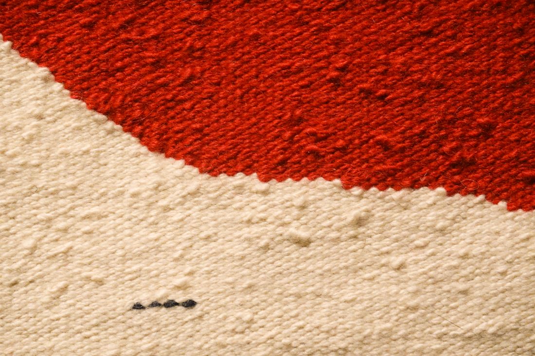
Material and texture close-ups do work at a design fair that they rarely need to do at an art fair, because the buyer is judging tactile qualities, wood grain, fabric weave, metal finish, that a wide booth shot can't convey and that framed work simply doesn't carry.
Framed work is mostly judged by what the eye takes in from a few feet away: color, composition, brushwork if visible. A design object is judged by what a hand would notice: whether a finish is matte or reflective, whether a weave is tight or loose, whether a joint is visible or hidden. A wide shot of a sofa proves the sofa exists in a pleasing shape. It doesn't tell a buyer whether the upholstery is a linen blend or a performance fabric meant for a household with kids and a dog.
A material close-up doesn't need to be dramatic. It needs to be honest and legible: enough depth of field that the texture reads clearly, light angled to reveal rather than flatten the surface, and a crop tight enough that the material is the entire subject of the frame. These images tend to be the ones a design buyer forwards to a client or a procurement team, because they answer the specific, practical question that started the conversation in the first place.
Skipping this step because it feels like a minor supporting image is one of the more common ways design fair coverage under-delivers for what the maker actually needed from the booth.
How should scale and human presence be handled differently than at an art fair?
Scale reads best against a consistent, recognizable reference, a doorway, a person's hand, another object of known size, and a design fair booth benefits from including that reference in more frames than an art fair booth typically needs, since dimensionality is central to how the buyer evaluates the work.
A framed piece at an art fair usually needs one scale reference at most, sometimes none, because a canvas photographed straight-on with visible proportions already reads clearly enough. A three-dimensional object doesn't behave the same way in a photograph. A chair can look tiny or oversized depending on lens choice, distance, and crop, and a buyer scrolling through booth photos later has no easy way to correct for that distortion without a reference point in frame.
Including a person in the frame helps, but the role is different from an art fair's occasional environmental portrait. At a design fair, a hand resting on an armrest or a person walking past a console table is there to calibrate scale, not to add narrative interest. The person should read as incidental, not staged, and never become the visual center of the image. The furniture stays the subject.
Architectural references work just as well when a person isn't available or appropriate: a doorway, a known-height wall panel, the booth's own structural elements. What matters is consistency. Switching scale references from frame to frame across a booth's photo set makes it harder for a buyer to build an accurate mental model of the work, which is the opposite of what design fair coverage is for.
What happens with brand and maker identity across a shared exhibitor floor?
A design fair floor usually holds dozens of makers in close proximity, so coverage needs to keep each maker's pieces clearly attributable and free of a neighboring booth's signage or product bleeding into frame, a problem art fair booths rarely face at the same density.
Art fair booths tend to have more visual separation, walls, partitions, defined perimeters that keep one gallery's presentation from bleeding into the next. Design fairs, especially the open-plan convention-hall format many design weeks use, often place booths closer together with sightlines that run straight through into a neighbor's setup. A wide shot meant to show one maker's dining table can easily include a competitor's lighting fixture in the background, which creates a usable-image problem before it creates an aesthetic one.
The practical fix is treating booth boundaries the way a photographer treats an embargo, actively checking backgrounds for a competitor's product or branding before confirming a frame, and reshooting an angle if a neighboring booth's signage becomes legible. It also means asking the exhibiting maker early which pieces they consider the priority set, since a shared floor rarely allows for exhaustive coverage of every object without confusion about whose booth is whose.
Getting this wrong doesn't just produce a messy photo. It produces an image a maker can't actually use in a lookbook or a press kit, because clearing rights or cropping around a competitor's visible product afterward is often more work than reshooting would have been. That attribution discipline is a design-fair-specific concern with no real equivalent in an art fair's more contained booth structure.
What should a design brand ask for after the fair closes?
A design brand typically needs a mixed set afterward: clean product-style images for a catalog or press kit, in-context booth images showing the piece styled and lit as intended, and a few detail shots of material and joinery, rather than one style of image repeated across the whole set.
The catalog-style images do the job a straightforward product shot does anywhere, evenly lit, accurate color, minimal distraction, useful for a wholesale line sheet or a retailer's product page. The in-context booth images do different work, showing how the piece looked styled at the fair, under its intended lighting, next to complementary pieces, which is often what ends up in a press feature or a maker's own social feed the week after the fair closes. Neither substitutes for the other.
Material and joinery details round out the set because they answer questions a wide shot can't, and they tend to be the images a design press outlet reaches for when writing about craft rather than just announcing a launch. A maker who leaves the fair with only wide booth shots usually finds themselves needing a second photography pass before the next trade cycle, once it becomes clear the wide shots can't carry a catalog or a press pitch on their own.
Naming this mixed need before the fair, rather than discovering it in the weeks after, keeps a design fair shoot from producing one style of image that half-answers three different real uses.
Frequently asked questions
Does a design fair booth need more photography time than an art fair booth?
Usually yes, because a three-dimensional piece needs multiple angles, a material close-up, and at least one scale reference to be usable, where a framed piece at an art fair can often be covered well from a single angle. A booth with several furniture pieces and a lighting fixture or two typically needs more time per object than a wall of framed work of the same booth size.
Should a lighting fixture at a design fair be photographed turned on?
When the fixture is the product being sold, yes. Turning it off to get flatter, more even light defeats the purpose of the image, since the buyer needs to see how the fixture actually throws light. The practical approach is shooting the fixture on for context shots and adding a separate, neutrally lit pass only for material or construction detail where color accuracy on the piece matters more than the fixture's glow.
How many angles does a piece of furniture usually need at a design fair?
Enough to show how its lines resolve in three dimensions, typically a front or three-quarter view for overall proportion, a side or detail angle that reveals joinery or profile, and a material close-up that shows finish and texture. Two or three angles per piece is a reasonable default for most of the booth, with more going to a signature piece a maker plans to lead with in a catalog or press pitch after the fair closes.
What's the biggest mistake in photographing a design fair booth like an art fair booth?
Treating every piece like a flat, frontal subject under one even light source, the same approach that works for a wall of framed work. That flattens the dimensional and material information a design buyer is actually evaluating, and it usually produces images that prove a piece exists without showing whether it would work in a real room. Multiple angles, raking light for texture, and a consistent scale reference solve this directly, without adding much time to the shoot.
Does a shared exhibitor floor create image rights problems for design fair coverage?
It can, if a neighboring booth's product or signage ends up clearly visible in a frame meant for a different maker, since design fair booths often sit closer together than an art fair's more separated layout. Checking backgrounds actively during the shoot, rather than cropping around the problem afterward, avoids most of it. Confirming with each maker which pieces are their priority set also helps keep coverage focused and avoids accidentally documenting a competitor's booth in the background.
Two openings on the same night doesn't have to mean a scramble.
We plan around clustered opening nights ahead of time, a split schedule, a second shooter, or booking early enough that the calendar stops being the risk.
Explore event coverage →