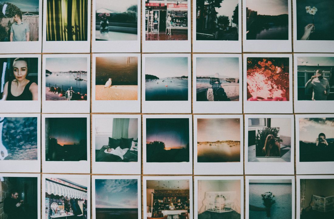
Most documentation gets approved by opening one image, deciding it looks good, and replying thanks. Then eleven months later, halfway through a grant application, someone notices that one painting is a slightly different white than the rest of the series and has been since the day it was shot.
A documentation review should happen on a contact sheet showing the whole set together, not on individual files. Check consistency across the set first, then squareness, color against the actual work, crop and edges, and detail coverage. Catching a problem while the setup still exists costs minutes; catching it later costs a reshoot.
Receiving Files and Approving Them Are Different Steps
There is a habit of treating delivery as the end of a documentation job. Files arrive, they look good on a phone, the invoice gets paid, and the folder goes into a drive. The approval step (the deliberate look at the whole set with specific questions in mind) quietly disappears.
That matters because almost every documentation problem is cheap to fix in the window right after a shoot and expensive after it. A color shift, a slightly rotated frame, a missing detail shot: all straightforward while the lighting setup and the artwork are still in the same room, all a new booking once they are not.
The approval step does not need to be long. Twenty minutes with a contact sheet and a short list of things to look for catches nearly everything that later becomes a problem, and it is the single highest-value habit an artist or gallery can build around documentation.
The other reason this step gets skipped is that it feels like distrust, and it is not. Photographers generally want the review, because the alternative is finding out about a problem eleven months later from someone who has now lost confidence in the whole set. A prompt, specific review is the version of this relationship that works for both sides.
What a Contact Sheet Should Actually Show
A documentation contact sheet is a single view of the entire shoot at small size, in order, with filenames visible. Its purpose is not to judge individual images. It is to make the set comparable, because most documentation errors are relative rather than absolute.
That means one page, or one screen, with everything on it. A folder of individual files opened one at a time defeats the point entirely: the eye adapts between images and a consistent shift across a set becomes invisible. Seen side by side, the same shift is obvious in seconds.
It should include every frame intended for delivery, including detail shots and any alternates, at a size large enough to read framing and color but small enough that ten or twenty pieces fit together. Some photographers deliver this as standard; where they do not, it is entirely reasonable to ask for one before approving.
Check One: Does the Set Hold Together
The first and most important check is whether the images look like they were made in the same session. Compare the whites, the background tone, the brightness, and the overall warmth across the whole sheet. A single piece that sits warmer or lighter than its neighbors is the classic error, and it is only visible in comparison.
This matters most for work that will be seen as a group: a series on a portfolio page, a set of images in an application, a catalogue spread. A viewer will not diagnose a color-temperature difference, but they will register that something is uneven and quietly attribute it to the work rather than to the photography.
Framing consistency belongs in the same check. Works of similar proportion should be cropped with similar margins, and a set where some pieces are tight to the edge and others float in space reads as unconsidered even when every individual file is technically fine.
There is a specific version of this worth watching for on multi-day shoots. Work photographed across two sessions can drift even with a locked setup, because bulbs warm differently, daylight leaks change, and a camera profile gets adjusted between days. If a set was shot over more than one session, compare the first piece of day one against the first piece of day two before looking at anything else.

Check Two: Is Everything Actually Square
Flat work photographed even slightly off-axis develops keystoning: the top edge becomes marginally wider than the bottom, or one side taller than the other. On a small screen it is easy to miss, and on a printed catalogue page it is the first thing a designer notices.
The reliable test is to look at the edges rather than the image. Are the two vertical edges parallel, and are the corners right angles? Rectangular works make this straightforward. For irregular or unframed pieces, look instead at whether the surface reads as evenly distant from the camera or as receding on one side.
This is worth checking on the contact sheet and then again at full size on any piece that will be reproduced. Minor keystoning can sometimes be corrected in post, but correction crops into the image and softens edges, so it is much better caught while a camera is still on a tripod in front of the work.
Check Three: Compare Against the Actual Work
Color approval has one rule that gets skipped constantly: compare the image to the physical artwork, in reasonable light, rather than to your memory of it. Memory of color is unreliable at the timescale of a week, and screens vary enough that two people can genuinely disagree about a file.
Where possible, do that comparison on a calibrated display or at least a consistent one, and in daylight rather than under a warm bulb. If the work has already left the studio, a color reference photographed alongside it during the shoot is what makes later verification possible at all.
Certain materials deserve extra attention because they are known to be difficult: deep blacks, saturated reds, metallic and iridescent surfaces, and anything fluorescent. If the set includes those, they are the pieces to check first, and they are the ones most likely to need a conversation rather than a straightforward yes.
Where a set includes works that are genuinely difficult to reproduce (fluorescent pigment, metallic leaf, very deep blacks), it is reasonable to expect a conversation rather than a perfect file. Some colours sit outside what a screen or a print can show, and an honest photographer will tell you which pieces are approximations. That is useful information to have attached to the file rather than discovered by a printer later.
Check Four: Crop, Edges, and What Got Included
Decide deliberately whether the documentation should include the edge of the work, and confirm the delivered files match that decision. For a painting on stretched canvas, whether the sides are visible changes what the image is claiming about the object; for works on paper, whether a deckle edge is included is a real editorial choice.
Look for anything in the frame that should not be there: a sliver of wall, a shadow at one corner, a clamp, a hanging wire, the edge of a backdrop. These are trivially removable at the time of shooting and mildly annoying afterward.
It is also worth confirming there is a little breathing room in the master file. A file cropped exactly to the artwork edge cannot be adapted for a layout that wants a margin, whereas a slightly generous master can always be cropped tighter. Ask for the generous version as the archival file.
Check Five: Is Everything Actually There
The last check is the least interesting and the one most likely to save an afternoon: does the delivery contain every piece, in every version, that the shoot was supposed to produce. Compare the contact sheet against the original list of works rather than against your recollection.
Missing detail shots are the most common gap, because they are the easiest thing to run out of time for at the end of a session. Missing alternates (a version without the frame, a second angle on a three-dimensional piece) are the second.
Filenames belong in this check too. Confirm that the naming convention is what was agreed and that it actually corresponds to the right works, because a mislabeled file is more dangerous than a missing one. A missing file gets noticed; a mislabeled one gets published.
Video and time-based work deserve their own line in this check, since they are the most commonly half-delivered category. A still frame is not documentation of a moving work, and an excerpt is not an archival master. If the shoot covered anything time-based, confirm which of those you actually received.
It is also worth confirming the delivery format itself matches what was agreed (file type, colour profile, bit depth, and whether the masters are genuinely uncompressed). Those are easy things to assume and awkward to discover later, particularly if the archive copy turns out to be a high-quality JPEG rather than the file you thought you were keeping.
How to Give Feedback That Gets Acted On
Specific and referenced beats general and evaluative. Naming a filename and describing what you are seeing (this one reads warmer than the rest of the set, this edge is not parallel) is immediately actionable. A note saying the colors feel a bit off generates a round of guessing.
Batch the feedback rather than sending it in pieces over three days. One consolidated list lets a photographer address everything in a single pass, and it dramatically reduces the number of rounds. Most documentation revisions should take one round, and they usually take three because the notes arrived one at a time.
And say what is right as well as what is wrong. Knowing which files hit the mark tells a photographer what to match, which is more useful than a list of problems with no reference point.
Do This While the Setup Still Exists
The single practical thing that makes all of this worth doing is timing. A review that happens within a few days, while the work is still accessible and the lighting setup could plausibly be rebuilt, converts most findings into small corrections. The same review a month later converts them into a new booking.
For larger sets, it is worth asking for a contact sheet before the full edit rather than after. Reviewing at that stage means any systemic issue (a color decision, a crop convention) is fixed once across the whole set instead of being corrected file by file after the fact.
None of this is about distrust. It is the same reason a proof exists in printing: two people looking at the same set with the same questions, at the point where an answer is still cheap. Documentation that has been through that step is documentation you can rely on for years without opening it again.
For artists working toward a specific deadline, it helps to build the review into the schedule explicitly rather than treating it as something that happens when there is time. A shoot four weeks before an application deadline leaves room for a review and a correction; a shoot four days before does not, and that compression is where most documentation problems actually originate.
Frequently asked questions
What is a documentation contact sheet?
A single view of an entire shoot at small size, in order, with filenames visible. Its purpose is comparison rather than judging individual images, because most documentation errors are relative. A color or brightness shift on one piece only becomes obvious when the set is seen side by side. Opening files one at a time defeats it, since the eye adapts between images.
What should you check before approving artwork documentation?
Five things: whether the set holds together in color, tone, and framing; whether each piece is genuinely square rather than slightly keystoned; whether color matches the physical work compared in reasonable light; whether crops, edges, and stray objects in frame are correct; and whether every intended file, detail shot, and alternate is actually present and correctly named.
How do you check color accuracy in documentation files?
Compare the image against the physical artwork in reasonable daylight rather than against memory, ideally on a calibrated or at least consistent display. If the work has already left the studio, a color reference photographed alongside it during the shoot is what makes later verification possible. Deep blacks, saturated reds, metallics, and fluorescents deserve checking first.
How soon after a shoot should documentation be reviewed?
Within a few days, while the work is still accessible and the lighting setup could plausibly be rebuilt. At that point most findings are small corrections. A month later the same findings usually mean a new booking. For larger sets, asking for a contact sheet before the full edit means systemic issues get fixed once rather than file by file.
How should you give a photographer feedback on documentation?
Reference specific filenames and describe what you are seeing (this one reads warmer than the rest, this edge is not parallel) rather than saying the colors feel off. Send one consolidated list instead of notes trickling in over several days, which is what turns a one-round revision into three. Naming the files that are right helps as much as naming the ones that are not.
Files you can approve with confidence.
We deliver a contact sheet with every documentation set, so the whole body of work can be checked together while corrections still cost minutes.
Explore artwork documentation →