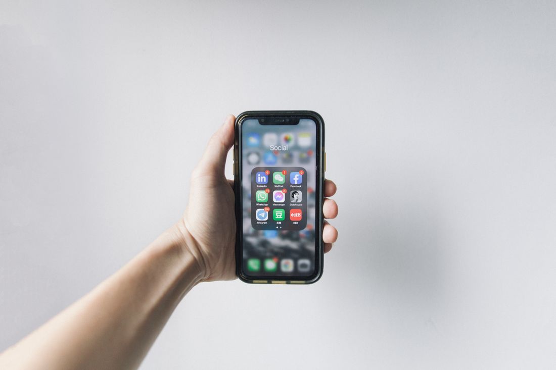
A first-time visitor to a gallery's Instagram doesn't scroll the feed looking for a story arc. They tap the highlights, because that's the row that behaves like a menu instead of a diary: current show, hours, who shows here, some history, some proof, and a way to ask about a piece. Most galleries build that row once during a launch week and never touch it again, which is exactly the part of the profile that gets browsed on purpose.
A gallery's Instagram highlights should organize the current show, hours and location, the artist roster, a curated slice of past shows, press worth trusting, and how to buy or inquire. Anything dated to a specific past year, or untouched since launch, reads as neglect rather than history and should get retired or rebuilt on a quarterly basis.
What Is a First-Time Visitor Actually Looking for in Gallery Highlights?
A first-time visitor checks a gallery's Instagram highlights before scrolling the feed, looking for six specific things: what's currently on view, hours and location, which artists the gallery represents, a sense of past shows, any press worth trusting, and a clear way to buy or ask a question. Highlights are the menu, not a scrapbook.
The feed works against that kind of browsing. It's chronological, and a post about an opening from four months ago sits between a studio-visit reel and a press mention with no logic connecting them except the date they were published. A visitor who wants to know what's on view right now has to scroll and guess. Highlights fix that by staying put under the bio, organized by topic instead of by date, and they don't disappear the way a story does after a day, which is the whole reason they're worth maintaining as infrastructure rather than a one-time launch task.
That makes highlights the one part of a gallery's profile that gets browsed on purpose instead of scrolled past. A visitor deciding whether to walk in, a press contact checking credibility, or a collector trying to figure out how to ask about a piece will all tap the highlights first. Most galleries build them once during a launch week and never touch them again, which means the rest of this piece matters more than any single reel: what actually belongs in that row, and what quietly turns it into a dead end.
What Belongs in the Current Show and Visit-Info Highlight?
The current show highlight needs the exhibition title, the artist's name, and the dates it's up. The visit-info highlight needs hours, the address, and anything genuinely non-obvious about getting in, like a buzzer, a shared building entrance, or whether a walk-in is fine or an appointment is expected. Keep the two separate.
Combining them into one general "info" highlight is tempting because it feels efficient, but it forces a visitor deciding whether to walk in right now to sit through unrelated content to find hours. Splitting them means someone checking "are you open today" gets an answer in two taps instead of scrolling past show details they don't need yet. The current-show highlight also changes every few weeks; the hours highlight barely changes at all, so bundling them means re-editing stable information every time the show does.
The human detail that matters here: this is the highlight people actually screenshot on their way out the door, often minutes before arriving. If a closing gets moved up, or hours shift for a holiday week, that highlight needs updating the same day, not whenever someone gets around to it. A gallery that's closed when its own highlight says it's open loses more trust in that one visit than a slightly dated past-shows folder ever will, because it's a wasted trip, not a missed scroll. Whoever runs the account should treat that update as equal priority to posting about the show itself, since a visitor standing outside a locked door doesn't care how good the current exhibition looks in the feed.
What Should an Artist Roster Highlight Actually Show?
An artist roster highlight should show who the gallery currently represents, one frame or short sequence per artist, with a name, a recognizable piece of their work, and a line about what they make. It answers "whose work is this gallery known for" in under a minute, without requiring the visitor to dig through old exhibition posts.
This is a different job from a past-shows highlight, even though the two get confused constantly. Past shows document what already happened. A roster highlight documents an ongoing relationship: who the gallery shows now, independent of whether that artist has a current exhibition up this month. An artist who isn't showing this quarter but is still represented should still appear here, because the roster is about who the gallery stands behind, not what's currently on the wall.
The practical limitation worth planning around: Instagram highlights don't support clickable text inside the story frames themselves, so any name or detail is just an image unless a link sticker was added when the story was originally posted. Building the roster from stories that already carry a link sticker to the artist's own page or tagged handle turns a static introduction into something a visitor can actually follow further, instead of a dead end that just names someone. It's worth revisiting whenever the roster actually changes, since an outdated roster highlight, one that still lists an artist the gallery no longer represents or leaves off a recent addition, causes more confusion than a missing highlight would, because it states something as current that quietly isn't anymore.
How Much Show History Actually Belongs in Highlights?
Enough past shows to demonstrate range and consistency, not a complete archive. A visitor sizing up a gallery wants to see that it has a track record and a recognizable point of view across several exhibitions, which usually takes four to eight representative shows, not every exhibition the gallery has ever mounted since opening.
The selection problem is more important than the volume problem. A past-shows highlight that includes every opening in chronological order eventually just becomes a long scroll with no editorial judgment behind it, and a visitor has no way to tell which shows actually mattered without reading captions on each one. Choosing shows that represent the range of what the gallery does, a solo show, a group show, something that took a risk, something that sold well, tells a sharper story than volume does.
The practical structure that holds up over time is one combined "Past shows" highlight, not a separate highlight per exhibition. A separate highlight for every show a gallery has ever done eventually crowds out everything else in the row and turns the profile's most valuable real estate into an index nobody scrolls through. One well-curated highlight, refreshed as new shows replace the least essential older ones, keeps the row usable instead of just long. Deciding what drops out is as much the job as deciding what goes in, and that decision gets easier once the highlight is framed as a rotating, representative sample of the gallery's range rather than a permanent record everything has to earn a place in forever.
What Press Coverage Actually Belongs in a Gallery's Highlights?
Real coverage: reviews, features, and mentions from outlets a visitor would recognize or trust, shown as a clean screenshot or photo of the actual piece with the outlet's name visible. Skip anything so minor it reads as padding, a single-line mention buried in a roundup rarely earns its own frame.
A press highlight functions less like an accolade and more like a fast trust signal. Someone deciding whether a studio visit or a first purchase is worth their time is, in effect, asking whether other people take this gallery seriously. A handful of legitimate mentions answers that faster than an artist statement ever could, because it's evidence from outside the gallery's own voice rather than the gallery describing itself.
The production detail that gets missed: capture press the same day it's spotted. Online articles get edited, paywalled, or quietly taken down more often than people expect, and a screenshot taken weeks later, if anyone remembers to take one at all, is sometimes the only surviving record. A quick, clean photo or screenshot filed away the day coverage runs is cheap insurance against losing it entirely, and it's far easier to trim an oversized press highlight later than to recover a clipping nobody saved. Keep the file somewhere outside the phone that took it, too, since a lost or replaced phone shouldn't mean starting the press archive over from nothing.
What Should the "How to Buy or Inquire" Highlight Cover?
How a visitor actually asks about a piece: whether to email or DM, what to include in that message, whether prices are shared on request, and roughly how long a response takes. This is the highlight that turns interest into an actual conversation instead of a visitor giving up and scrolling on.
Many galleries skip this entirely, assuming a visitor who's interested will figure out how to reach out. In practice, that visitor is often the highest-intent person browsing the profile, someone past the point of just looking and into the point of wanting to buy or ask something specific, and an unclear path to inquire is exactly where that momentum dies. A visitor who has to guess whether to DM, email, or show up in person frequently just does neither.
Keep it honest rather than exhaustive. This isn't the place for a public price list if the gallery doesn't share pricing that way, and it doesn't need to promise a response time the gallery can't consistently meet. A short, accurate answer, here's how to reach us, here's roughly what to expect, here's what's useful to include, does more for a serious inquiry than a highlight that oversells responsiveness the gallery can't actually deliver on busy weeks. Revisit it whenever the preferred contact method changes, since a highlight pointing someone toward an inbox nobody checks anymore quietly turns a serious inquiry into a dead end.
Why Is "2023 Openings" a Dead Shelf, and How Often Should Highlights Get Rebuilt?
A highlight named or dated to a specific past year signals inactivity even if the gallery has done a dozen things since. "2023 Openings" sitting on a profile in 2026 tells a visitor the account stopped being tended around that year, regardless of how much has actually happened since then. The fix is a quarterly review: retire what's stale, merge what's thin, and rename anything that dates itself.
The damage here isn't really about the content inside that highlight; it's a meta-signal that sits above it. A first-time visitor isn't checking the account weekly and won't notice small updates accumulating. What they see instead is one label that reads like a timestamp on neglect, and that single impression colors how they read everything else on the profile, even content posted last week. Dated shelving quietly undercuts an otherwise active account.
A practical habit: the same week every quarter, go through every highlight and ask three questions. Is this still accurate? Is it thin enough to merge with something else? Does its label or cover reference a year, season, or branding detail that's since changed? Treating this like a recurring calendar task, the same way a website gets a periodic content audit, keeps the row current without needing a full rebuild each time, because small quarterly fixes are cheaper than one large overhaul once everything's gone stale at once.
How Do You Design Covers That Survive a Rebrand, and What Should You Record at an Opening?
Design highlight covers around a simple, reusable system, an icon set or a consistent crop style, rather than a specific exhibition's palette or a logo version that will eventually change. At an opening, deliberately shoot footage meant for highlights, not just disappearing stories, so there's already a home waiting for it afterward.
Covers tied to one show's colors or an old logo mark age the fastest, because the highlight itself might stay relevant while its cover visibly doesn't. A neutral icon system, one consistent shape or symbol repeated across every highlight with only the color or label changing, survives a rebrand without forcing a redo of every single cover the day new branding ships. That's the difference between updating one template and re-shooting or re-designing six or eight covers from scratch.
The opening-night detail most galleries miss until it's too late: shoot with the highlight in mind while the room is still full. That means one clean establishing shot of the space, one clear detail shot of the actual work on view without a crowd blocking it, a few seconds of the artist if they're present and willing, and a couple of honest guest reactions. Saving these deliberately, rather than hoping a few random stories from the night happen to work later, is what gives an opening somewhere permanent to live instead of vanishing after a day.
Frequently asked questions
How many highlights should a gallery keep active at once?
There's no fixed number, but somewhere around six to nine keeps the row scannable without crowding it. Cover the essentials first: current show, hours and location, artist roster, past shows, press, and how to buy or inquire. Anything beyond that should earn its spot rather than just accumulate. A row with too many thin, overlapping highlights is often harder to use than one with fewer, clearly labeled ones.
Do highlights need to be updated every time a show changes?
The current-show highlight does, since it should always reflect what's actually on the wall right now. Hours, roster, and how-to-inquire highlights only need updates when those specifics actually change. Past shows and press can be updated on a slower, quarterly rhythm rather than after every single exhibition, since their job is showing a track record, not tracking every event in real time. Treat frequency as tied to what actually changed, not a fixed schedule for every highlight equally.
What's the fastest way to fix a stale highlights row without starting over?
Start with anything dated to a specific past year in its name or cover, since that's the most visible sign of neglect. Retire or rename those first. Then check for thin highlights covering similar ground and merge them. A full rebuild is rarely necessary; most stale rows just need a handful of the oldest, most obviously outdated entries addressed rather than everything replaced at once.
Should past shows get their own highlight per exhibition or one combined highlight?
One combined "Past shows" highlight generally holds up better over time. A separate highlight for every exhibition eventually crowds out everything else in the row and turns it into a long index instead of a quick overview. Curating four to eight representative shows into a single highlight, and swapping in newer ones as older, less essential shows get dropped, keeps that space useful instead of just growing indefinitely.
Does changing a highlight cover affect anything else on the profile?
No. Editing a highlight's cover, name, or which stories it contains only changes that highlight itself; it doesn't touch the feed, existing posts, or any other highlight. That makes covers a low-risk place to test a cleaner, more consistent visual system, since updating one doesn't require reworking anything else already published on the profile. It's a safe testing ground precisely because a bad cover choice is easy to undo without any lasting consequence elsewhere.
Let's plan a studio day that shoots itself.
We find the moments in a real working day that are actually worth filming, and cut them into reels that hold up on their own.
Explore social reels →